Back in 2008 I coined a phrase, "Do not let your political opinions influence your investment decisions." I did this because we had a flood of clients and advisors with some dire predictions following the election of President Obama. This of course was based on some pretty extreme campaign talking points fueling an anti-Wall Street populist movement. These clients and advisors wanted to go all to cash after his election.
While that looked like a good call post election and into the end of February, once President Obama backed off his populist rhetoric (reportedly after an Oval Office meeting with former President Clinton who advised him to be more positive), anybody letting their political opinions influence their investment decisions gave up significant gains. Thankfully most of our clients and advisors took our advice to let the DATA determine their investment decisions (including their financial plans & SEM's quantitative strategies).
Unfortunately I am bringing this up because President Trump is once again touting the stock market as the primary performance metric for his presidency. His first mention of this was on November 14. He's done it several more times since then.
"You have to start my term from November 5th, okay? Or November 6th if you want ... November 5th, because the market's gone through the roof. Enthusiasms doubled. It's doubled in the last short while." - President-elect Donald Trump 11/14/2024
We all know the President-elect has made a career of being a fantastic salesman and his chief promoter. One key in sales is to not let the data get in the way of your message. I thought today rather than critiquing the endless "expert" commentaries and webinars discussing 2025 and beyond under Trump which continue to flood my inbox, I'd show a few charts to remind us it's not one president, one Congress, or one party which can change the direction of the stock market (or economy). I don't do this to criticize President Trump, but to remind everyone that things could be great or they could be terrible, or more likely somewhere in between REGARDLESS of who is president.
I wanted to focus on this because in the last two weeks we've had over a dozen clients request to increase their equity exposure. I don't know their politics, but their addresses are all from 'red' districts. Maybe the market will be the best we've ever seen, but I think we need to at least look at what the data says.
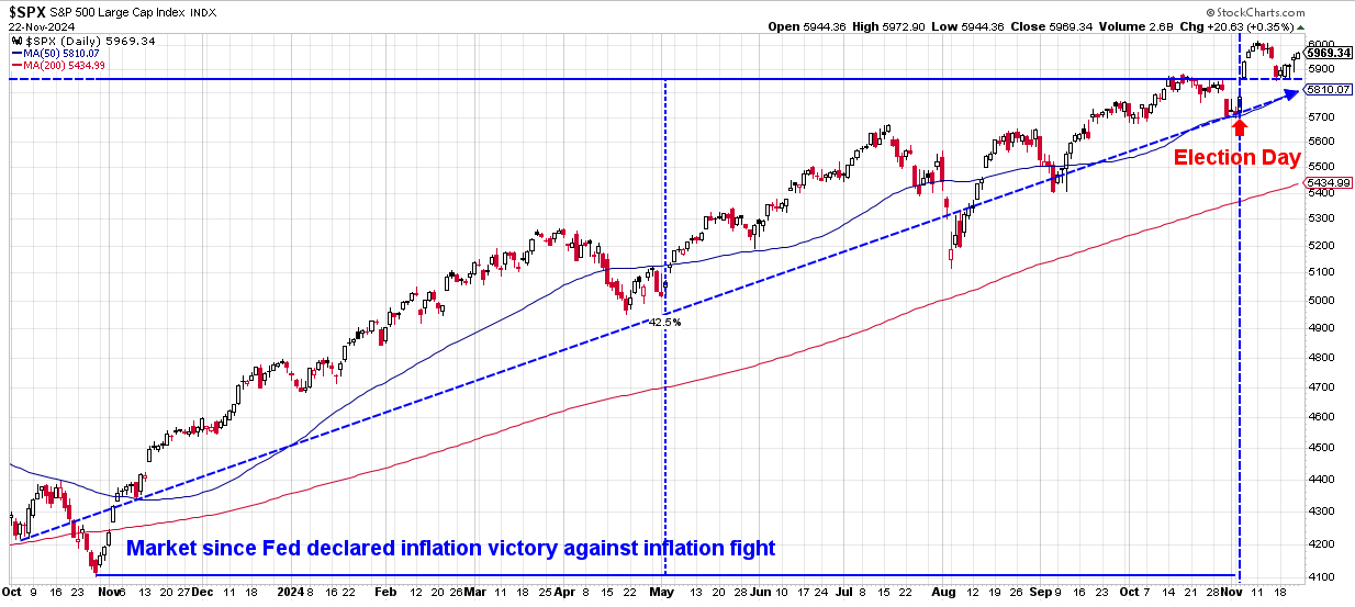
Let's start with President Trump's new benchmark – November 6 – I cannot give him November 5 because going into the election it was literally a coin toss on who would win. Since the close on election night the market did stage an impressive rally. Some of that enthusiasm waned in week 2, but resumed again last week. I kept the blue trend lines and the mark for the "Biden" all time highs on this chart as a point of reference.
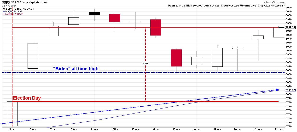
3.2% in a little less than 3 weeks is nice, but zooming out we can see the market has been in rally mode for a year now.
Ever since the Fed declared victory over their inflation fight, the market has already been rallying – up 42% since the end of October 2023.
I know because of the spike in inflation in late 2021 and throughout 2022, nobody believes the stock market was good under Biden, but the data tells a much different story. Even with the 10 month bear market in 2022, stocks enjoyed a 14.1% annualized return under Biden.
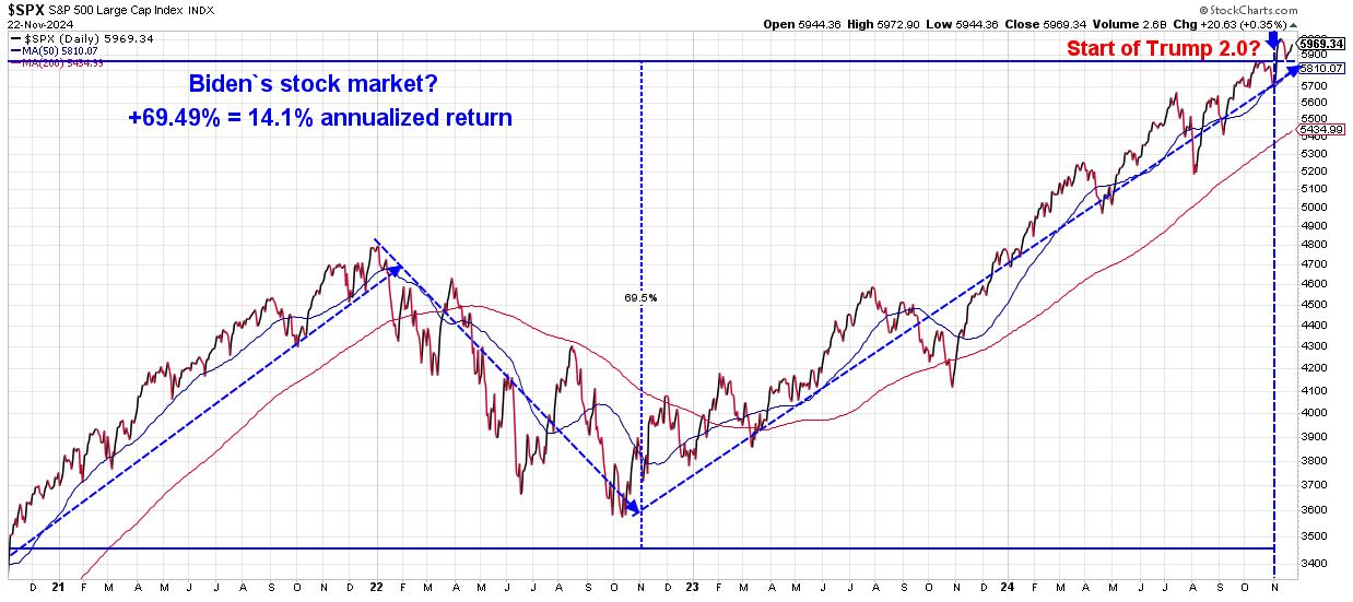
If we're keeping score, President Biden's stock market was 'better' than President Trump's, even if we back out the big drop in the early days of the pandemic.
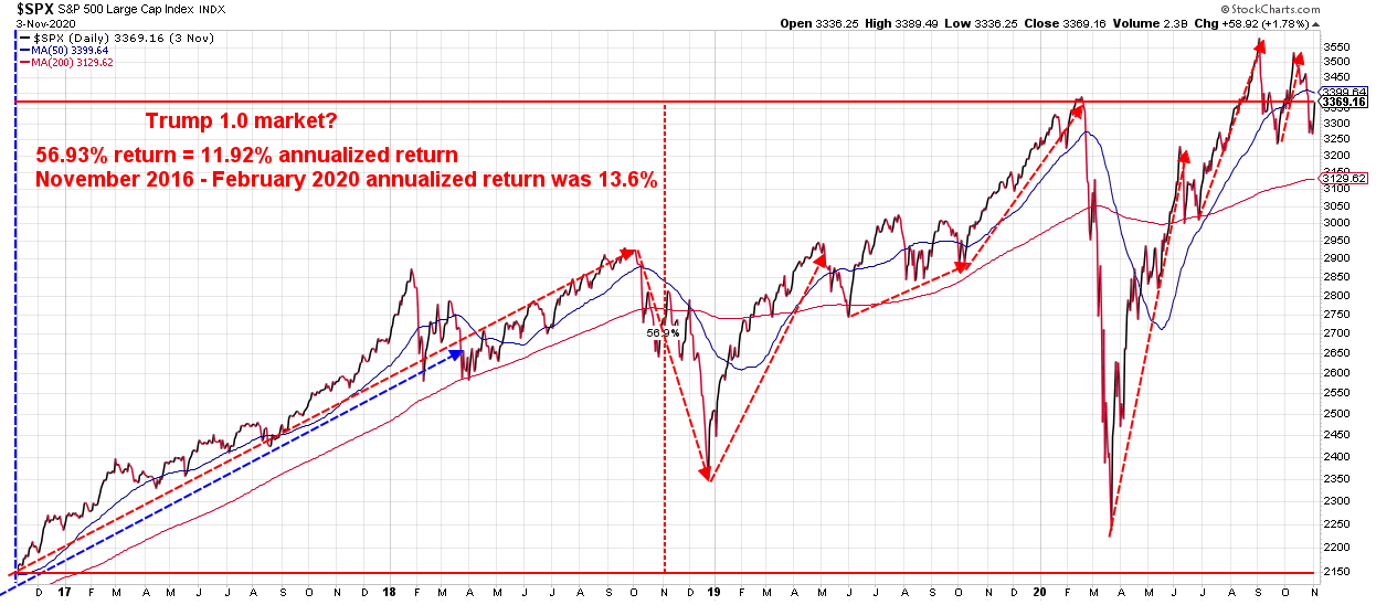
One thing you should note on the chart above is the VOLATILITY. I included this in my post-election blog reminding advisors and clients that not everything President Trump has promised is a POSITIVE for the market. Some, if he follows through would be a big (short-term) negative for stocks.

The other thing to note on the chart above is the blue trend line. The rally that started in early 2016 when Hillary Clinton was the presumed winner (and at the time believed to be better for stocks than an of the Republicans including Trump) simply continued into 2018. Revisiting those clients who in 2008 believed the end was upon us with the campaign rhetoric from President Obama, we can see most certainly they appeared to be correct with a 33% post-election drop. Even factoring that loss in, stocks still matched the long-term average return of around 10%.
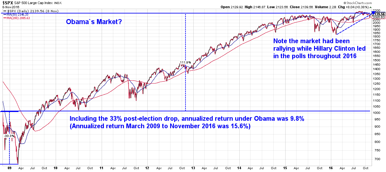
Following Obama's pivot to being more "positive" stocks posted a 15.6% annualized return.
I hope you see the theme of these charts not an attack or an endorsement of any one president (or party), but rather a reminder that the stock market can and will rally (and experience big drops) no matter which party is in control. Based on 90 years' worth of data, we should expect slightly below average returns over the next 2 years.
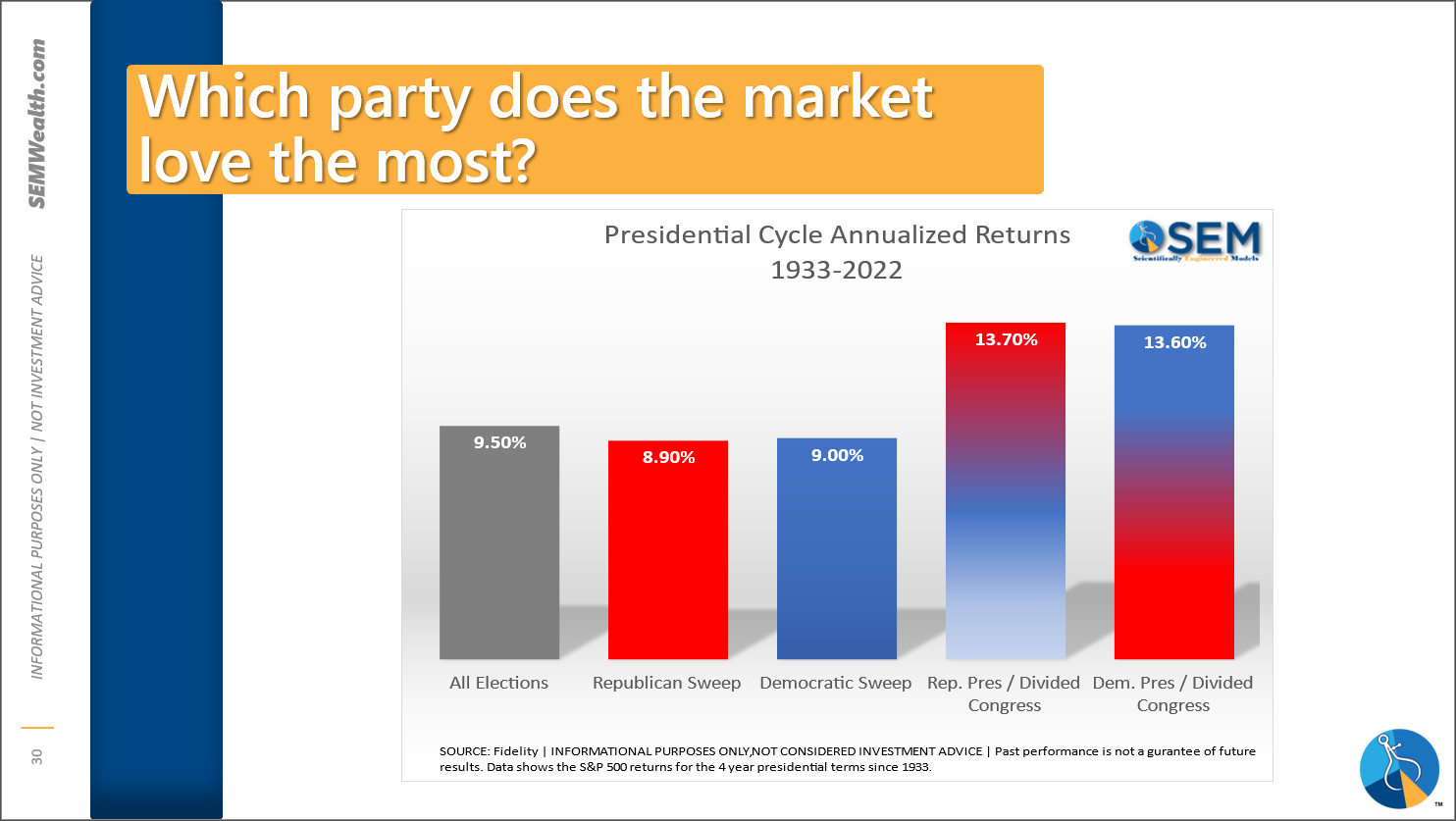
We discussed this in our 'Preparing for the election' webinar:
As I've said before the election, the biggest risk was not knowing who would control the White House or Congress at Thanksgiving (or later). That didn't happen so stocks have breathed a sigh of relief. This relief rally has made an already overpriced market even more overpriced. Before jumping up your risk, please read our "Buy high, sell higher" series:

I'm not saying any of this to dampen your enthusiasm (or to make light of your concerns) about the future based on the election outcome. I do want everyone who is an SEM client or advisor that SEM's systems are designed to remove all emotion and to make decisions based on the data. Each portfolio is customized around the financial plan, cash flow strategy, and risk personality of each client. Those things should not change based on who is in the White House.
Market Charts
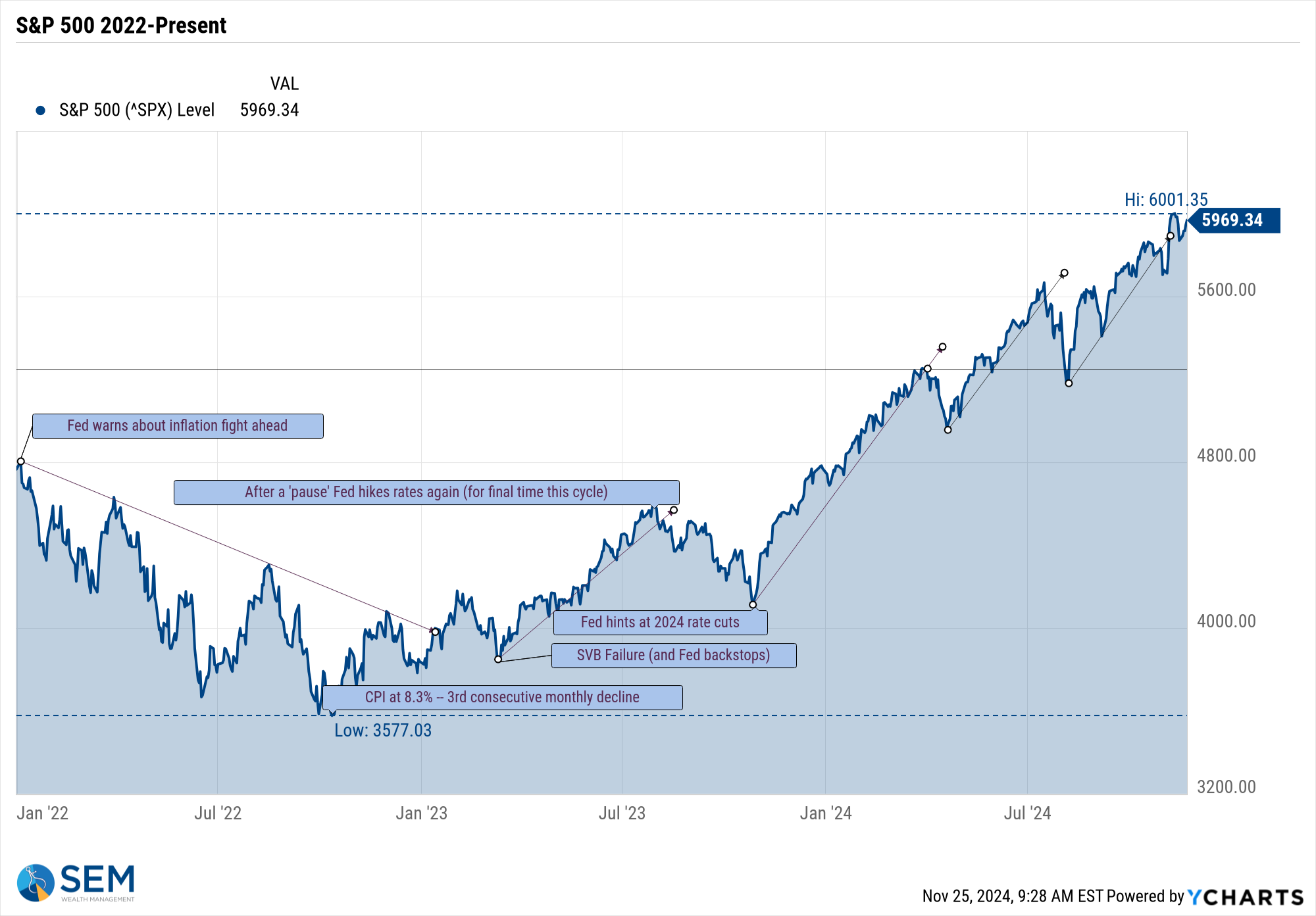
We've already shown quite a few charts above, but let's look at a few more we post each week. First is the S&P 500 and it's push back towards 6000. As I've said most of the year, high highs lead to higher highs.....until something significant comes along to change it. We don't know until it happens what that "significant" event will be, but history tells us that will happen at some point. The more steep the uptrend the more "surprised" the market will be that anything could actually go wrong. It's simply human nature and why we follow a quantitative approach.
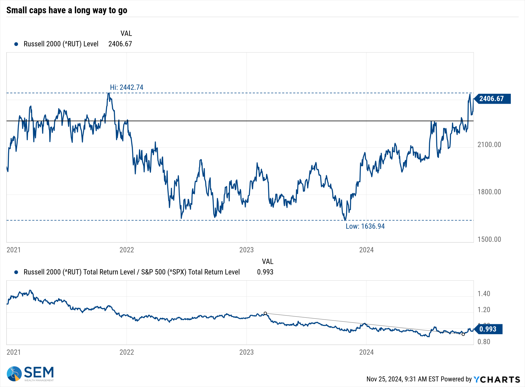
It is a positive that small cap stocks are FINALLY beating large caps (which has also been a nice boost to our Cornerstone clients which by design cannot own most of the mega caps due to our BRI screens.)
I'm going to show a slightly different, longer-term interest rate chart this week to keep this big up move in perspective. Yes interest rates have spiked quite a bit, but we are simply back to the range we saw from 2004-2007.
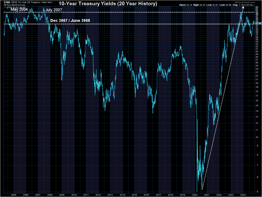
Of course shorter-term the problem is the stock market is pricing in lower interest rates, but the bond market has a different outlook, namely that most of President Trump's campaign promises being inflationary.
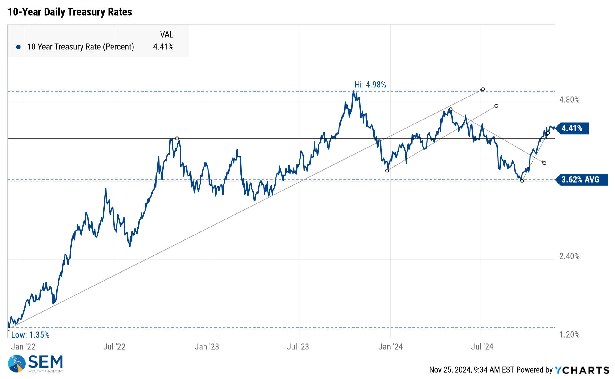
For now, as noted below, we are enjoying this rally. The key difference is we are ready to take some of those gains off the table when the data says the easy days are over.
SEM Model Positioning
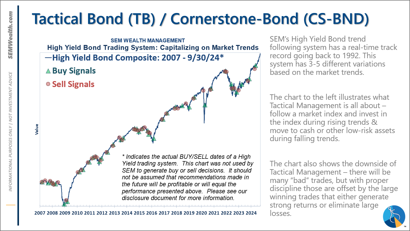
-Tactical High Yield had a partial buy signal on 5/6/24, reversing some of the sells on 4/16 & 17/2024 - the other portion of the signal remains on a sell as high yields continue to oscillate.
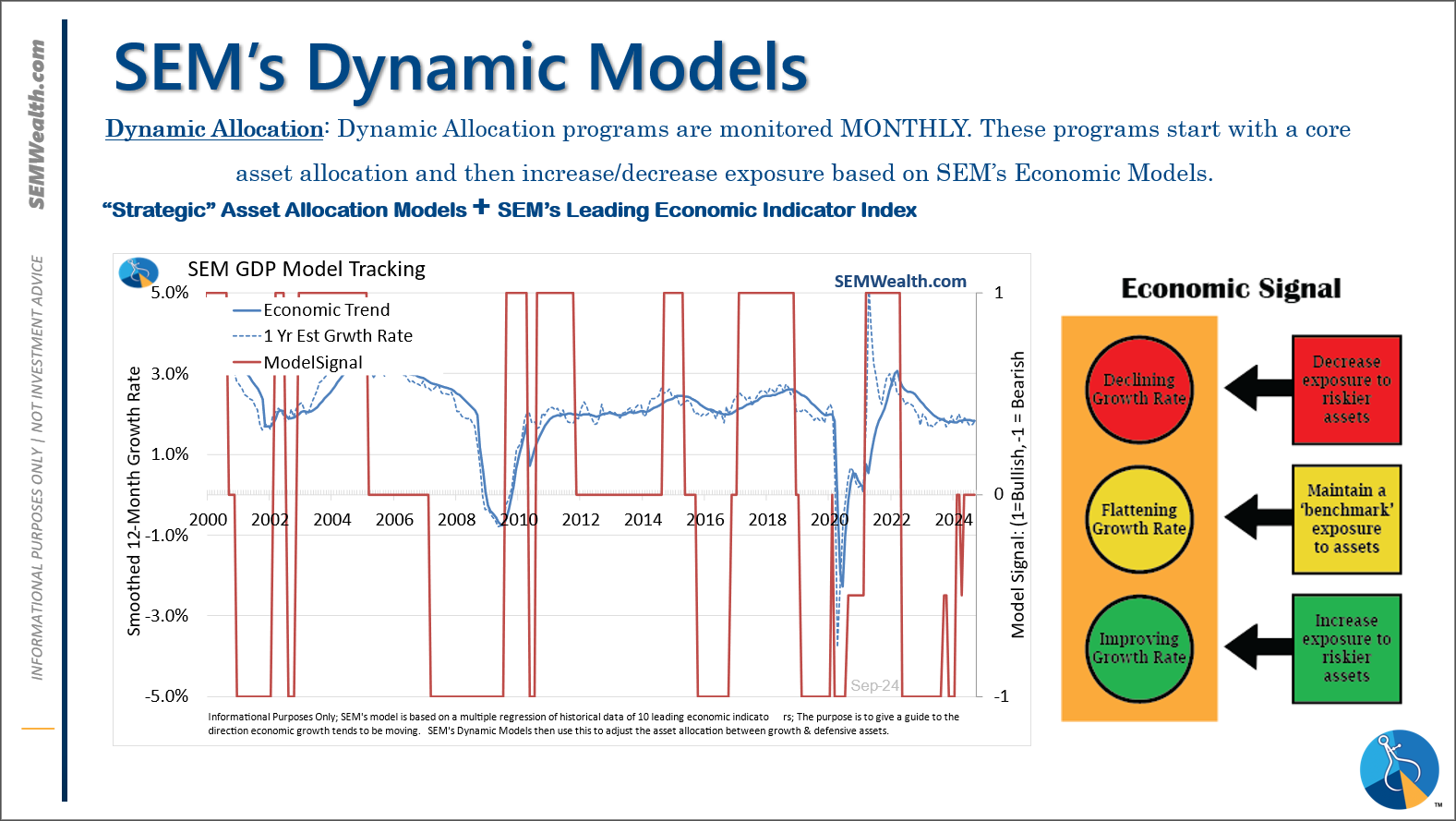
-Dynamic Models are 'neutral' as of 6/7/24, reversing the half 'bearish' signal from 5/3/2024. 7/8/24 - interest rate model flipped from partially bearish to partially bullish (lower long-term rates).
-Strategic Trend Models went on a buy 11/27/2023; 7/8/24 – small and mid-cap positions eliminated with latest Core Rotation System update – money shifted to Large Cap Value (Dividend Growth) & International Funds
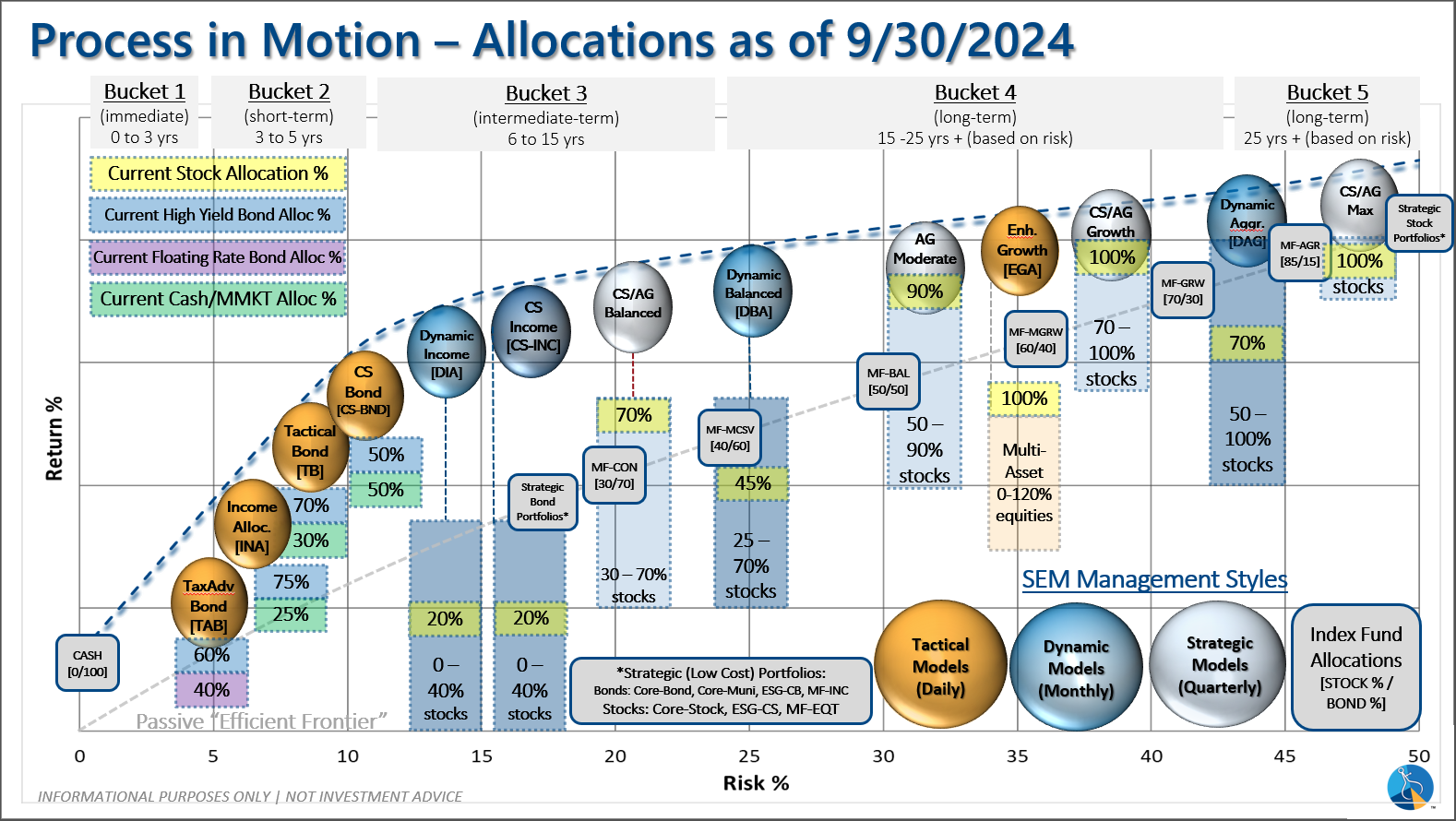
SEM deploys 3 distinct approaches – Tactical, Dynamic, and Strategic. These systems have been described as 'daily, monthly, quarterly' given how often they may make adjustments. Here is where they each stand.
Tactical (daily): On 5/6/24 about half of the signals in our high yield models switched to a buy. The other half remains in money market funds. The money market funds we are currently invested in are yielding between 4.3-4.8% annually.
Dynamic (monthly): The economic model was 'neutral' since February. In early May the model moved slightly negative, but reversed back to 'neutral' in June. This means 'benchmark' positions – 20% dividend stocks in Dynamic Income and 20% small cap stocks in Dynamic Aggressive Growth. The interest rate model is slightly 'bullish'.
Strategic (quarterly)*: BOTH Trend Systems reversed back to a buy on 11/27/2023
The core rotation is adjusted quarterly. On August 17 it rotated out of mid-cap growth and into small cap value. It also sold some large cap value to buy some large cap blend and growth. The large cap purchases were in actively managed funds with more diversification than the S&P 500 (banking on the market broadening out beyond the top 5-10 stocks.) On January 8 it rotated completely out of small cap value and mid-cap growth to purchase another broad (more diversified) large cap blend fund along with a Dividend Growth fund.
The * in quarterly is for the trend models. These models are watched daily but they trade infrequently based on readings of where each believe we are in the cycle. The trend systems can be susceptible to "whipsaws" as we saw with the recent sell and buy signals at the end of October and November. The goal of the systems is to miss major downturns in the market. Risks are high when the market has been stampeding higher as it has for most of 2023. This means sometimes selling too soon. As we saw with the recent trade, the systems can quickly reverse if they are wrong.
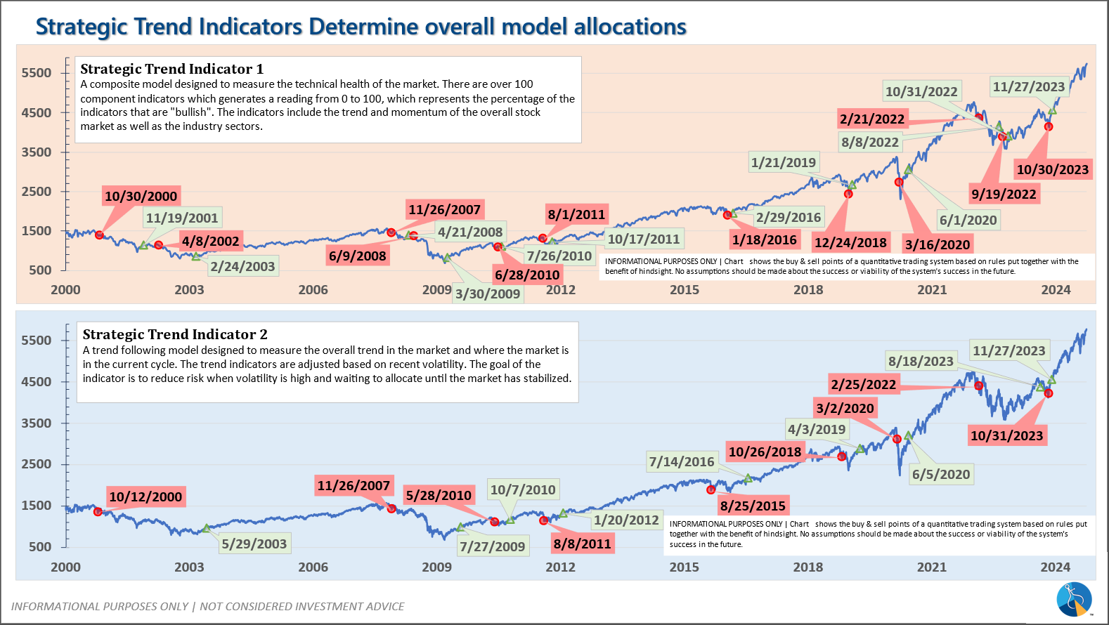
Overall, this is how our various models stack up based on the last allocation change:
Questions or comments - drop us a note?
Curious if your current investment allocation aligns with your overall objectives and risk tolerance? Take our risk questionnaire


