I had no idea 18 weeks ago we would still not know for sure how severe the Coronavirus pandemic would be. NBA players last week began preparing to resume their season which was temporarily suspended in mid-March. Major League Baseball teams are using a different approach and are preparing for
The economic data continues to show signs of improvement while the number of Coronavirus cases and now the daily death numbers begin to rise again. This has led to some states to slow or even reverse their re-opening plans. Scientists are learning more and more about the virus, yet it
I'm not sure if the 3 day weekend in celebration of Independence Day was welcome given how different this July 4 was than all the others in my lifetime. I love our country so much, but I found myself needing to stay busy over the 3 days because every time
We just finished dealing with some new regulatory requirements (Regulation Best Interest and Form CRS, if you're curious). Among other things, we now send an automated email (containing a link to Form CRS) when someone opens a new account.
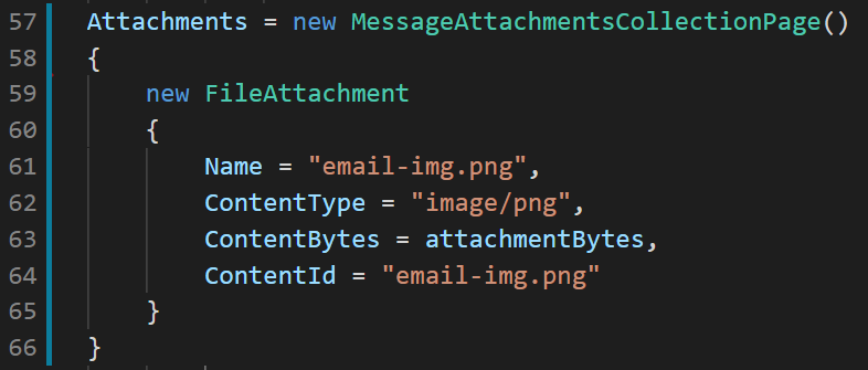
This email contains an embedded (or inline) image using CID. I

Dancing through a Minefield
In just three months the stock market switched from panic mode to full-fledged euphoria. For most of the quarter stocks have been going up 4, 5, or 6 days in a row, only to have a sudden large drop with little warning or explanation. Many investors


