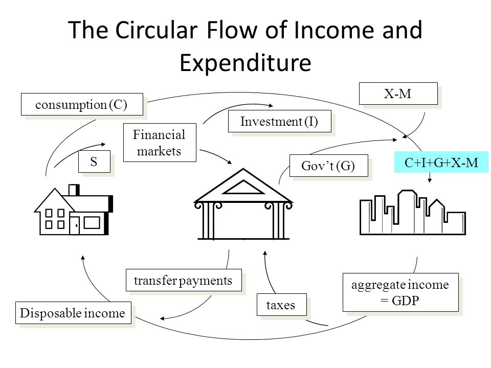
GDP = G + C + I + X – M
That’s the model we were all taught in school. What can we learn about today’s economy from this simple equation?
Our economic growth model essentially comes down to:
Government Spending + Consumer Spending + Investment + Exports – Imports.
Understanding the role each of these plays towards economic growth and how they inter-relate can really help us understand the fundamental background of the economy. The Fed has taken center stage in the fight to restore growth back to “potential”. What does that really mean and is it even possible? That is an issue that is important to all of us, whether we are investors, business owners, students, or workers.
This article attempts to simplify the economic model & illustrate the components of economic growth since the end of WWII. The article is divided into the following sections:
-
What drives GDP?
-
Where’s the growth?
-
Paying for growth
-
What should we expect?
-
What have we learned?
[NOTE: This article was originally written May 12, 2014. The charts have been updated with data through June 2016 along with some additional comments]
What drives GDP?
During this 5 [now 7] year bull market, one thing that has made it so hard on traditional portfolio managers is the question as to how long the Fed will continue to use unprecedented measures to “stimulate” the economy. Janet Yellen made it clear once again last week [and again throughout 2016] when she talked about the stubborn labor market and their inability to get back to a more “structural” level of growth. For years I’ve talked about STRUCTURAL problems with our economy and have grown frustrated that our policy makers do not seem to see the issue. Our long time readers will know that I struggled in my economics courses, primarily because while all my other business classes were taught out of the business school, economics was taught out of the Liberal Arts college. That’s the key problem I’ve always had with economics — it’s an ART more than a SCIENCE.
With that understanding, I’ve recently started studying economics again to see if I’m missing something. As with most things, I have to see theories supported by hard data. Back when I took my economics classes we didn’t have the data readily available to compare the classroom model to the real world. The Federal Reserve has probably my favorite website (yeah, I’m kind of a nerd like that), the Federal Reserve Economic Database (FRED) where we can access all sorts of historical data. I spent some time while traveling last week going through the database and seeing what I could find to help explain what is happening with our economy.
I started with the equation, GDP = G + C + I + (X – M). Put simply, economic output is comprised of Government Expenditures/Investment, Personal Consumption (Consumers), Business & Residential Investment, and Trade (Exports minus Imports). The first place to start, then is to see how much each of those components contributes to GDP. The chart below shows the contribution to GDP over time.

ILLUSTRATIVE PURPOSES ONLY — PLEASE SEE DISCLAIMER AT BOTTOM OF PAGE
The fact that personal consumption (consumer purchases of things with no long-term useful life) is the biggest component of GDP is no surprise. That is typical of most developed countries. The biggest surprise to me is how much government spending used to contribute to GDP. Note the continued decline of government spending as a percent of GDP, which is now sitting at its lowest levels ever. Now I’m not saying the government needs to spend more money (we’ll get to that later in the article), but I was surprised at the continued decline in this portion of GDP (again, more on this later in the article as government spending is borrowed from other places of the economy.)
The other noticeable area of the chart is the Exports & Imports portion. Taken individually, we could be excited about the continued increase in exports as a percent of GDP or alarmed at the high amount imports are subtracting from GDP. Overall, the NET Export component of GDP (Exports – Imports) is reducing GDP by about 3% of GDP. The only other component I haven’t mentioned is Investment. These are long-term purchases on things that should add economic growth in the future. This number is the most volatile and tends to go up and down based on confidence in the future. To me, this is probably the biggest contributor to our long-term growth prospects.
Where’s the growth?
Over the past few years I’ve been having to frame my discussion about the market/economy into the time frame. Short-term vs. Long-term. The stock market is and has been focused very closely on the short-term prospects. Every piece of data is viewed through the lens of what the Fed may do next because the Fed has been saying for 5 [now 7] years now the economy is running at a pace below “potential”. Most of the Fed members view “potential” Real (adjusted for inflation) GDP growth to be right around the long-term average growth of 3.2%. We will discuss what the real “potential” is for GDP growth later, but for now let’s focus on the growth rate of the economy and the various components of GDP.
If we look at the change in the long-term growth rate over time, it is easy to see that the pace of growth has been slowing for most of the components of GDP.

ILLUSTRATIVE PURPOSES ONLY — PLEASE SEE DISCLAIMER AT BOTTOM OF PAGE
If we remove some of the more volatile series and focus on the more stable (and higher percentage of GDP) components, the overall trend is clear.

ILLUSTRATIVE PURPOSES ONLY — PLEASE SEE DISCLAIMER AT BOTTOM OF PAGE
This brings up an important question — how much is the “average” skewed by the earlier boom years coming out of World War II that lasted well into the late 1960s? To answer that question, let’s look at the 30 year annualized growth rate of GDP and its components.

ILLUSTRATIVE PURPOSES ONLY — PLEASE SEE DISCLAIMER AT BOTTOM OF PAGE
This time I’ve left the noise in there to show where we are still seeing decent growth — Imports & Exports as well as to show how volatile the Investment component has been. This allows us to see both the shift to a more global economy as well as the continued slowdown in overall GDP growth. An even more interesting picture develops if we focus on 10 year growth rates.

ILLUSTRATIVE PURPOSES ONLY — PLEASE SEE DISCLAIMER AT BOTTOM OF PAGE
Clearly when we start using a 10 year look-back period, the volatility in growth rates escalates. This chart shows the tech bubble and the impact it had on growth rates. Note that none of the components except for Exports have seen much of a recovery in growth rates.
Comparing the various growth rates we can begin to see the problem the Fed is facing. What is the true long-term growth rate for the economy and the various components? Can monetary policies actually fix the clear downtrend in recent growth rates and push them back towards the long-term averages?
ILLUSTRATIVE PURPOSES ONLY — PLEASE SEE DISCLAIMER AT BOTTOM OF PAGE
The most important question — if the economy cannot grow over the long-term at the rate the Fed is targeting, are they creating even bigger risks to the overall economy?
Paying for Growth
So far we’ve learned that Consumer spending represents the vast majority of GDP, government spending is becoming an increasingly LOWER portion of GDP, and Exports & Imports are having an increasingly larger impact. The biggest question raised thus far is what should be the expected growth rate going forward. Do we use the very long-term, the last 30 years, or the last 10 to project economic growth in the future? It seems the Fed is using the very long-term growth rate, which could be a big mistake. We will discuss the long-term potential growth in the next section.
Before we do that I’d like to take a side step to something that needs to be factored into the economic model — how our growth has been financed. It’s been a while since I talked about our debt problems, but that doesn’t mean it hasn’t gone away. Honestly, I stopped talking about it because nobody seems to care. [And here we are in another election cycle and nobody seems to want to address our massive debt issues.] Until the market cares, we won’t waste our energy. I fully believe the size of our debt is a major component (or deterrent) to our long-term growth potential. The more debt we accumulate, the more money we need to make just to pay back the debt.
First, let’s look at the composition of debt in the United States (all $58 TRILLION of it, not counting Social Security, Medicare, and other “off balance sheet” pension obligations. [It is now over $60 Trillion, a mere 2 years since this article was written.])

The chart below illustrates the change in debt levels and compares it to the growth in GDP.

ILLUSTRATIVE PURPOSES ONLY — PLEASE SEE DISCLAIMER AT BOTTOM OF PAGE
Believe it or not, our country used to have less debt than GDP. Note the exponential increase during the 21st Century.
Debt can be a good thing, but only if that money is used to invest in things that will increase the growth rate at a significant enough rate to pay back the debt plus interest. When you continue to accumulate debt, you end up sending an increasing amount of income to the people you borrowed from, which is a highly inefficient use of capital and DECREASES the growth rate of the economy. The impact our increasing debt load has had on the economic model is clear when we look at the Velocity of Money. Money Velocity is the number of times $1 is spent on domestically produced goods & services.
Here’s an easy way to think of the concept of money velocity: if the government spends money on an infrastructure project, the companies they contract with hire workers. Those workers spend their money in their communities, creating higher sales and income for the businesses in their area. That leads to higher incomes and more spending. The problem is two fold — 1.) With imports becoming a larger portion of GDP that money leaves our own economic system & 2.) If the extra income is used to pay down debt, that money is gone, unless there is demand for additional loans.
The chart of the Velocity of Money makes it clear that we hit our peak about the same time the level of debt began to accelerate relative to GDP.

ILLUSTRATIVE PURPOSES ONLY — PLEASE SEE DISCLAIMER AT BOTTOM OF PAGE
At the time Money Velocity peaked, the long-term rate of growth on debt in the US had hit 10%. The long-term rate of growth in debt appears to have peaked in the late 80s, but it is still too high. There is no way we can grow debt at an 8.7% annual rate while GDP growth is less than 3%.

ILLUSTRATIVE PURPOSES ONLY — PLEASE SEE DISCLAIMER AT BOTTOM OF PAGE
Since 2000, Total Debt has still averaged a 6% annual growth rate at a time GDP has grown a mere 2%. In other words, we continue to accumulate debt at a pace far faster than our economy can support.
What should we expect?
In general, all countries have the same drivers of economic growth — government spending, consumer spending, investment, & net exports (exports – imports). As we saw in our growth charts earlier, the contribution of each component as well as the individual growth rate has shifted over the years. Whether a country is just emerging, in the “developing” stage, or in the “mature” stage of the growth cycle, the long-term growth of GDP really comes down to two components — the change in productivity & the change in the labor force. In fact, economists have come up with a fairly simple model to predict potential GDP growth — add the growth in Productivity by the growth in the Labor Force.
Looking at the contribution to GDP this really makes sense. All economic growth comes down to how much you can produce. As long as you are producing something that is in demand, the more you can produce, the more you can grow. The only way to produce more is to hire more workers, have the workers be more efficient (produce more), or a combination of both. That leads to more money for workers and thus more consumer spending. In a healthy economy, that leads to additional investment by businesses.
Many people, including myself thought the strong growth in our economy during our “rebuilding” years (the 40s – 60s) was due to increasing productivity, but in reality, the growth of the economy was really driven by strong growth in the labor force. This chart shows the long-term growth rate of our economic drivers along with the actual growth rate of GDP.

ILLUSTRATIVE PURPOSES ONLY — PLEASE SEE DISCLAIMER AT BOTTOM OF PAGE
This really illustrates the contribution to GDP productivity and the labor force have had. While the growth in productivity stagnated, the slowdown in the labor force growth rate the past 30 years has pulled GDP growth lower. Note the crossover in the Actual vs. Potential GDP growth line in the 1970s.
The Fed continues to cite potential or “trend” growth as something they are targeting with their monetary stimulus. The problem with the Fed’s theory on “potential growth” is what period they are using to measure the growth rate. When you start cutting off the rebuilding years following WWII, we see a different picture.

ILLUSTRATIVE PURPOSES ONLY — PLEASE SEE DISCLAIMER AT BOTTOM OF PAGE
This chart really shows how the slight improvement in productivity growth the past 10 years being completely wiped out by the slowing in the labor force growth rate. Since the “reset” in 2008, the Fed has gone out of their way to push economic growth higher. Their policies have helped stimulate some areas of the economy, but they have done little to change productivity growth.
Monetary policies (those controlled by the Fed) can do little to spark growth in our labor force. That is a matter of fiscal (Congress & the White House) as well as other policies (think immigration reform, trade reform, & tax reform that can impact the size of our domestic labor force.) The government can also promote productivity growth by infrastructure spending & investments in education and job training programs.
Zooming in to the 10 year growth rates, the chart gets a lot noisier, but we can see the continued decline in the productivity growth rate. Combine that with minimal growth in the labor force and we see the potential growth rate for our economy is far below the Fed’s 3% “target” (creating future inflationary pressure).

ILLUSTRATIVE PURPOSES ONLY — PLEASE SEE DISCLAIMER AT BOTTOM OF PAGE
That brings us to the key question — what is the real potential growth rate for our economy? I continue to be baffled by all the Ivy League Professors running the Federal Reserve that believe the potential growth rate is around the long-term average growth rate. How in the world do they expect us to grow at an average rate that includes the rebuilding following WWII as well as the infrastructure improvements of the 1980s & 1990s? At best, the potential growth rate of the economy is probably somewhere closer to the 30 year average, which is significantly lower than what the Fed is targeting.

ILLUSTRATIVE PURPOSES ONLY — PLEASE SEE DISCLAIMER AT BOTTOM OF PAGE
The more the Fed targets a growth rate that is close to impossible to achieve over the long-run, the more inflationary pressure they create. We are clearly seeing this inflationary pressure in asset prices (read: stock and bond prices), but little of that “growth” trickling down to the rest of the economy. The members of the Fed honestly believe that they can manage this–create short-term inflationary pressure to kick-start growth and then ease off the throttle as real economic growth takes place.
What have we learned?
I like to say, “sooner or later the Fundamentals will matter.” What I mean is over the very long-term, stocks will reflect the growth rate of earnings, which can only grow in conjunction with a growing economy. So that leads us to the key question — what growth rate should we expect for the economy?
The constant decline in the long-term growth rate should tell most rationale economists that we cannot expect the economy to grow at the long-term average unless we see significant developments that can increase our productivity and thus our economic output. For some reason, the Fed and most economists continue to use the long-term average of 3.2% as their target. Our study this week shows that it is highly likely the best long-term growth we can expect going forward is somewhere between the current “Potential GDP” (Growth in Productivity + Growth in Labor Force) around 2.5% or the 30 year long-term growth average of 2.7%. Given the declining labor force and our heavy debt load, it is also possible we see long-term growth fall to 1.6%, which is the 10 year average GDP growth rate. Looking at the Potential GDP based on the past 10 years, our GDP growth could fall to Japan-like 1% levels.
So what can we do to change this? Economic theory says the only way to improve growth in a mature economy is for technological innovations to create more productivity. How do we do that? We need to INVEST. I’m not talking about buying S&P 500 Index funds. We need US Companies to invest in long-term projects that will make them more efficient. Over the past 5 years we’ve instead seen our corporations spend all the excess money created by the Fed & our government be used to pay down their debt (not necessarily a bad thing long-term), buy back shares of their stock & pay dividends (those may be good for shareholders, but aren’t good for long-term growth prospects.) In order to INVEST, corporations need to have the CONFIDENCE in the economic environment. The Fed has attempted to create that confidence, but the fiscal side of the equation (Congress/The White House) has continued to create a drag on confidence, and thus investment.
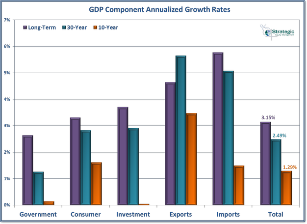
The chart below shows the contribution to GDP of each of the major components over various periods.

ILLUSTRATIVE PURPOSES ONLY — PLEASE SEE DISCLAIMER AT BOTTOM OF PAGE
The main thing I notice is how much imports are subtracting from GDP growth. In addition Investment has ground to a halt. We can turn that around, but it will take major changes in government policies to encourage more domestic production. That would lead to additional investment, more jobs, and thus more consumer spending.
There is no way we’re going to solve this issue today, but I hope this discussion helped shine some light on the economic model the Fed and economists are looking at when they make their forecasts and policy decisions. I also hope it helps you understand the major risks of any forecast that assumes we will return to “normal” growth of 3.2%. Whether or not we hit that growth level has major implications for your investing future.