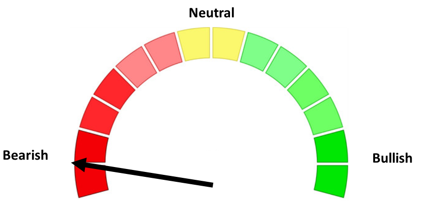
Despite the much better than expected payrolls report, nearly all of the economic data in our model is showing signs of stalling out. Our economic model has been "bearish" since April 2022 after going "neutral" in October 2021. Our model isn't designed to call the beginning of a recession or start of a recovery, but rather changes in the overall trends in the economy.
This becomes important because typically the trend in corporate earnings tends to follow the trend in economic growth. Right now, market analysts are expecting a very minor decline in earnings (just one quarter) followed by impressive growth the rest of the year. This is obviously in direct contrast with the economic data. The payrolls report always closes out the month for our economic model (it will be 3 weeks before we get any additional inputs), so this week let's look at the indicators and what they are saying.
Here's a look at our economic dashboard. The indicators are sorted by the correlation to economic growth. No single indicator works over the long-term in predicting the direction of the economy which is why our model is comprised of a composite of the indicators.
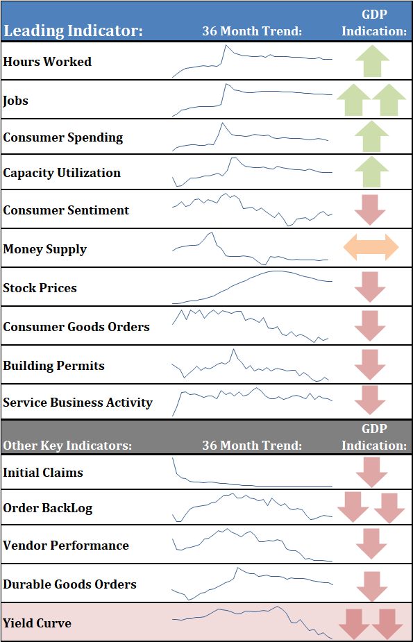
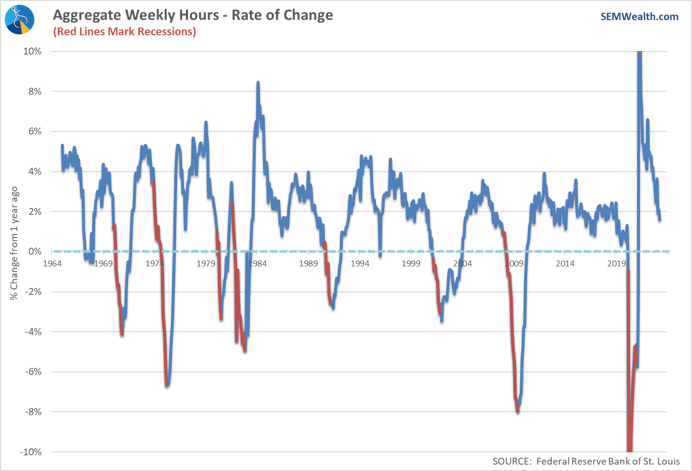
Hours Worked
This indicator is useful because employers will always increase hours before they hire workers. While still strong, the hours worked index is showing early signs the strong payroll growth is likely over.
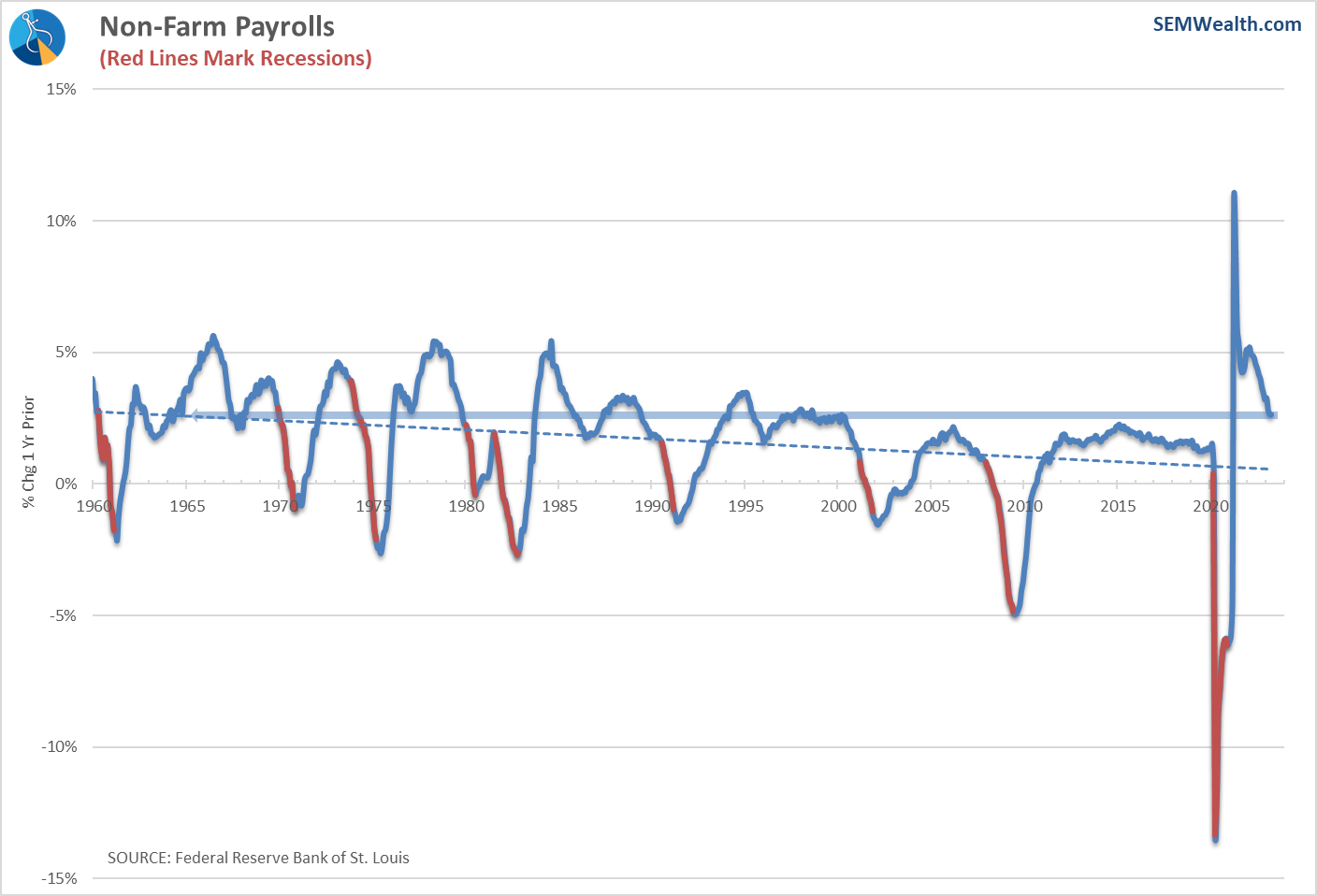
Jobs
The economy continues to add new jobs, or at least that's what the report says. I'm not one for conspiracy theories when it comes to economic data. The fact is we have a $20 Trillion+ economy and it's not easy to measure everything in real-time. The Jobs report has to use estimates to calculate the numbers and big shocks to the system (like the pandemic) tend to cause incorrect data being fed into the models. We saw the same thing following the financial crisis.
Whatever the actual number is, other more reliable reports show the TREND in job creation is still strong, which overall is a good thing.
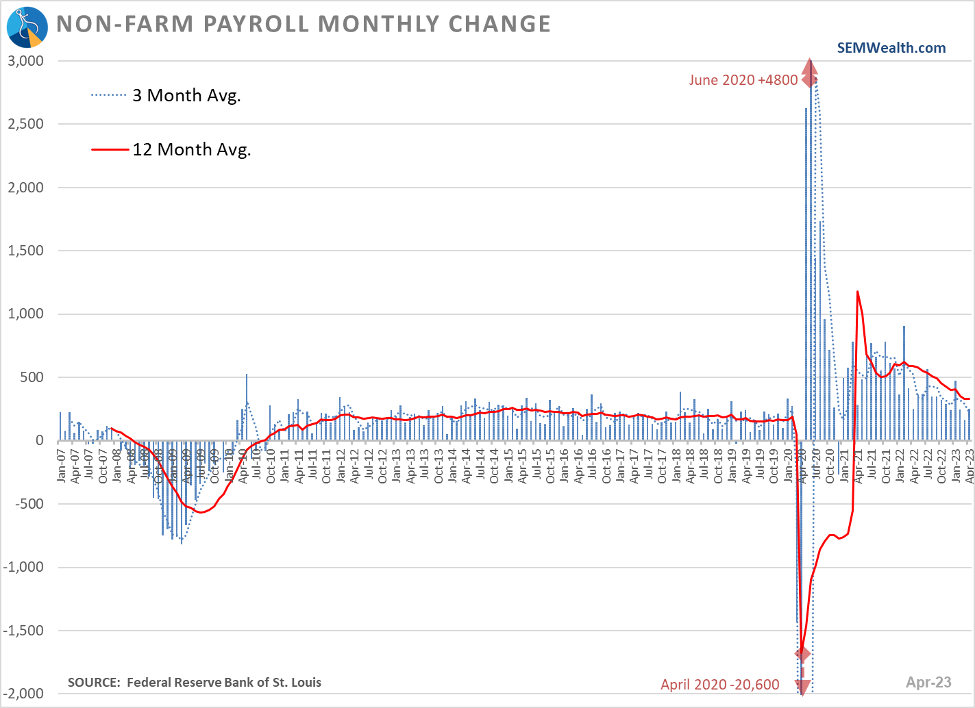
The month-to-month change is falling, but still the strongest we've seen since the tech bubble burst.
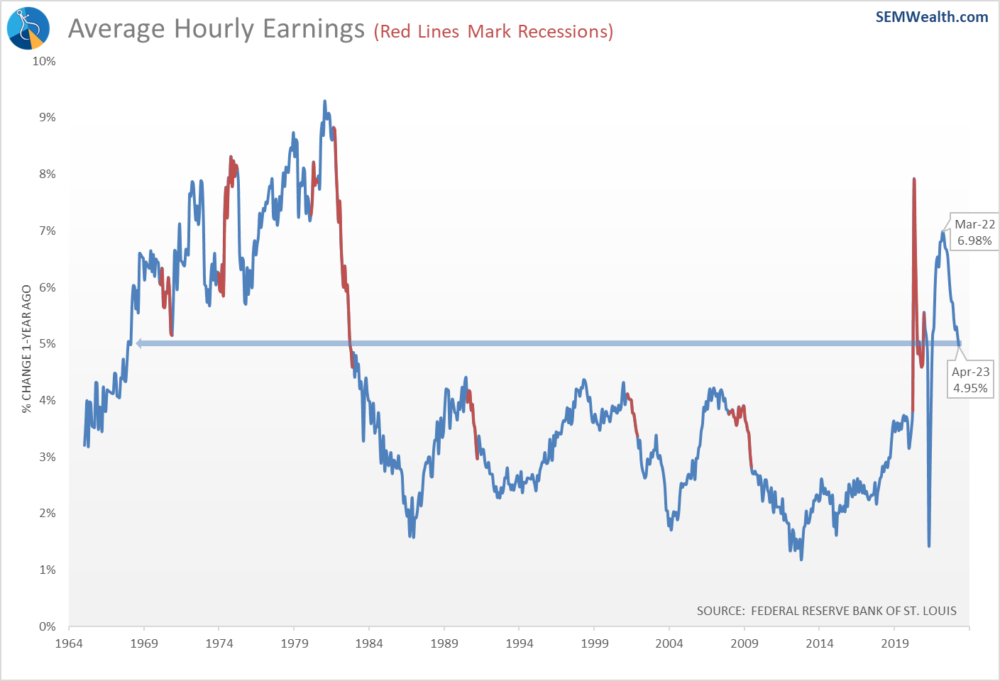
The bigger issue though is what this does to inflation. Average Hourly Earnings were rising at about the same rate as inflation throughout 2022, but now are nearly 3/4% higher than the current PCE inflation rate. This is one reason the Fed this week held off on saying they were done raising rates.
Another concern is the payroll numbers and the low level of unemployment is skewed by the pandemic. We saw a structural shift in the economy during the pandemic where workers changed careers in large numbers, small businesses were started, and Americans were forced to piece together multiple jobs. This led me to do some research on possible indicators which could be better at highlighting a slowdown in the labor market.
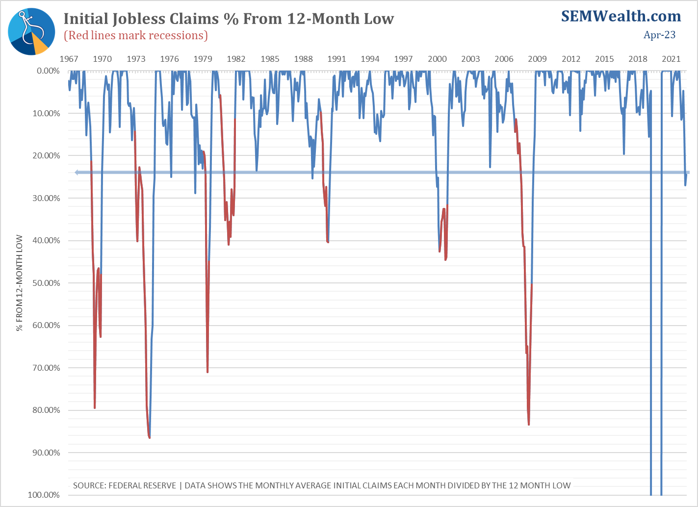
The most obvious indicator is initial unemployment claims. Not only do we get this data weekly with just a one-week lag (meaning it is more relevant), it is also based on much more solid data (from actual unemployment claims). I've looked at this data before and watch it most weeks, but compared to payrolls long-term it did not have the same prediction skills.
I worked through a lot of variations and found tracking the % of the 12-month low is a very strong predictor of economic strength or weakness, especially over the last 5 years. When the economy is weakening, we see jobless claims increasing. When it is strong, the economy hovers near the low (or continues to set new lows.) While the long-term track record does not surpass the Payrolls indicator, the performance the last 5 years does have it on our radar. Starting this month we will start showing this with our other payroll charts.
Here is the chart. Note the scale is flipped so when the line is moving down (away from the 'low') it is a negative indication. Unlike the Payrolls data, this indicator is flashing red. It is at a point where we usually see a recession on the horizon.
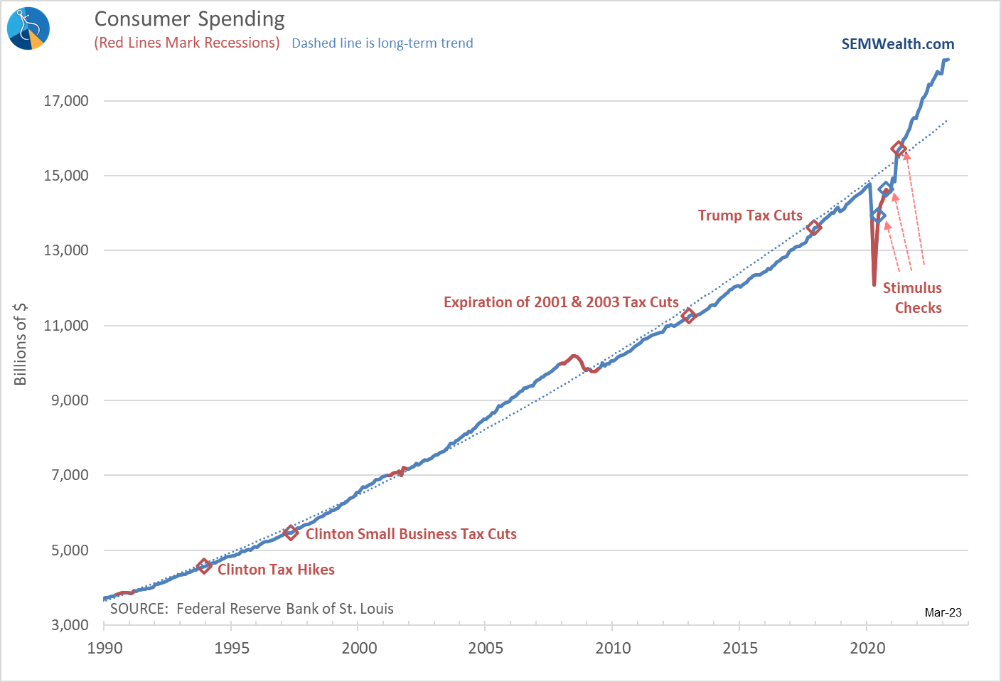
Consumer Spending
We talked about this last week after it was released. The flattening of Consumer Spending last month could be temporary, or it could be a sign consumers have (finally) felt the strain of no longer having stimulus money sitting in their bank accounts and a year and a half of 7-9% inflation. Spending is still in the 'bullish' category......for now.
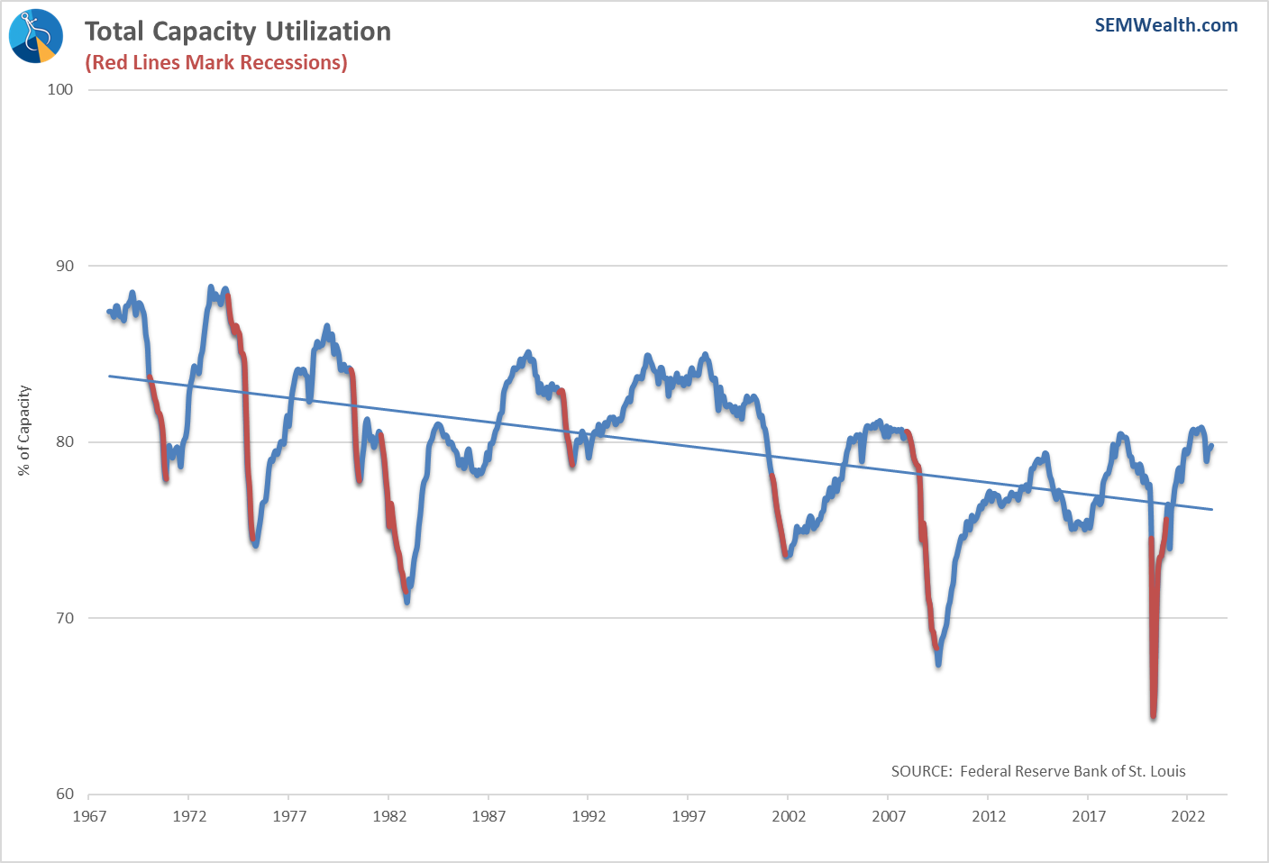
Capacity Utilization
This indicator picked up nicely, enough to bring it from 'bearish' to 'bullish' in our model. This indicator shows the percentage of factory capacity being utilized. One of the benefits of the pandemic is we learned how dangerous 'just-in-time' inventory from one single country was to our economic system. Bringing back some of the supply chain to the US would be a long-term positive.
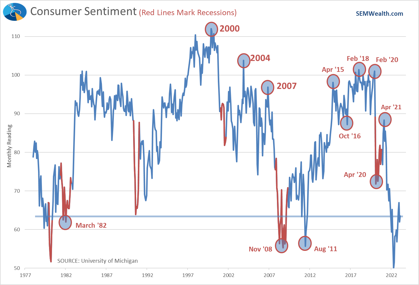
Consumer Sentiment
While off the lows, sentiment remains weak. I will continue to marvel that sentiment during the recovery peaked the same month the last stimulus checks hit (and the economy started to re-open fully).
Money Supply
Obviously the Fed continues to be the key driver of financial markets. The "will they or won't they" (change direction on interest rate cuts) is the basis of most sitcoms. We've talked a lot about the influence the Fed has had and the results of their policies – they stimulate too much and create an asset bubble and then they tighten too much and create a bear market and recession when they burst the bubble.
The Fed has tightened aggressively (because they kept their foot on the gas for way too long). This has created a scenario we've NEVER seen before in the history of our country. The Money Supply, as measured by M2 is BELOW where it was a year ago.
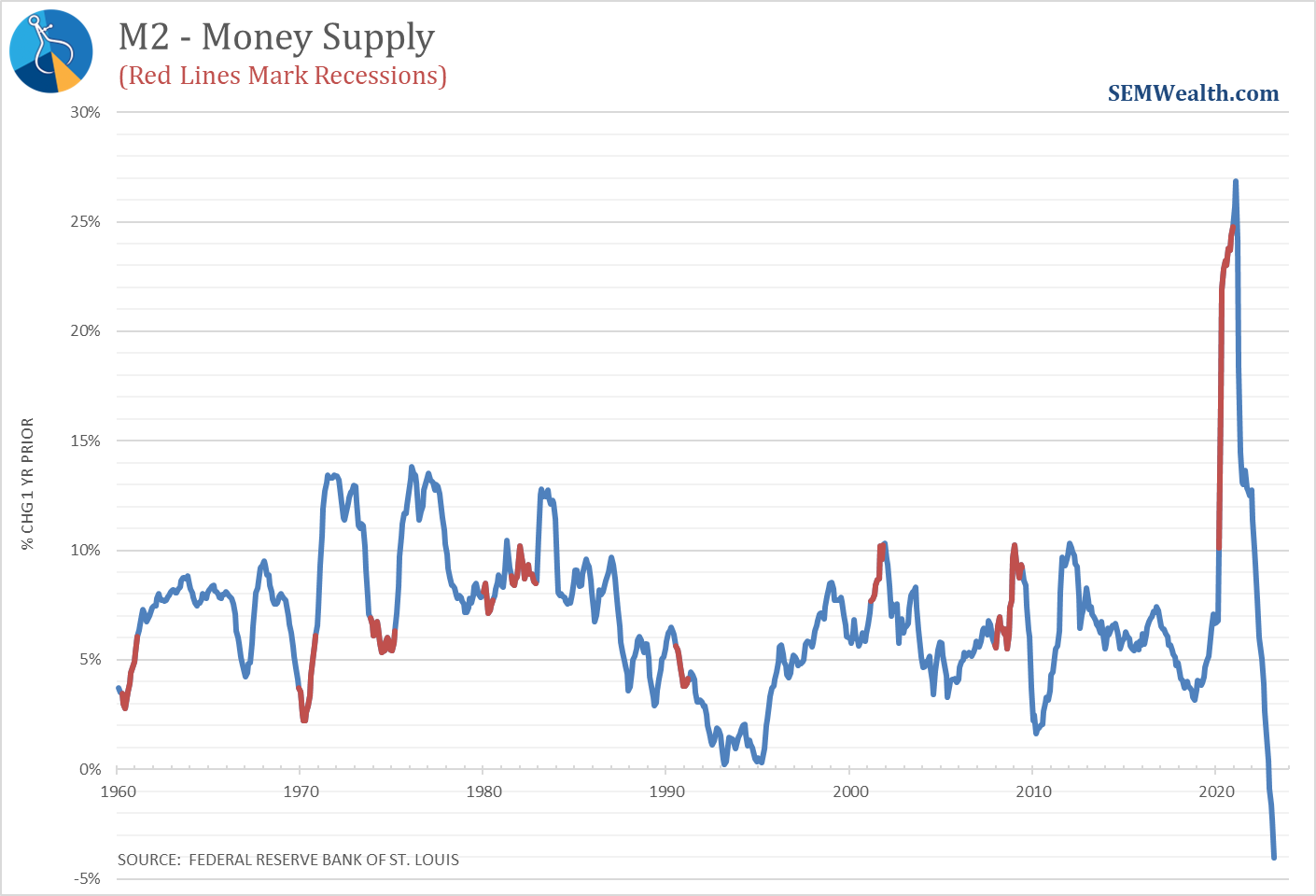
Long-time readers may note we've not shown the chart above before. The reason is in terms of predicting the economy, it's not a very good indicator. You can see the change in Fed policies if you look closely. Note until the last 3 recessions, the Fed did not start increasing the money supply until after the recession had already started. During the last 3, they aggressively raised the money supply BEFORE the recession had started.
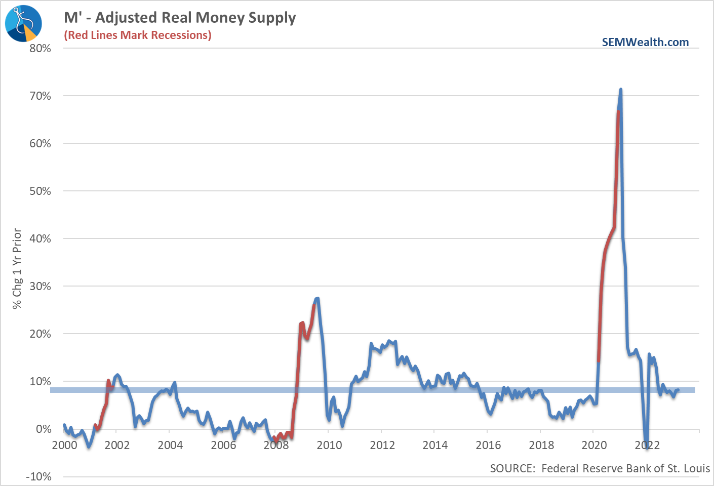
While this is interesting and something to keep on our radar, a far better predictor of economic direction is what we call M-Prime (M'). It is an adjusted Money Supply measurement that both takes into account inflation as well as the increase in brokerage accounts and other financial instruments that can quickly be converted to cash (such as money market funds). Our economic model uses M' due to its ability to predict the economic direction more reliably than M2.
When M' is increasing it is usually a sign of a weakening economy. As you can see, despite the Fed's "talk" of tightening conditions they really haven't taken care of the real issue – there is too much 'cash-like' money out there. By pushing rates up the Fed has created a bunch of cash. This is cash that is not being used to INVEST in longer-term, higher risk projects. The Fed doesn't seem to understand this.
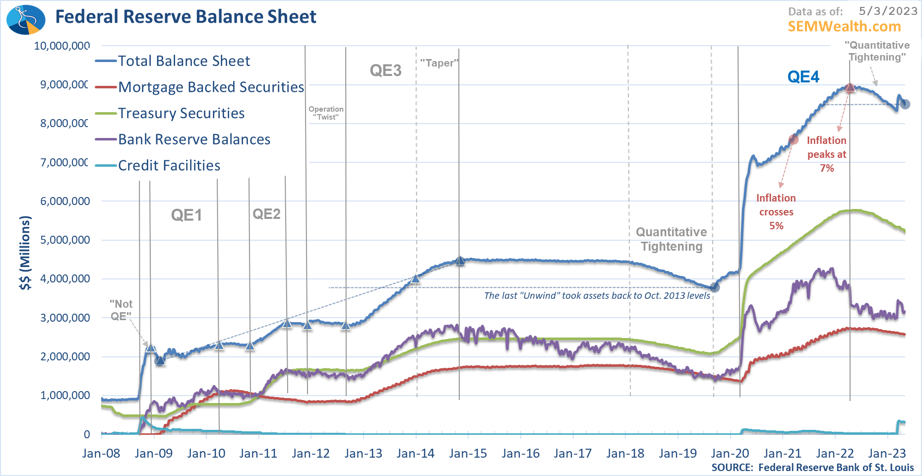
The root cause of the problem is the fact when Congress decided to dump $5 Trillion of money into the economy, rather than letting INVESTORS buy the debt needed to finance it, the Fed decided to do $5 Trillion of 'Quantitative Easing". This left everyone flush with cash as instead of being a net effect of $0 going into the economy ($5 Trillion stimulus sucking up $5 Trillion of investor cash), the Fed turned $5 Trillion into $10 Trillion.
For whatever reason the Fed chose to fight inflation by raising rates instead of slashing the money on their balance sheet. The Fed's balance sheet grew by $5 Trillion from February 2020 until they ended QE in June 2022. Since that time they have taken away a mere $442 Billion (9% of the money they created).
Stock Prices
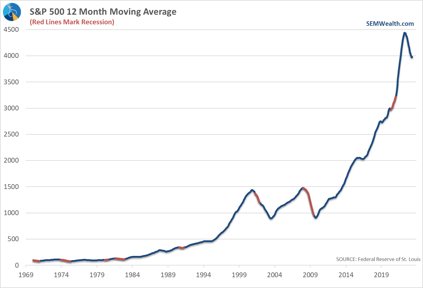
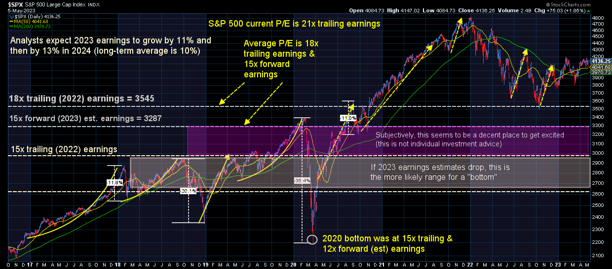
Although there can sometimes be some lag effects, over the very long-term stock markets track the direction of their overall economy. Because stock prices are based on the estimated present value of all future streams of earnings, stock prices can show the general direction analysts believe earnings (and thus the economy) are heading. While most of us are programmed to look at more recent performance data, when you zoom out and look at stock price changes over the past year, you can see with the exception of the very short (and artificially created) recession during the pandemic, we've never had a recession when stock prices were not down for a year.
The 12-month moving average tends to roll-over just as the recession is beginning. That of course hasn't happened this time, but that is the result of the $10 Trillion of money mentioned above floating around in the financial system. I mentioned several times, 2022's losses literally were giving back the 'stupid' returns from 2021 (that were not based on any fundamental strength in the economy).
What will be important moving forward is whether or not earnings track the way analysts expect (which show NO RECESSION), or if as usually happens we learn analysts were far too optimistic and we see earnings estimates plummet. This chart of quarterly earnings estimates over the last year is telling. Note how high analysts thought earnings would be in 2022. They were wrong and stocks came down hard.
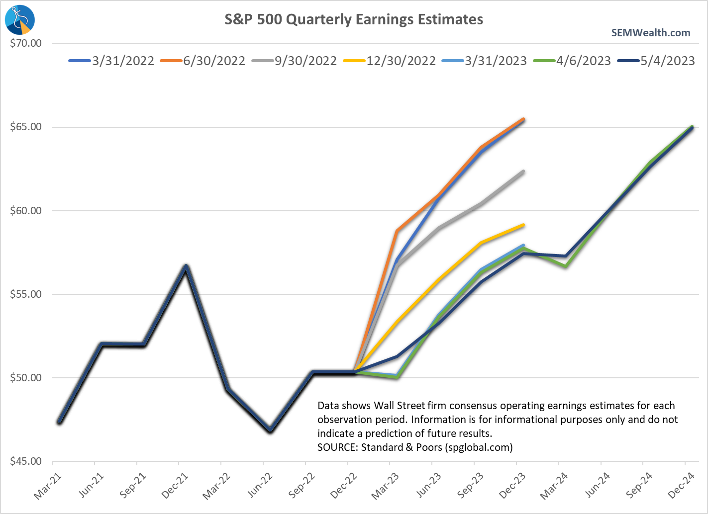
Now analysts believe we will be able to avoid any sort of recession in earnings and it will be off to the races the rest of 2023 & throughout 2024 (brining earnings by the end of 2024 almost back to where last year at this time they thought they would be at the end of 2023.)
[My bet based on the economic data is they are wrong, which means stocks are massively overvalued.]
Consumer Goods Orders
It's no secret after a surge during COVID (thanks to the broken supply chain) manufacturing has been dropping rapidly. The data continues to confirm this. Note any reading under 50 is an indication of recessionary pressures.
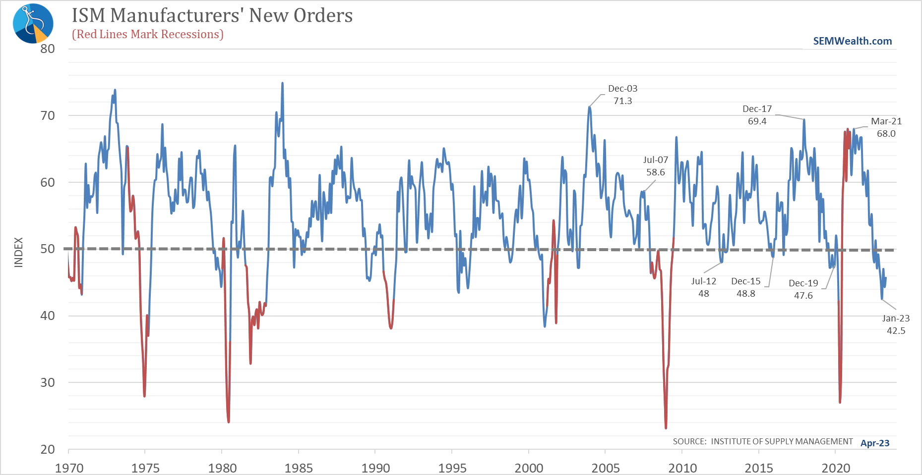
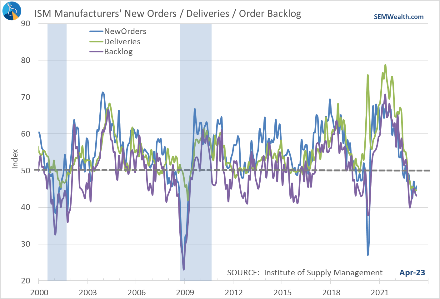
We also do not see much hope in some of the leading new orders components inside this index:
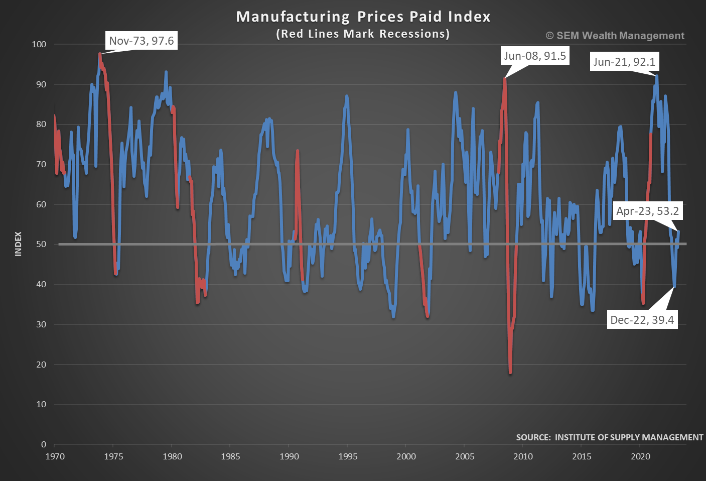
Want more bad news? Manufacturing Prices Paid are now back above 50, indicating EXPANSION in prices.
Building Permits
This is another indicator which was skewed by the pandemic, but as things 'normalize' is indicating a drag on our economy.
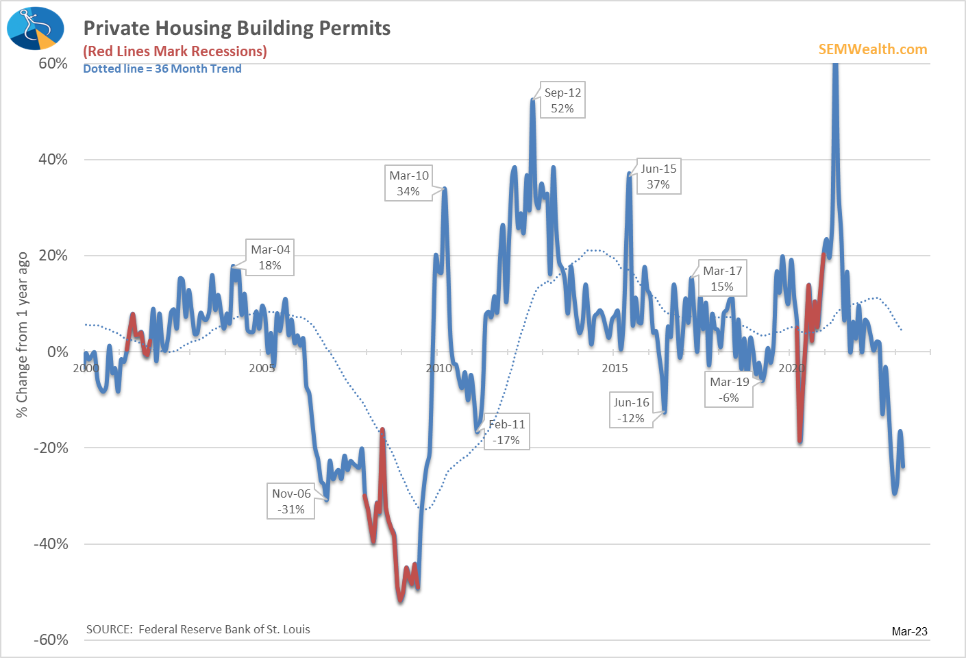
While we are seeing signs of strength in the 'multi-family' category overall, we should expect the impact of higher rates (and end of stimulus money) to be a continued drag on the economy.
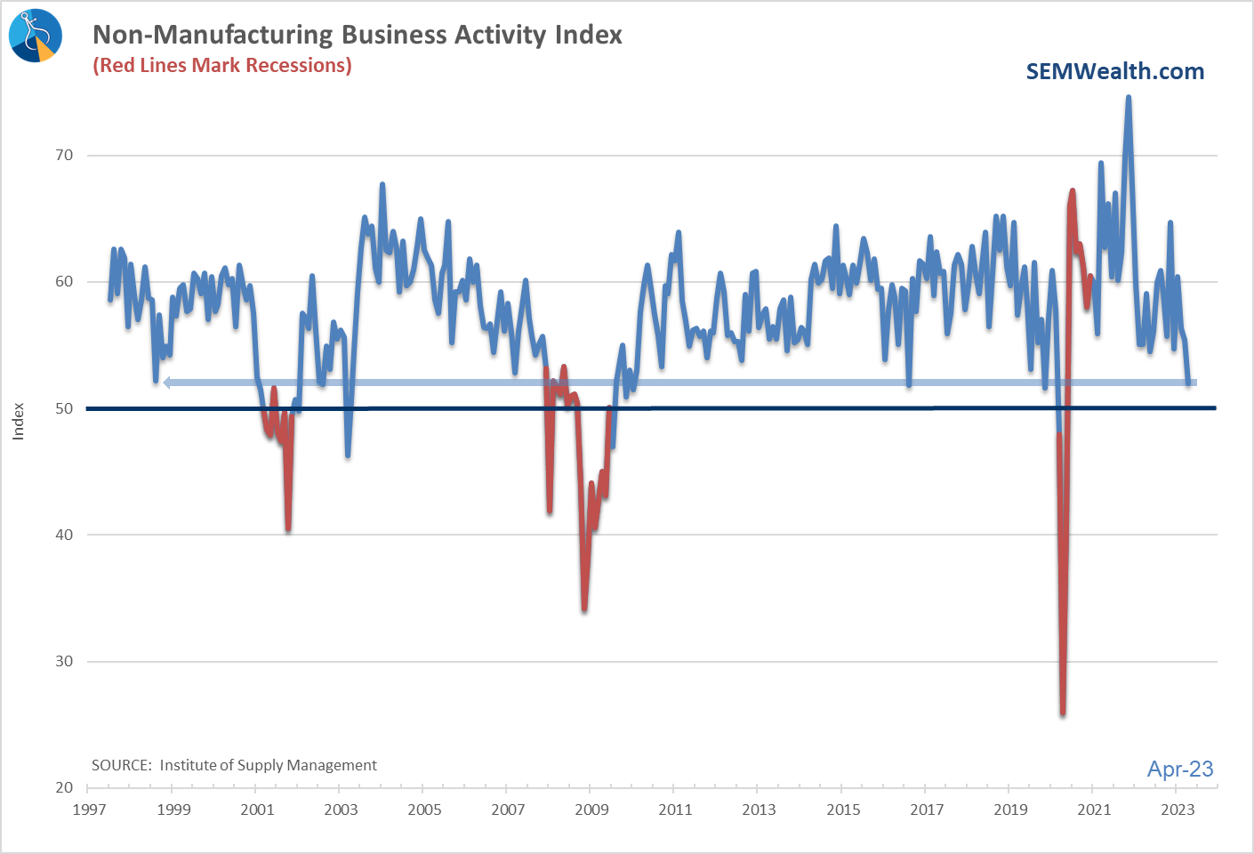
Service Business Activity
We know our economy is based heavily on services, so this indicator is important for a feel on what is happening right now. It is the only indicator added since I originally created this model in 1995 (because this indicator wasn't around back then). It is incredibly noisy, but like the Manufacturing indicators we use a reading above 50 is 'expansionary' and below 50 is 'recessionary'. While we aren't quite down to 50 we are moving uncomfortably in that direction.
Model Remains Bearish
It shouldn't be a surprise based on all of the indicators above, our economic model remains bearish, a position it took in April 2022.
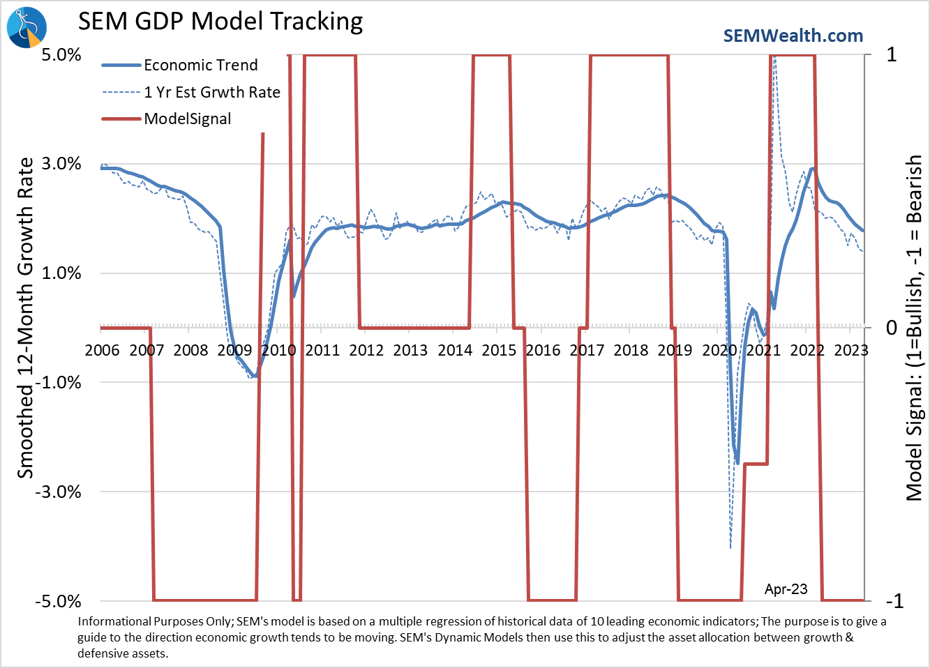
Again, this model isn't designed to call recessions or beginning of expansions, but rather the overall trend in economic growth. As you can see, it remains negative (which is in direct contrast to the market expectations for earnings). We've actually returned to the 2019 trend. People like to believe the economy was humming along before COVID struck, but the data argued otherwise. Our model was calling for an economic slowdown before COVID hit because there was some significant underlying weakness in the economy.
We're back to that point, only unlike last time, the Fed is unlikely to help us out until it is too late.
Markets Stalling?
The stock market has been digesting the 1st quarter earnings reports the last 3 weeks. The fact stocks haven't gone down significantly is a good sign, but the economic data (and bear market history) suggests if we get any sort of reversal to the downside, it could be a bit of a scary trip. Note the other times during the past 16 months we've seen strong rallies that ended in disappointment.
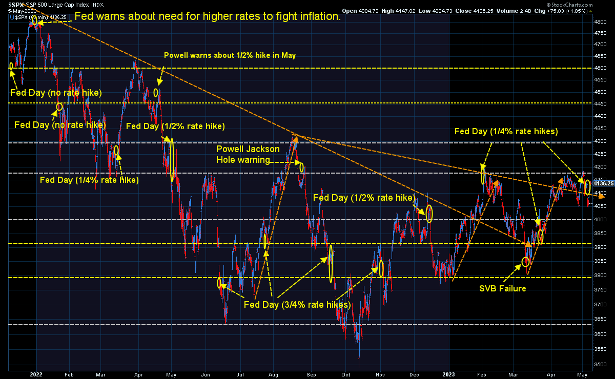
Subjectively, getting above 4185 (and staying there for more than a day) would be viewed as a positive. A move below 4050 (and staying there for more than a day) would be viewed as a negative.
Longer-term I continue to use this chart as a guide when looking at raising risk exposure overall. If earnings are able to grow stocks are still overvalued. If they decline, stacks are MASSIVELY overvalued.
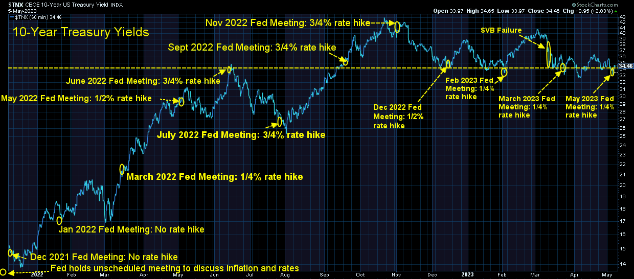
Bond yields are also stalling out and remain around that 3.4% pivot point on the 10-year. There are a lot of moving parts behind where bond prices are currently. For now it seems the bond market is telling us inflation is somewhat under control and we are not yet in a recession. If yields start moving lower rapidly, it could be a sign the recession is starting.
SEM Market Positioning
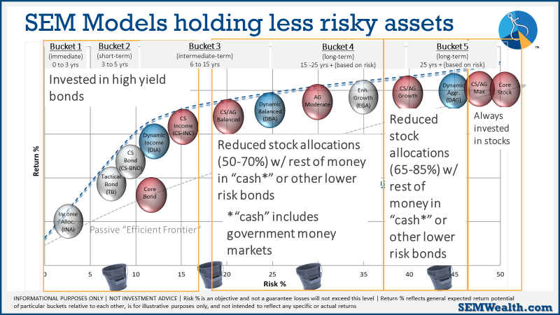
There were no changes last week in any of our models. We remain mostly invested in high yield bonds in Tactical Bond, Income Allocator, and Cornerstone Bond. We remain "bearish" in the Dynamic models (reduced risk exposure based on our economic model), and right in between minimum and maximum exposure in our 'strategic' models. This chart summarizes where we are:
As always, our models will change if the environment changes. For now, calculated, short-term risks are acceptable with the knowledge things could change quickly.