The Wall Street cheerleaders who have been urging the Fed to cut interest rates because of the increasing financial stress apparently did not get the memo from consumers based on the current spending data, which accelerated in March following a 'slowdown' in February. March consumer spending was up 5.9% over the past year versus February 4.8% number.
Annual spending growth has rarely been this high since the financial crisis.
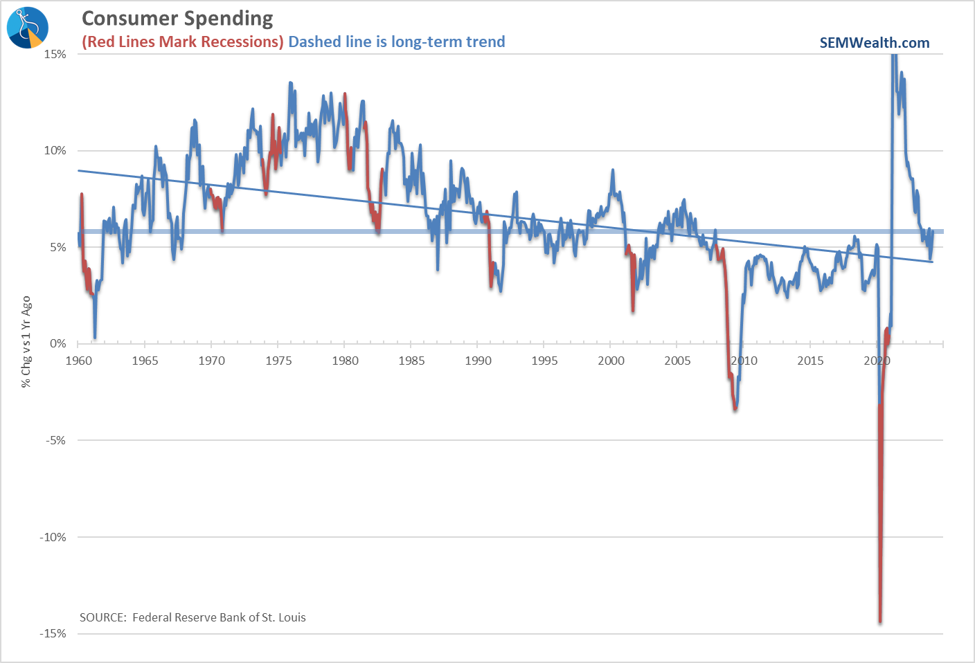
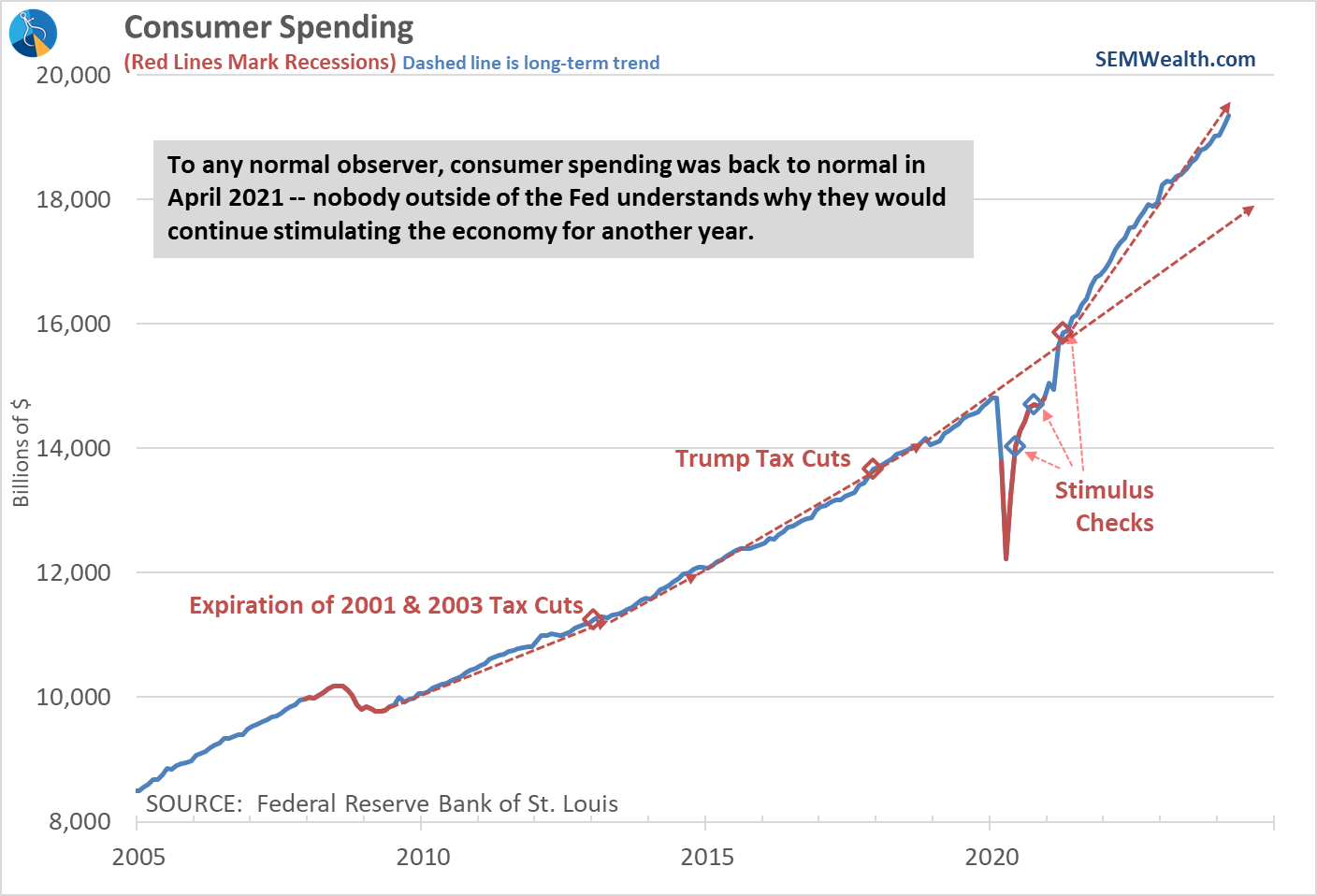
Looking at this chart it is hard to argue the Fed needs to cut interest rates any time soon. Notice the spending levels (blue line) are nearly back on track to the very sharp uptrend started after the 3rd and final stimulus check in April 2021.
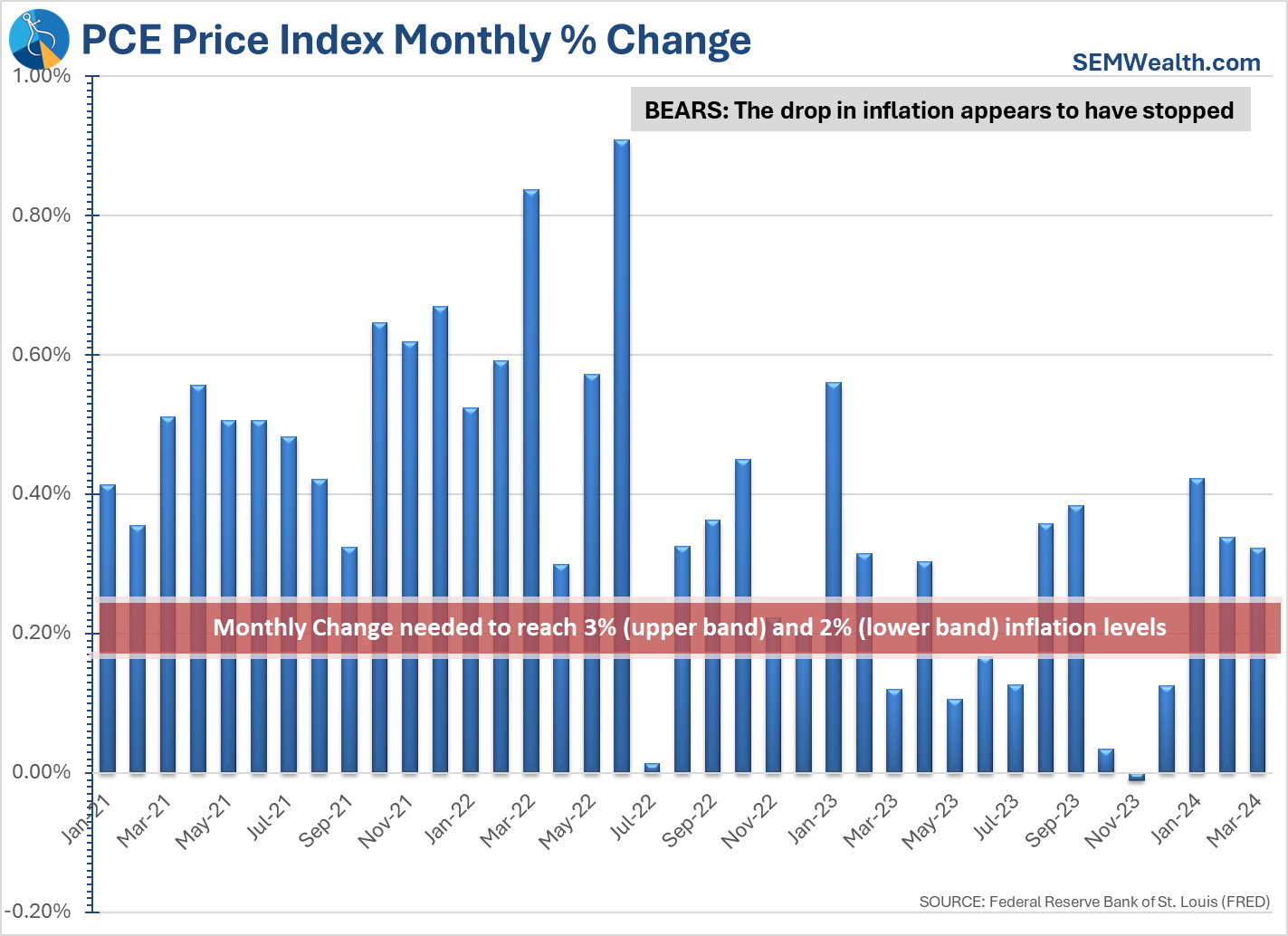
Accelerated spending is obviously a concern for those hoping to see inflation come down to a level that would allow the Fed to cut rates. So far the data is not supporting that. Here are our two inflation charts updated with the most recent data. The monthly chart shows the problem the Fed is facing. The monthly increase is running well above the 3% annualized level. Making things worse – the next 3 months we will be comparing the inflation rate to a much lower base, making it harder for inflation to appear like it is coming down.
That's not stopping the bulls from arguing that despite the recent upturn in the 12-month readings, the trend is still down and will continue in that direction.
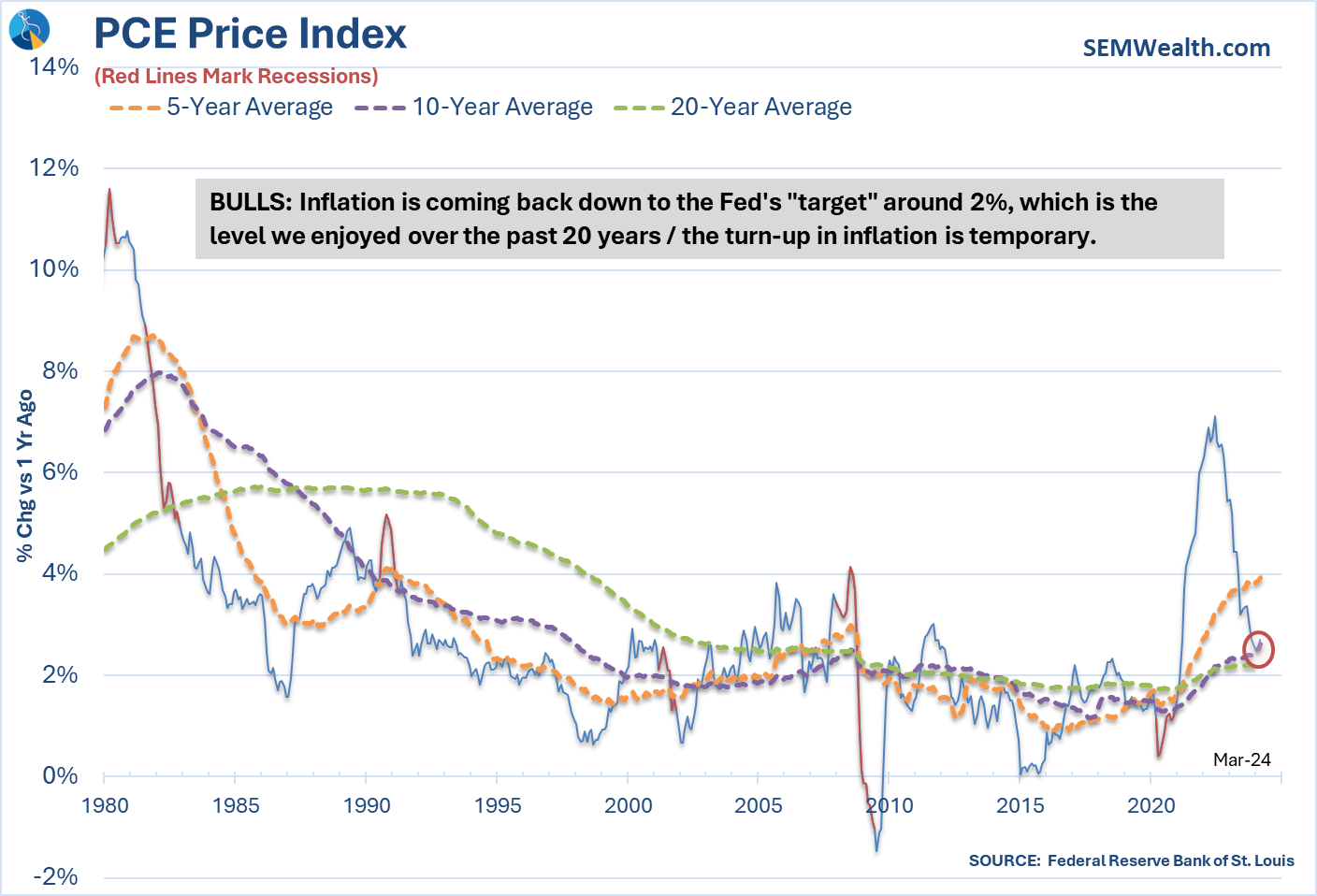
As a side note, for anybody complaining about inflation levels, we are basically at the same rate we AVERAGED in 2000-2009. I guess everything is relative.
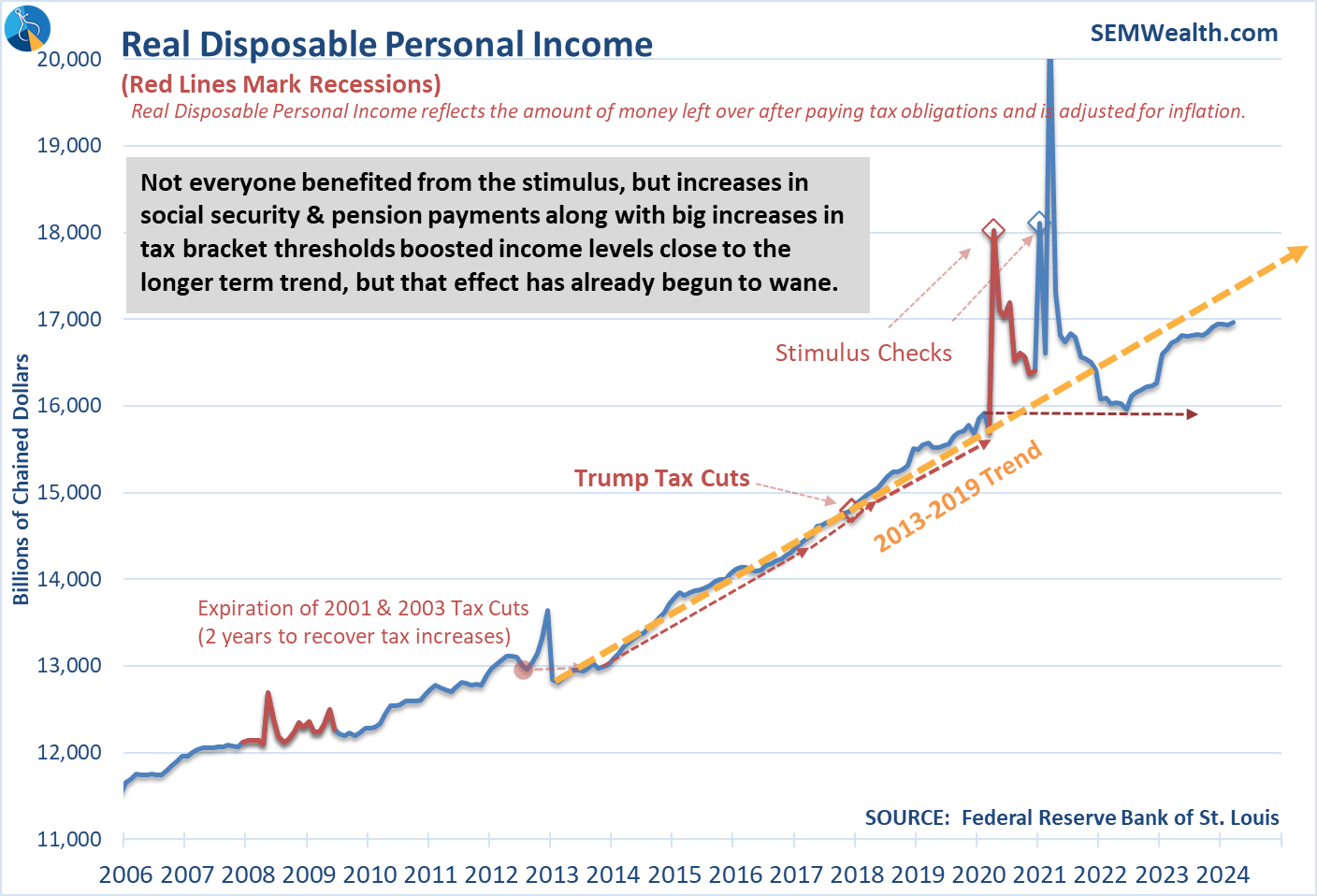
Despite the headline for this week's post, there are signs of stress that COULD be an issue going forward. The first is one we've been highlighting the past few months – INCOME is not keeping pace with SPENDING. We've seen a sharp decline in income growth the past two months (which means the jump in spending was the result of either dipping into savings or using debt to finance it.)
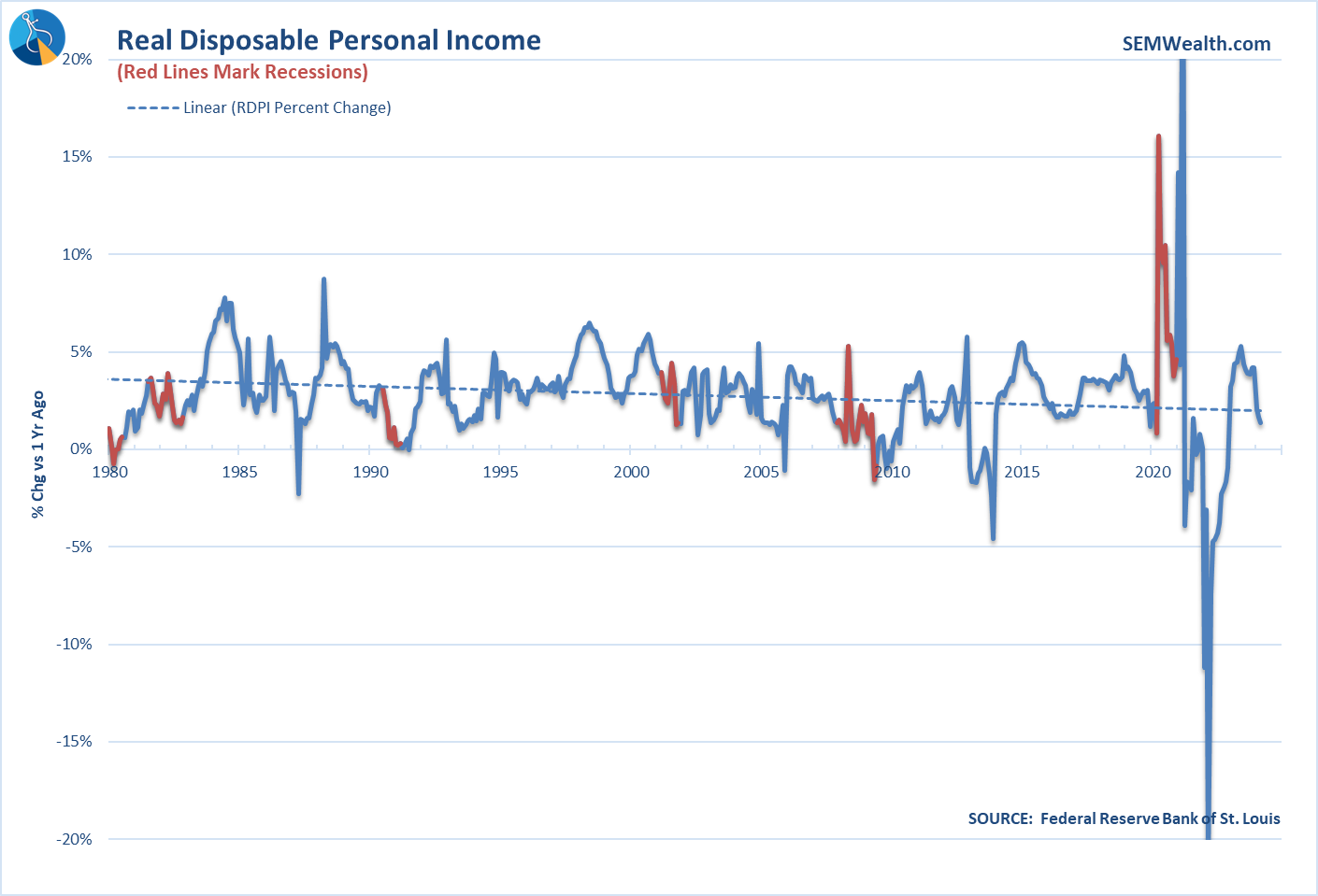
Income growth continues to run below the 2013-2019 trend which will eventually be a problem for the economy.
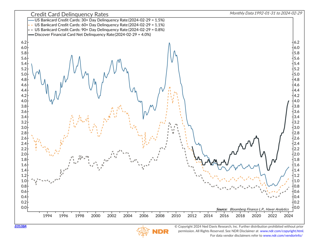
According to Ned Davis data, the credit card delinquency rate is rising rapidly. They didn't have Discover Card data for the financial crisis, but that spike is a bit alarming. All of the other levels are nearing the COVID peak prior to the arrival of stimulus checks.
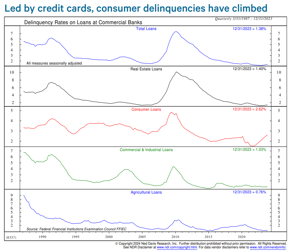
Looking at all loan types, the non-consumer types of loans seem ok for now.
We'll get more data next week when the Payrolls report is released, but the Initial Jobless Claims number continues to show very little stress or reason for concern.
As I mentioned a few weeks back, the problem the Fed has is if they cut rates to try to help those feeling stressed (the lower half of the K), they actually could end up hurting them. We've seen the price of housing come down with higher interest rates and inflation is slowing. Lowering rates could unleash another surge in home and rental prices and lead to another surge in inflation.
Turning to the economy, the first estimate of 1st Quarter GDP was released last week. The headlines called the number 'disappointing', but I certainly don't see it that way. As I have to do nearly every quarter, here is a reminder of how the government reports GDP — they take the change from the most recent quarter versus the last quarter, apply some sort of mathematical 'seasonal' adjustment factor and then essentially multiply it by 4 to give us an 'annual' rate (they actually add 1, raise it to the 4th power and then subtract 1.)
This chart helps illustrate the differences. The orange bars are the official 'headline' numbers. The blue line is the actual 1-year change (how much the economy grew the past 12 months).
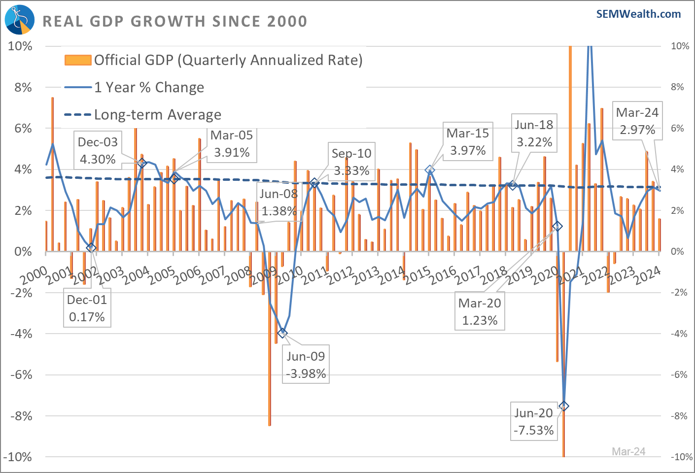
The headline should have read, "Economy grows nearly 3% over the past year." Just as it wasn't growing by 4.8% in the 3rd quarter last year (the 'official' number), it didn't grow by 'only' 1.6% in the 1st quarter (the 'official' number.) There really isn't too much to be concerned about (yet). The annual number does appear to be rolling over a bit, but it's at 3%, which is essentially the long-term average.
To put the economy in perspective, I put together these charts. Keep in mind over the past 12 months the economy grew by 2.97%. The economy is currently growing FASTER than the average growth rate since 1980!
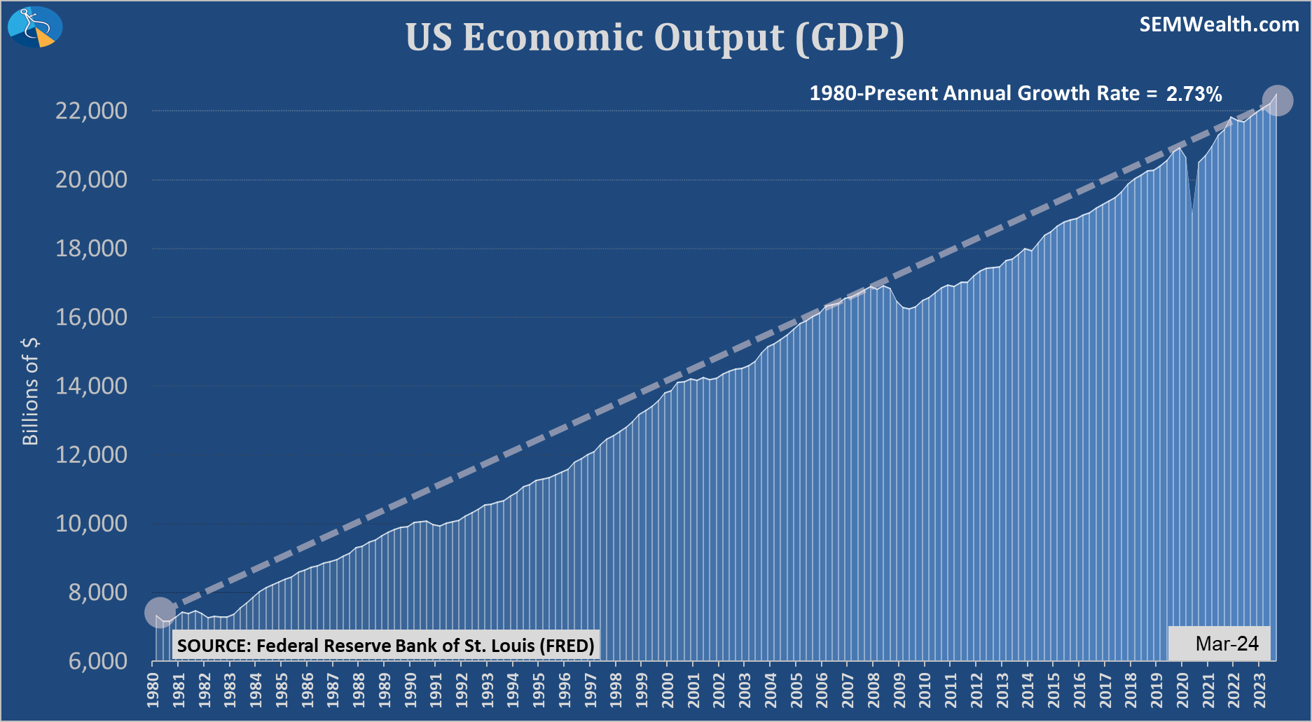
The economy is also growing FASTER than it did since the end of the financial crisis.
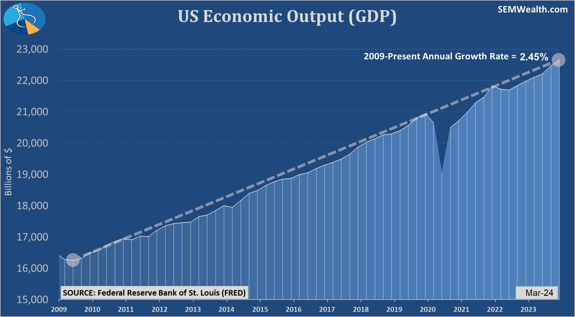
The economy is also growing FASTER than the 2020 - Present growth rate!
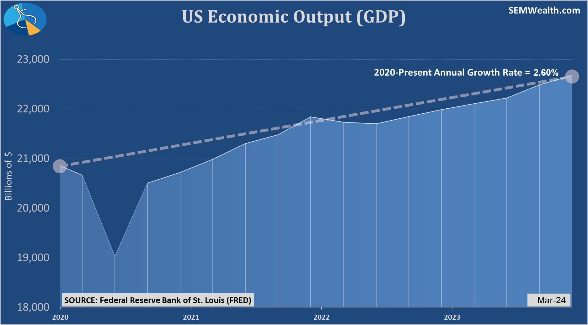
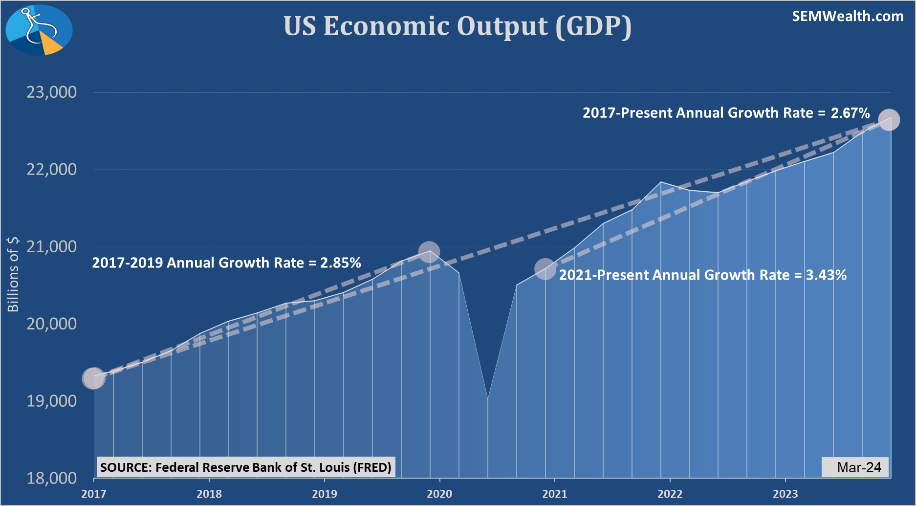
This final GDP chart illustrates the strange environment we've had the past 8 years.
The economy is growing FASTER than the 2017-Present growth rate!
The economy is growing FASTER than the 2017-2019 growth rate during the 1st 3 years of the Trump presidency!
The only pace that is SLOWER is when you compare it to the Biden years of 2021-2023, which has had a 3.43% growth rate. Every one knows this rate was abnormal, was driven by the Fed and Congress dumping 50% of economic output into the economy, and saw massive amounts of inflation. We know that's not normal, which is why the Fed had to hike rates so aggressively.
What stress are we seeing in the economy to justify rate cuts? The economy is performing better than it has since 2017, 2009, and 1980!
The bond market is TELLING us rates should be higher, which is why they have already risen rates so much (more in the Market Charts section below.) The bond market doesn't see any signs of stress and is far more concerned about inflation pressures than problems in the economy. We're getting closer and closer to the June Fed meeting, which is when forecasters originally predicted the Fed would start cutting rates.
I'm not entirely sure if the Fed not cutting rates would actually cause much more of a sell-off. So long as the economy remains decently strong, stocks should be able to hold up (after a normal correction of prices). In case you missed it, please check out last week's post about the current 'correction'.

If the Fed decides to cut rates no matter what, it could unleash yet another euphoric and indiscriminate rise in stocks which would actually be a bad thing for the average American. The data doesn't say they should, but I've made the mistake before of underestimating the Fed's ability to completely misunderstand the big picture and how their decisions impact normal Americans.
This week the Fed will be in focus and every word dissected when the Fed announces their latest policy decision on Wednesday.
Market Charts
The S&P 500 posted its best week in nearly a year, gaining 2.7%. Large Cap Growth stocks led the way with a 4% jump. Value stocks gained less than 1%. This doesn't mean the selling is over. Note the decline from August - October last year. We had several big jumps in stocks before they eventually bottomed.
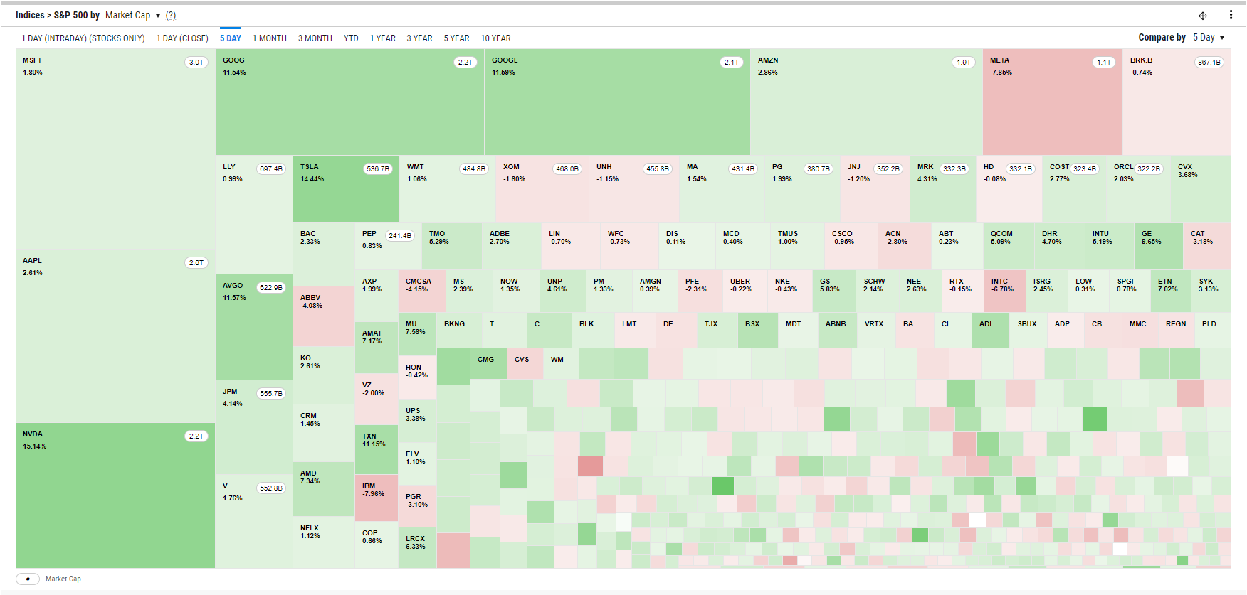
This heat map, where the box size represents the allocation of the index illustrates the disparity in the S&P. There is still a lot of red shades in the bottom 450 stocks.
The Volatility Index, which is a good measure of sentiment is still well below average.
We noted last week how a 5% correction 2-3 times a year is 'normal'. It is obviously too early to call the end of the correction. This chart shows the 'drawdown' or the % from the high for large caps, small caps, and bonds.
Turning to bonds, the mixed bag of weaker than expected economic growth and higher than expected inflation left bond yields essentially at the same level as they started the week. The trend in yields is still higher which will be a problem for stocks.
Looking at the various interest rates, we can see the upward trend in all rates except the 3-month T-Bill, which essentially is set by the Fed.
Lately we've had several clients compare their returns to a CD. Essentially they say, "CDs can give me 4 1/2 - 5% interest, therefore I should be making at least 5% every year." I understand that logic, but we forget that there is "renewal" risk meaning when a CD renews it will be priced at the current interest rate level.
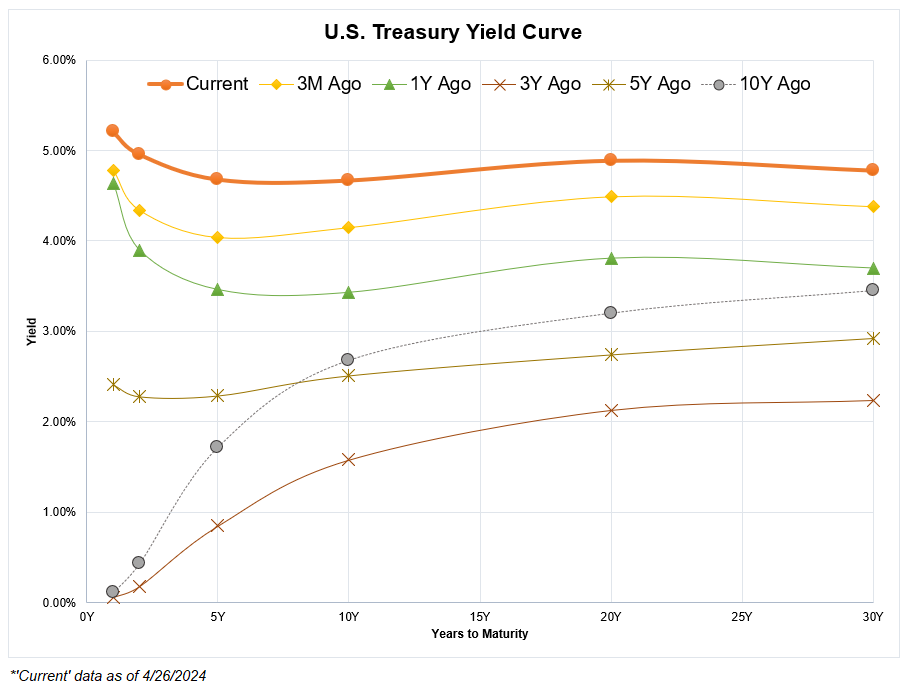
Interest rates right now are NOT NORMAL. Short-term rates should be higher than long-term rates, but that is not the case thanks to the Fed's manipulation of the economy in the name of stimulus.
Here is a yield curve chart. The 3 Year and 10 Year lines represent a more 'normal' environment. This means eventually the yield curve will normalize, by either seeing long-term rates go way up or short-term rates come way down. The only way a CD makes sense for most people in their long-term accounts is if somebody believes the curve will normalize by seeing long-term rates shoot higher.
I did a study for our advisors comparing CDs to Passive Management to Active Management since 2000. If you'd like a copy, drop us a message.
While there aren't signs flashing red, things are not as easy as they were last year and could turn down rather quickly. Stay tuned!
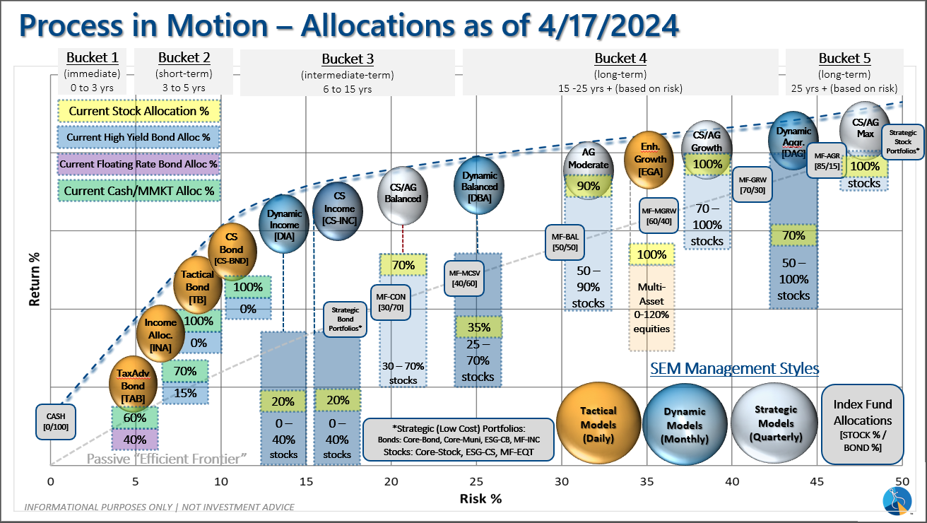
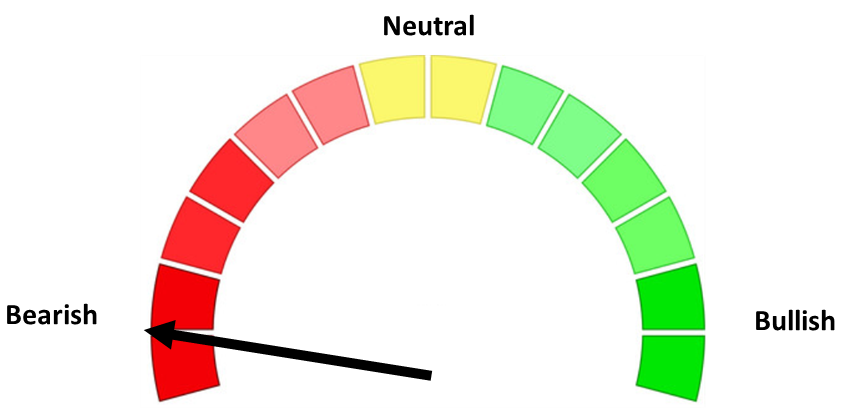
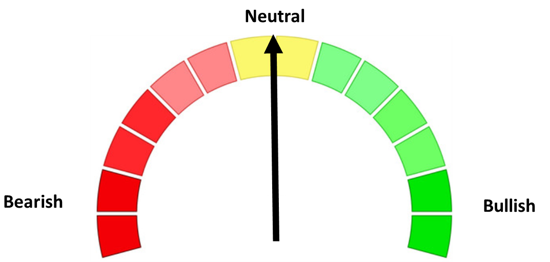
SEM Model Positioning
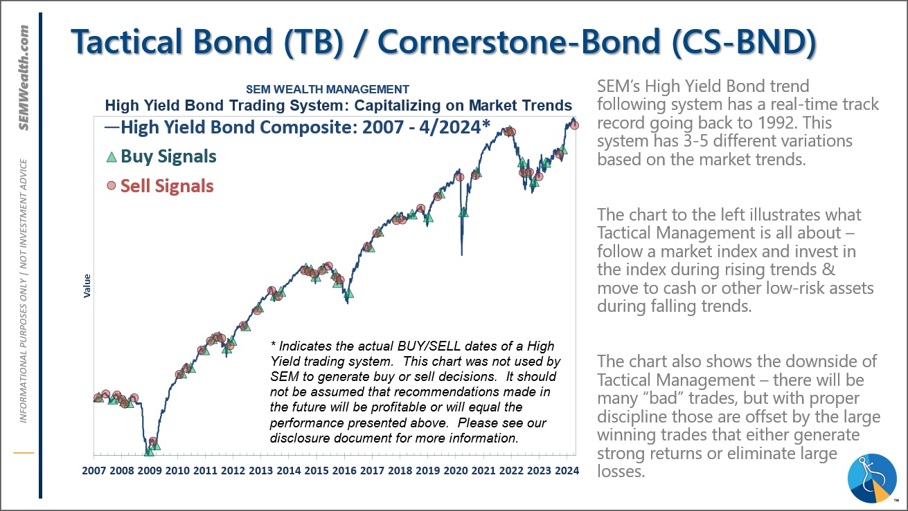
-Tactical High Yield went on a sell 4/16 & 17/2024
-Dynamic Models went to 'neutral' 2/5/2024
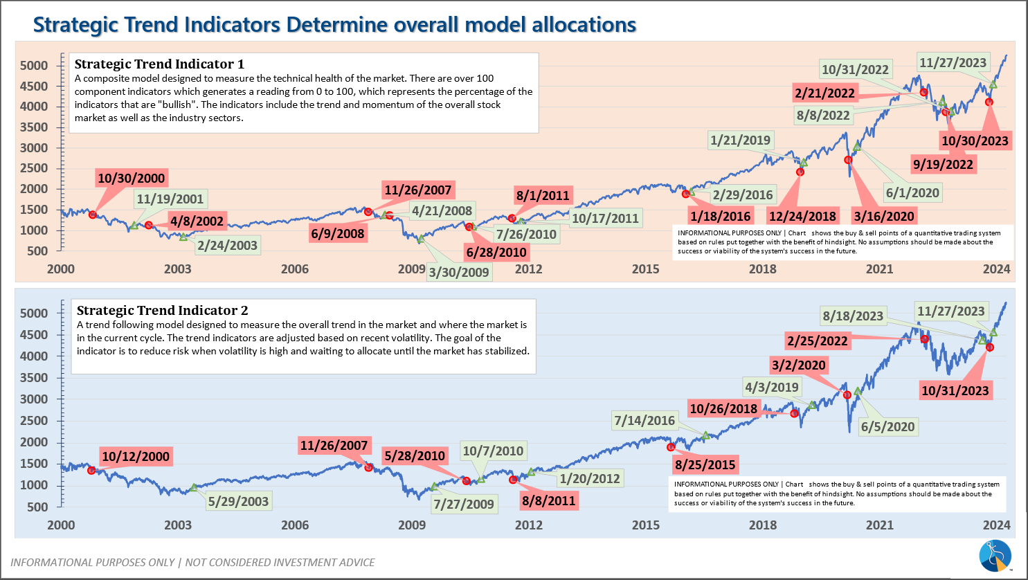
-Strategic Trend Models went on a buy 11/27/2023
SEM deploys 3 distinct approaches – Tactical, Dynamic, and Strategic. These systems have been described as 'daily, monthly, quarterly' given how often they may make adjustments. Here is where they each stand.
Tactical (daily): On 4/15 & 16, 2024 the High Yield Bond systems sold the positions bought on 11/3/2023. The money market funds we are currently invested in are yielding between 4.8-5.3% annually.
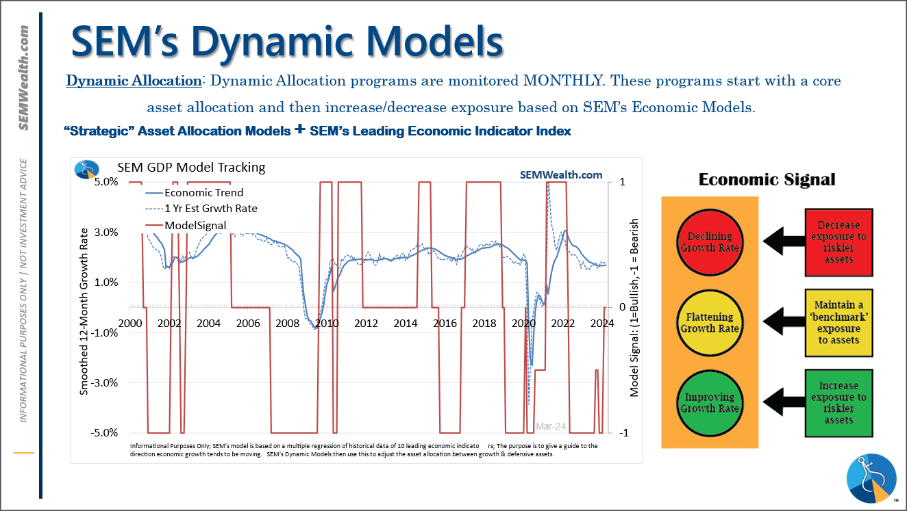
Dynamic (monthly): At the beginning of December the economic model reverted back to "bearish". This was reversed at the beginning of February. This means benchmark positions – 20% dividend stocks in Dynamic Income and 20% small cap stocks in Dynamic Aggressive Growth.
Strategic (quarterly)*:
BOTH Trend Systems reversed back to a buy on 11/27/2023
The core rotation is adjusted quarterly. On August 17 it rotated out of mid-cap growth and into small cap value. It also sold some large cap value to buy some large cap blend and growth. The large cap purchases were in actively managed funds with more diversification than the S&P 500 (banking on the market broadening out beyond the top 5-10 stocks.) On January 8 it rotated completely out of small cap value and mid-cap growth to purchase another broad (more diversified) large cap blend fund along with a Dividend Growth fund.
The * in quarterly is for the trend models. These models are watched daily but they trade infrequently based on readings of where each believe we are in the cycle. The trend systems can be susceptible to "whipsaws" as we saw with the recent sell and buy signals at the end of October and November. The goal of the systems is to miss major downturns in the market. Risks are high when the market has been stampeding higher as it has for most of 2023. This means sometimes selling too soon. As we saw with the recent trade, the systems can quickly reverse if they are wrong.
Overall, this is how our various models stack up based on the last allocation change: