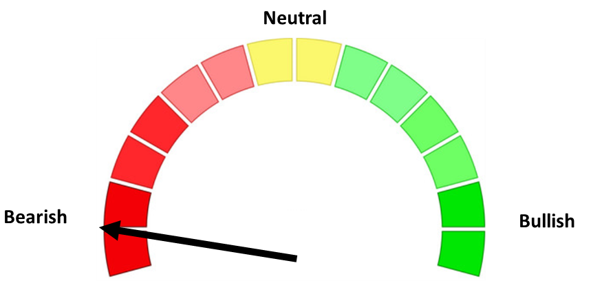
Stock markets are usually described as being a “bull” or a “bear”, but a different animal could be used to describe the current market.
I’m not sure when the terms “bull” or “bear” market were first used, but they are common terms to describe the direction of the stock market. Sometimes I think other animals could be used to describe the market environment. Last week I compared the market participants to our new Golden Retriever puppy. We discussed their sunny disposition in our weekend Podcast:

Over the weekend I caught up on my John Mauldin reading (I was only 3 weeks behind) and a new animal came to mind….the Ostrich. The title of last weekend’s letter was “Promises, Promises, Pension Promises.” Anybody that has been around me discussing the long-term fundamental issues our country is facing may know where this is going as this is going. Mr. Mauldin and I often have similar themes, although he is a far better writer and has significantly more resources than I do. In this week’s letter he included a chart we discussed in our Spring Newsletter — the 7 Year Asset Class Return Forecast from renowned asset manager GMO.
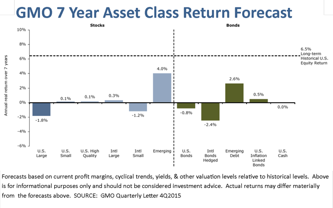
These forecasts are the result of ultra low interest rates (in many countries now negative interest rates) and bubble-like valuations. When you start at extreme valuation levels it takes significant economic growth to lead to even average returns. The consequences to the economy are significant. Mr. Mauldin focused in on the impact this will have on pension funds. One thing people seem to forget is in the US the funding level of a pension (or in most cases, the amount a pension is underfunded) is greatly impacted by the level of returns assumed inside the pension plan. In most cases those returns are assumed to be in the 7-8% range. Over the next 10 years it is highly unlikely pensions will be able to generate those returns. Mr. Mauldin included this simple, fundamental based calculation of what pensions are likely to earn over the next 10 years.
-40% Bonds. Yield is 2% for the US aggregate bond market.
-60% Stocks. Our base case is 5.4% for US stocks, but we think valuations are too high, so we trim this to 3.3% for the coming decade. Here’s our logic:
+The yield is 2%.
+Earnings growth over the past century has been 4.5%, of which 3.1% was inflation (real growth of 1.4% … far less than most people realize).
+Inflation expectations are about 2%, so perhaps we should trim this forecast by 1.1%.
+This gives us a base-case of 5.4%.
+Valuation multiples are stretched, with the stock market priced at 25 times the 10-year average earnings, against a historical norm of 16.8x. If we’re back to historical norms in 10 years, that costs us another 4.2%. Since valuation multiples could (a) return to historical norms, or (b) remain at today’s lofty multiples, let’s split the difference, and trim our return expectations another 2.1%.
+This gives us a likely outcome of 3.3% from stocks.
This simple logic is based on fundamentals. It is higher than GMO’s forecast, but still significantly below “average” The conclusions are more chilling and something I’ve also been saying for quite some time.
If our logic is sound, we earn 0.8% from our bonds (40% allocation x 2% return) and 2% to 3.2% from our stocks (60% x 3.3%, or 60% x 5.4%). Add up the return from stocks and the return from bonds, and we get 2.8% to 4% from our balanced portfolio.
Bottom line … US public service pensions are toast. One of three constituencies gets nailed: the taxpayer (keeping in mind that the affluent are mobile!), the current and/or future pensioners (keep in mind that private-sector pensions are now far less generous than public pensions … there’s an inequity here!), or the public services that are on offer to our citizenry, net of sunk costs from servicing past generations. Most likely, it’ll be a blend of the three.
Over the short-term the market participants can ignore these problems and focus on how much stimulus the central banks may unleash next, but all of this stimulus is actually making the long-term problems SIGNIFICANTLY WORSE! The problem with ignoring these problems is eventually the future becomes the present.
Tuesday, July 26
Stocks have been down just 6 of the 16 trading days in July. 4 of them have occurred in the last 7 trading sessions. Volume again remains extremely light.
Yesterday I was updating the charts for an article I wrote 5 years ago that remains one of our most popular articles. In the Grand Experiment, I discuss the 2 economic schools of thought. With the Democratic National Convention this week and Bernie Sanders speaking yesterday, I thought the timing was right to remind people exactly how much government “stimulus” we have already thrown at this economy and what that money has brought. The Democrats believe we need to spend even more money despite the evidence there is something wrong with their Keynesian economic theory in this environment. As I was updating the data for those charts I saw another chart I had created 5 years ago and I was a bit surprised at how much things have changed. It certainly fits this week’s theme of the “Ostrich Market.”
This chart shows the various types of debt along with the overall output of our economy. Believe it or not, when the 21st century started not a single category of debt was larger than the overall economy. 5 years ago the level of public debt surpassed GDP, but corporate debt creation had slowed while household debt was declining. Since that time, thanks to QE3 we’ve seen public debt continue to rise at exponential rates, corporate debt surge, and now household debt nearly surpassing the 2007 peak.
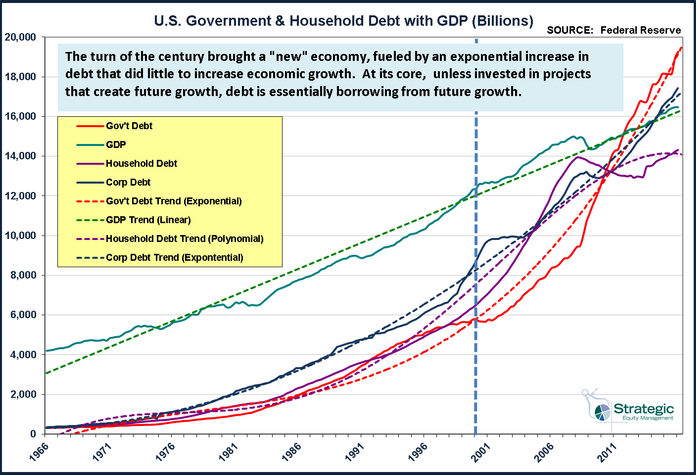
If this debt were being used for long-term investments that create future growth, it would not be as worrisome. Unfortunately that is not the case. The vast majority of public debt has been used to pay social security, medicare, and welfare benefits, not to invest in infrastructure and other productivity enhancing projects. Corporate debt has been used to pay special dividends and buy back stock. The largest areas of growth for household debt have been in auto and student loans. All of this debt has to be paid back, which means it will be a serious drag on future growth.
Of greater short-term concern is what we are seeing in the corporate debt market. We are seeing a surge in delinquent loans at commercial banks. As this chart shows, that typically means we would see a spike in high yield bond spreads (meaning high yield prices would drop.)
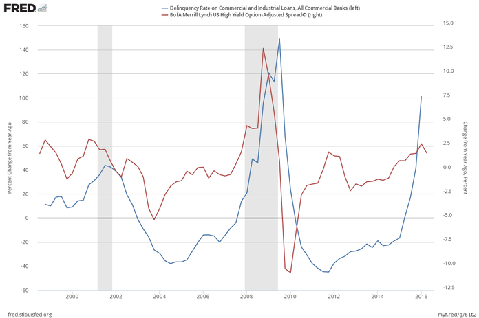
The fact that this has yet to happen should not be reason to believe it won’t. We of course are heavily invested in high yield bonds, but that does not mean these are long-term positions. The systems used are trend following meaning they will ride the wave as long as possible. By design the system has a tight sell level. Delinquencies at commercial banks that turn into defaults in the high yield market would be a welcome sign for us as it will create far more attractive opportunities in the future while we watch from the sidelines in money market or short to intermediate-term government bonds.
Wednesday, July 27
Stocks were flat on Tuesday as market participants await the results of the latest Fed meeting. If the Fed truly were “data dependent” they would be raising interest rates as the economy is getting stronger across the board. Apparently they see something the stock market participants do not. The bond market also does not seem as enthusiastic about the long-term growth prospects as the stock market. Looking at the spread between short-term and long-term rates, we can see the bond market is signaling an economic slowdown is on the horizon.
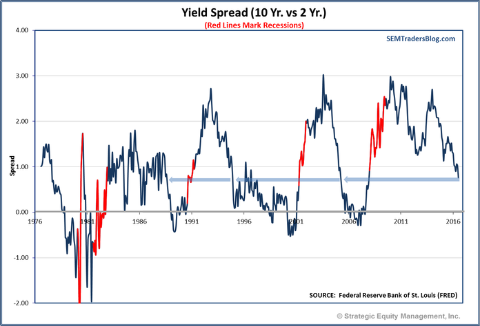
The yield spread is historically the earliest of all leading economic indicators, but it is also one I pay close attention to. While stock investors have a myopic focus on a company’s ability to beat quarterly earnings estimates (which are usually lowered throughout the quarter), the bond market cares about the ability of a borrower to repay their loan. As we saw yesterday, we are seeing a sharp spike in commercial loan delinquencies, something that can have dire consequences on the overall economy (and eventually the stock market.)
Thursday, July 28
The Federal Reserve meeting that concluded on Wednesday was pretty much a non-event. As I’ve mentioned several times the past few weeks, the market participants may not be fully pricing in the chances the Fed will be forced to raise rates sooner than most expect. I was a bit surprised the market did not react more negatively to this key change in the Fed statement:
Near-term risks to the economic outlook have diminished.
In the bigger picture I continue to remind investors their faith in the Fed and their ability to control the markets and interest rates. Remember, the stated purpose of Quantitative Easing was to lower longer-term interest rates (since short-term rates were already near zero.) As this chart shows, QE had the opposite effect on interest rates. Long-term rates only fell when the Fed ENDED their “stimulus” program.

It is important to keep in mind in the history of the Fed they have NEVER wanted a recession, yet they continue to happen. The more they manipulate the market the harder it will be to control when a bigger crisis emerges.
Friday, July 29
The market continues in a very tight trading range. Individual earnings reports have moved individual stocks, but have had little impact on the overall market. That’s not necessarily a bad thing, but this flat movement is creating a bit of a coiled spring when whatever news brings out the buyers or sellers. Remember, market direction is a function of supply and demand & often the decision to buy or sell is fueled by emotions. Higher prices often bring buyers off the sidelines and lower ones lead to a rush of sell orders.
With the conclusion of the Democratic National Convention last night, I thought I’d end with another comment on debt in our economy. Hillary Clinton’s economic plan has been described as the “do no harm” plan, yet it is full of additional deficit spending in the name of “growth”. This week I updated my “Grand Experiment” article in which I discussed using debt to finance growth. Here’s a couple of other ways to look at the level of debt in our country.
The overall level of debt is staggering and spread throughout our economy.

Believe it or not, up until 1986 our economy was bigger than our total debt load.

Debt is future growth borrowed. Everyone wonders why GDP has been below average this entire recovery, yet nobody realizes its because we are paying back all the “growth” from the past 30 years. The longer we see below average growth and try to fight it with additional debt, as Hillary Clinton and her supporters are proposing, the worse it will be in the future.
Ignore this at your own (and your portfolio’s) peril.