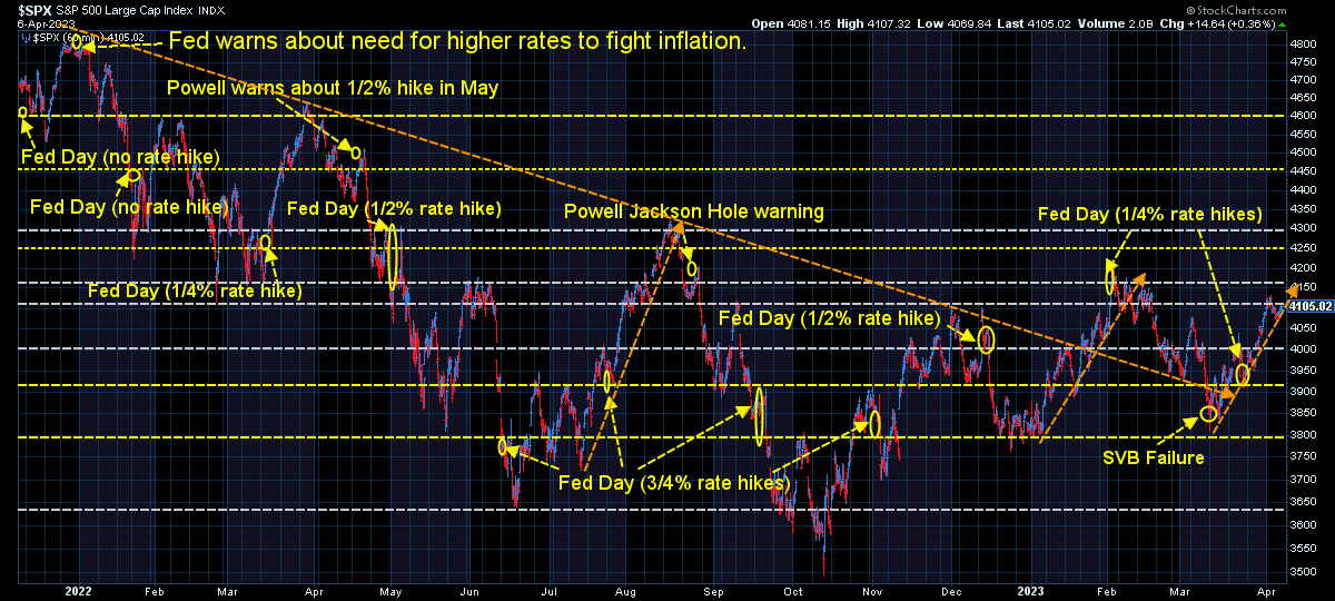
Throughout the last 6 months, the stock market has been hoping for a "goldilocks" scenario. With the Fed raising interest rates aggressively to fight inflation, the market participants were looking for any sign the economy was slowing enough to cool inflation, which in turn would lead the Fed to backing down in their fight. This has led to a bizarre environment where bad economic data was viewed as good news for the stock market.
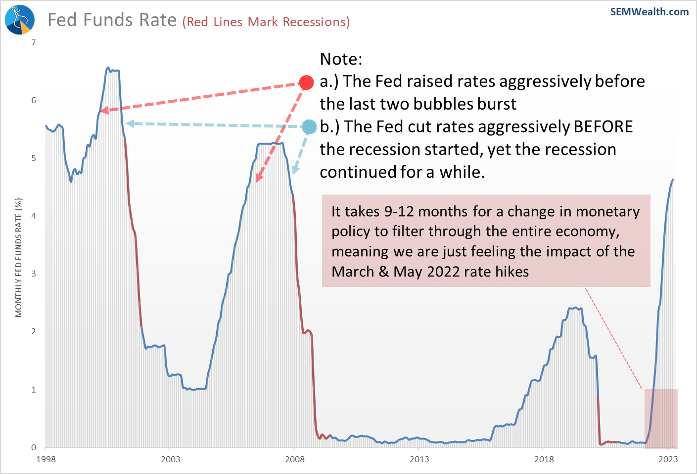
I won't go into the stupidity of that mindset. I've done that throughout the year on this page. As always, market participants have ignored data and history and believe the Fed simply stopping their rate hikes (or even reversing course and cutting rates) can save an economy that is tumbling into a recession. As I began warning a year ago – it takes 9-12 months for one change in Fed policy to filter all the way through our economy. That means today's economy is feeling the impact of the move from 0 to 0.75% in March & May 2022.
As this chart shows, we have a long way to go before we feel the FULL impact of the Fed rate hikes. It also illustrates what happened the last time the Fed was forced to aggressively raise rates and how shifting course to rate cuts did not prevent a recession.
The past week we saw a greater focus on the economic data being released. There were a few "scares" along the way as market participants realized there is a very fine line between a "just right" slowdown and one that threatens the rosy 11% earnings growth the market is currently banking on.
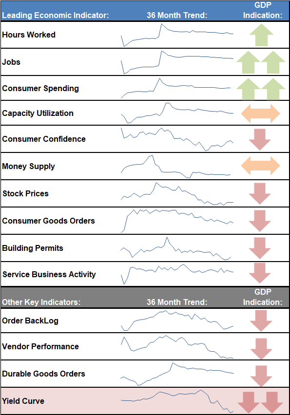
This week, we'll take a deeper look at our economic model to see what's still working and what has already broken.
Still Strong
The Fed was originally created with one mandate – to promote financial stability, meaning they were supposed to supervise the banks and ensure the 'plumbing' worked correctly. In the 1970s with inflation running too hot and the economy struggling, Congress decided to create the so-called "dual mandate" for the Fed, which was to promote price stability and maximize employment. There's a few issues with that:
1.) Monetary policy is a blunt tool that can help stimulate investment/speculation, but the most effective ways to grow the economy/jobs is through FISCAL policies (those set by Congress & the White House).
2.) Sometimes the dual mandates conflict (such as in the 1970s and today). If you push too hard towards "maximizing employment" you risk overheating the economy and creating inflation. Push too far the other way to fight inflation and you risk causing a recession.
3.) Many times the Fed loses focus on their primary role – supervising the banks and ensuring the financial system functions properly (as we witnessed in March and during the Financial Crisis).
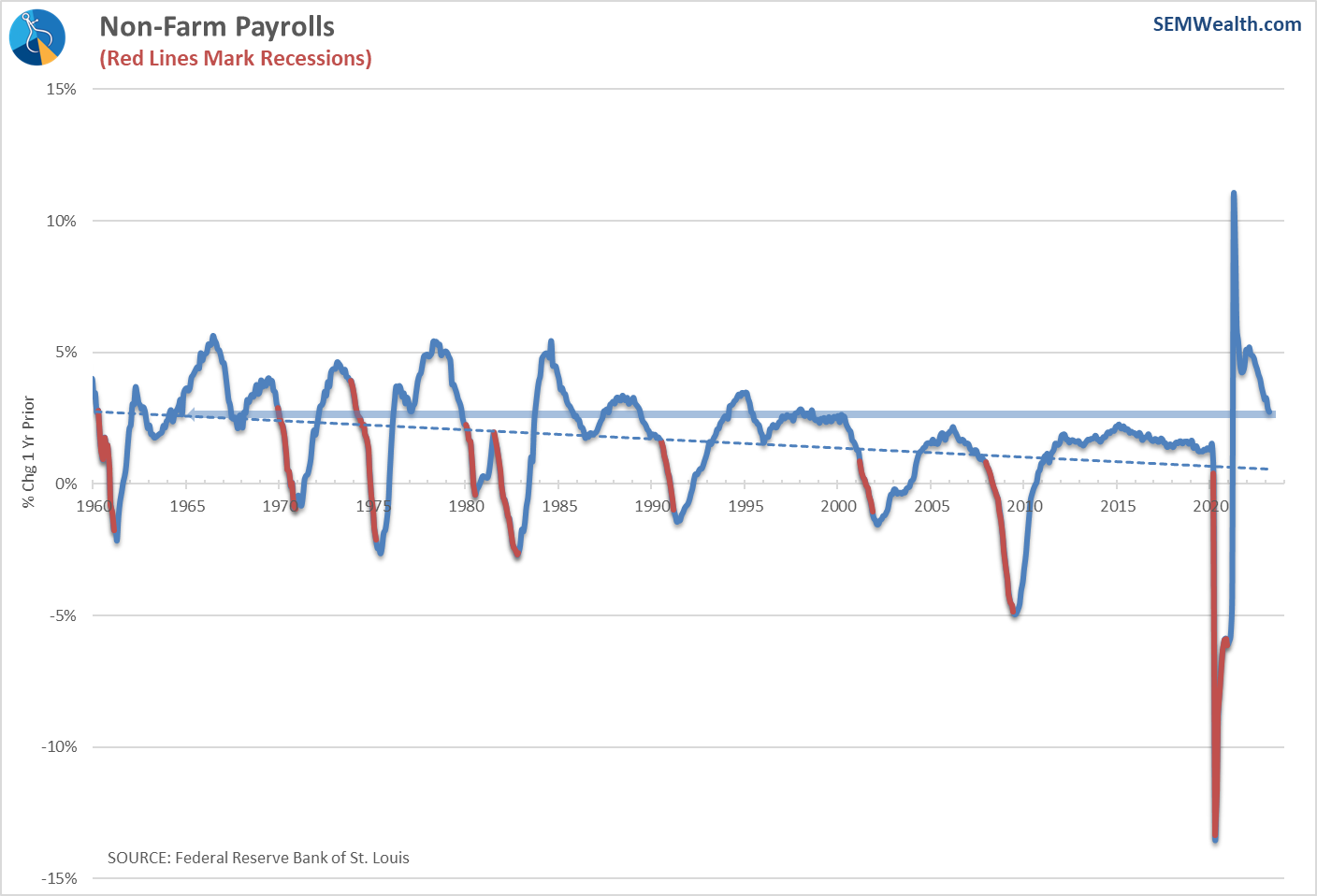
Labor market still strong
Looking at the data, the labor market is not showing any signs of struggling. However you define "maximum" employment, it appears we are still doing quite fine.
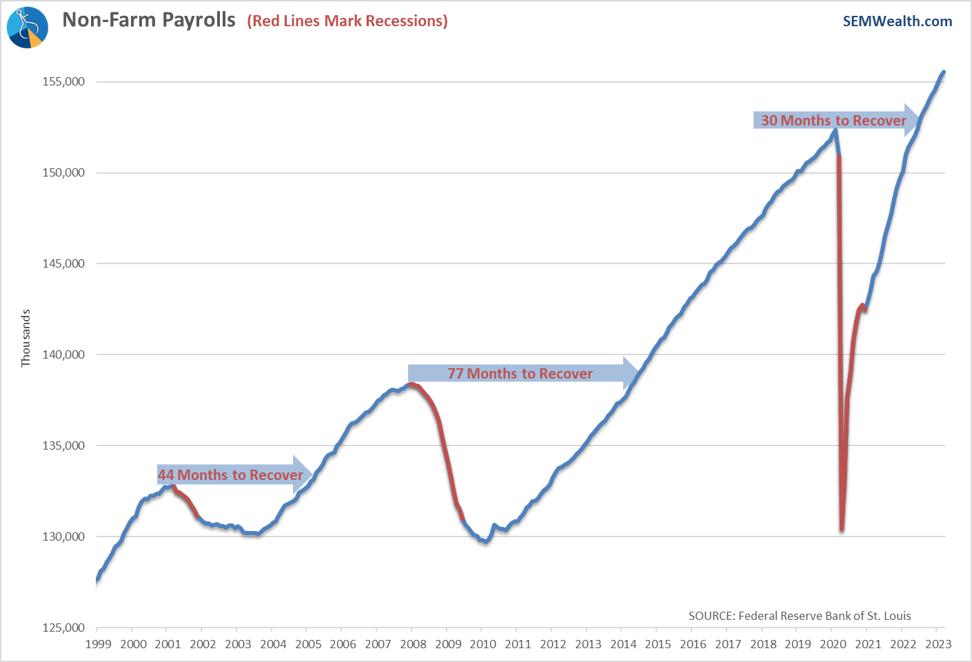
Yes we are seeing "slower" growth, but the growth is still well above past recoveries.
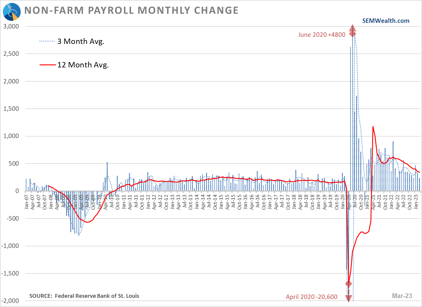
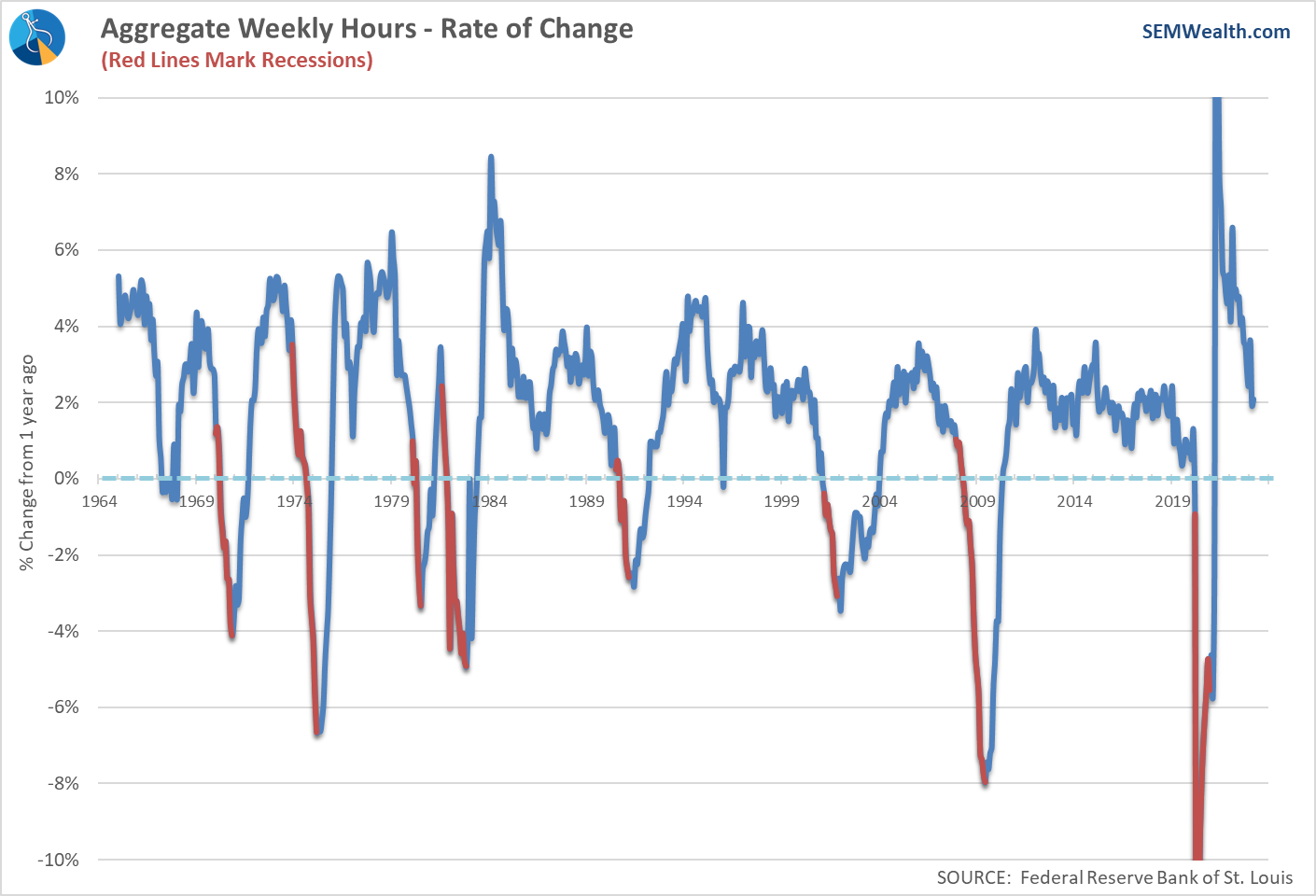
The average workweek continues to grow at a 2%+ rate, which is in-line with a growing economy.
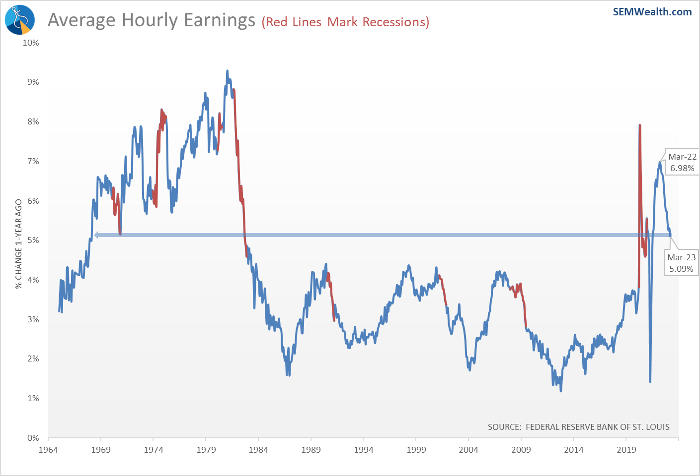
"Too many jobs" is a problem, however when you are trying to fight inflation. This can lead to wage pressures, which we continue to see in the average hourly earnings data. Earnings growth was 7% a year ago, but still 5% today, which is well above "normal" inflationary pressures.
Consumers still spending
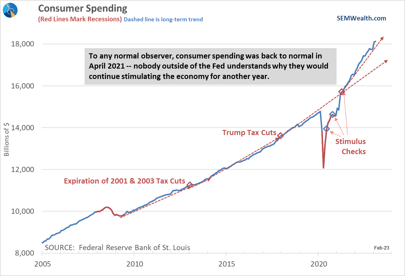
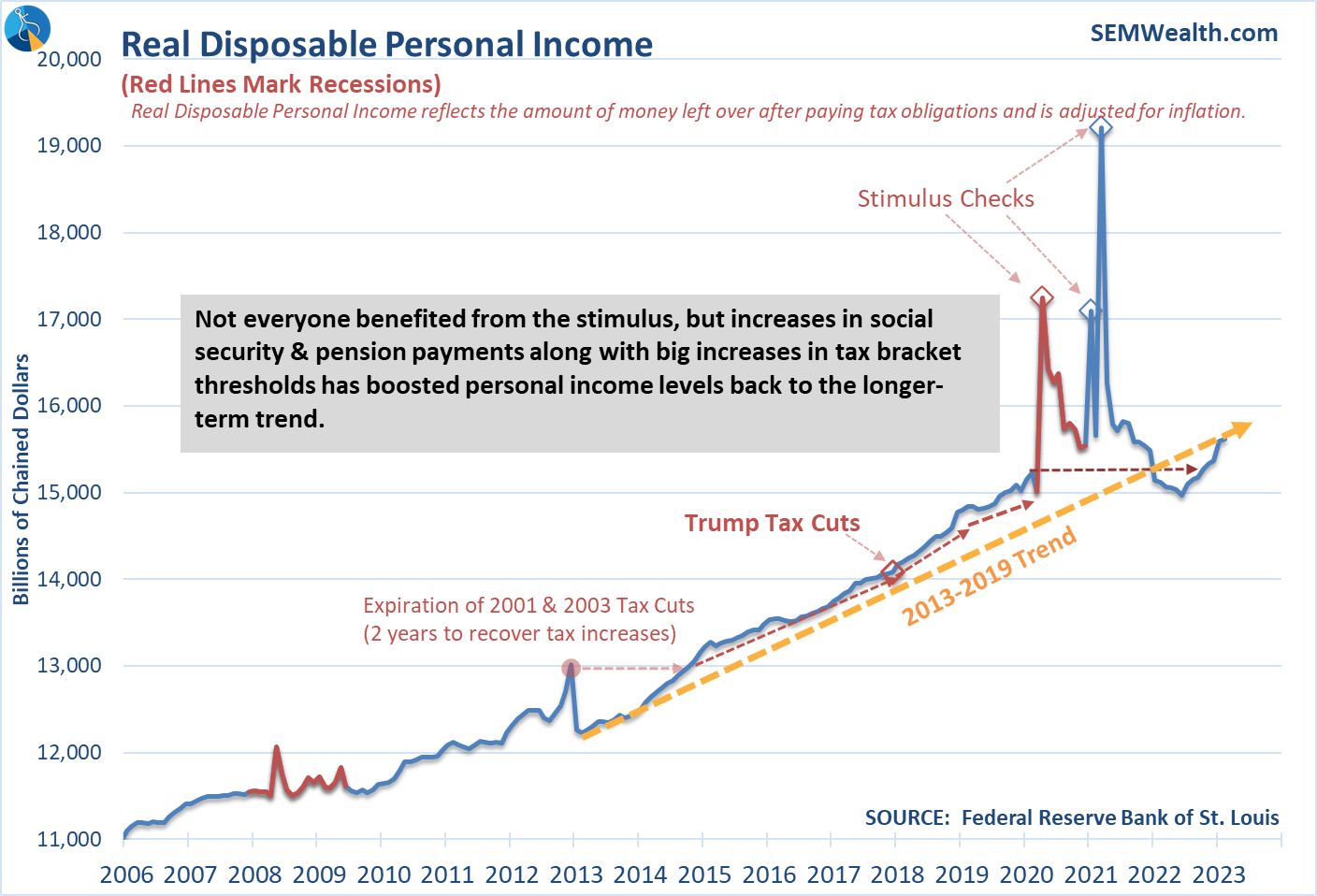
Consumer spending growth accelerated in March, which is not good news for the Fed.
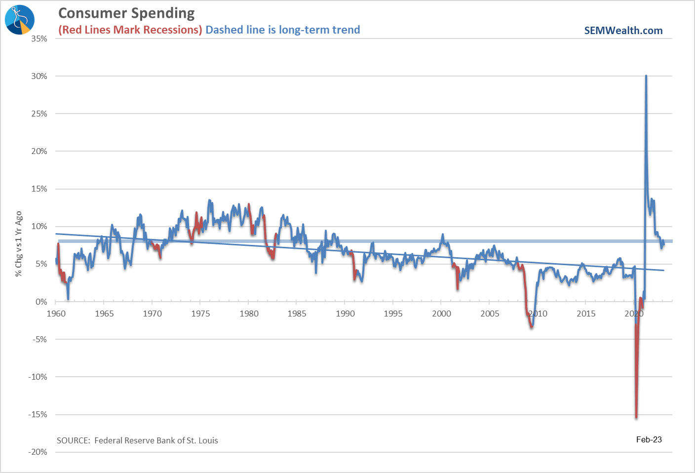
This chart should be used as Exhibit 1 when we look back at how the Fed failed us. The 3rd stimulus checks hit in April 2021. The same month Consumer Spending returned to the long-term uptrend. Yet, for some reason, the Federal Reserve waited another 11 months before they realized all of this excess money is probably inflationary.
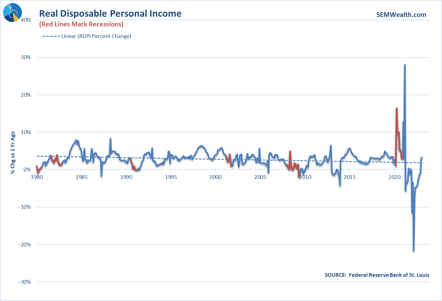
The Fed now has another problem – personal income is rising due to two primary reasons: 1.) Social Security, federal, and many state pensions all had 7%+ increases which started this year and 2.) The IRS tax brackets were adjusted on average 7% higher for 2023.
This means people have more money in their checking accounts, which is fueling more spending.
Neutral Indicators
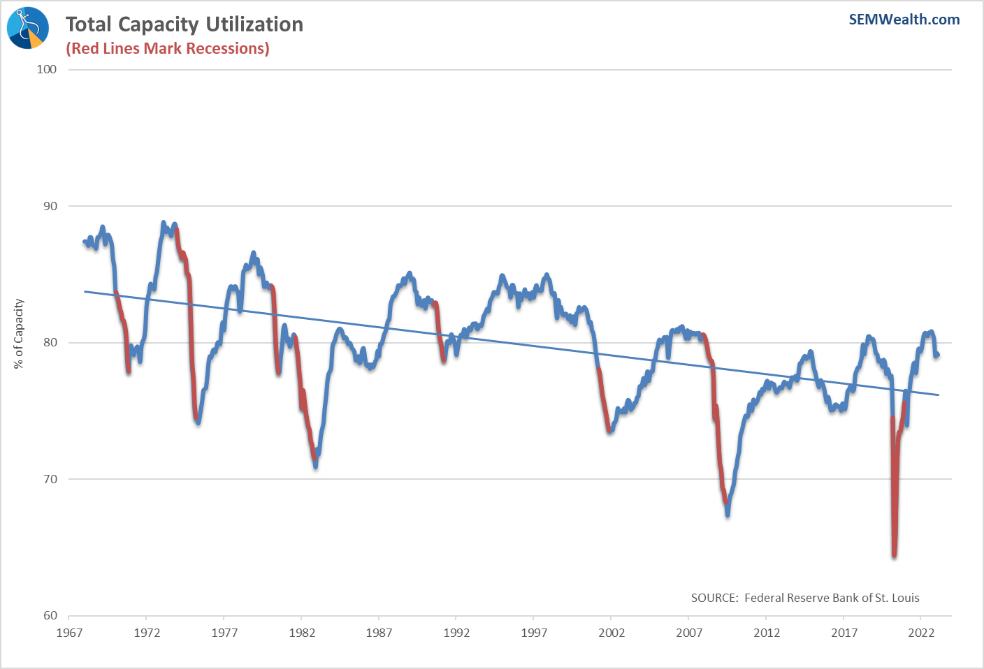
Early signs of factories slowing
We don't talk about it too much, but Capacity Utilization is a fairly reliable "coincident" indicator (meaning it reflects the current economic environment). Factories will go through ebbs and flows of activity based on demand, so looking at the % of manufacturing being utilized shows us what the factories are seeing.
Right now, we can see the utilization for this cycle may have peaked.
The Fed hasn't really been that restrictive
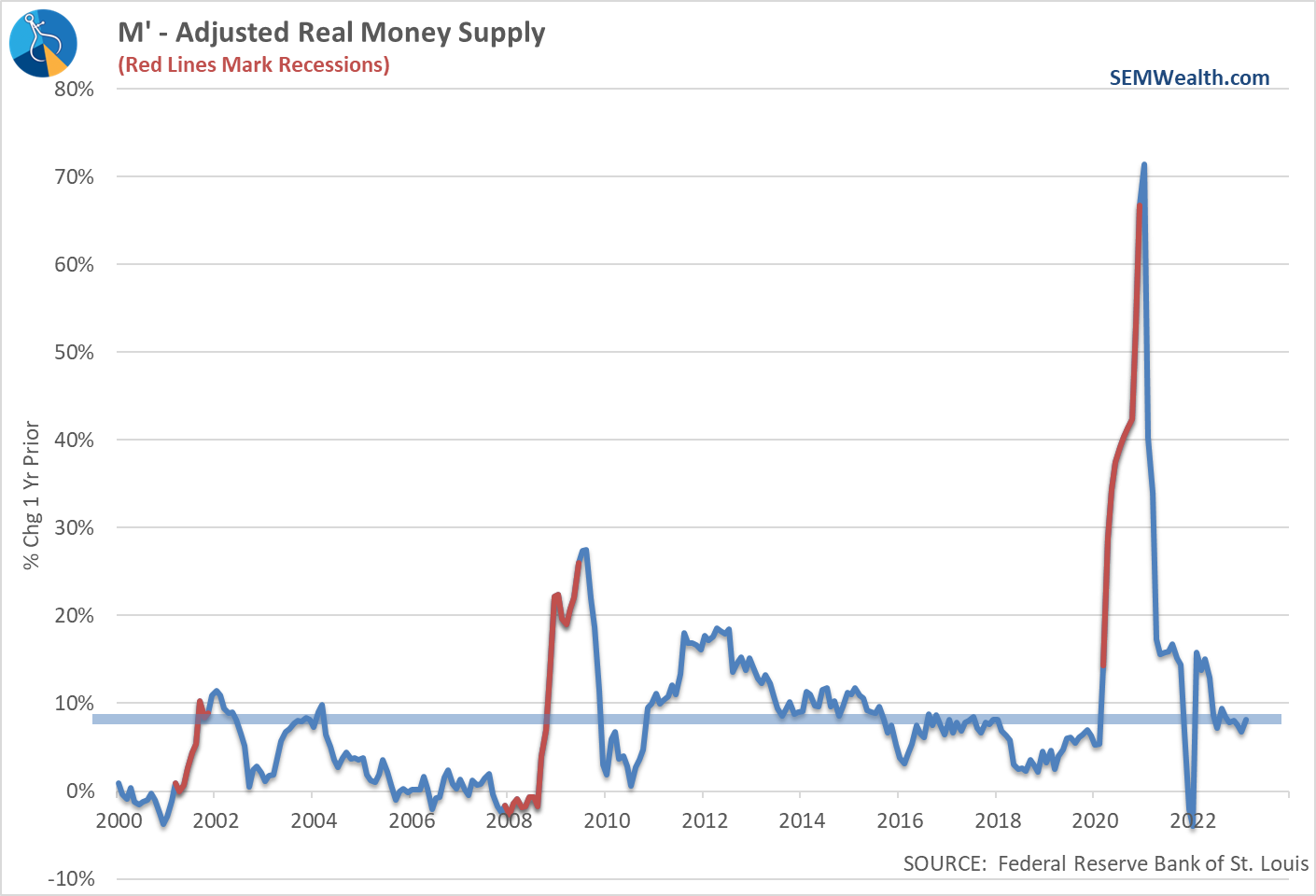
Actions speak louder than words. While we would like to believe the Fed has been "aggressively" fighting inflation, the data says otherwise. Yes, they have raised rates by quite a bit, but they have done little to control the money supply.
We can use this chart as Exhibit 2 when we look back at how the Fed has failed us. The money supply today is 8% higher than a year ago.
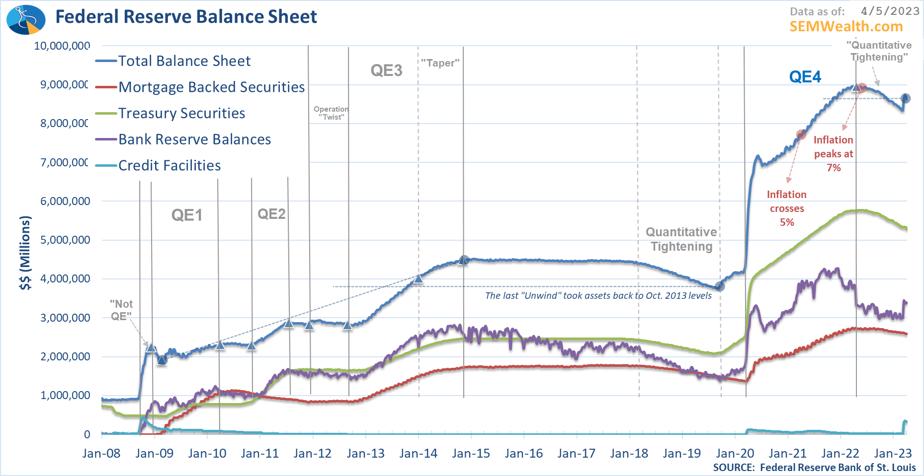
The next chart can be used as Exhibit 3 when we look back at how the Fed failed us. They kept pumping money to the Wall Street banks even after inflation crossed the 5% level in May 2021. They finally got around to beginning the process of their bubble-inducing policies after inflation had already peaked above 7%.
Weak Indicators
The list of weak indicators has not really changed over the past several months, but most have deteriorated even more. The question for the market is whether the strong labor market and spending data is enough to offset the downward spiral of these indicators.
Sentiment weakening again
The chart of Consumer Sentiment shows how politicians can only buy votes for so long. Sentiment peaked for this cycle when the last round of stimulus checks started going out. It bottomed early in 2022 but has since fallen once again.
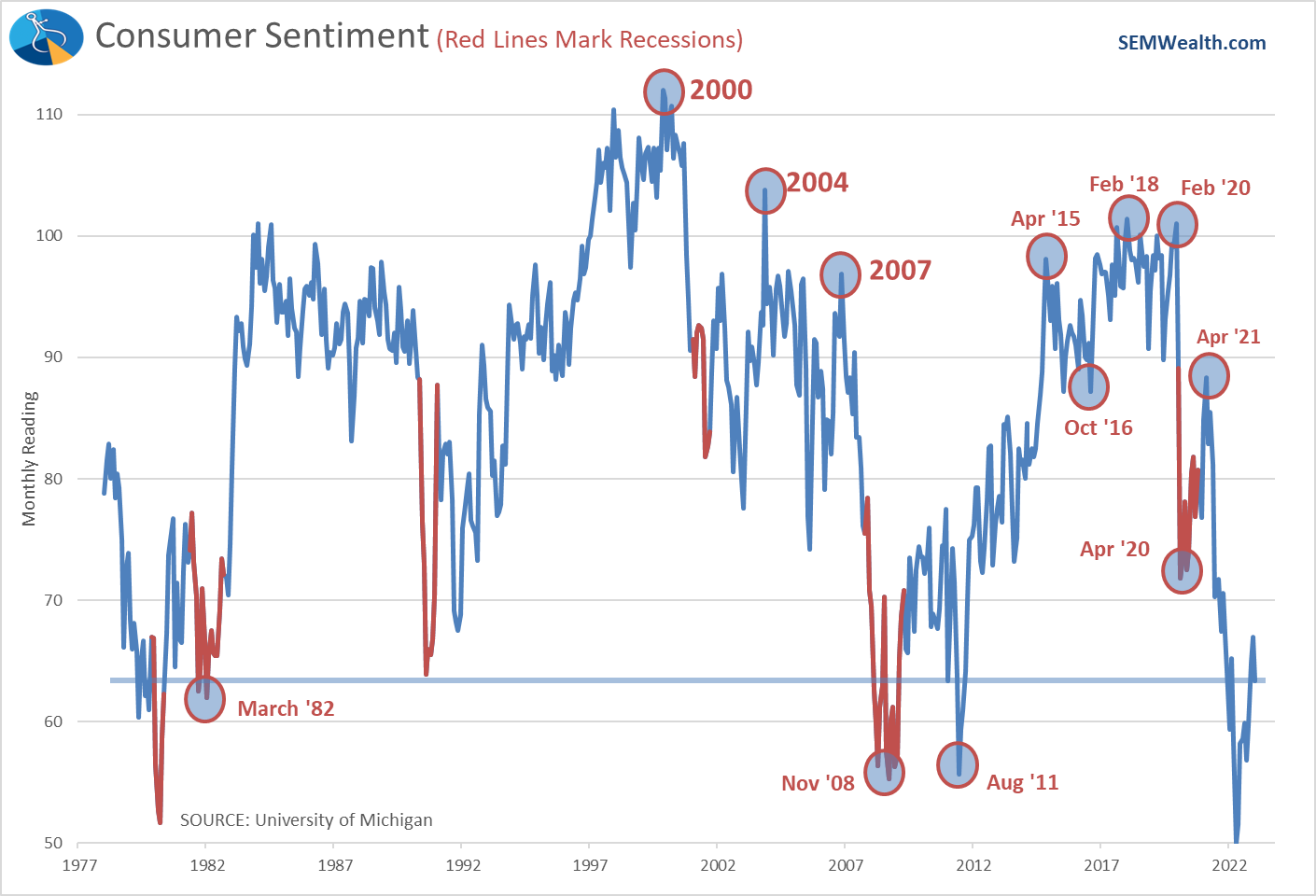
What doesn't line-up is the fact Americans are still spending money like a government agency at the end of their fiscal year. At some point we should expect the weak sentiment to show up in consumer spending (but probably not until we see jobs declining).
Despite 'strength' stock prices still pointing towards a slowdown
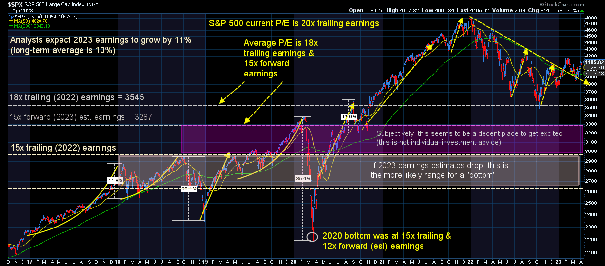
Stocks are a "forward looking" mechanism, meaning investors are paying today what they think the future value of the earnings stream is worth. Therefore, stock prices today can be broken down to: Expected Earnings x a valuation multiple (ie price/earnings ratio). When we see stock prices declining, this is usually a sign of investors either lowering their earnings expectations and/or the valuation multiple.
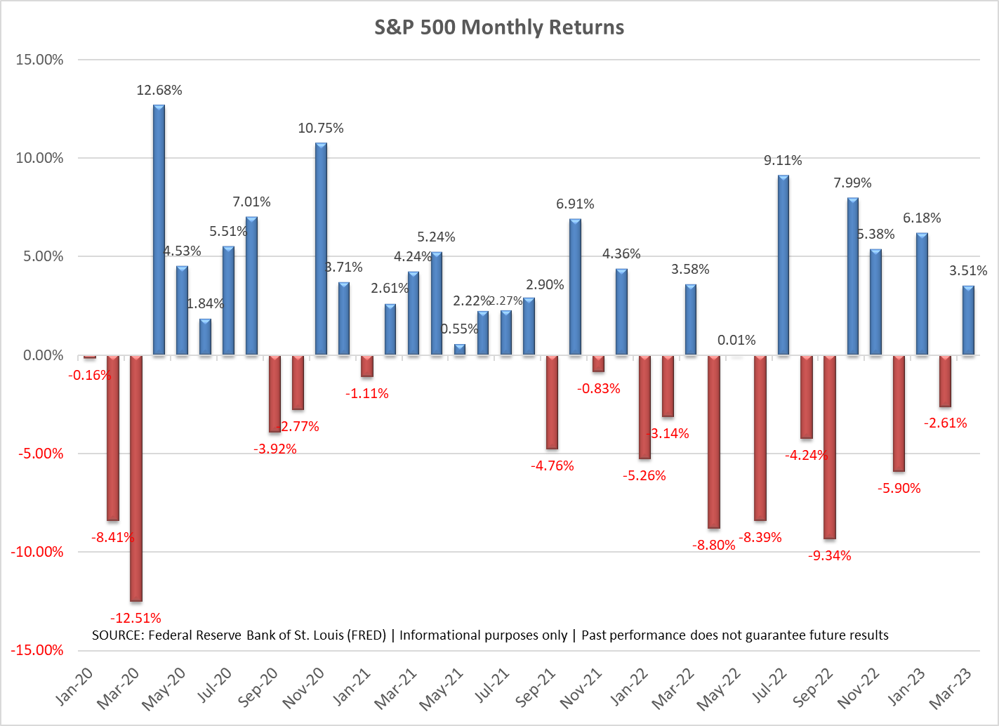
What we saw in 2022 was an interesting phenomenon – earnings estimates (and ultimately earnings) fell by 10%, but the multiple only fell by a couple of points. The expected earnings from 2022 were simply shifted to 2023 and the multiple remained well above average and at a level we'd expect to see in a growing economy.
Despite the hope and euphoria, stock prices are showing signs of strain and unless we see the miraculous "goldilocks" economy, earnings are not likely to hit the rosy projections currently priced in. The stock market is up on average nearly 70% of the months (8 out of 12), so when you see a chart of returns like this, it is typically a sign of stress in the economy.
Manufacturing orders screaming recession
When I developed my economic model in 1995, back when I had to go to the library to get the updates, I noticed how long it would take to get updated data. Often times you'd have to wait 2-3 months to learn what was happening with the economy. Even when I mechanized it in 2001 when the Federal Reserve Economic Database implemented some major upgrades, there was still a bit of a lag. I wanted a model that could get more real-time updates to help speed up the economic signals.
This is one reason I love the ISM data. We know the first day or two of the month what the prior month's readings were. They have proven to have a strong correlation to the data we eventually receive the last week of the month. In addition, I love the simplicity of the data – if it is above 50 it indicates a growing economy and below 50 a contracting one. Finally, they include subsets of the data to give us even better methods of forecasting the economy.
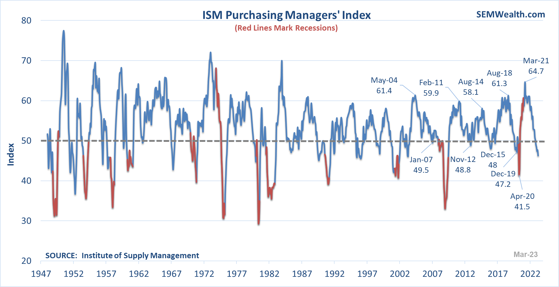
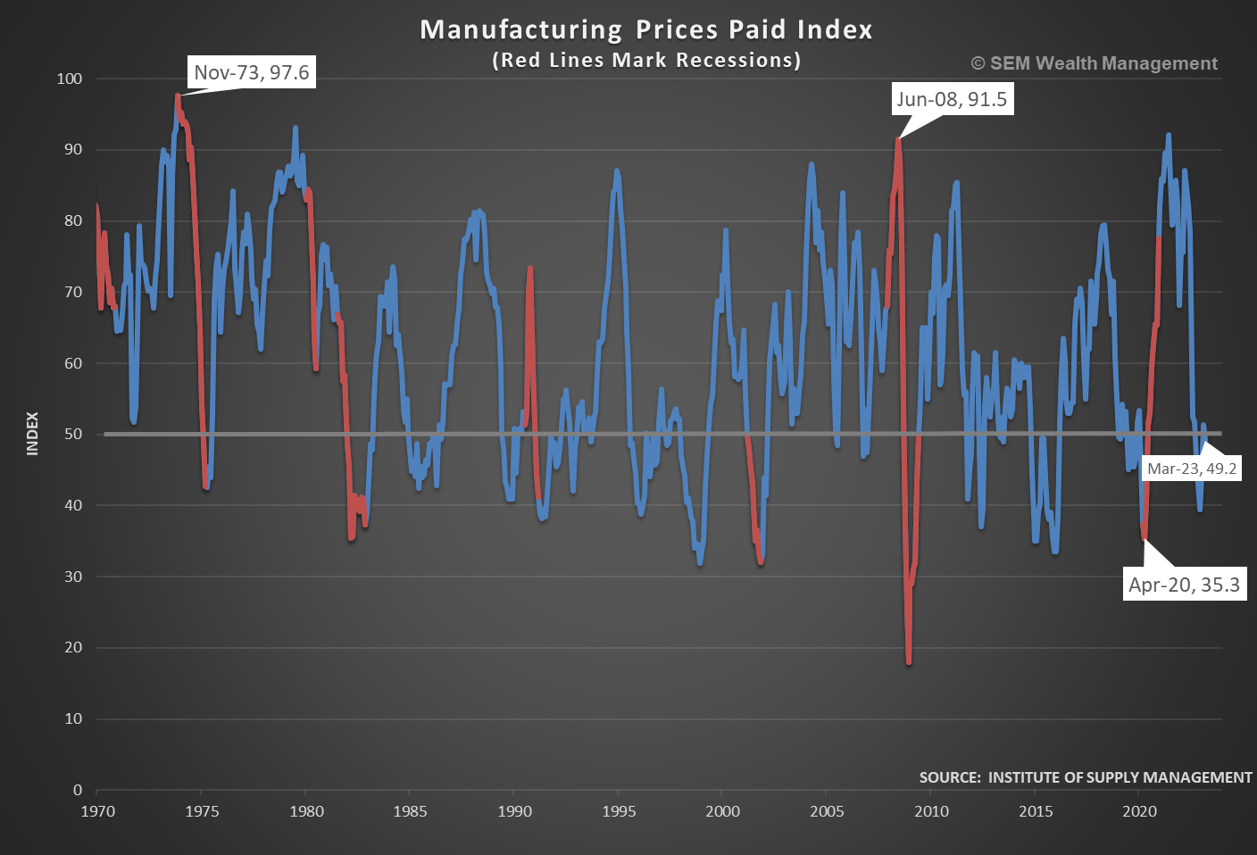
The ISM Manufacturing data is not looking great for those of you hoping for a "goldilocks" economy. The overall Index remains in "contraction" territory.
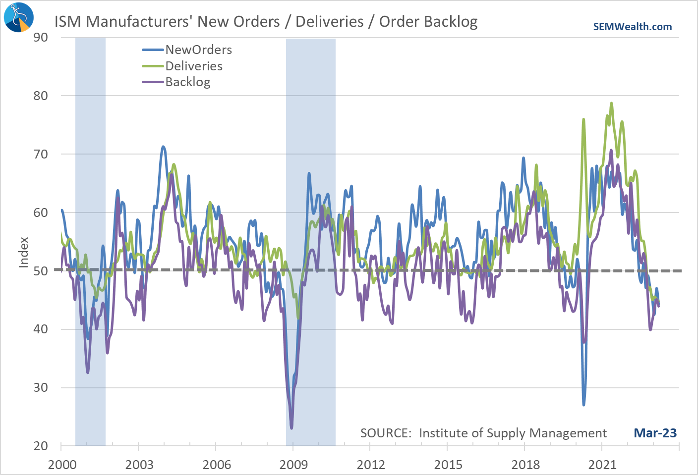
The sub-components also remain below 50.
Even on the inflation front, we're not seeing much of a slowdown in prices, with the prices paid indicator right at the neutral line. The hope would be a slowdown in manufacturing would lead to a big drop in prices, which could alleviate inflationary pressures.
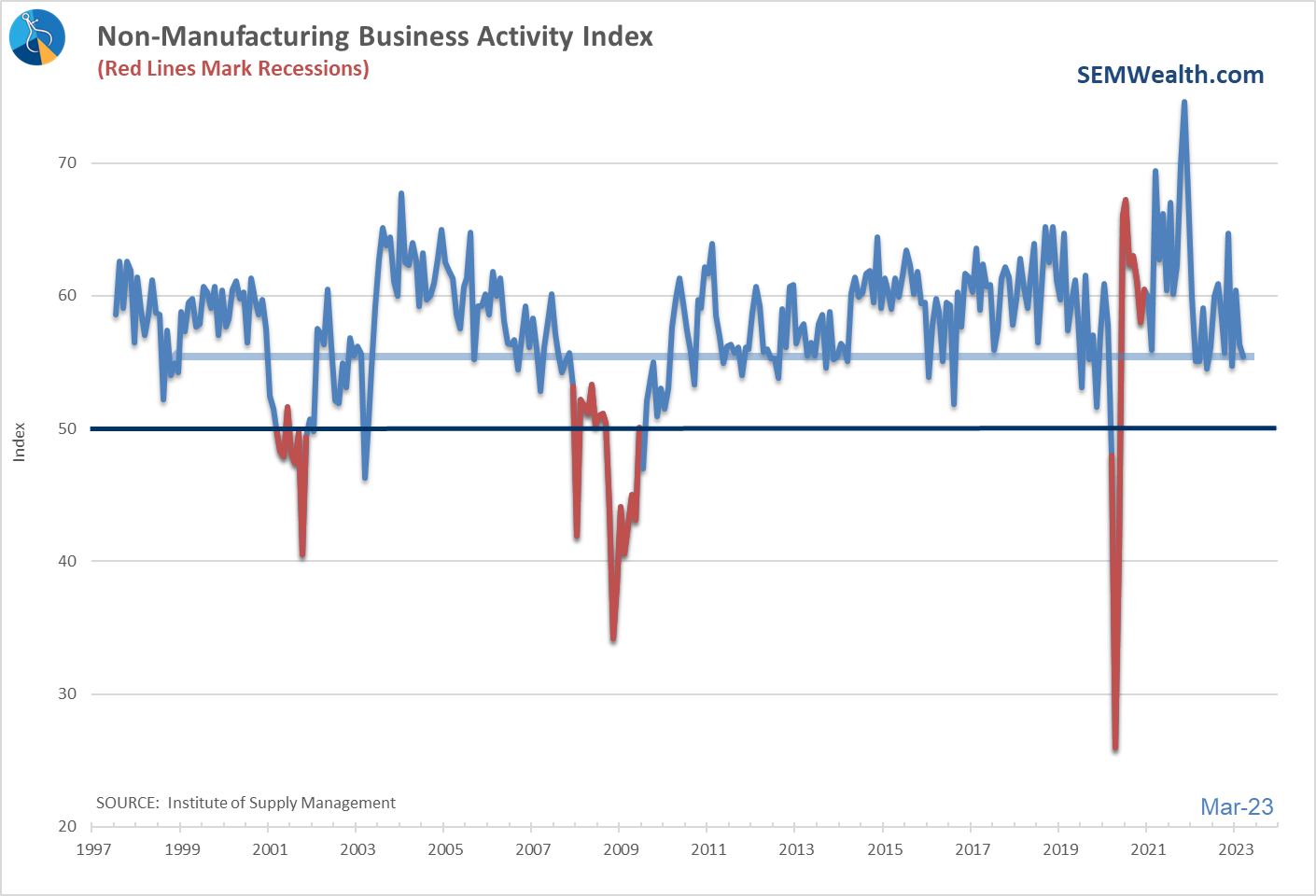
Services weakness a growing concern
Over on the services side, while the indication remains above the 50 level, the direction of the index has raised a red flag for our model. Service business (and jobs) are "easy come, easy go." It doesn't take much for consumers to suddenly stop spending money on services, which is why our model is flashing red.
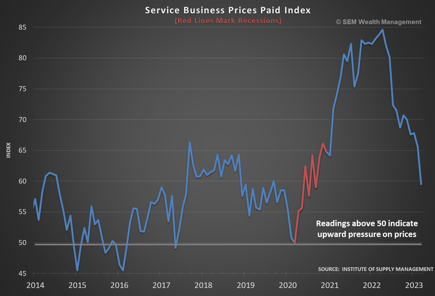
Services inflation has been a problem for the Fed as well. The price increases we've seen over the past 9 months have kept inflation uncomfortably high. While the direction of these pricing pressures is encouraging, note how far above 50 the index remains.
Improvement in housing?
The most obvious beneficiary and now victim of the Fed's policies is the housing market. When they pushed short-term rates to 0% and long-term rates came down to historic lows, we saw a huge spike in demand for housing. That has obviously been reversed and we saw building permits plummet.
The chart below may look like an improvement, but if you look at the axis on the left, you can see we are still down about 18% from a year ago. I guess you can describe it as "less bad".
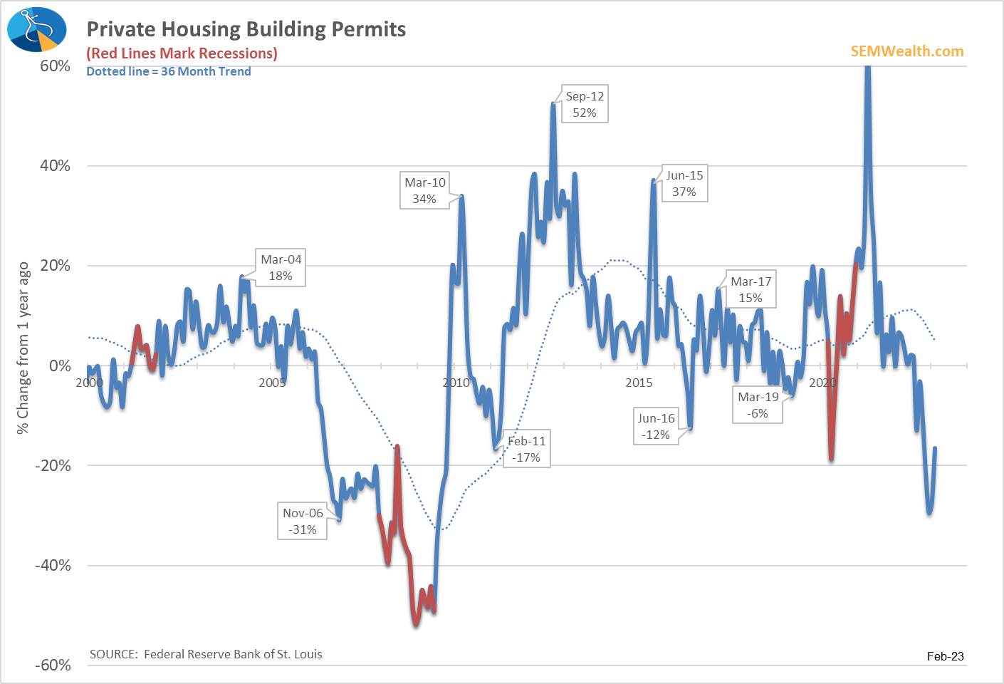
More importantly, when we look inside the data, we see the growth was actually in the multi-family segment. Long-term that's a very good thing as we saw during the latest housing boom a shortage of affordable rentals for younger and middle class Americans.
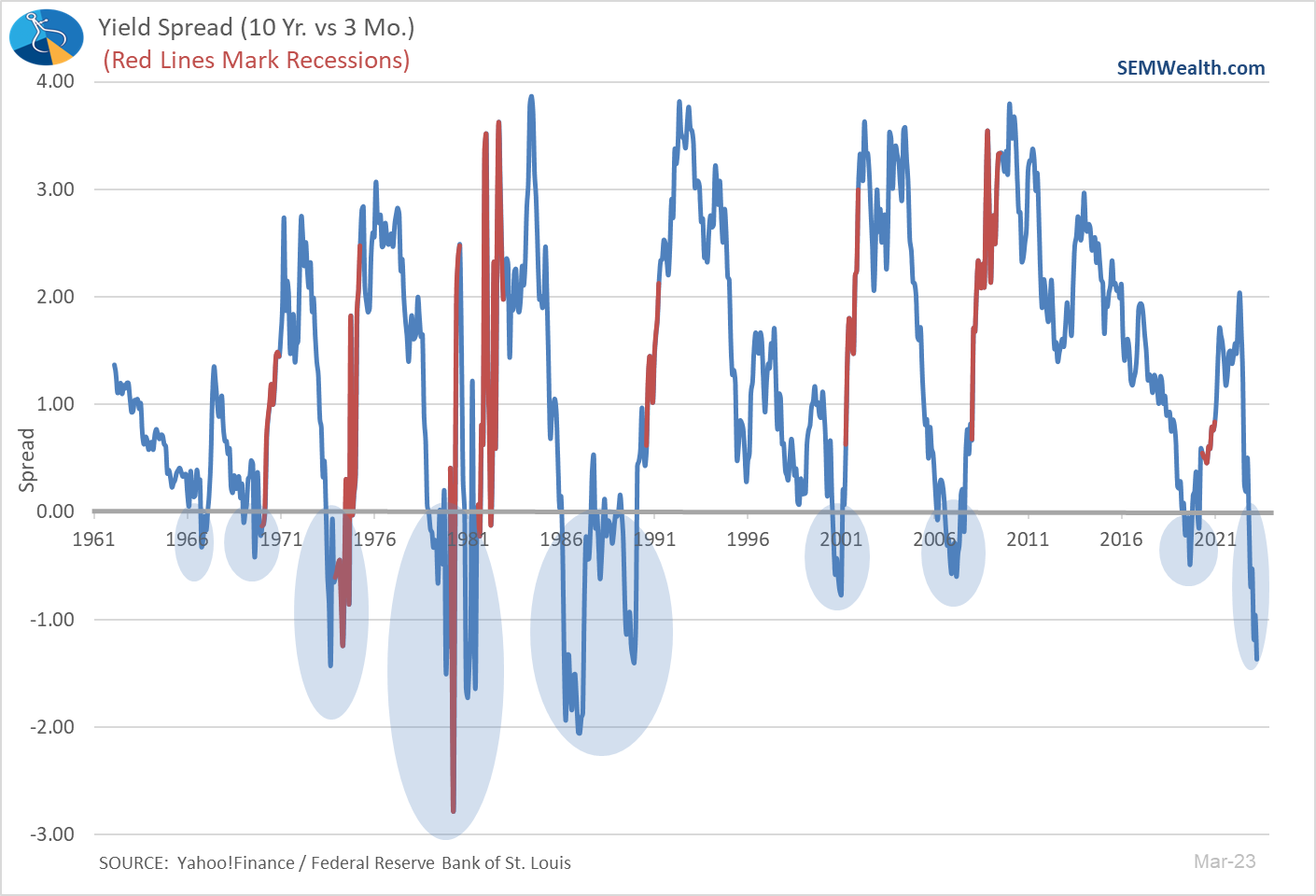
Yield Curve Still Negative
We showed this chart last week and discussed some of the reasons why this is such a dire indicator for the economy.
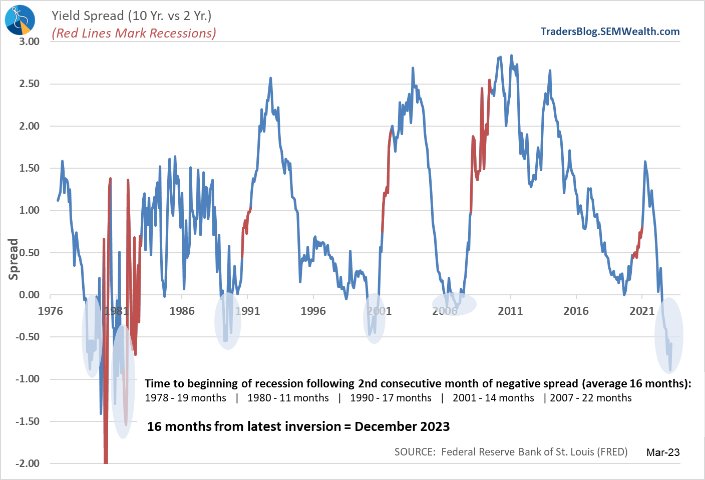
If you look closely, the 10-2 year yield spread improved slightly last month. However, the 10 year - 3 month spread actually worsened. With the big drop in long-term interest rates last week, this will put even more stress on banks and the overall economy.
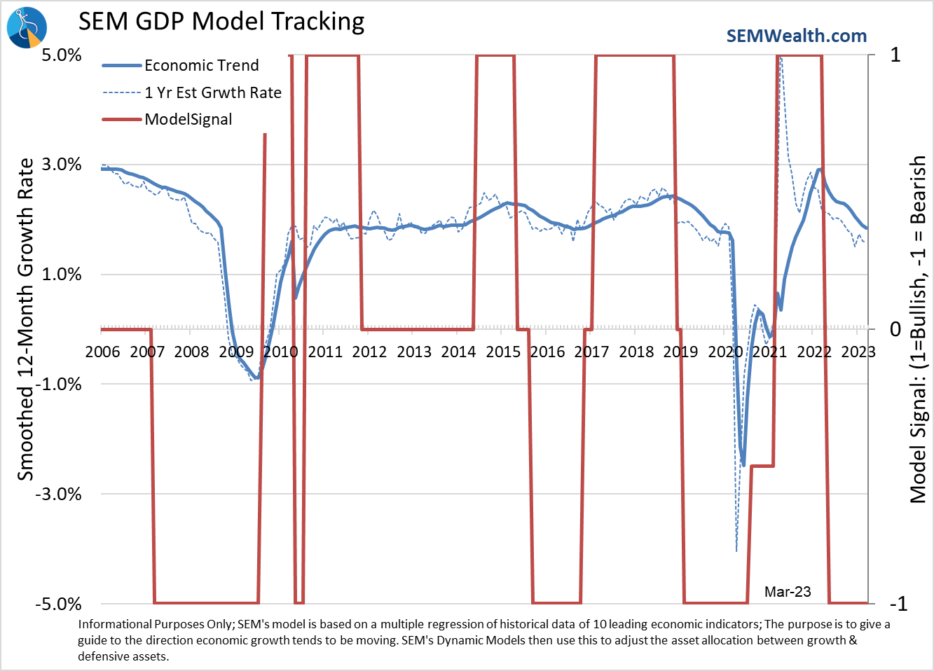
Model Still Bearish
This is the one-year anniversary of our economic model moving to a "bearish" signal. As a reminder the model doesn't make recession calls, but rather indicates a change in "mode" for the economy. In theory, a decline in expected growth should lead to a decline in expected earnings, which would lead to a decline in stock prices. This should lead to institutional investors reducing their allocations to stocks. The same thing (usually) happens in reverse.
As it stands, it looks like our Dynamic models will remain in their "bearish" allocations a bit longer.
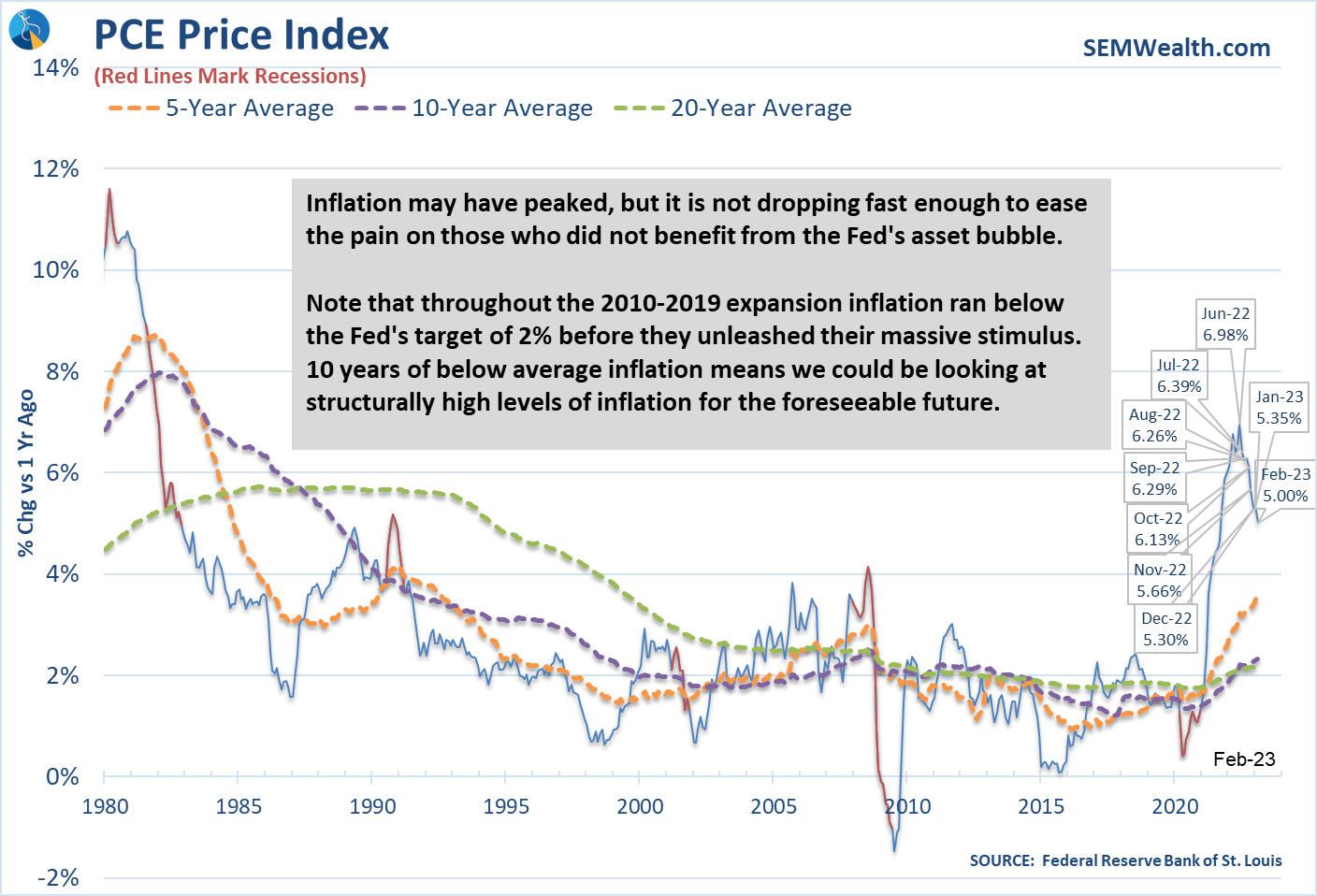
Inflation still too high
While the economic growth rate is most certainly declining, it is not enough to say with confidence we will see inflation low enough to warrant the Fed ending their tightening cycle. This chart can be used as Exhibit 4 when we look back at how the Fed has failed us.
From 2010-2019 the Fed tried to get inflation to a more health 2-3% level and failed. They constantly told Congress monetary policy could not stimulate economic growth enough and they needed FISCAL policies to do the heavy lifting. When Congress and the White House unleased unprecedented fiscal policies, the Fed kept their foot on the gas.
Inflation has certainly come down, but it is still too high, which is a problem for the Fed.
What's next?
The stock market had its first down week since early March (which given the banking crisis is impressive). The steep uptrend still remains in place. As we've seen during this bear market, the uptrends have been a good time to reduce risk exposure, not to add to it, especially given where our economic model currently stands.
More importantly, stocks are not anywhere near a level you would consider attractive if you followed a disciplined, data driven approach. Earnings are likely too high, which means the P/E multiple also needs to come down. Having money on the sidelines earning 4.5-5% (current money market rates) is comfortable. I'll start getting excited when we see the P/E ratio drop to more normal or preferably below normal levels.
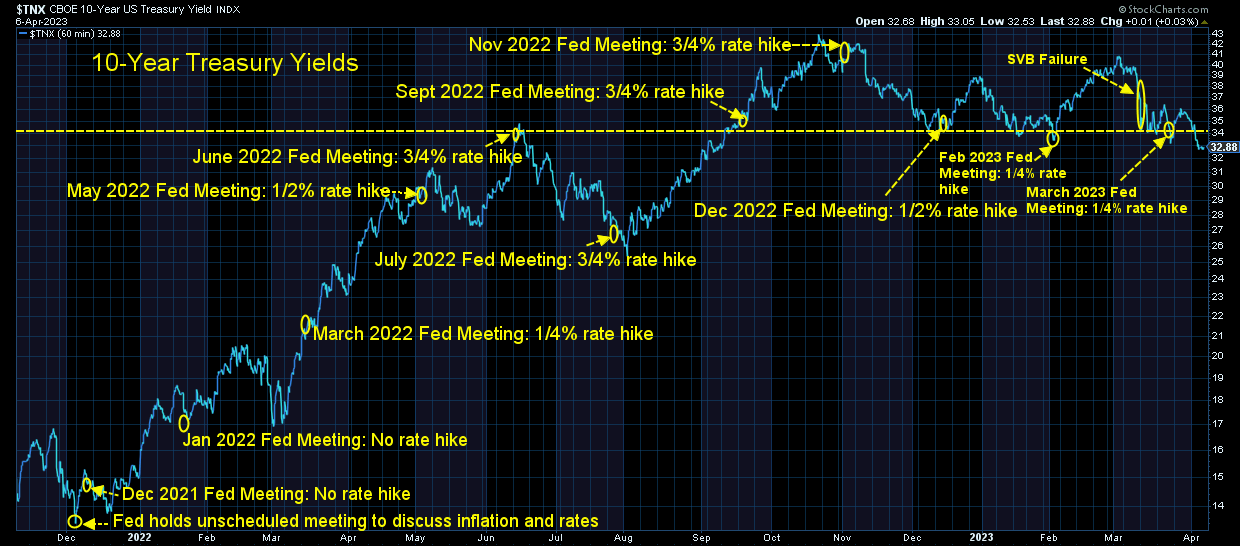
Looking at the bond market, the 3.4% barrier in 10-year Treasury yields was broken with authority last week. Is this the end of the bear market in bonds? Will Treasury bonds finally provide some downside protection against stock losses? Time will tell, but some of our correlation numbers have reverted to more normal readings, which is a good sign for SEM's models.
We did receive a buy signal in one of our high yield bond models last week. The others have not yet triggered but could early this week.
At the start of the year we saw the "core" components of AmeriGuard & Cornerstone move out of Large Cap Value and into Small Cap. Small companies had finally picked up some momentum in the last part of 2022 and appeared primed to take the lead. This was true for the first 6 or 7 weeks of the year, but as the banking crisis took hold we saw small caps get crushed (note the sharp drop in the red line below).
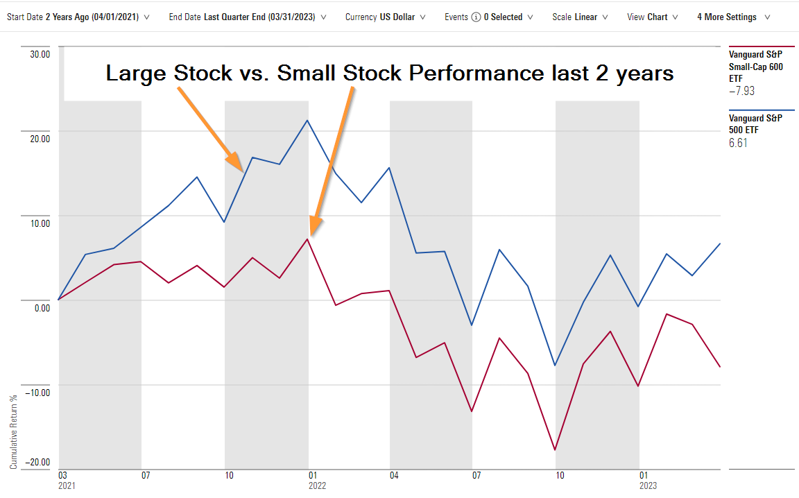
We've rotated back out of small caps and are now slighlty overweight large cap growth. We also kept our small international stock position. Our trend models remain half invested, with the other half of the money sitting in money market. (As an example, AmeriGuard and Cornerstone Growth have a 100% target allocation to equities, but are only 85% invested currently).
It's certainly been an interesting start to the year to say the least, but we are grateful for our data-driven quantitative systems which remove all subjectivity and emotion from the investment decisions. We could make a case for the markets to move sharply in either direction. A lot of what actually happens will depend on the economic data, whether or not there are more issues in the banking system, how much collateral damage there has been to the non-banking financial system (insurance companies, pension plans, hedge funds, private equity funds, money market funds, etc.), and how the Fed decides to act.
This will require discipline, patience, and perseverance to succeed, something we've shown over and over again the past 30+ years.
Follow us on social media
While I still prefer to read my news, not everyone does. In order to get more people to see what we view is valuable, common-sense content, we've been posting more short-form videos on social media.
April is financial literacy month. We plan on posting a ton of content all month, so please follow along, share anything you think more people need to hear, and send us any ideas on topics you'd like covered.
You can find all of our content here: