Did you miss our SEM University today? This presentation is near and dear to my heart because when I was in school, I struggled with economics classes. Our hope with this presentation is that we can help our advisors and clients understand how the economy works.
Long story short, humans don't act the way economists think we're going to act. In this webinar, I first explained how our brains work which will influence how we make decisions and interpret data. Then I discussed what truly moves the economy and what we're currently seeing with the economy as we head into the Fall of 2023.
Here's the full presentation:
Here is the Q&A session:
[THIS PRESENTATION IS FOR INFORMATIONAL PURPOSES ONLY. PLEASE CONSULT WITH A FINANCIAL ADVISOR PRIOR TO ACTING ON ANY INFORMATION CONTAINED IN THIS VIDEO.]
If you prefer a written version, you can find all the slides from the presentation with a summary.
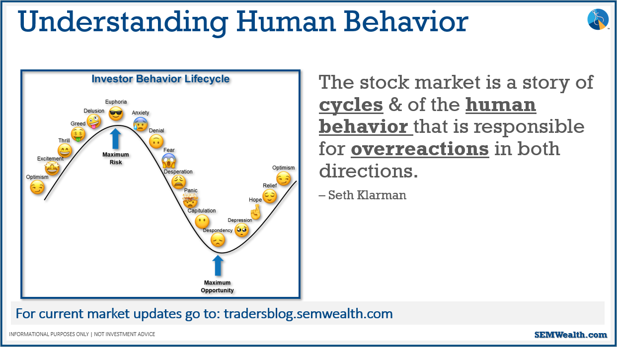
This quote from Seth Klarman is used in almost all of our presentations. Humans tend to overreact when things are really great and when things get really bad. We'll see both humans and eventually the stock market go through these emotions.
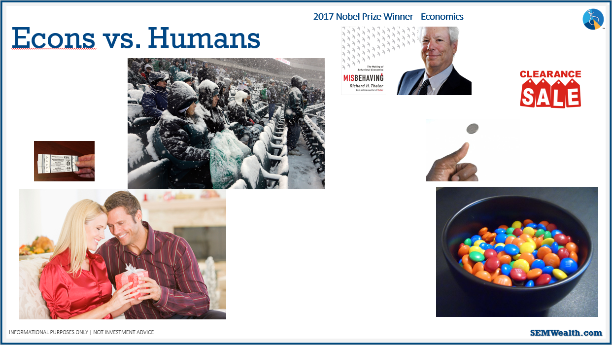
In Richard Thaler's book, Misbehaving, he determines why economists models don't work – they make assumptions that humans are perfectly rational, when in reality, humans are irrational. Here are some things Richard Thaler says people aren't good at doing: putting a value on things and how we spend money; understanding odds/percentages.
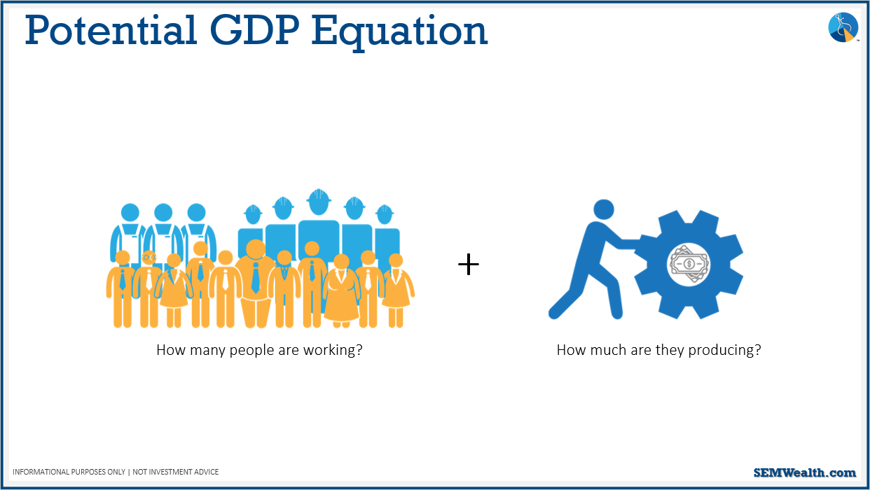
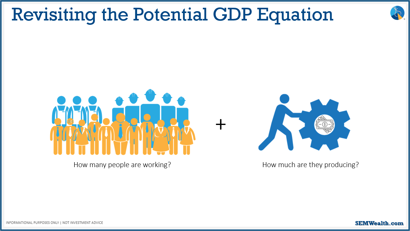
What really drives the economy? The slide shows a very simple mathematical equation that can be used to determine that. When it comes to economic growth, if we want 3% economic growth, we need to grow the labor force and productivity by a combination of 3%.
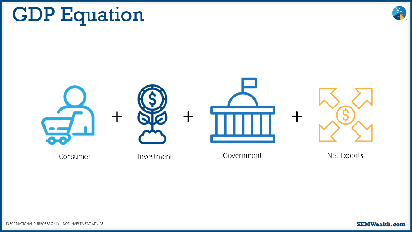
Another important equation when it comes to what really drives the economy is the GDP equation seen in the slide above.
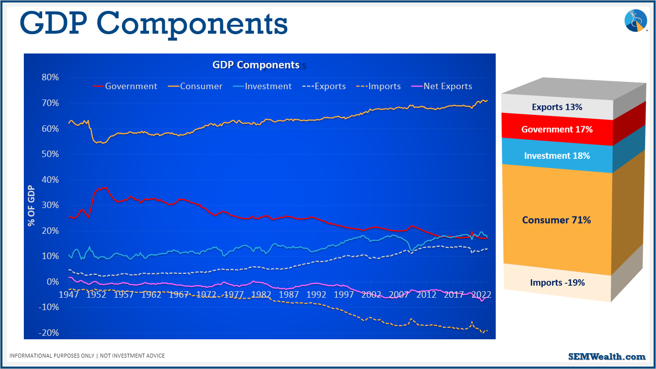
These charts break up the different components of GDP. You can see that by far the largest contributor to economic growth is consumer spending (71% economic output overall). Therefore, we should focus largely on consumer spending without losing track of the other components. In the breakdown on the right, it shows that our net exports is actually negative – our trade deficit, which we will talk about more later.
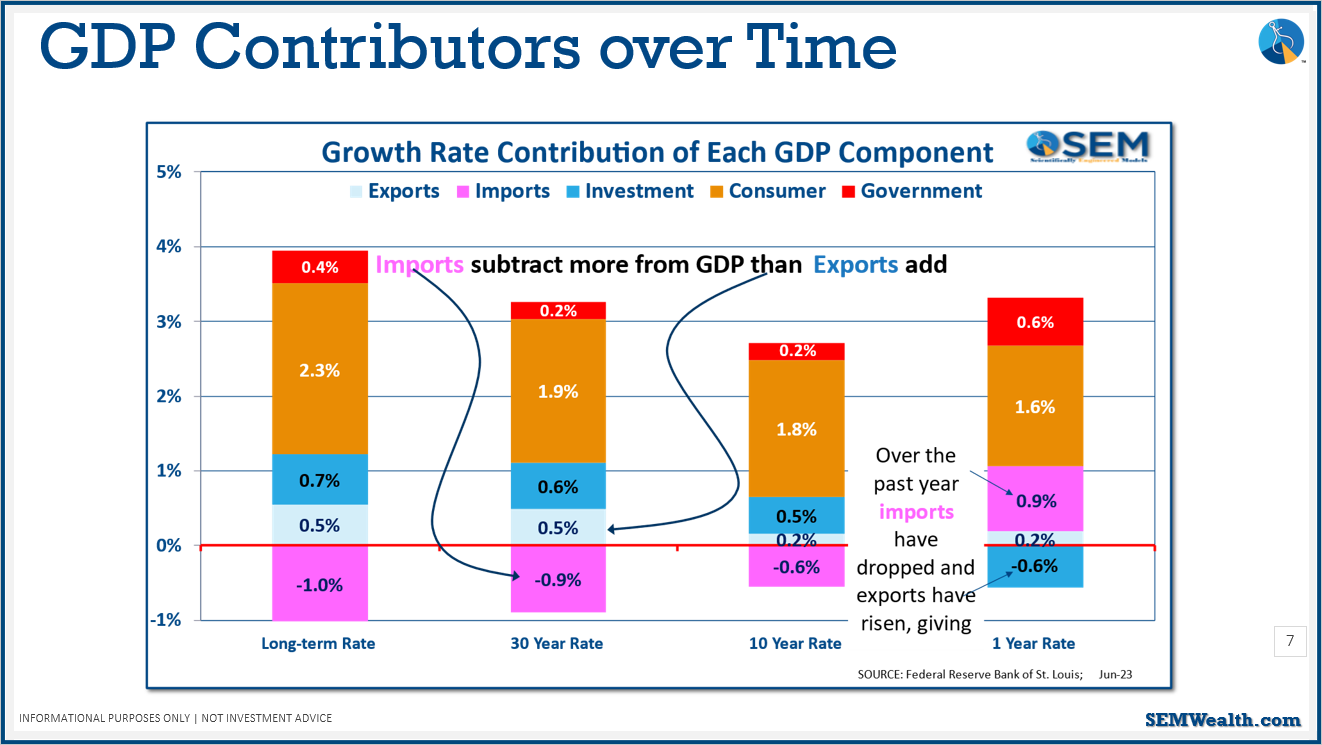
Looking at the above chart, you can see consumer spending is dropping, which we will discuss more later. This chart shows the current economic environment is not the same as we've experienced long-term. The question is, should we overreact to this change or are we going to revert back to normal? According to the data, what we've experienced over the last 3 years isn't normal. It's likely we'll eventually revert back to normal (the 1 year rate on this chart is not normal.)
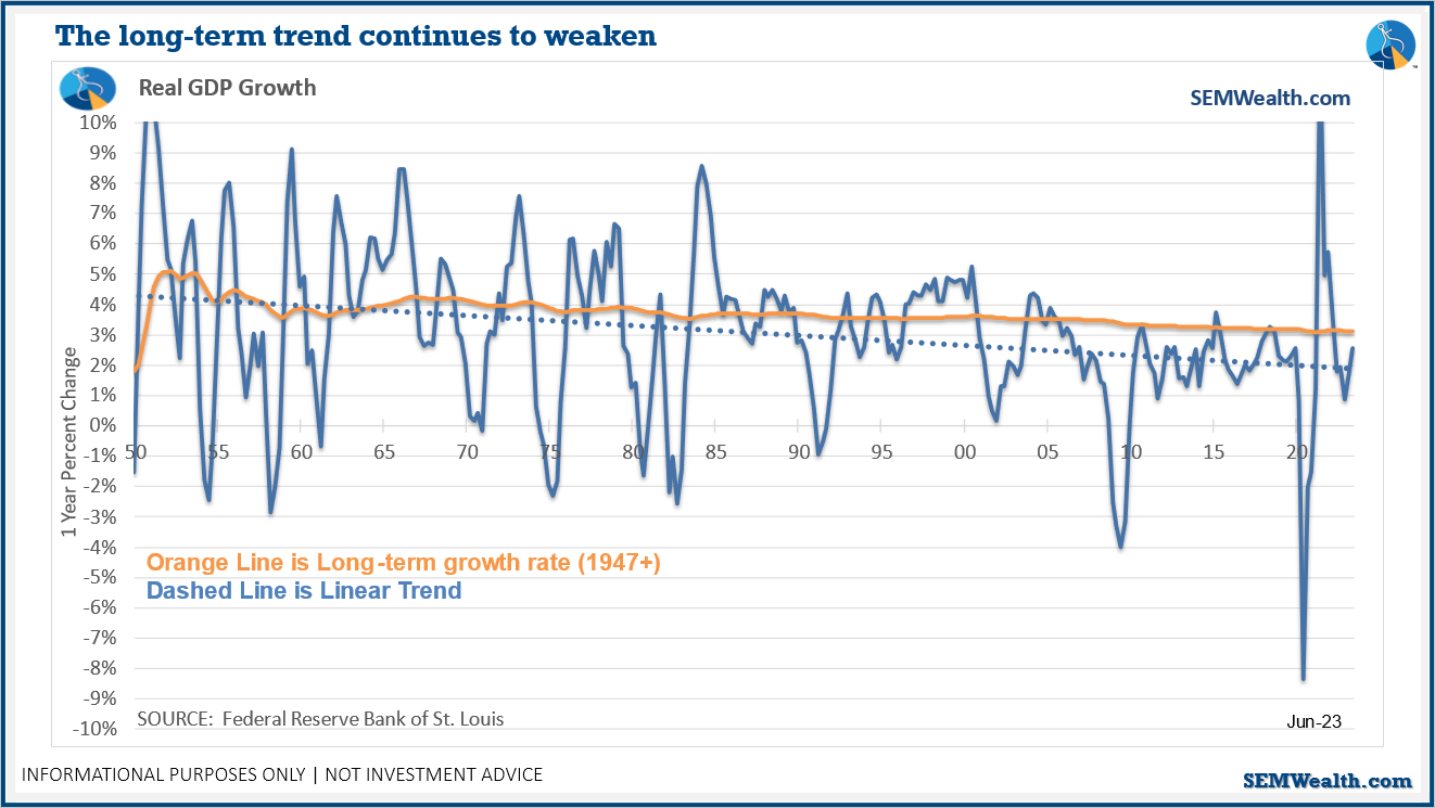
Over the last 23 years, we've rarely eclipsed the long-term average growth rate (the orange line in the chart).
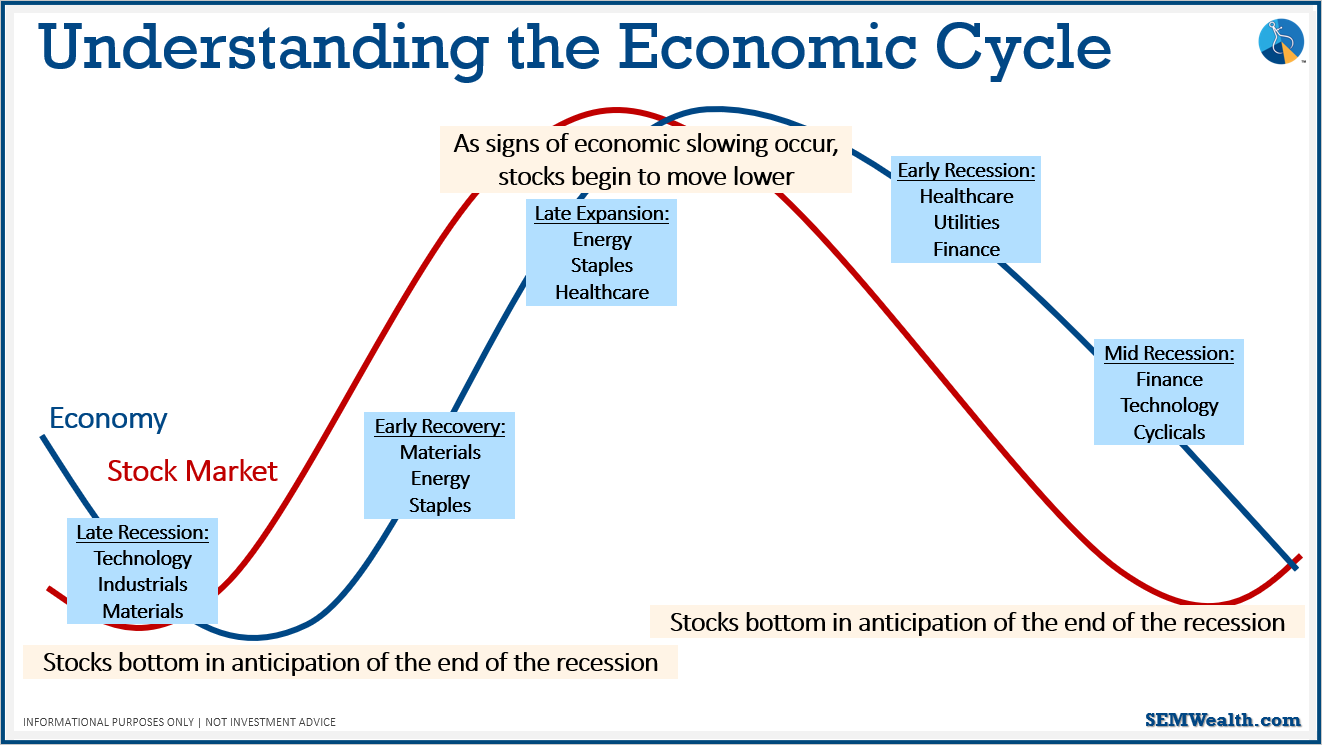
How do we use all this in our investments? Stock market is a forward looking mechanism – it's trying to guess which way the economy is going and allocate assets to the sectors that they predict are going to do well. The stock market tends to turn before the economy does. The slide above breaks down the economic cycle and what sectors tend to be impacted.
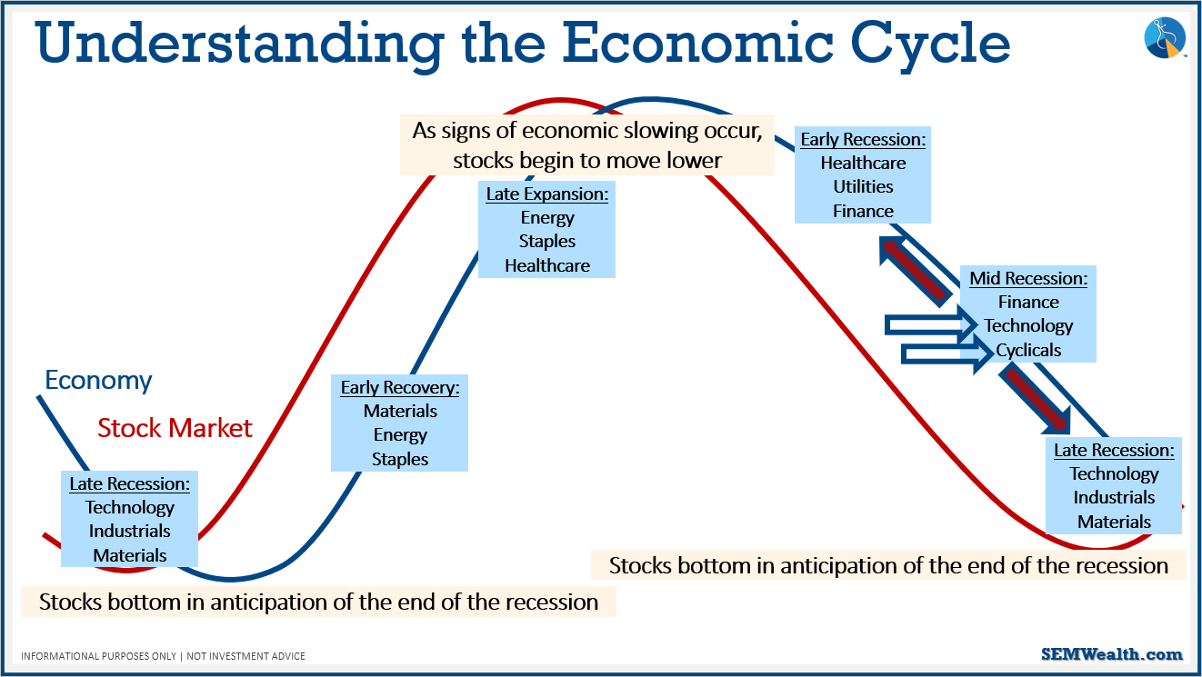
Based on the sector activity, the stock market is saying we're mid-recession, if not turning back into growth. We didn't technically have a recession, unless you use the simple explanation of two or more quarters of a decline in GDP (we had in 2022). In the above graphic, you can see that we have the potential of moving back to the early recession or moving to the late recession.
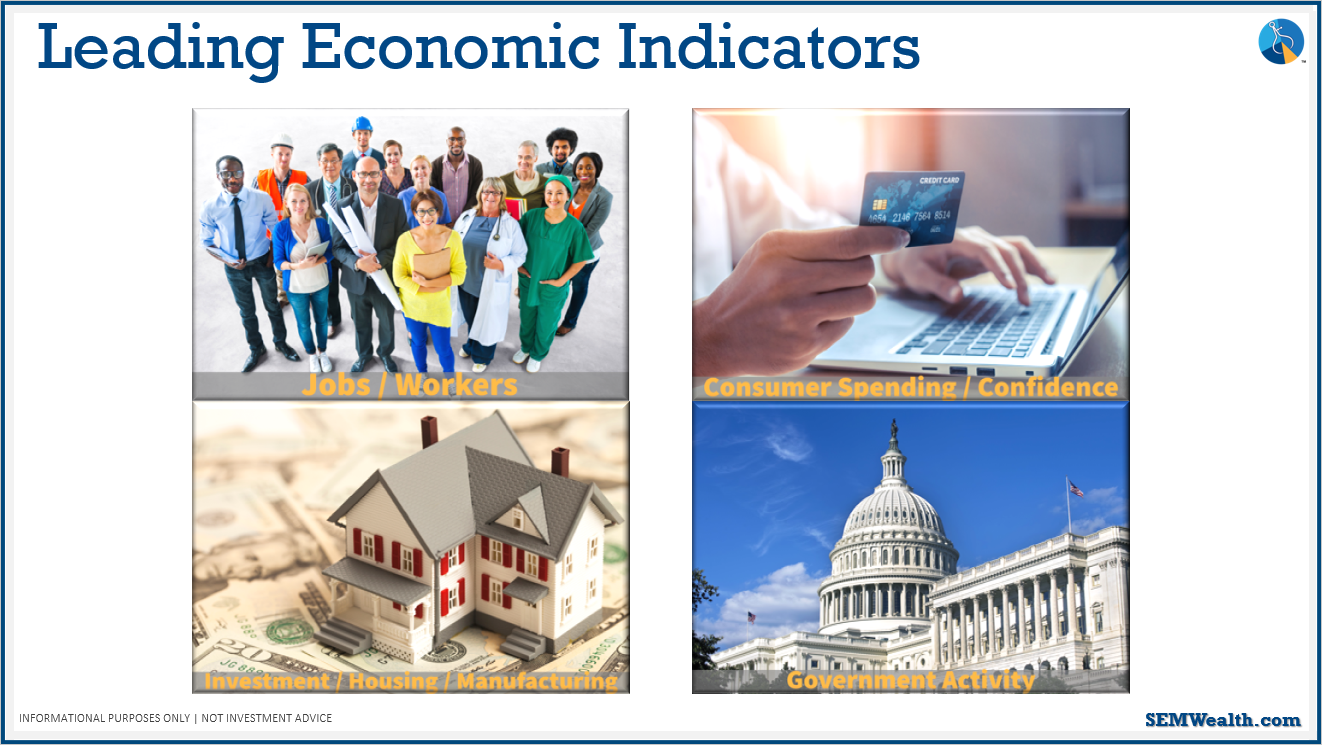
Here are the leading economic indicators, broken into 4 sections. We'll discuss each of them further. Note: all the red lines you see in the charts shared all the slides, show when we went into a recession.
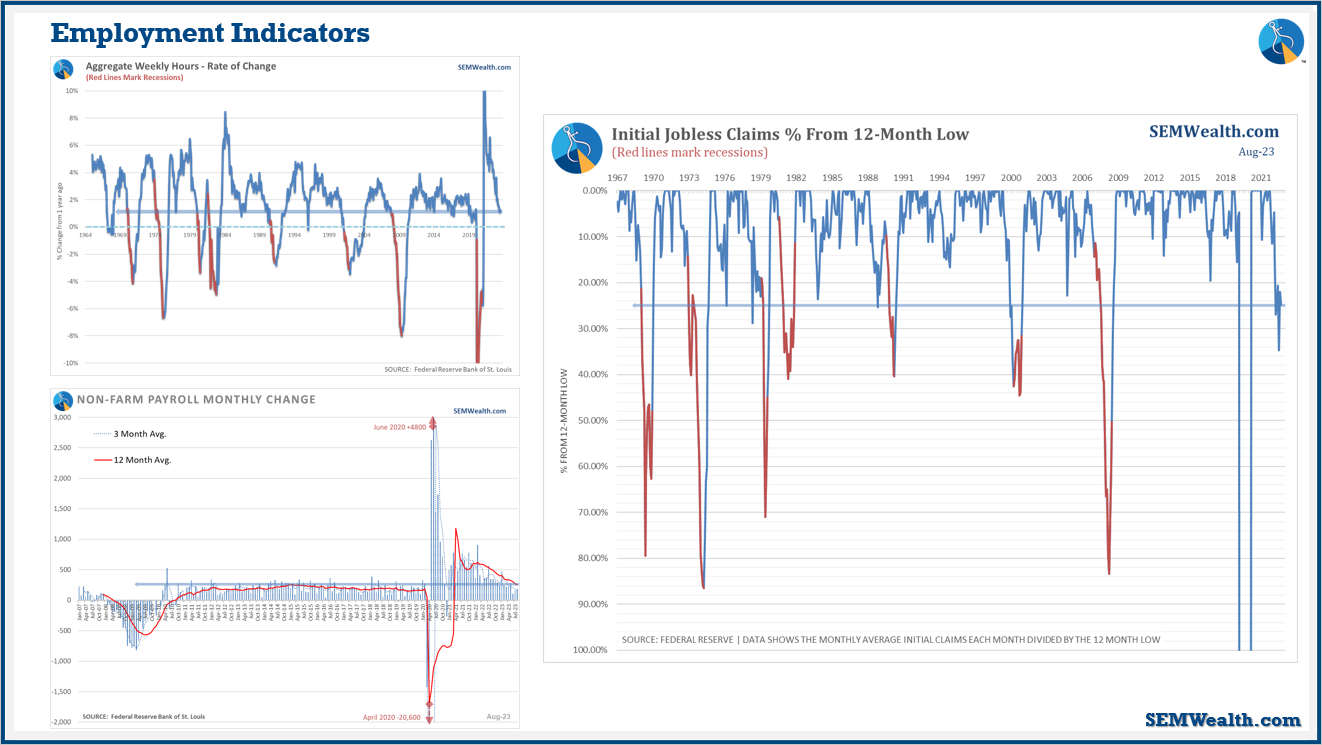
One of the best drivers and indicators of potential growth is the aggregate weekly hours index (top left). It's easier to add or cut people's hours than it is to hire somebody and then have to either lay them off or lay them off and have to hire them back. This chart shows that employers have been cutting hours recently. The chart on the bottom left shows payroll. Right now, payroll has been going down/flatlining, but it's still positive. For now, jobs are still improving. Jobs are what we call a coincidence indicator; meaning, they'll start dropping when we're already heading into a recession. Therefore, it's not that great of an indicator if you're trying to predict where the economy is going. What is a good predictor is shown in the chart on the right: initial jobless claims. As jobless claims go up, that's bad; however, our brains tend to see things going up as a positive. I flipped this chart around to help with how our brains work. Right now, we're in an area where jobless claims are 20% higher than they were twelve months ago – this is a sign of economic strain.
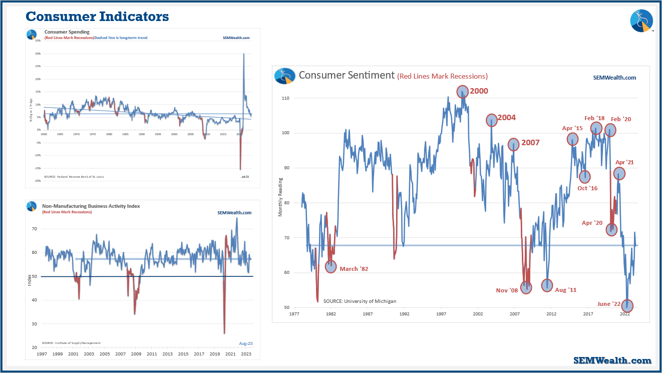
Consumer spending is the largest driver of our economy, and it's continuing to blow away expectations (see top left). What will get people to stop spending money? Probably some economic strain. We've turned into a service economy. You can look at where consumers spend their money, and it's on services. The indicator shown in the bottom left basically tells us if it's over 50, it's an indication of expansion; if it drops below 50, it's an indication of a contraction. Right now, we're still strongly in expansion territory.
Consumer sentiment (shown on the right), is very interesting because consumers overall are extremely pessimistic. In the long-term, if consumers are not optimistic, they're less likely to spend money, which is a red flag.
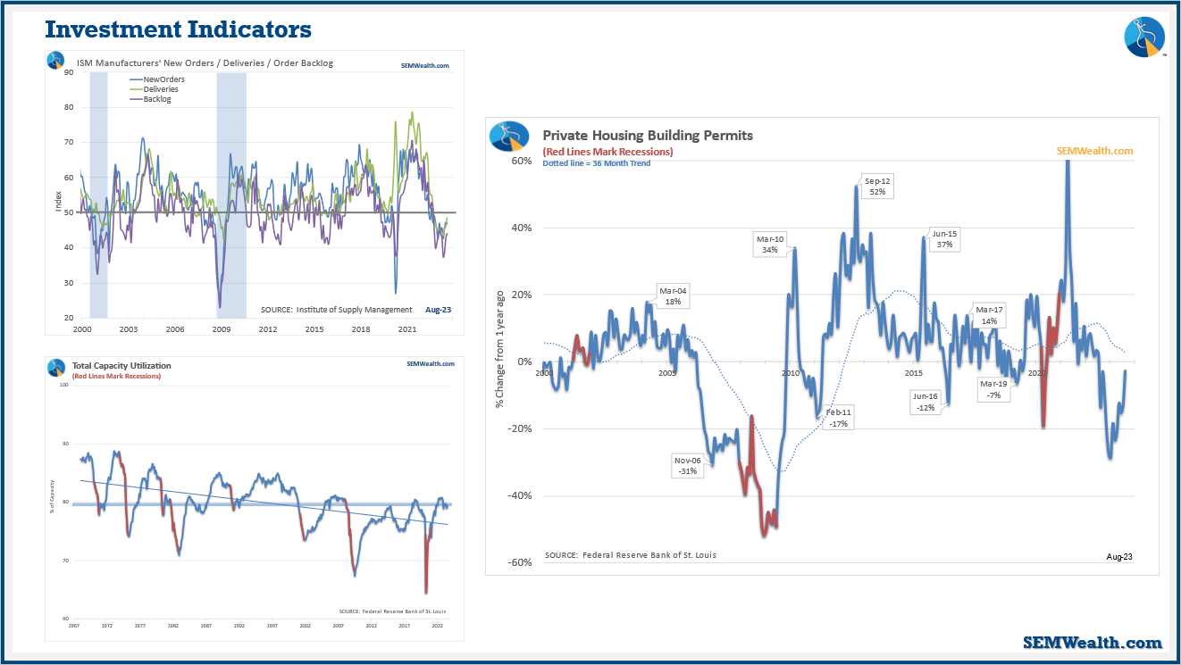
We're not a manufacturing economy anymore, but it's still about 20% of our economy. Right now, we're going through a trend where we're reshoring jobs and production, so manufacturing is going to become a bigger player. All of our manufacturing indicators (shown in the top left), are pointing to weaker growth – in this chart, any number below 50 is negative. Capacity utilization (bottom left): are we investing in more growth? After COVID, we saw a growth, but now it's starting to flatline to the point of manufacturers are not using their full capacity.
The biggest one of the investment indicators is building permits (chart of the right). This shows the planned number of houses that are going to be going up – kind of like a leading, leading indicator of economic activity. It helps produce more jobs and spending, including the increased spending after someone purchases a house (new furniture, yard work, etc.) Even though the numbers have picked up over the last year, it's still negative.
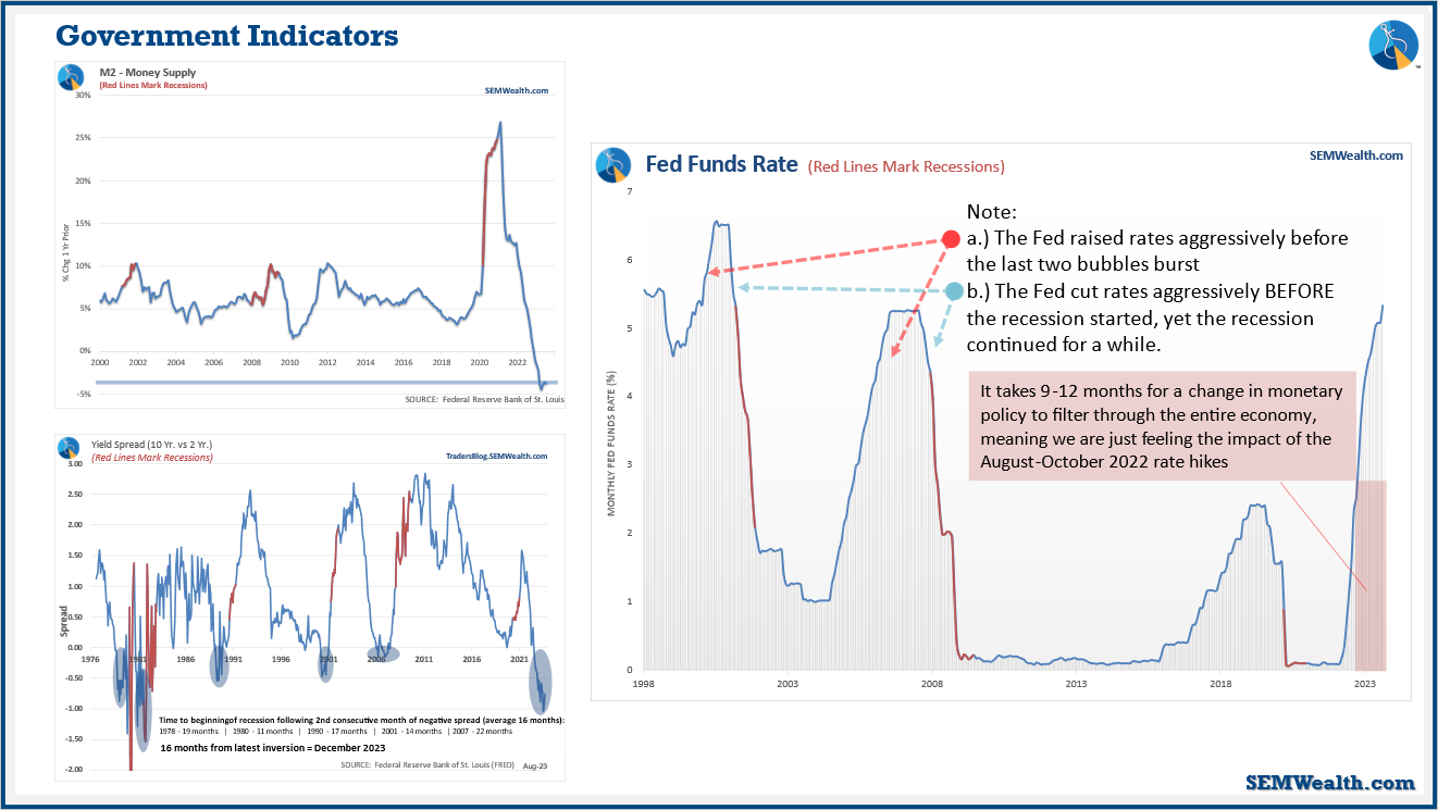
Government can be split into two things, but I'm mainly going to talk about the Federal Reserve because they can tweak the economy faster than Congress can. First off, money supply is shrinking (top left) because we had such high inflation that the Federal Reserve is trying to take money off the table. The yield curve (bottom left) is really important to understand. When the yield curve inverts, it starts to slow down the economy and it gets difficult to get a loan because banks aren't willing to take risks. There's a 16 month lag from the time the yield curve inverts two months in a row to when we get into a recession. Looking back, that means the end of 2023 is when we're heading to a recession (based on this data).
In the chart of the right, I break down a couple scenarios with the Federal Reserve. We're just now feeling the impact of the August-October 2022 rate hikes. It's going to be very hard for the economy to grow with the rates the stock market is expecting.
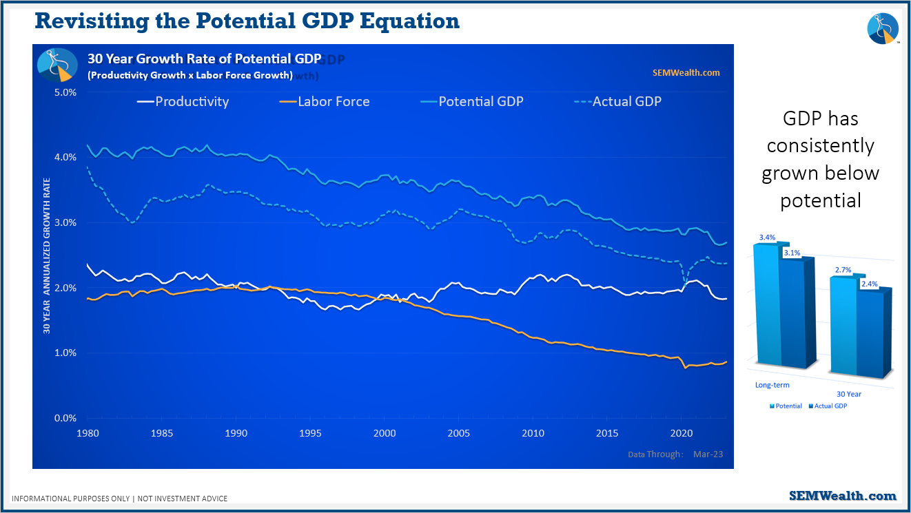
You can see in the chart, that the potential GDP (used based on the equation in the previous slide) and actual GDP don't line up – meaning, the potential GDP equation doesn't actually work. This is because in the equation, it's assumed that everything is rational and there aren't other outside factors, which isn't the case.
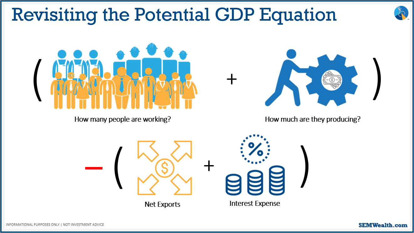
This is how we need to change the potential GDP equation. If we run a trade deficit and budget deficit where we have to pay interest, money leaves the U.S. to other countries to pay for their goods/services or to pay investors who loaned us money to finance our budget deficit. This is why we've lagged long-term potential GDP growth – our two deficits.
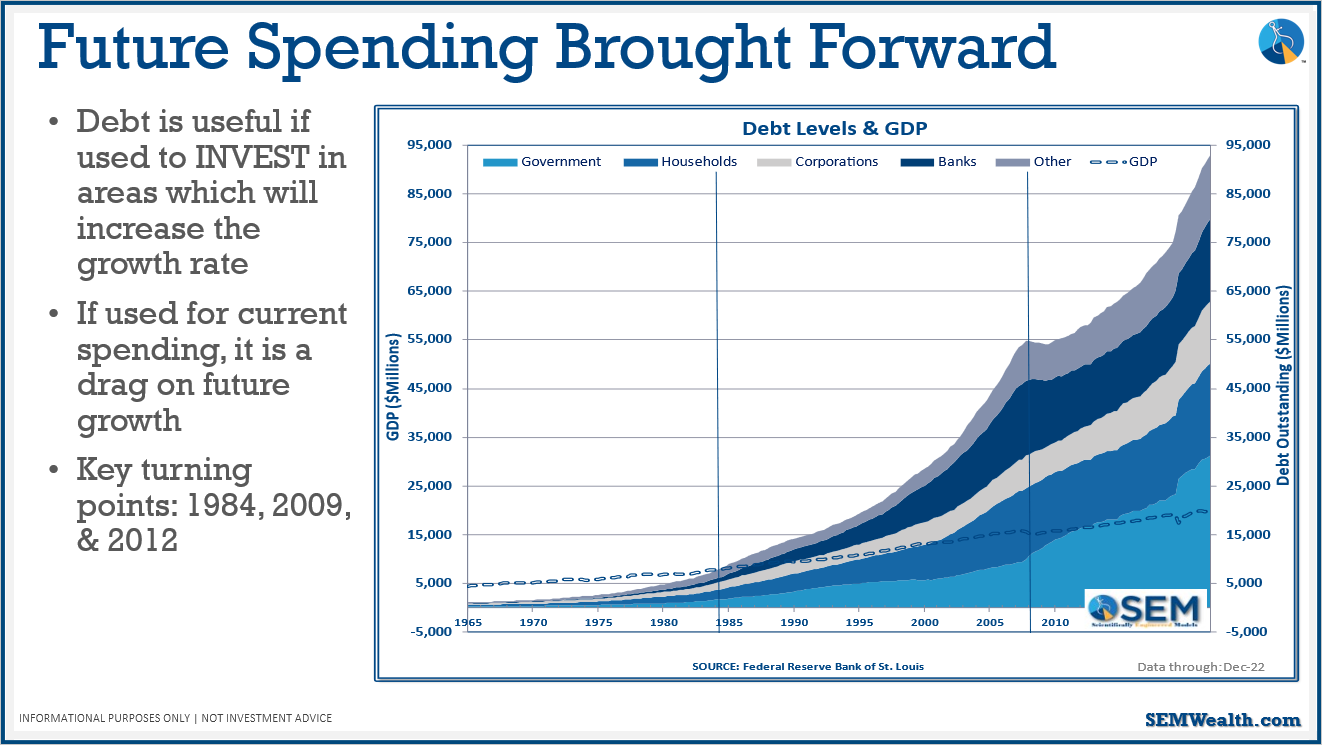
Some key turning points shown in the above chart:
1984: first time total debt in the US exceeded economic output
2009: level of debt went ballistic
If the spending isn't putting more people to work or making them more productive, it's shrinking the growth rate of the economy.
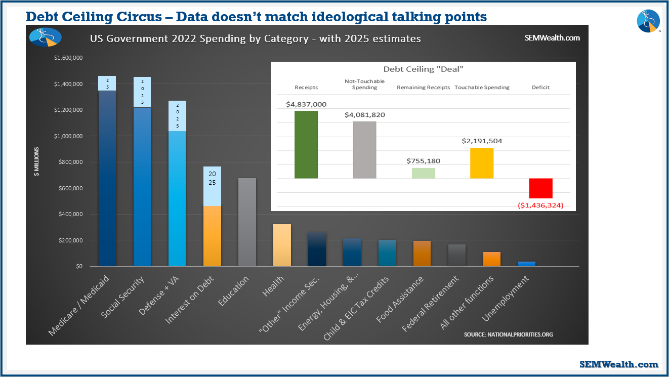
The three "untouchables" are Medicare/Medicaid, social security, and defense spending (+VA benefits). This chart shows why this is a problem – the untouchable money adds up to $4Trillion while we're only bringing in $4.8Trillion. Social Security and Medicare are a problem because they don't put more people to work and they don't make people more productive; therefore, it's a drag on economic growth.
Also shown on this chart is by 2025, interest on debt is going to be our 4th largest spending category. Things are only going to get worse the more money we borrow.
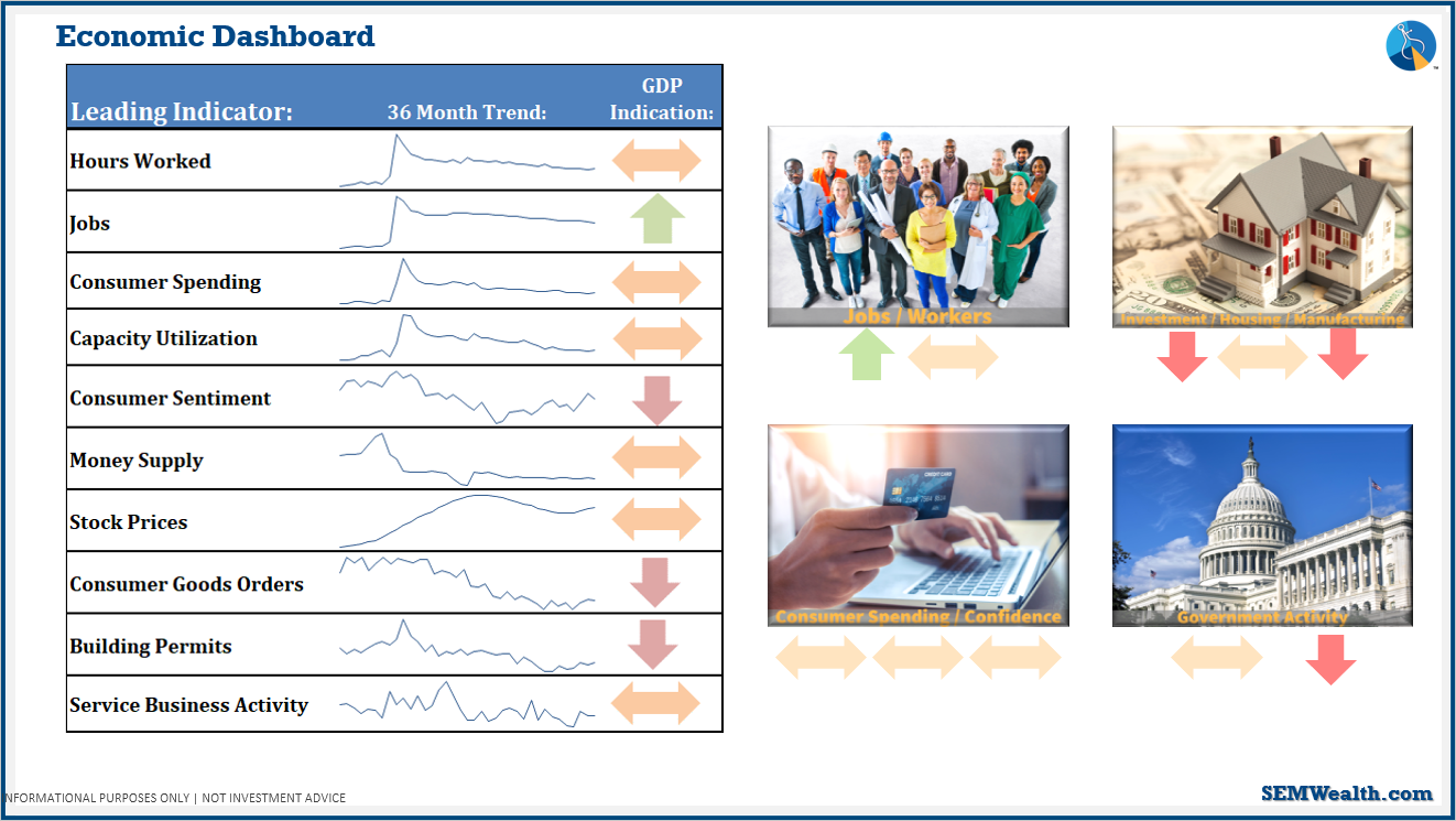
Above is a summary of all the economic indicators discussed:
- Number of jobs are still looking good; aggregated hours are tending to slow down.
- Investment/housing/manufacturing: most indicators are negative, one of them is flat.
- Consumer spending, while spending is still aggressive, sentiment and spending levels are coming back down.
- Government activity is also slowing down.
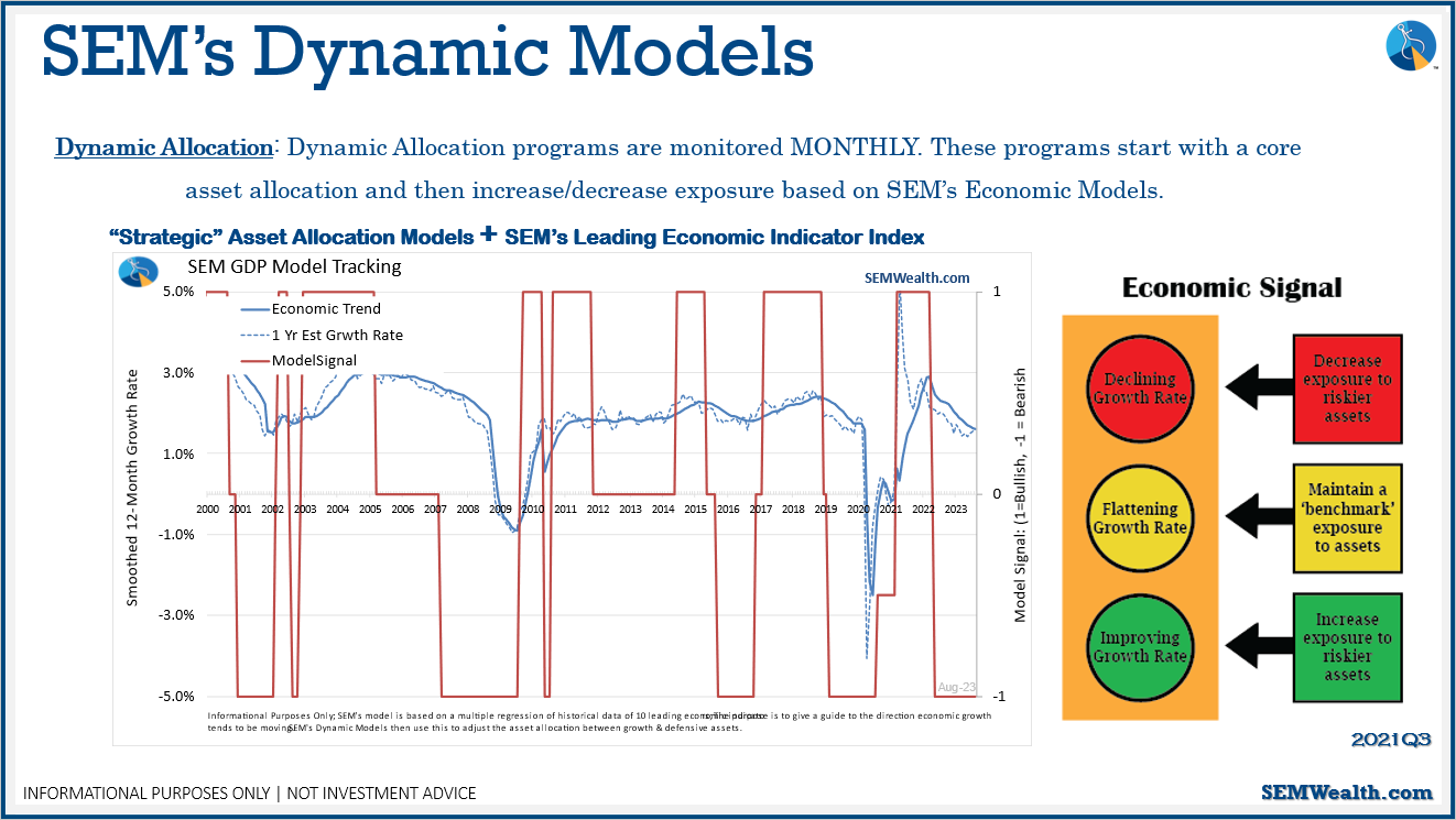
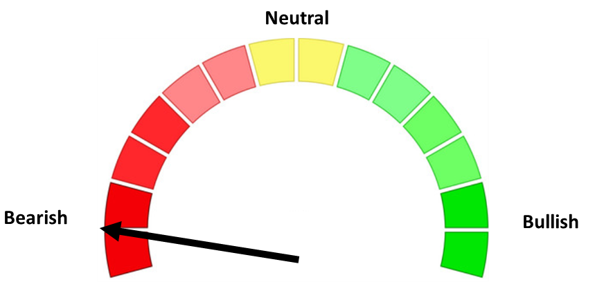
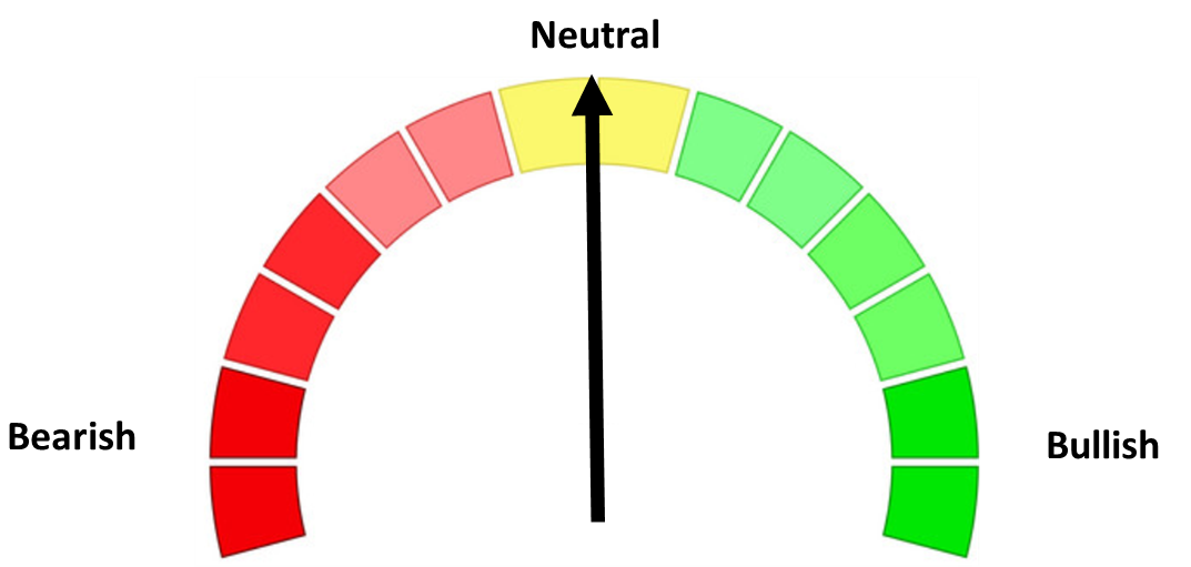
Based on the indicators, our economic model is saying it's bearish. While not an outright recession, the economy is slowing.
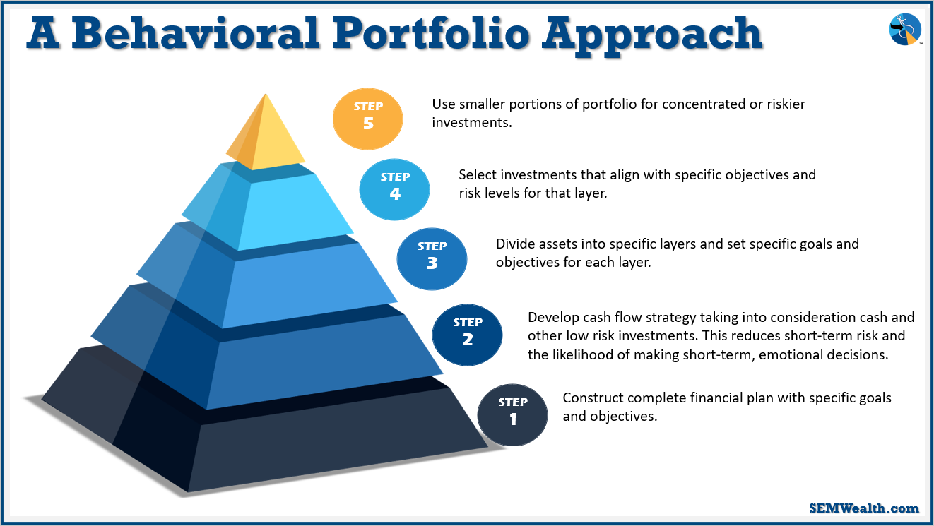
How does all this apply to you whether you're a financial advisor or a client with SEM (or someone else)? We need to understand and base every decision from the standpoint of your financial plan and your cash flow strategy.
Contact us if you're not sure you have this approach in place: SEMWealth.com/contact
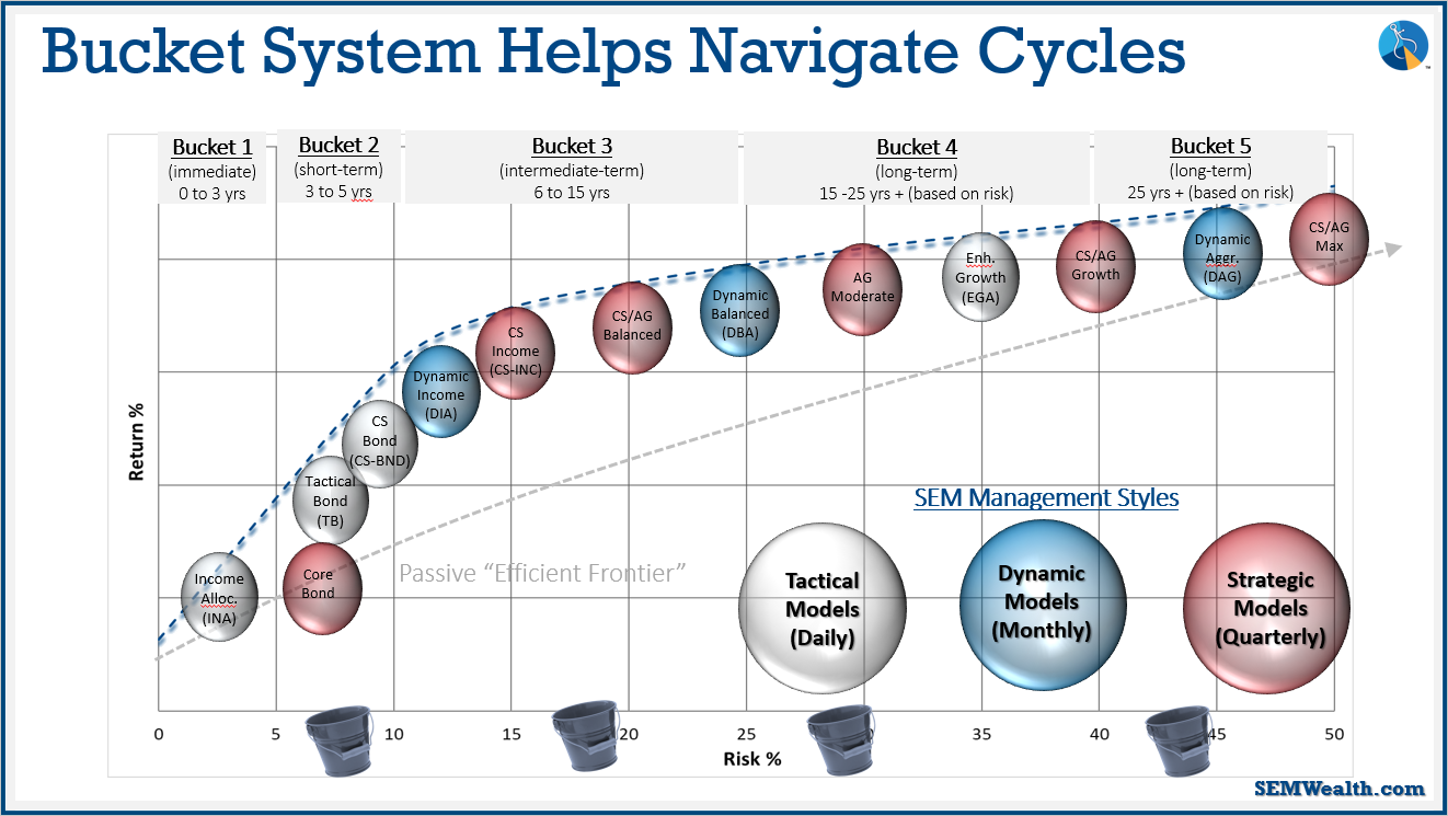
We use a bucket system at SEM to break up money based on when you're going to be spending the money. We have a lot of investment options. How we allocate those comes down to your financial plan, cash flow strategy, and your personality.
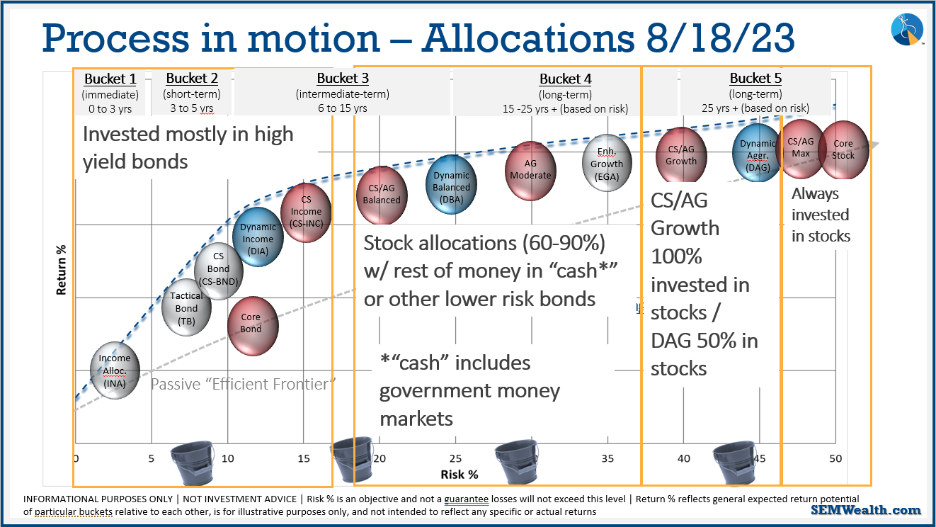
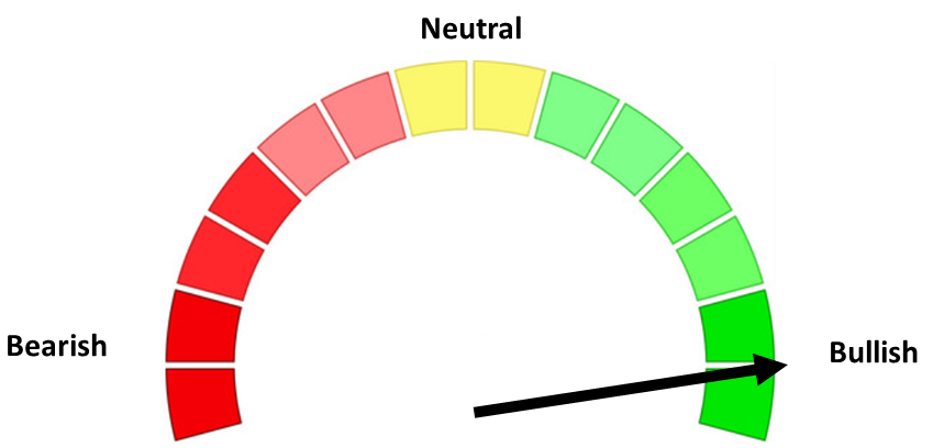
This is where we're at as of August 18. We're pretty optimistic short-term, but long-term we're being careful (because of what the economic indicators are saying).