20 weeks ago, Congress came together and passed a wide-ranging, 800+ page, $2.2 Trillion legislation called the CARES (Coronavirus Aid, Relief, and Economic Security) Act.
15 weeks ago, the House passed the 1800+ page, $3 Trillion HEROS (Health and Economic Recovery Omnibus Emergency Solution) Act. The Senate did not take the bill up and said it was more prudent to wait.
2 weeks ago, Republicans in the Senate introduced the 700+ page, $1 Trillion HEALS (Health, Economic Assistance, Liability Protection, and Schools) Act. The Senate response is actually 8 separate Senate resolutions rolled into one.
0 weeks ago, after failing to negotiate a compromise between the two sides, President Trump signed 4 executive orders to provide additional unemployment assistance (but not expand the current program), a suggestion to extend the moratorium on evictions for some renters, extend student loan, and to defer payroll taxes. The legality and effectiveness are still in question, so I'll reserve comment on the impact.
By my math it took less than 7 weeks for Congress to return to their normal posturing at the expense of the American people. This will obviously be a focus for most market participants this week given the huge impact the CARES Act had on Personal Income.
 Jeff Hybiak, CFA
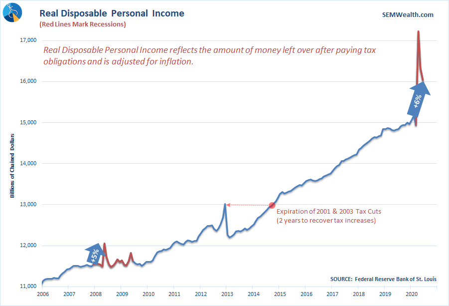
Here's what else is on my mind as we start the week......
New Jobs or Returning to Work?
Great Jobs Numbers!
— Donald J. Trump (@realDonaldTrump) August 7, 2020

The Payrolls Report on Friday announced 1.7 million 'new' jobs. Given the carnage in the economy I think most of us know these jobs weren't new, but simply people returning to work. So far we've seen an estimated increase in jobs of 2.7, 4.8, and now 1.7 million in May, June, & July. While it is a good thing to see that many people returning to work, the quality of the jobs is a concern.
This chart from the BLS website illustrates how the largest increases came in the lowest paying jobs (leisure and hospitality and retail trade). Education and health services was the next biggest gainer with a total of 215,000 estimated job increases (just 11% of those jobs were in education).
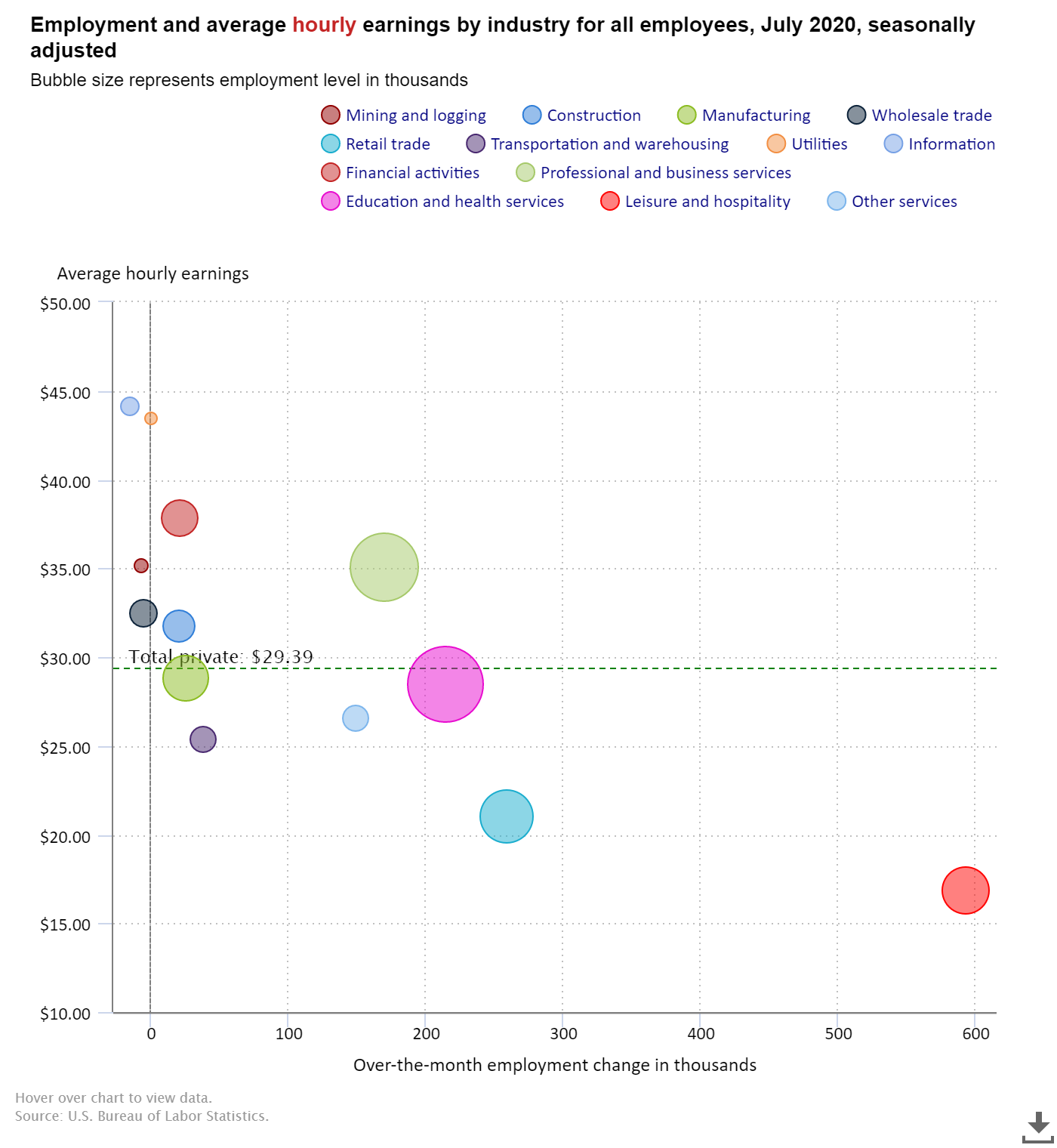
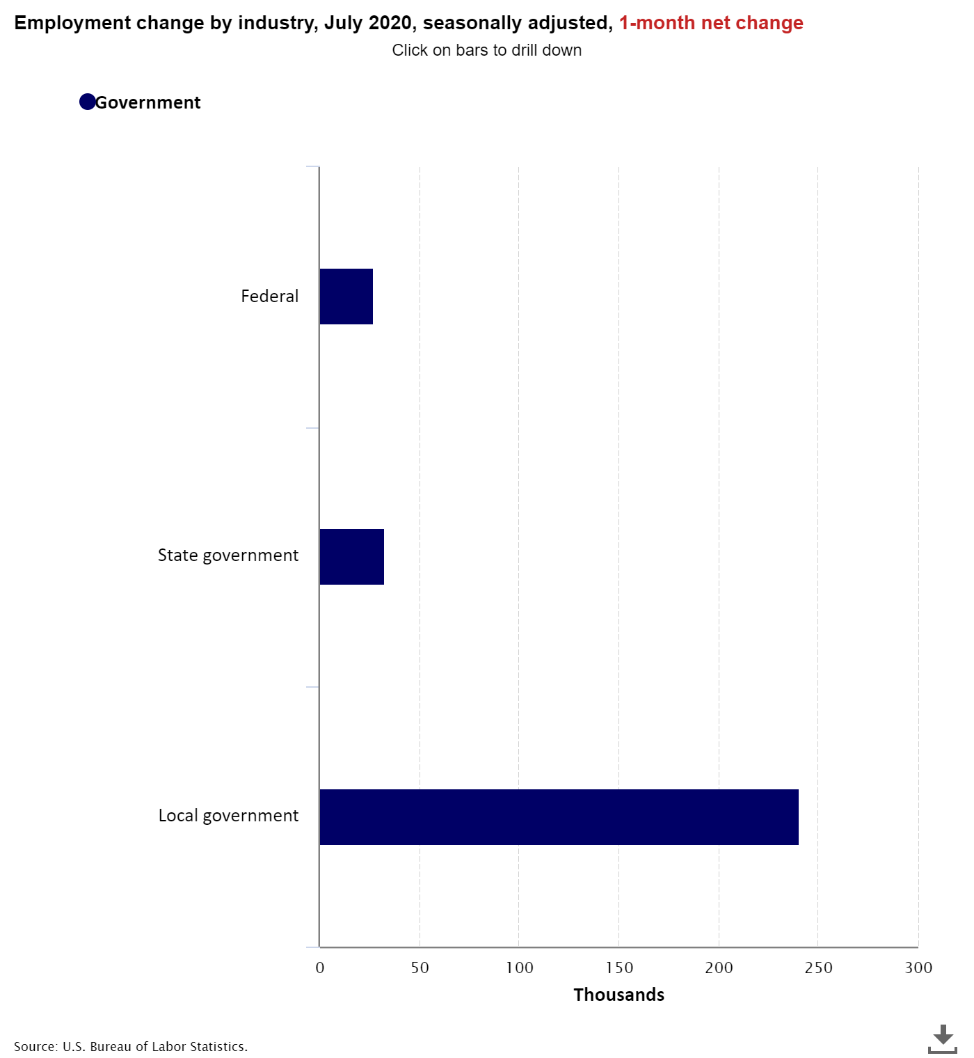
Not shown on the chart above is the 301,000 jobs added back by the government, 241,000 at the local level, likely due to furloughed workers returning to work.
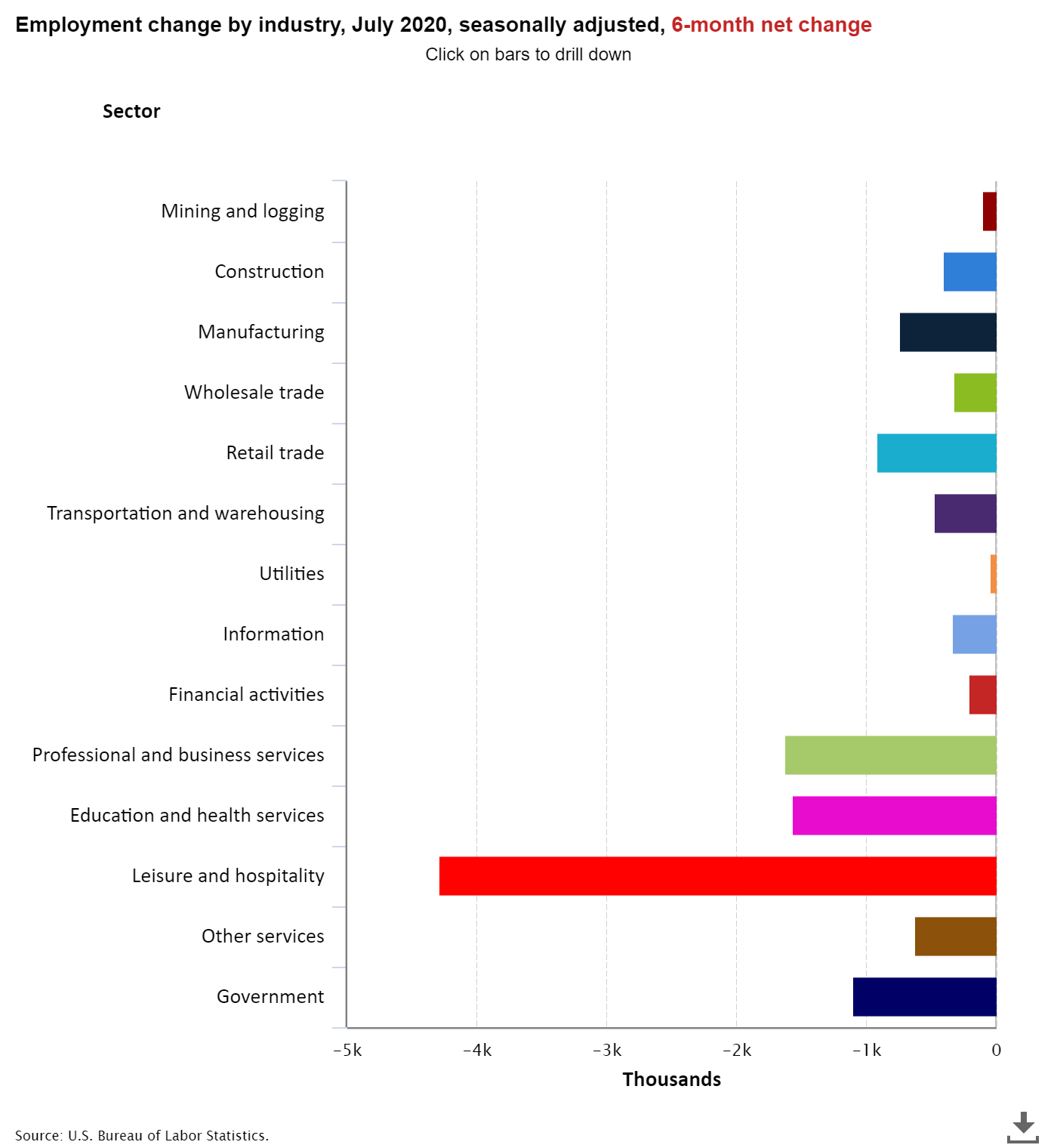
Going back to January, the Leisure and Hospitality industry has lost over 4 million jobs. The next closest industry is professional and business services.
All data and tables are from the BLS Employment Situation Summary unless otherwise noted.
Something Doesn't Add Up
The Payrolls report shows with the addition of 1.4 million people "working" there are 16.3 million Americans officially unemployed. The problem is the way they count employment. If during the survey week somebody worked, even if just 1 hour, it is counted as a job. It doesn't matter if they wanted or needed to work 40 hours (or had been working full-time previously). They count this as a "job". The government does provide an alternative measure of unemployment (U-6), which shows the actual percentage of people not working as much as they want/need to. That percentage is 16.5%, not the 10.2% "official" number.
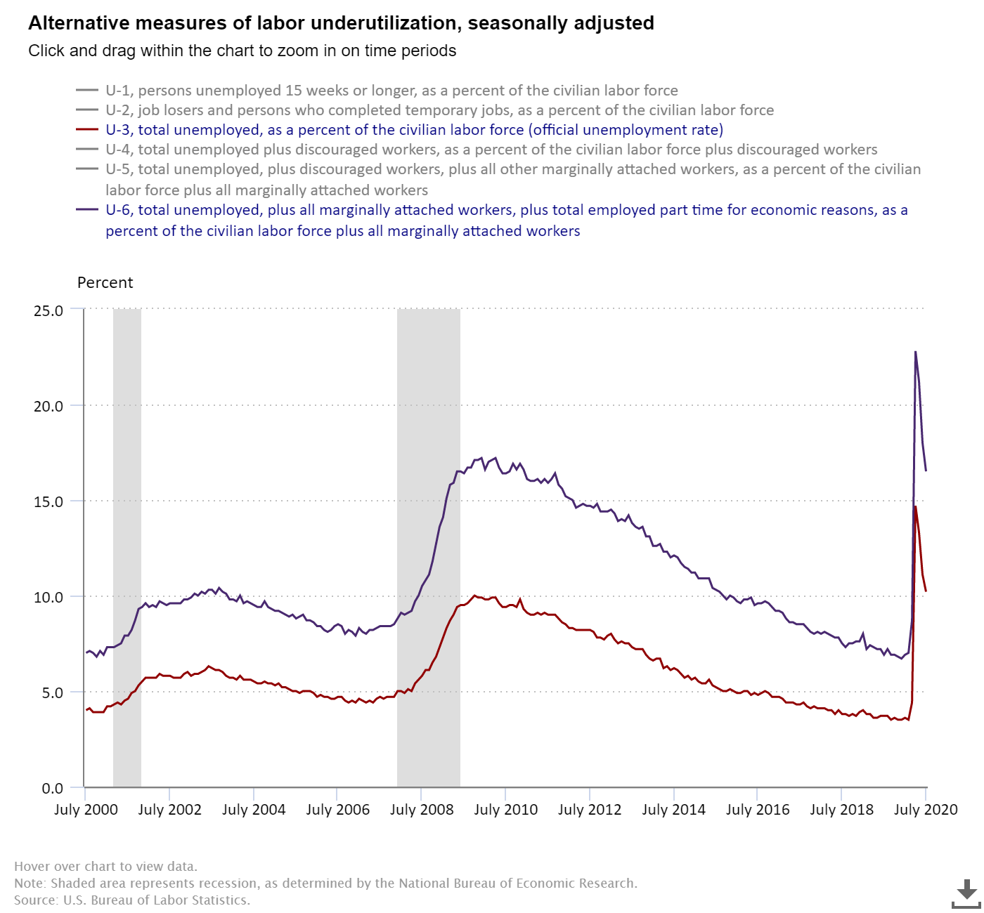
So we actually have 26.3 million people unemployed or underemployed in our country. That's down from 38 million in April, but still a large number of people.
We also can see the issue with the Payrolls report when we look at state and federal unemployment claims. In his excellent blog, Mish Shedlock plotted the numbers. First, we can see the state unemployment claims were still sitting at 16.9 million during the survey week.
Worse, there were over 15 million people who for whatever reason were not eligible for state unemployment benefits, but were receiving Federal unemployment assistance. That's over 30 million people or 18% of our labor force relying on the extended unemployment benefits.
As you can see, there has been very little improvement in the total unemployment claims.
Employment Gap Widens Again
Going back to the "official" unemployment number, we can once again see the divide between the experience of White and Black Americans.
The White unemployment rate hit 14.2% in April and has quickly fallen to 9.2%. The Black unemployment rate hit 16.7% in April and has only dropped to 14.6%.
At SEM we realize there are no simple explanations and there are numerous reasons behind the gap. We firmly believe these gaps need to be addressed in a logical and rational way and will be working on different ways in our communities to make a change.
The 95% Economy
Since before the crisis I've been warning about the converging social and demographic cycles which could cause a major STRUCTURAL shift to our economy. The social cycle goes through a series of 18-22 year cycles with 4 distinct cycles inside of every 80-90 year period. The last phase is the "crisis" where all of the gaps created during the third phase of the cycle are unwound, creating great unrest in our country. It's most likely this started with the near-collapse of the financial system in 2008 meaning we are about half-way through the cycle.
Jeff Hybiak, CFA
We also are facing a demographic "cliff" as the massive BabyBoom generation fully enters retirement. This generation had great influence on all facets or our economy and led to a very long economic boom. As they shift to retirement they are cashing in their investments and staking their claims to the pensions and other entitlements they promised themselves. The problem is the math simply doesn't add up. We don't have enough jobs in the US at high enough levels of income to pay for their retirement. Paying these benefits will create a drag on the rest of the economy.
My fear is the COVID19 Pandemic has accelerated this shift. I think many of us have found we were spending money on things we probably didn't need (think leisure and hospitality). Others have found they need to have more money in reserves knowing how quickly their income can disappear. Businesses have already closed for good and jobs have been permanently lost. So many people are betting the economy returns to 'normal', but I fear the 'new normal' may be around 95% of where we were in February.
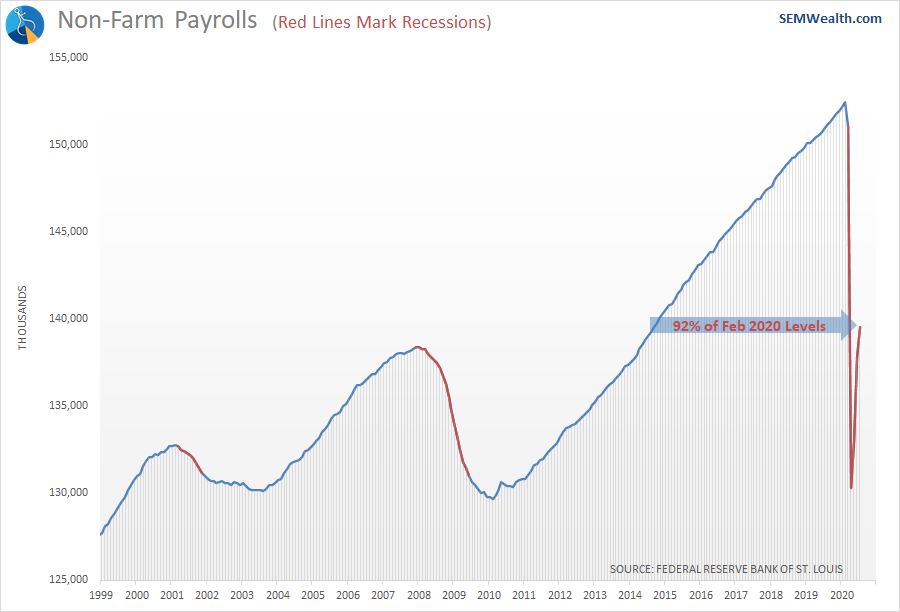
The number of "official" jobs is back to 2014 levels and is only 92% of the peak.
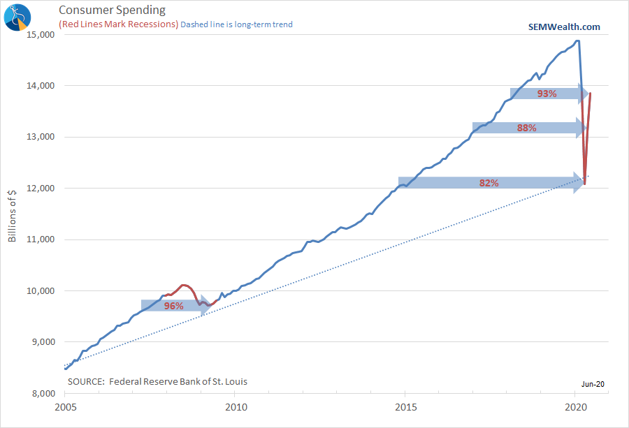
Spending looks a bit better, but is still back to February 2018 levels.
Keep in mind, government stimulus has actually caused incomes to temporarily increase by over 6% to offset the lost wages. That obviously cannot go on forever.
Jeff Hybiak, CFAEconomic Model Still Bearish
Despite some very strong gains in most economic indicators our economic model remains "bearish". Keep in mind, the model began getting concerned about the economy in early 2019, a year before anybody had even heard of Coronavirus. It picked up on underlying weakness as the impact of the tax cuts in 2018 had already worn off. The model is also designed to filter out "noise", which we've obviously had a lot of recently. You can see that noise in the dashed line in the chart below. What we are watching is the solid line for a clear trend change.
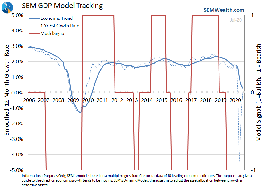
This model is used in our "Dynamic" models. Interestingly enough, even with the sharp rally back while we were "bearish" the models are performing quite well. All are ahead of their benchmarks for the year and nicely in positive territory.
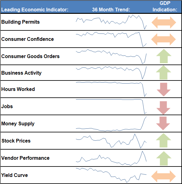
Looking inside some of the components, we can get a quick glimpse at the parts of the economy doing well and those still signaling weakness ahead.
In case you missed it, here's my take on the 2nd Quarter GDP report:
Jeff Hybiak, CFA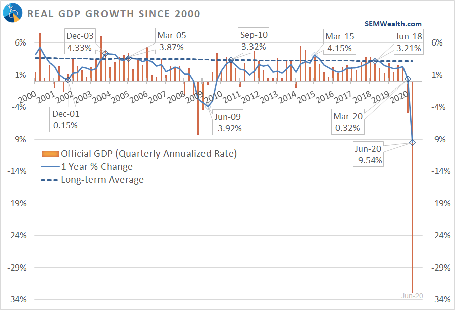
The Experiment Continues
We continue to see all kinds of different methods to control the spread of the virus. I've been documenting the difference between Virginia and Arizona since the beginning. With nearly opposite responses, we can see what works and what doesn't work.
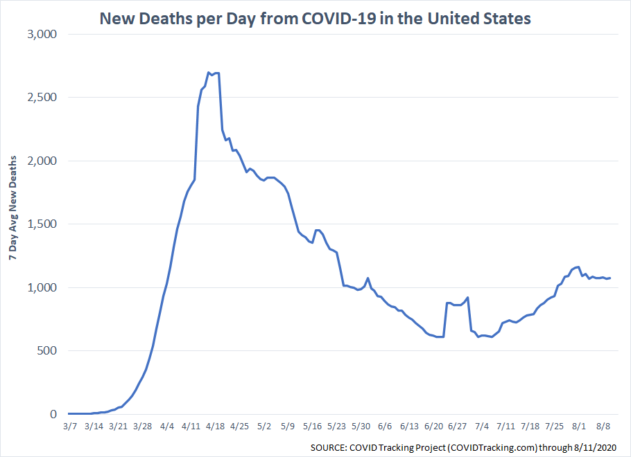
First the look at the US totals. Remember, I focus on deaths (knowing they may be slightly under/over reported) as it shows the real impact of the virus.
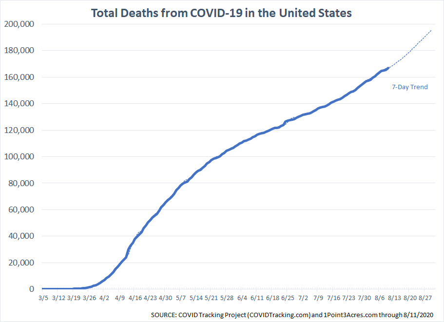
Deaths per day have been hovering around the 1000 level.
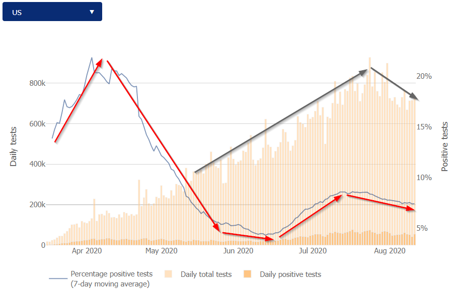
I also focus on the percent positive tests as it normalizes the number of cases. We are testing more which means we will find more cases. What we need to be concerned about is if the virus is widespread. Overall the renewed restrictions after the outbreaks in the south appear to be working, although I will point out the number of tests has also been on the decline.
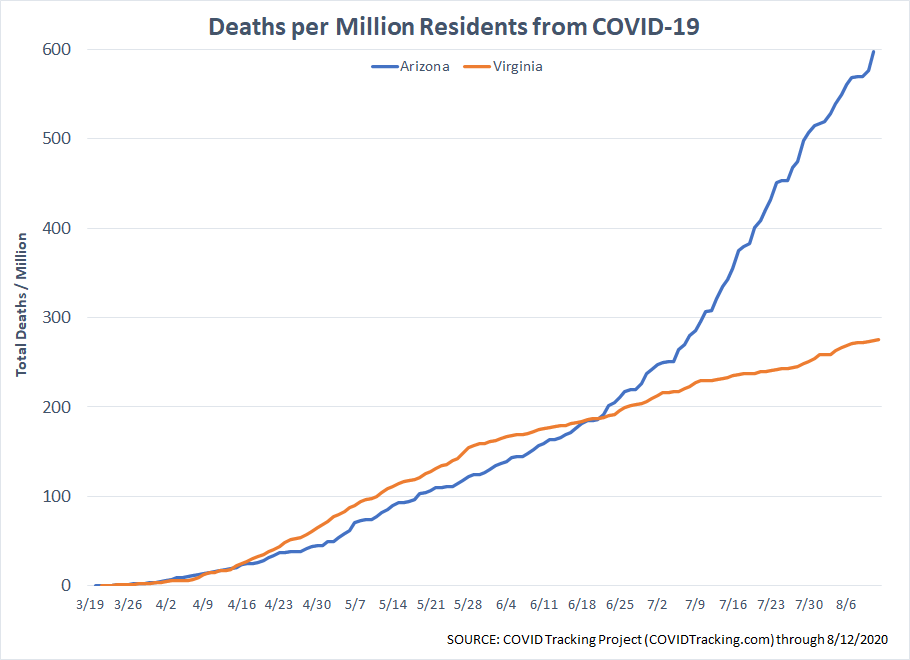
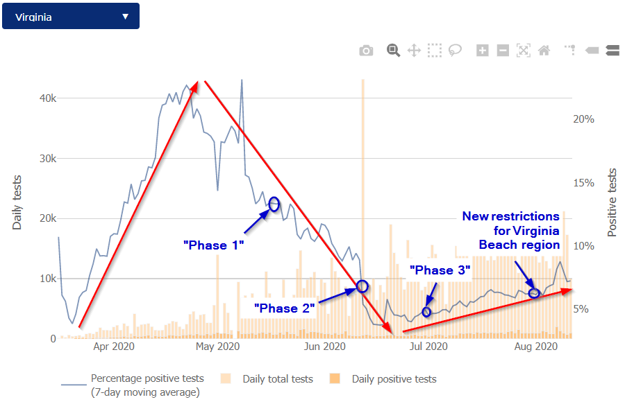
Turning our focus to Arizona and Virginia we can again see the impact of (sensible) restrictions and what happens if they are removed too quickly.
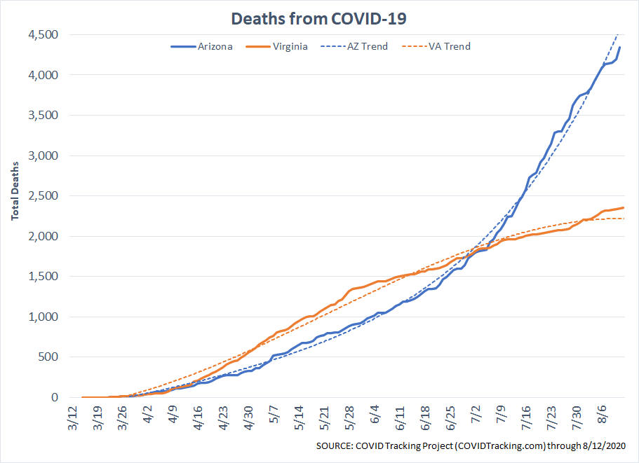
Remember, Arizona has nearly 2 million LESS people than Virginia. Deaths per million shows an even bigger gap between the two states.
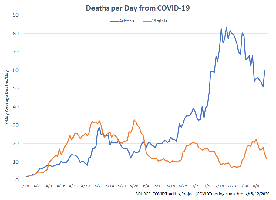
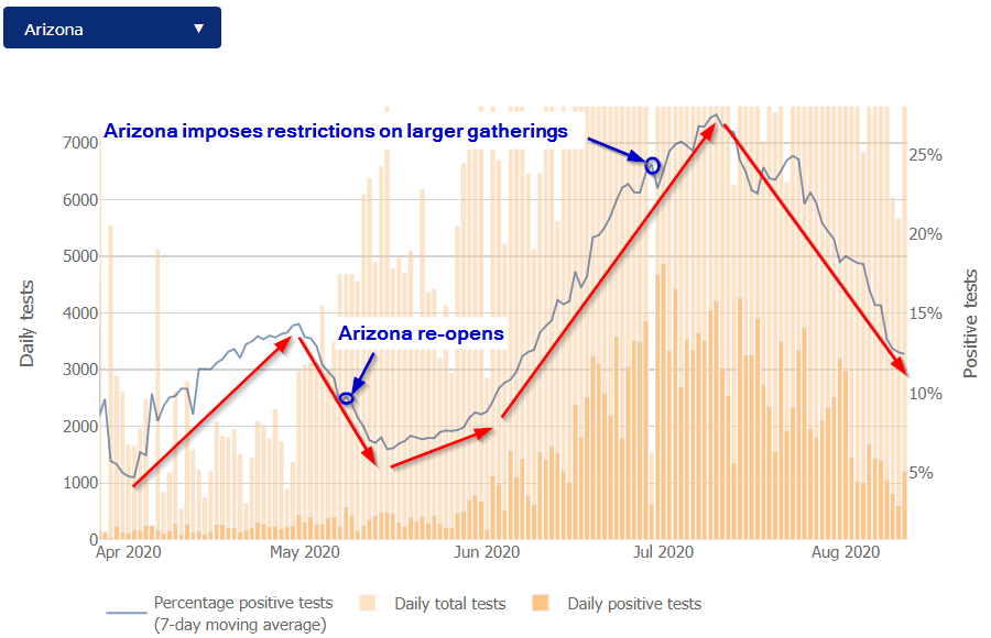
Arizona, after allowing mayors to impose mask mandates and rolling back some indoor capacity at restaurants and gyms has seen a drop in deaths per day, but it is still high.
With the increased restrictions, Arizona's percent of positive tests has fallen dramatically. The drop started about 10 days after the restrictions were put in place. It's still a high 13%, but far better than it was in mid-July.
Virginia is now going through an increase in positive tests. The increase started shortly after "Phase 3" began in early July. Most of the cases have been coming from the Virginia Beach region as well as the heavily populated Washington D.C. region, but it still indicates how easily the virus comes back when we lower our guard.
With schools opening using all kinds of different procedures, we will again gain more data, which will move us closer to being able to handle whatever the next "wave" looks like.
If you haven't watched it yet, I'd encourage you to take a look at this excellent presentation on the virus from one of our Cornerstone fund partners.
Jeff Hybiak, CFA
Source of Calm
The last two weeks I've returned to our church worship band. While socially distanced and wearing a mask I was able to hold conversations with people about our experiences the last 22 weeks. Knowing my job, I was asked multiple times about how tough things must have been for us. I enjoyed the look of surprise when I said it really wasn't a big deal for us. Using a data-driven process provides a calm, predictable experience. The weeks, months, and years ahead are likely to throw a lot of "new" things our way. I'm confident just as we did 22 weeks ago, applying our scientific process will allow us to adjust to whatever environment we face.