[Updated 5/18/2020] On Tuesday night, March 31, President Trump's press conference was pretty dire. He had already backed-up on his plan to "open the country" on Easter Sunday (April 12), saying we should stick to the CDC's recommendation to "shelter in place" through April 30. That guidance has since wavered and we now see some states opening up. That night he pointed to the real possibility to see 100,000 to 240,000 deaths. I'm not anywhere near an expert, but the experts I've spoken to agree that was in the realm of possibilities.
In my "Monday Morning Musings" that week I mentioned how the key metric I'm looking at is the number of deaths. This is because every person who dies is tested and a large number of people who have had COVID-19 won't be tested (I've since found out that due to a wide range of health care privacy laws in each state and the number of available tests, even the death number is not close to accurate). We should see a big jump in reported cases, which will be shocking to some and is partially due to how quickly the virus spreads, but it's also because we have a lot more tests available.
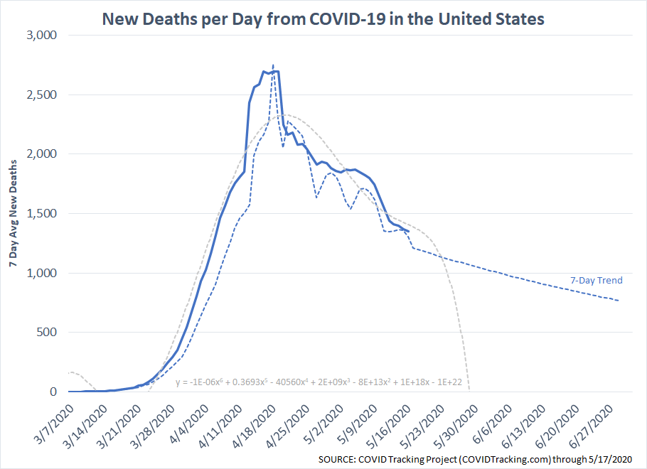
After the press conference on the 31st I decided to create my own charts to begin tracking this. I applied some simple polynomial models. We had originally been tracking a 3rd order model, but it seems the last few days of March we accelerated to a 4th order. The top end of the projections given by the President would have been a 5th order model. [4/15/2020 Data Update: Thank goodness the panic the President created on the 31st hasn't come to fruition. One thing I'm noticing in the data is it is revised several days later, so I've started using a 7 day average daily rate. The CDC last week actually revised its reporting criteria for cases. Some states (like Virginia) have some strict privacy laws and several counties have been reluctant to report cases. I've heard a few people say we'll never know the actual total, but this is the best data we have to go on for now. [5/18/2020 Data Update: The pace of deaths continues to slow. The 5th order model is predicting an increase in the number of deaths, while the 7 day trend is slowing. It does appear we will see at least 100,000 deaths although the pace is much slower than the President warned about at the end of March.]
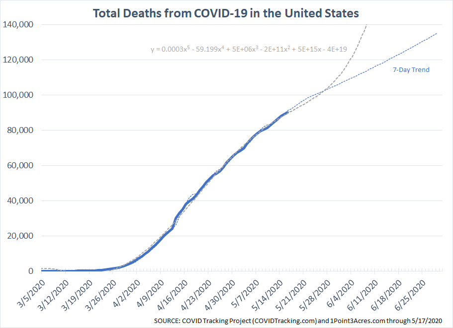
The deaths per day is also showing a sharp decline and is showing a possible steep drop soon. . I think the model will adjust as the deaths are certainly not declining at this fast of a pace.
For other models and additional updated data, check out the FT's Coronavirus Tracker, and this real-time CoronaVirus Tracker. I used the data from the COVID-19 Project, which allows API access along with downloads of the data.
I'll continue updating these periodically. Remember, while deaths from the flu or auto accidents each year are much higher, the issue is the number of cases at the LOCAL level will overwhelm the hospital system. We're praying for the medical professionals and our community leaders. They are all doing everything possible to protect our country. And of course our prayers are with everybody impacted from this. Each death is somebody's loved one and was treated by somebody who took an oath to help as many people as possible.
I continue to have faith in our country and our ability to weather this latest test. We have the greatest scientists in the world working on this.
From an investment standpoint, I'd encourage you to check out the following posts:
SEM Quarterly Newsletter -- Just released, check it out!
Still Overvalued -- stocks are not bargains (yet). Better entry points will be ahead.
No Quick Fixes - a look at past severe bear markets and the likely path ahead.
Not Another COVID-19 Update - a brief look at what really matters from an investment perspective and how SEM is adapting.