Probably the most frustrating thing for investors to learn is the relationship between economic growth, inflation, interest rates, and stock prices. Often during times of prolonged growth for stock prices we hear about a "Goldilocks" economy where growth and inflation are not too hot and not too cold. This allows the Federal Reserve to let things coast without having to use their blunt interest rate tools to inflate/deflate economic growth.
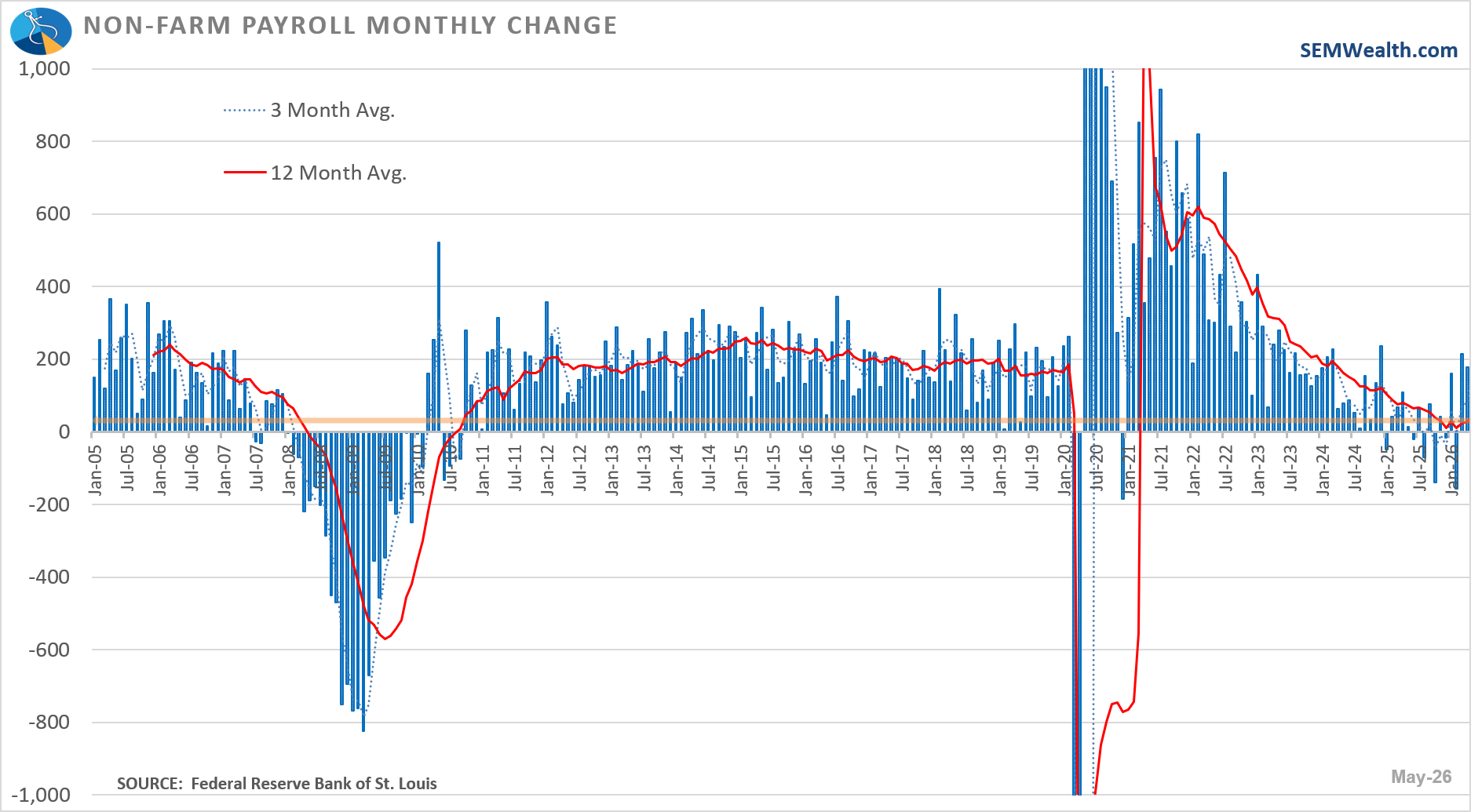
This means that SOMETIMES a strong economy can be viewed from a negative standpoint by investors. One of those times was on Friday as the May Employment report was "better than expected". This is the 2nd consecutive month of "strong" growth. I put "strong" in quotes because the chart below shows that the "too strong" monthly number is a.) basically in the range we enjoyed from 2011 - 2020 and b.) leaves the 1-year growth rate just above 0%.
The issue of course is the market was expecting lower interest rates this year. A "stronger than expected" labor market takes away really the last argument the President and those calling for lower interest rates had. Every other indicator is saying the economy is holding up well and inflation pressures are a much bigger concern than growth slowing. That didn't stop the President over the weekend to call for a rate cut. We'll see how independent new Fed Chair Kevin Warsh will be starting with his first meeting as Chair next week.
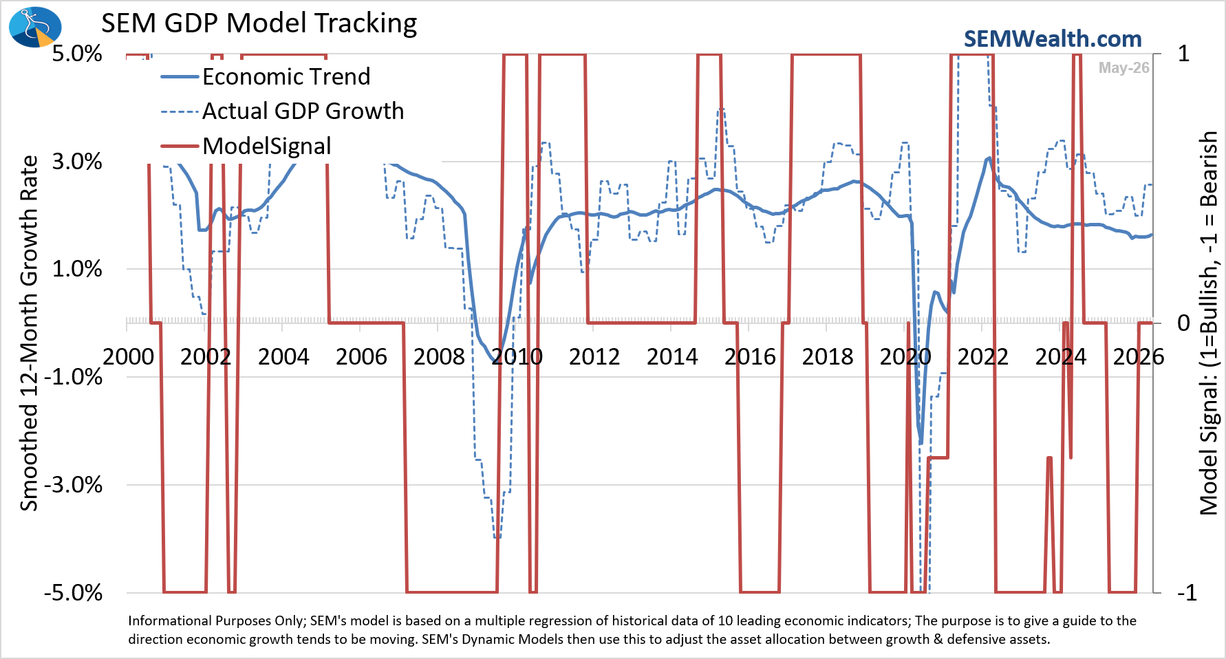
Prior to the big sell-off on Friday I was planning on doing a full economic update. I guess my timing is good as our quantitative economic model is showing a "Goldilocks" environment with half the indicators leaning bullish and half (including the Payrolls component) leaning bearish.
In other words, there shouldn't have been a panic over a "strong" employment report because it wasn't really that strong. The market was looking for a reason to sell-off and it found it. Remember, institutional managers have to find an estimated $75-$80 Billion to invest in the SpaceX IPO on Friday. That's going to shatter all IPO records and would by itself represent 6-8% of the average daily volume for the US stock market. Tech stocks were obviously "overbought" given the strong earnings growth they've been posting. The problem, as we learned in 2022, is the highest growth stocks take the biggest hit if interest rates go up.
For more on the sell-off, see the Market Charts section near the bottom of the blog. But first, let's take a look at what the DATA says about the economy.
Economic Update
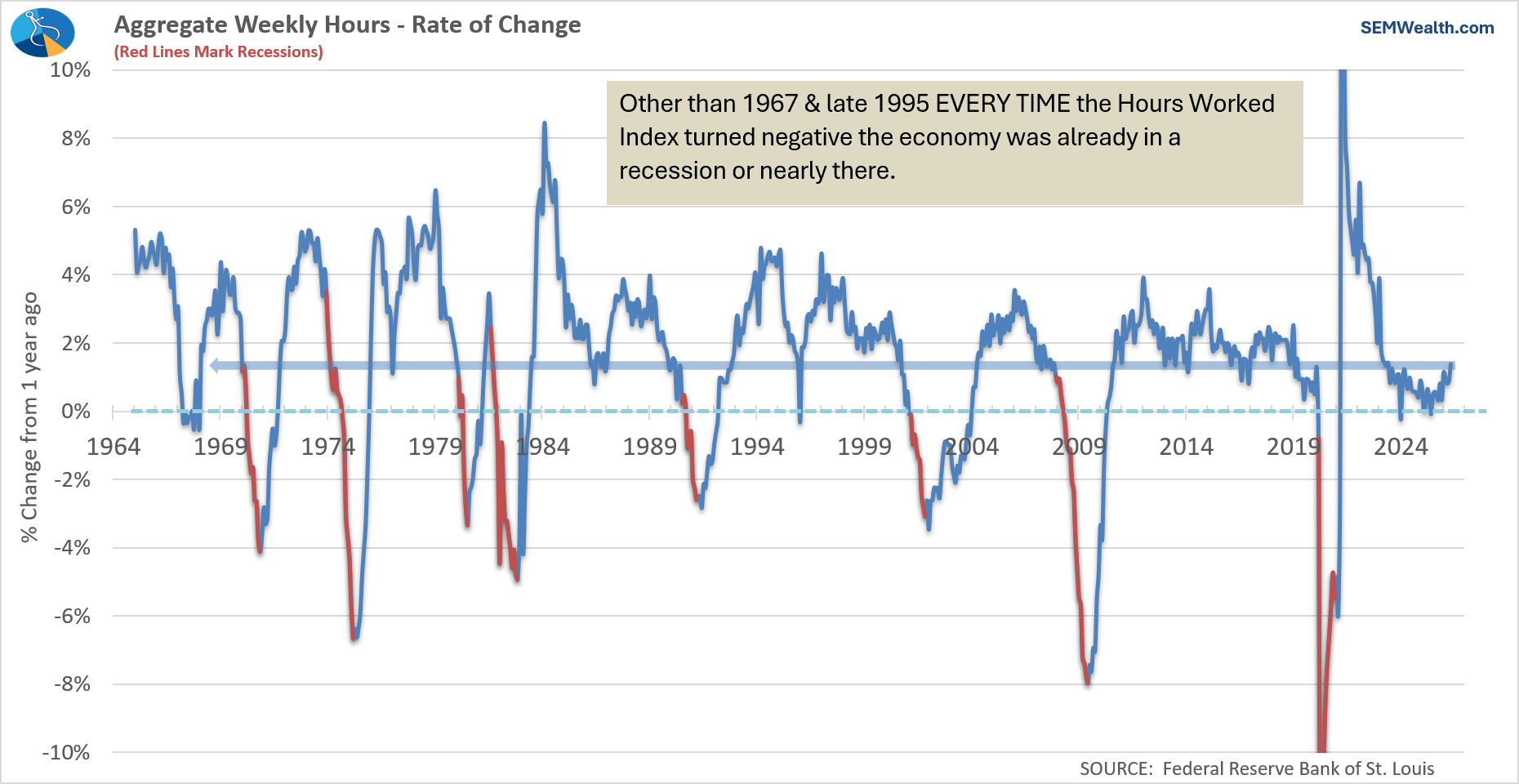
1) Hours Worked
This is one of the cleanest reads on economic momentum because it captures both hiring and how much employees are actually working. When businesses increase hours, it usually means demand is strong and they need more output without yet committing to new hires.
Current Reading: BULLISH
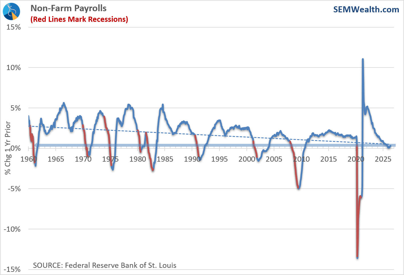
2) Payrolls
Payroll growth tells us whether companies are expanding or pulling back on labor. Steady job creation supports income growth and tends to feed directly into broader economic expansion.
Current Reading: BEARISH
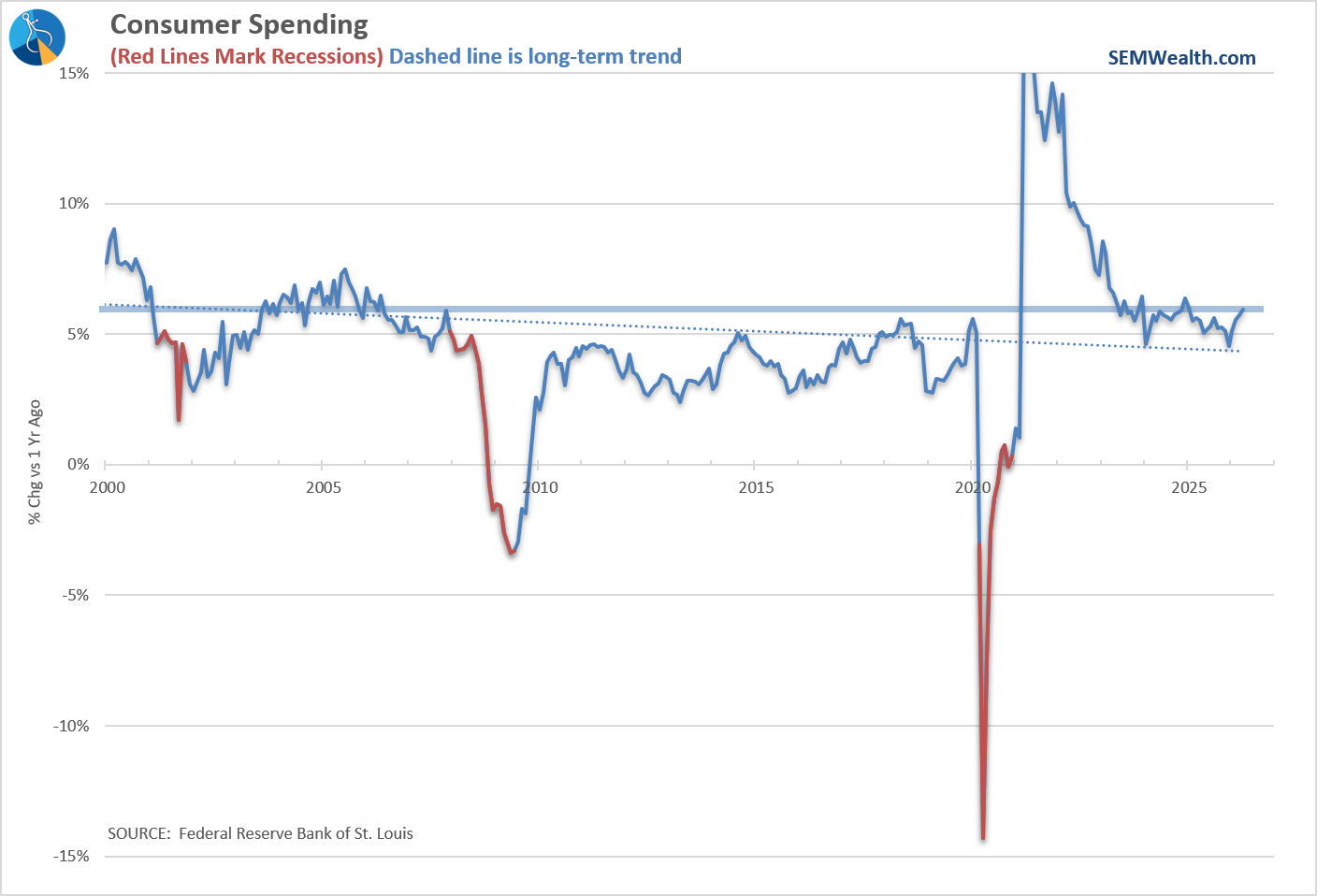
3) Consumer Spending
Consumer spending is the backbone of the U.S. economy, making up roughly two-thirds of GDP. When consumers are spending freely, it signals confidence and keeps the growth engine running.
Current Reading: BULLISH
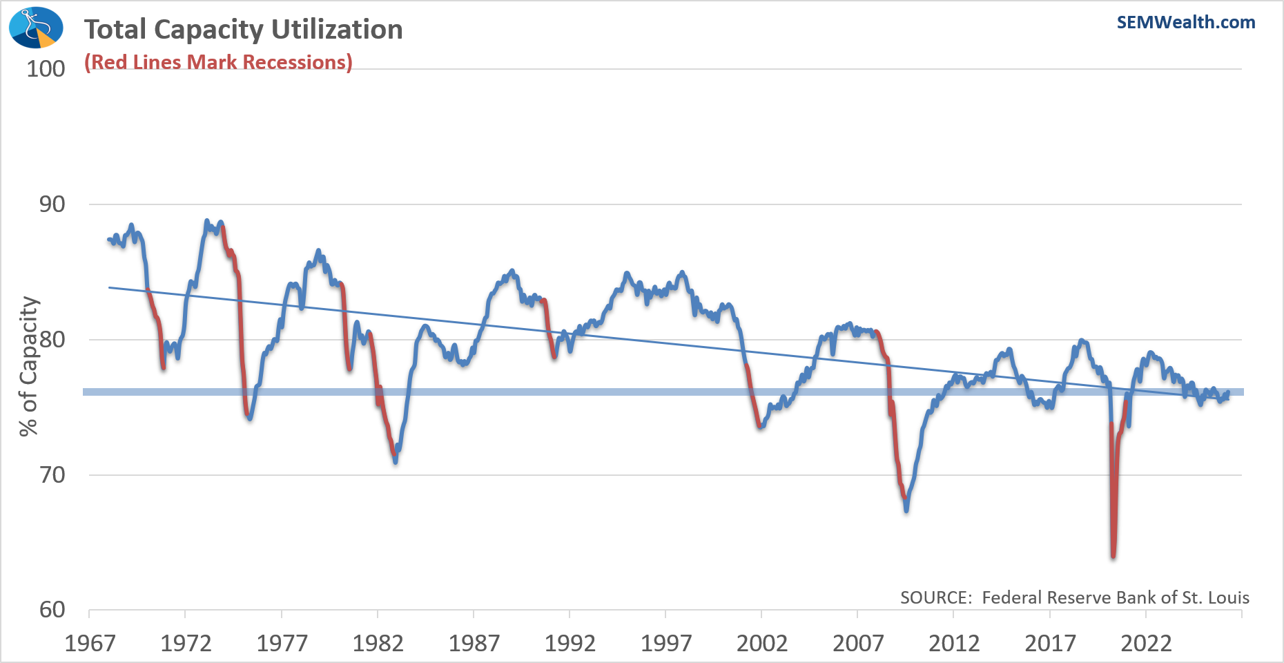
4) Capacity Utilization
This measures how much of our industrial base is actually being used. Higher utilization suggests strong demand and can eventually lead to more investment and hiring as companies push toward full capacity.
Current Reading: BULLISH
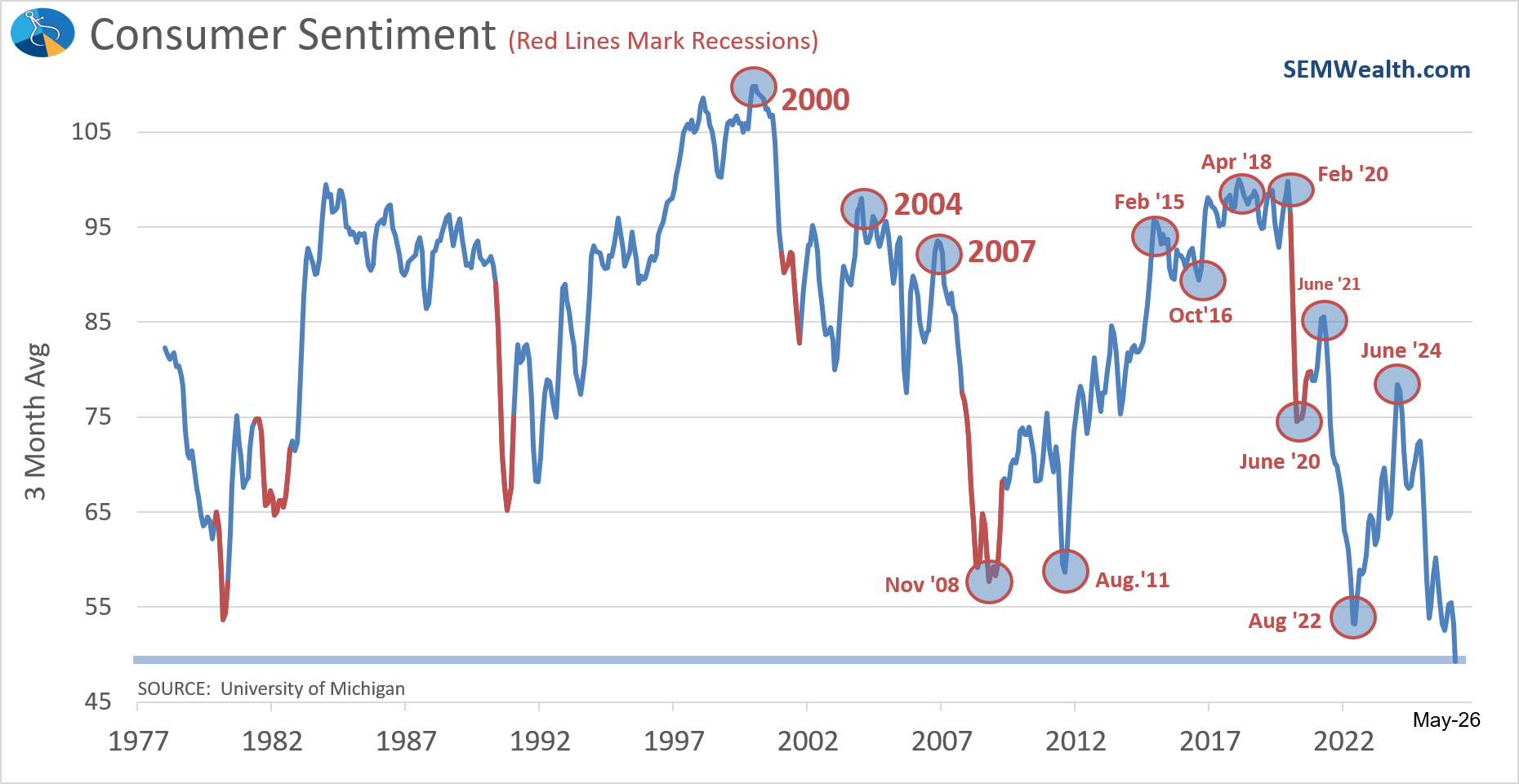
5) Consumer Sentiment
Sentiment gives us a read on how consumers feel about their financial situation and the economy. It often leads actual spending since confidence tends to drive willingness to make big purchases.
Current Reading: BEARISH
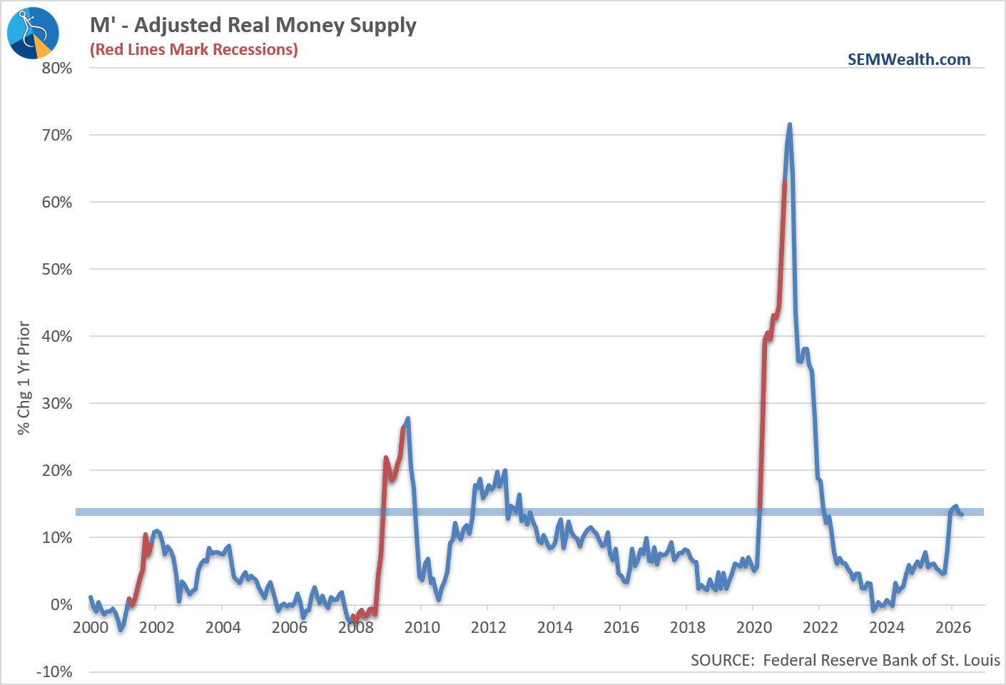
6) Money Supply
Money supply reflects the amount of liquidity in the system, but it doesn’t always move in a straightforward way relative to economic growth. In practice, it often expands rapidly during slowdowns as the Fed steps in to support the economy, so sharp increases can sometimes signal stress or future inflation rather than strength.
Current Reading: BEARISH
7) Stock Prices
The stock market is forward-looking and tends to move ahead of the real economy. Rising markets often reflect expectations for stronger earnings and growth in the months ahead.
Current Reading: BULLISH
8) Consumer Goods Orders
New orders in manufacturing provide an early signal of future production. When companies are receiving more orders, it typically leads to increased output, hiring, and broader economic activity.
Current Reading: BULLISH
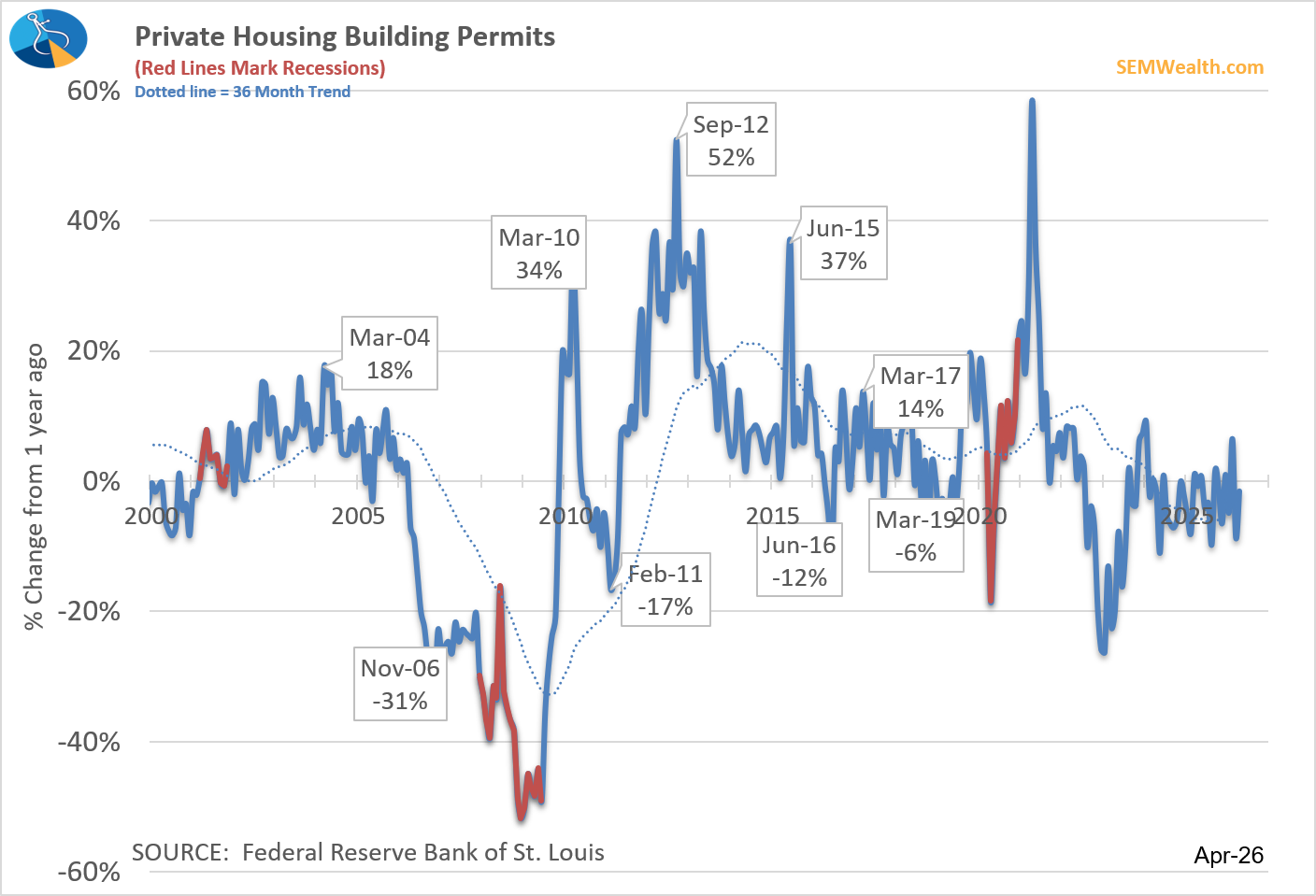
9) Building Permits
Permits are a leading indicator for housing construction, which has ripple effects across the economy. Strong permitting activity suggests future growth in jobs, materials demand, and consumer spending tied to housing.
Current Reading: BEARISH
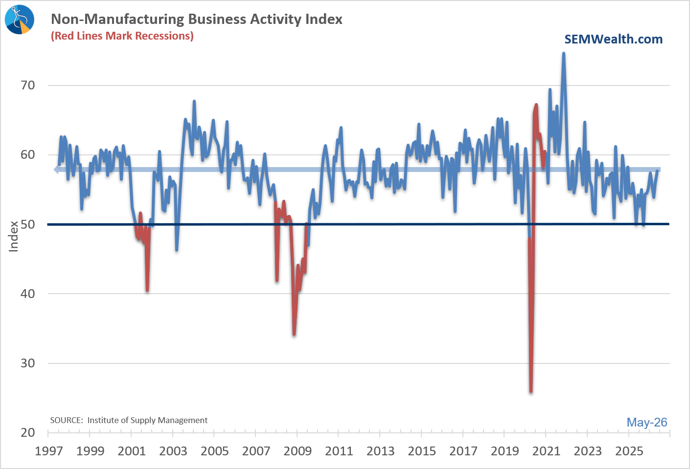
10) Service Business Activity (ISM Non-Manufacturing)
This captures real-time activity in the services sector, which makes up the majority of the economy. Growth here signals healthy demand across areas like healthcare, finance, and retail, reinforcing overall economic expansion.
Current Reading: BEARISH
Summation of the economy
Based on our economic model, this is how I would describe the economy..........
We've seen an increase in manufacturing, which has led to factories picking up their orders and increasing their workweek. The money supply continues to surge, which has embolden consumers to keep spending. This has sent the stock market off to the races with anticipation of strong earnings growth. However, sentiment remains weak as the labor market is not producing new jobs, service businesses are struggling, and the housing market continues to be out of reach for most consumers.
Here's our dashboard.
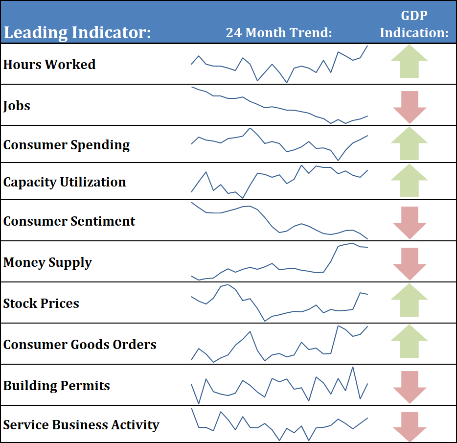
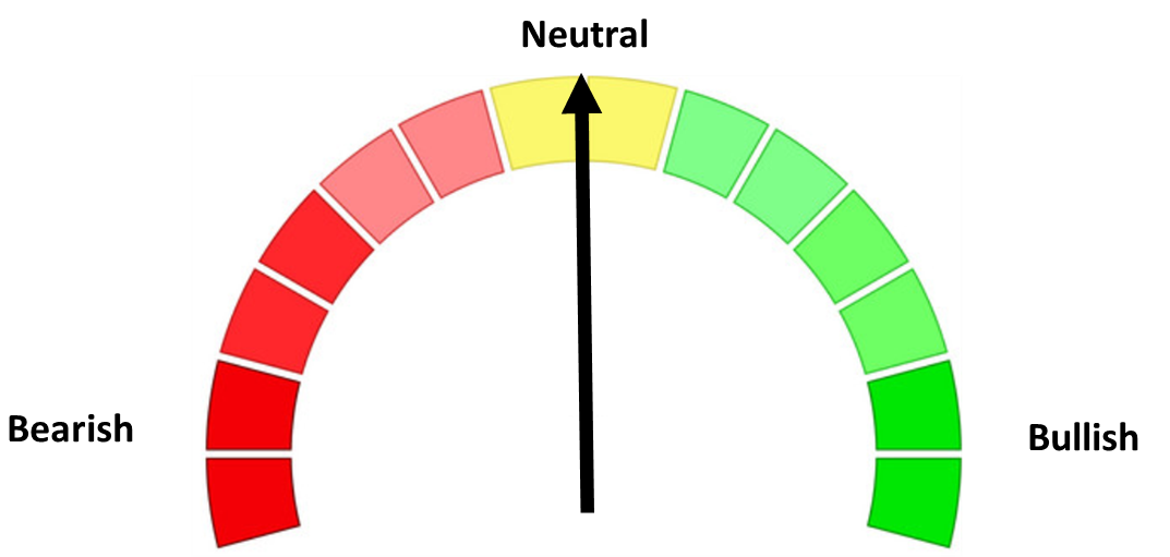
With half of the indicators "Bullish" and half "Bearish", our model remains "neutral". The trend is SLIGHTLY higher.
Biggest areas of concern:
Going into the summer, we need to see two things — inflation needs to slow, which should lead to an improvement in sentiment. Personal income is not keeping up with consumer spending, so we'd also need to see some improvements there. Right now the increase in inflation is thought to be "transitory", and will reverse whenever the war with Iran is over. For the market's sake, the "experts" better be right or things could get ugly fairly quick.
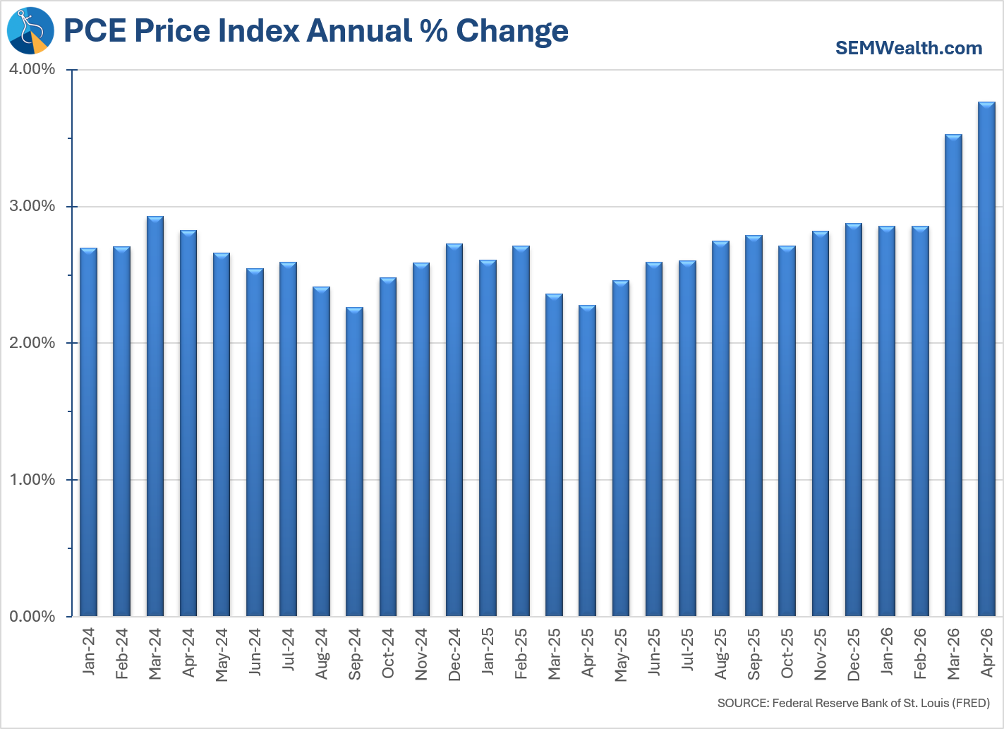
The PCE inflation chart below shows how we never hit the Fed's 2% target. We've been moving higher since May of 2025 (right after the "liberation day" tariff announcement). The surge above 3% may be "transitory", but the bigger question is whether we will land closer to 3% or 2%.
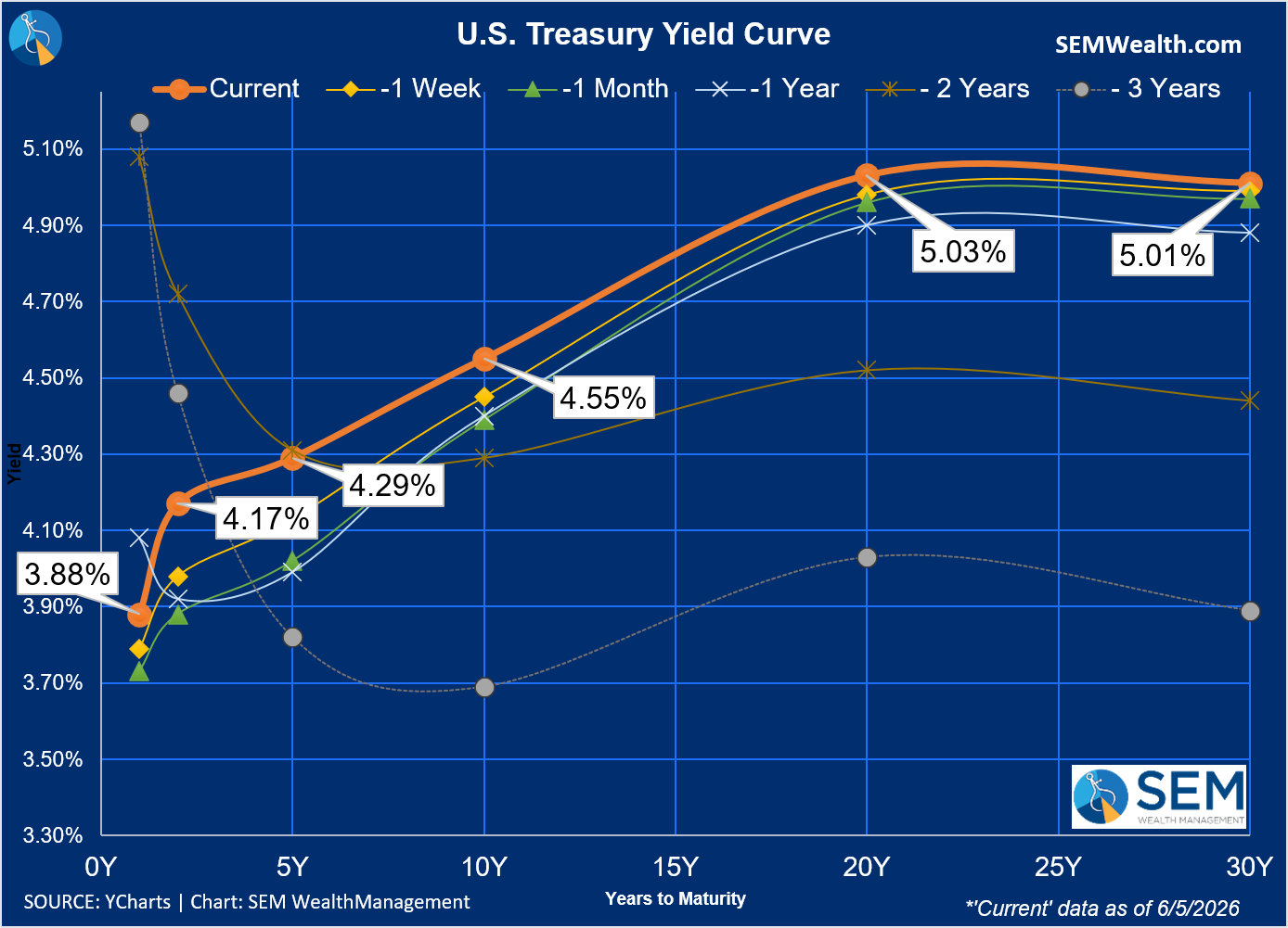
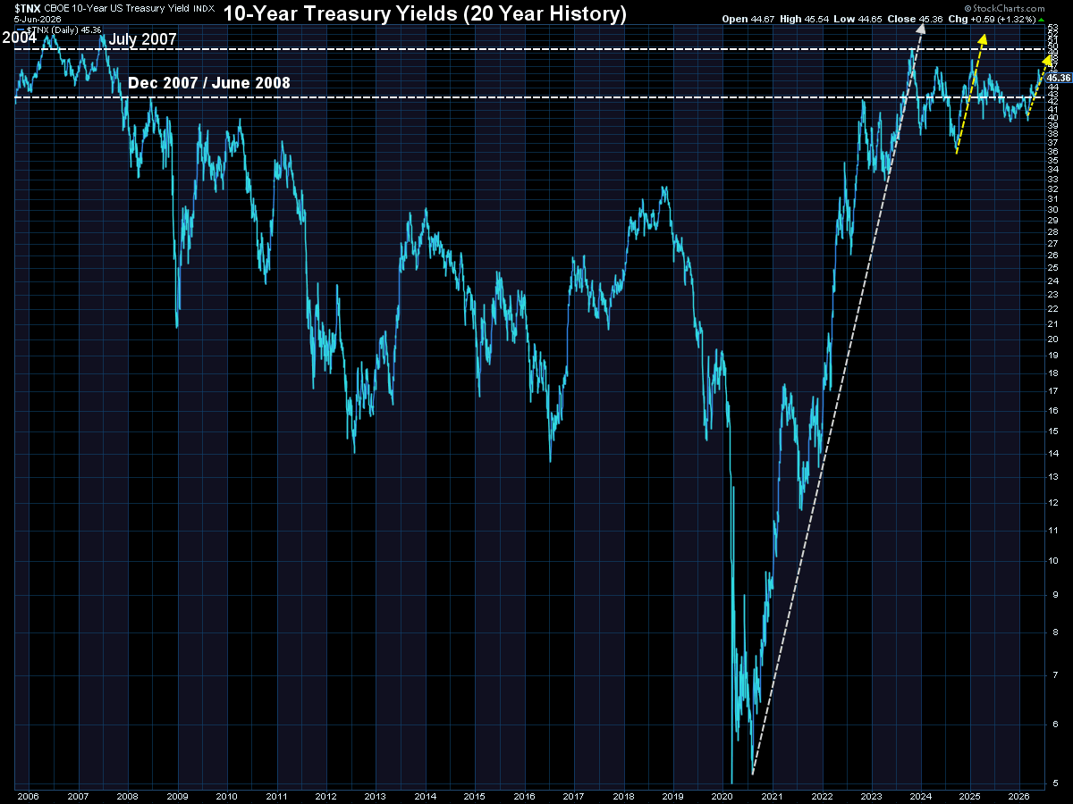
There certainly is no logical case to justify lower interest rates and as we saw on Friday, the "strong" jobs report led to fear the Fed is (again) behind the curve on inflation. The Fed may set short-term rates, but the free market sets longer-term rates.
Our chart of the yield curve illustrates what happened on Friday. Rates across the board increased.
Market Charts
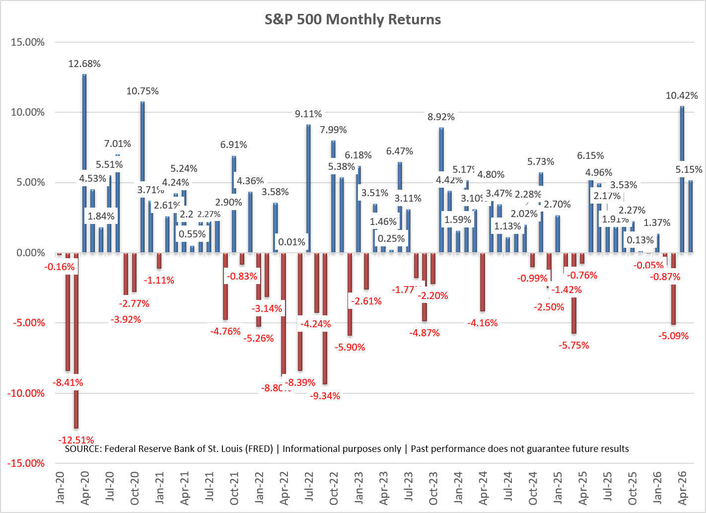
The week started off strong, but Wednesday gave us a preview of how anxious investors were following some strong AI-related earnings reports. The bottom may have fell out of the stock market on Friday, but we are only back to where we were on May 20.
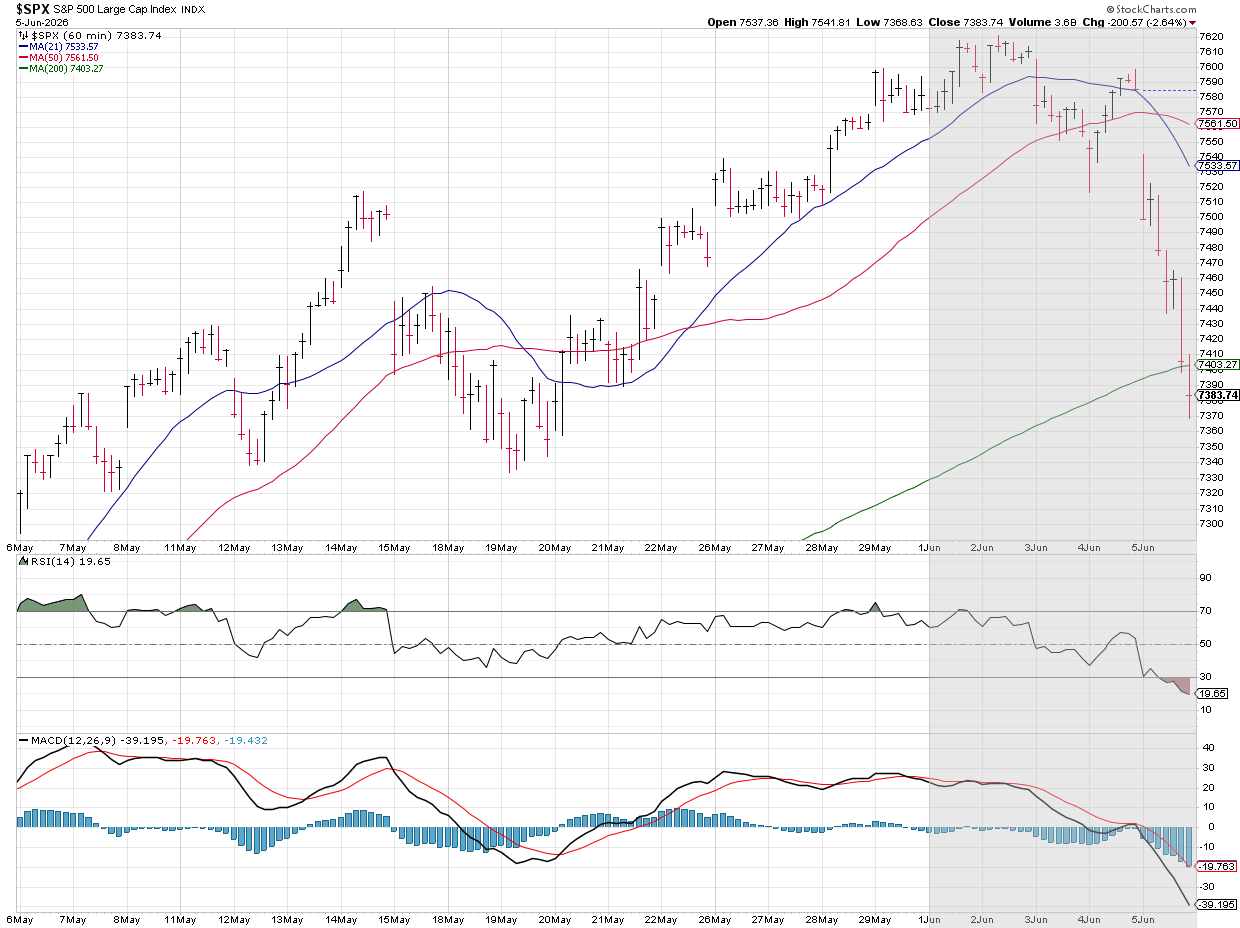
It's easy to forget how far the market has rallied since May (or April). From a technical standpoint, the push to new highs early last week was not confirmed by the "overbought" RSI reading, which is usually a point where it is healthy for stocks to retreat a bit.
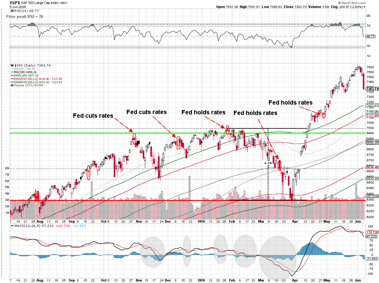
From a market performance stand-point, we're not even halfway through the year and even after Friday's drop, Large Cap stocks are still close to the ANNUAL average return for stocks.
What can go wrong? We mentioned it earlier — inflation remaining too high and long-term interest rates going up.
Rates certainly have moved up, but are still in a reasonable range as shown in this 20-year chart of the 10-year Treasury.
Last week was a reminder – sometimes stocks go down. It wasn't enough (yet) to trigger any moves in our models.
SEM Market Positioning
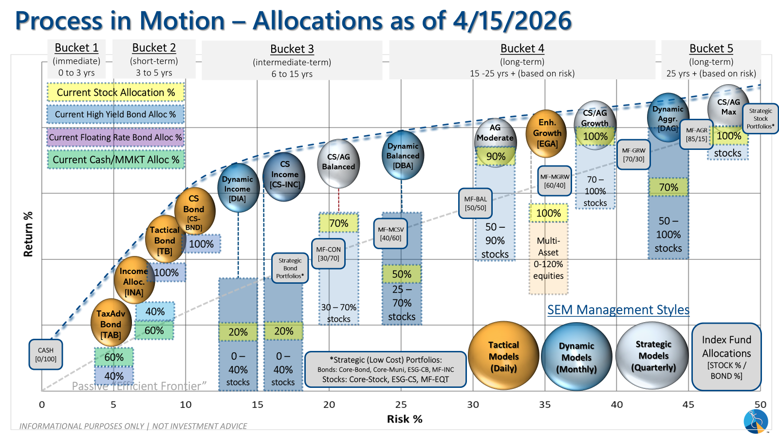
SEM deploys 3 distinct approaches – Tactical, Dynamic, and Strategic. These systems have been described as 'daily, monthly, quarterly' given how often they may make adjustments. Here is where they each stand.
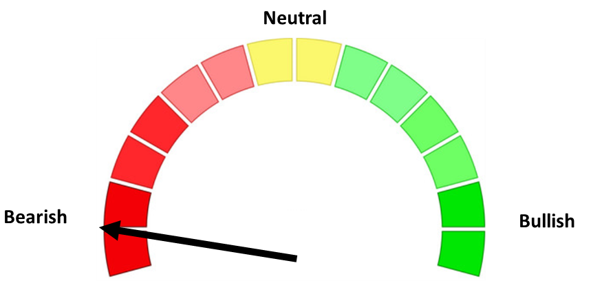
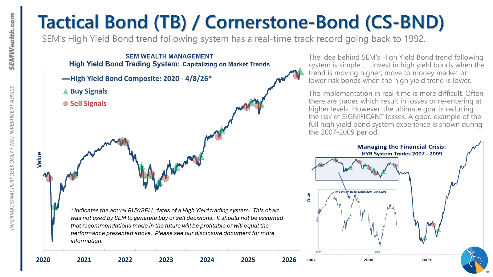
- Tactical = BULLISH | 100% High Yield Bond (4/8/2026) | High-yield spreads remain narrow but trend is slightly higher
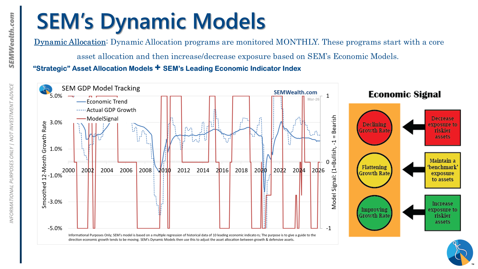
- Dynamic = NEUTRAL (2/15/2026) | "Benchmark" Allocation | Economic model inconclusive
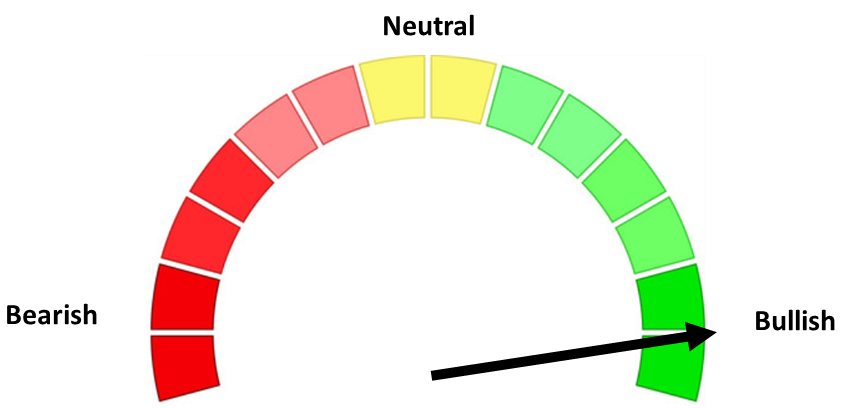
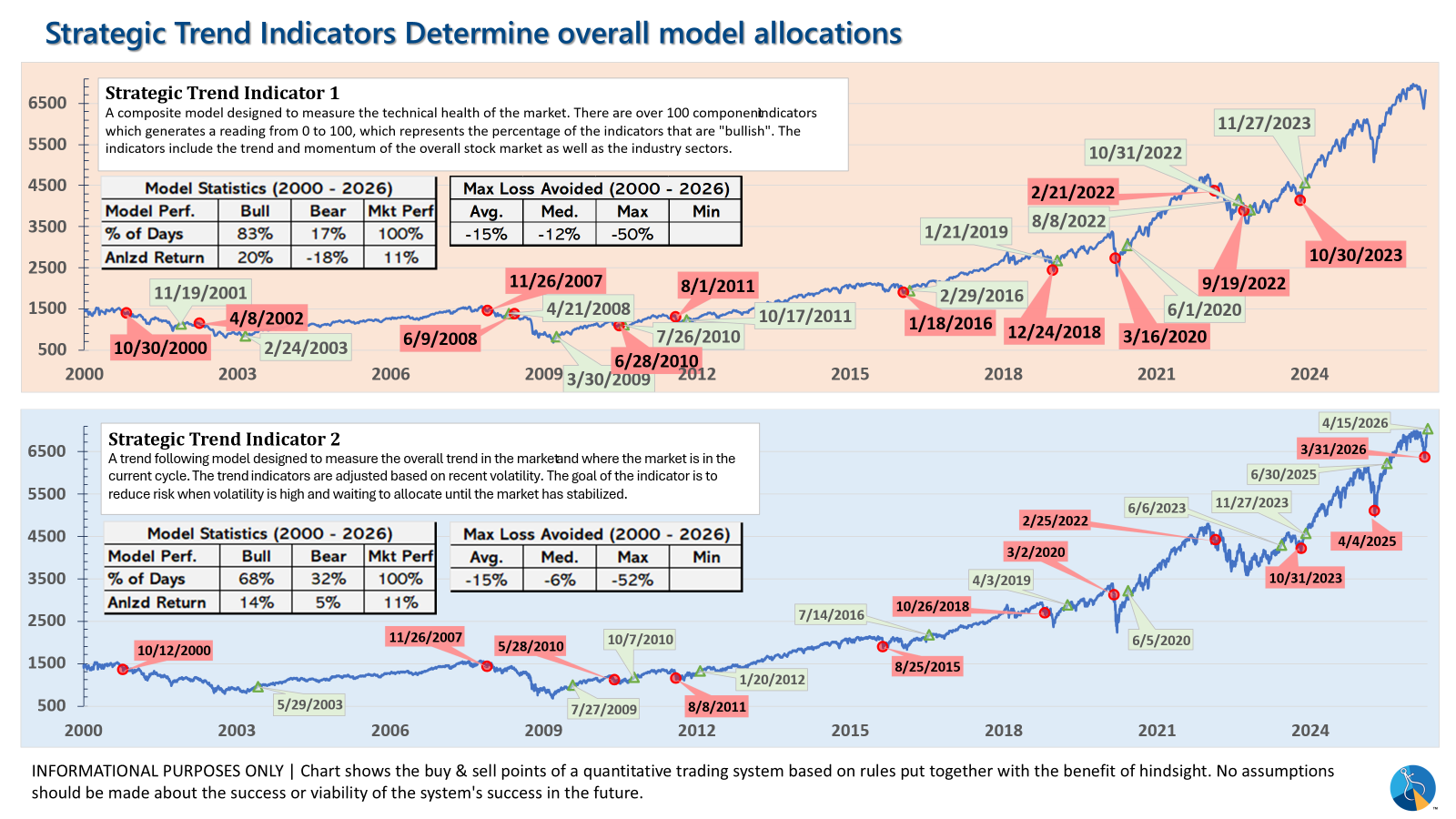
- Strategic = BULLISH (4/15/2026) | V-Bottom projecting "end" of Iran War
Tactical (daily):
- Monitored DAILY
- Models: Tactical Bond, Cornerstone Bond, Income Allocator, Tax Advantaged Bond
- Designed to follow the trends for use in our lower risk models
- BUY Signal issued April 8, 2026 (exiting the sell from March 13)
Dynamic (monthly):
- Monitored MONTHLY
- Models: All "Dynamic" Models (Income, Balanced, Growth, and Asset Allocator)
- Uses SEM's Quantitative Economic Model
- Designed to overweight riskier assets if economic trend is higher & underweight those assets if economic trend is lower.
- NEUTRAL signal issued February 15, 2026 (following BEARISH signal from July 2025)
Strategic (quarterly)*:
- Monitored QUARTERLY
- Models: AmeriGuard (Balanced, Moderate, & Growth) and Cornerstone (Balanced & Growth)
- Core Component: Quantitative Filter using 4 different time horizons across universe of asset classes
- Trend Indicator: Two different Quantitative Systems monitoring the intermediate-term trend, health of the market, and volatility
- CORE has been overweight small cap and international since October 2025 – overweight increased slightly in January
- Both TREND INDICATORS are BULLISH following 10% drop and "V-Bottom" reversal in early April
- AmeriGuard & Cornerstone Max DO NOT use the Trend indicator and are always 100% invested in stocks using our CORE rotation model.
The core rotation is adjusted quarterly. This quarter we saw half of our international positions reduced (we sold developed markets and kept our emerging markets exposure). We also saw the remaining share of mid-cap reduced in favor of more small cap exposure. We remain with a "barbell" core portfolio – about half in large cap and half in small cap as the models expect the market to "broaden".
The * in quarterly is for the trend models. These models are watched daily but they trade infrequently based on readings of where each believe we are in the cycle. The trend systems can be susceptible to "whipsaws" as we saw with the recent sell and buy signals at the end of October and November. The goal of the systems is to miss major downturns in the market. Risks are high when the market has been stampeding higher as it has for most of 2023. This means sometimes selling too soon. As we saw with the recent trade, the systems can quickly reverse if they are wrong.
Overall, this is how our various models stack up based on the last allocation change:
Curious if your current investment allocation aligns with your overall objectives and risk tolerance?