We were in Arizona last week and had the opportunity to be a tour guide to somebody who had never visited the Southwestern US. The whole week she was in awe about the beauty and how much you can see. The cover image today was the sunset on our last night in Tucson. From afar it shows the breathtaking landscape of Arizona. Earlier in the day we visited the Arizona Sonoran Desert Museum and saw all kinds of animals who call the southwest home.
One thing we said often when we lived there was, "there are a lot of things in the desert hiding in plain site and they want to kill you." Here is one of those creatures. No matter how often I see it, I cannot help but marvel at the way the coloring matches their habitat making it impossible to see.

This also reminds me of the market environment we are in right now – earnings growth is breathtaking and we all continue to marvel at the beauty of our rising investment portfolios. However, living inside the beauty are all kinds of things hiding in plain site who want to kill you. It is not always obvious and they are doing their best to camouflage their location. Just because they are there, you might not fall prey to them or even encounter them, but you should be aware. When you golf in Arizona they tell you to take two clubs into the rough (where I spend too much time) and to never reach down into a bush to grab your ball. You also have to watch for jumping cactuses which can ruin the rest of your day if they grab onto your skin.
As we progress through the "AI Revolution" I'm seeing more and more things emerging which COULD do us harm, or ruin our day if we encounter them. We've talked about those in great detail this year in the blog. Many of them may not strike until next year or the year after. Some may not ever emerge. This doesn't means we shouldn't be cautious while still enjoying the beauty.
The stock market closed at record highs once again, but at the same time some new (potential) risks also emerged.
Inflation "Cools"?
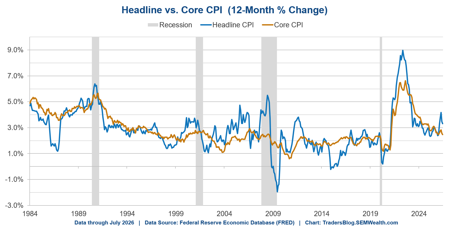
The Consumer Price Index Report (CPI) on Wednesday was "in-line" with expectations. I'm not sure what that means exactly, but thought we could look a little deeper at the index and what is driving inflation. Economists (and political spinmeisters) have come up with all kinds of different inflation measures. Here's an easy way to understand them:
Headline CPI is the actual level of inflation (as measured by CPI). Think of this as the inflation we all see.
Core CPI is also know as CPI "less food and energy". Economists like to strip these out because those two categories are more volatile. Of course, it is also the inflation the average household feels the most.
CPI reports can also be confusing because the report might be a monthly number (for instance, "Core CPI increased by 0.22%"). That doesn't mean much, nor does annualizing a number which may fluctuate. (The annualized rate of "Core" CPI in July was 2.67%. We prefer to look at the 12-month percentage change as that strips out seasonality and month-to-month volatility. (Core is up "only" 2.47% over the last 12 months.) However, actual CPI is up 3.30%.
I think a better way to look at this is the composition to the headline CPI number. This tells us what is driving inflation. This chart introduces another buzzy CPI measurement "Supercore" which strips out Shelter from "Core".
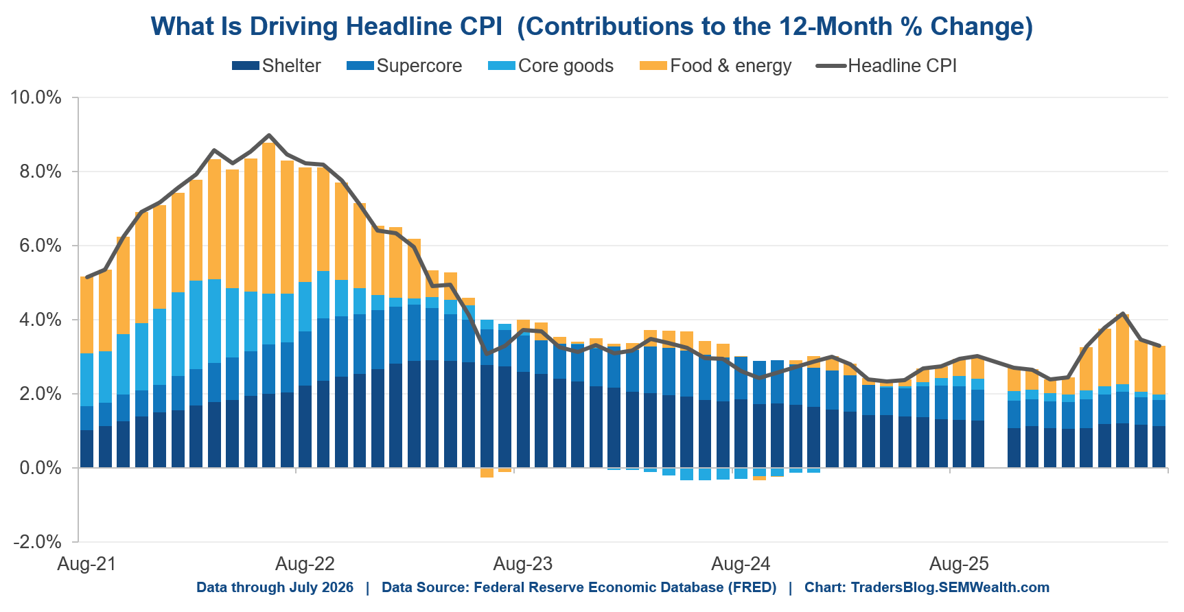
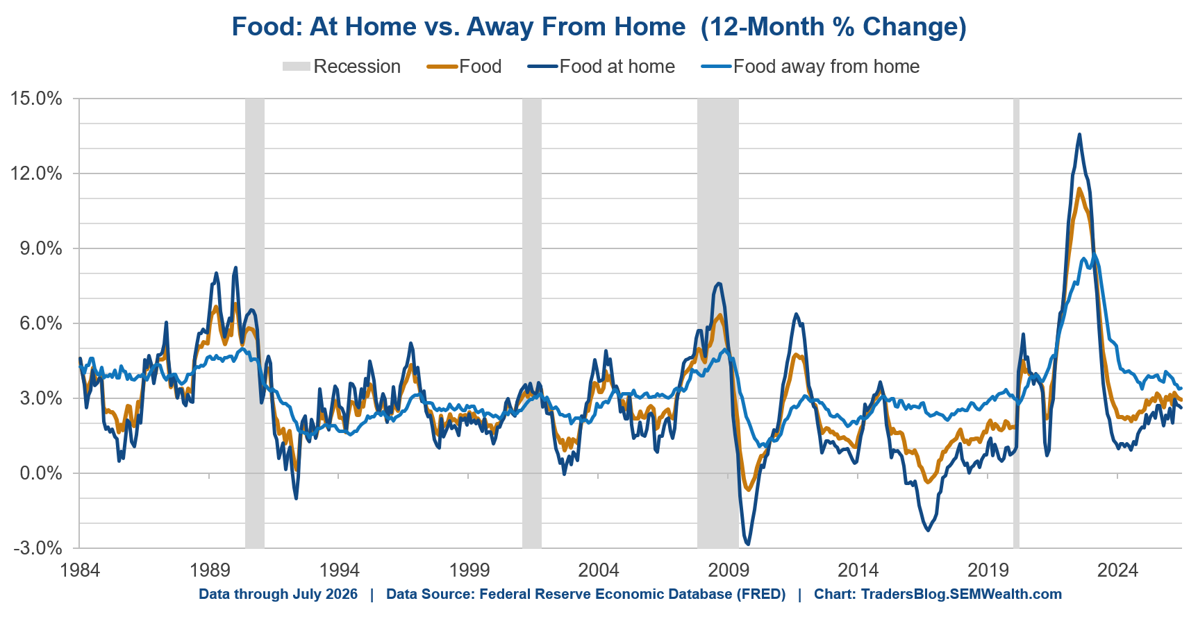
A lot of focus has been on energy prices as a driver of CPI that will magically go away whenever we actually see the War in Iran ending. However, food prices are not related to that and have been climbing since early 2024.
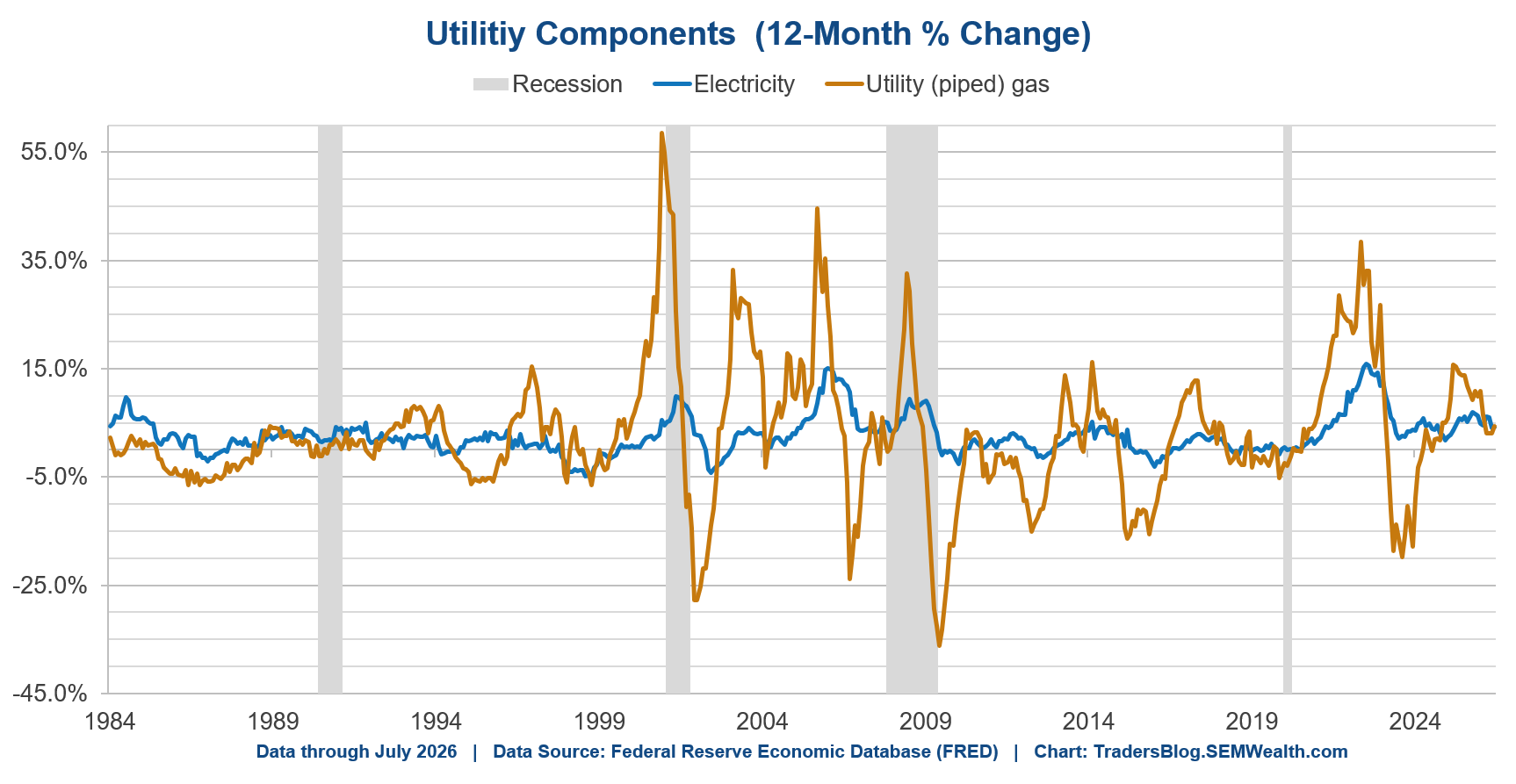
The other portion, which isn't directly linked to the War in Iran is the utility component. Along with food, this is something that is hurting the average household. Both of those components are up 4.25% over the past year.
What should the Fed do?
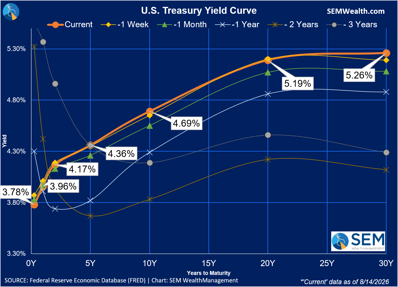
Yields for the most part were flat last week, although the odds of a rate hike from the Fed in September dropped slightly after the CPI and PPI reports.
I have been a frequent critique of the Federal Reserve and their policies. There are many reasons, but to sum up my opinion – they are almost always too far behind the trend. They are too slow to act when needed and stay dug into their policies even when the data says they should act.
The Fed (for now) prefers the PCE Price deflator as a more robust indicator of inflation than CPI. Either way, this chart shows how Fed policies (the orange line) have been very late in fighting inflation or trying to stem a deflationary cycle/recession.
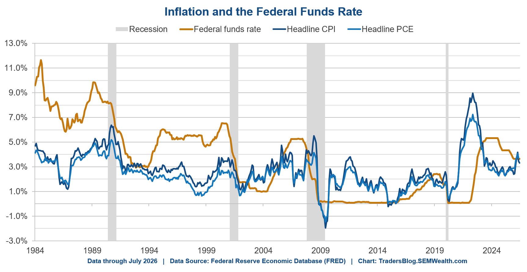
While every Fed Chair since Greenspan has claimed they were "data dependent", the facts show they have not been. Back in 1993 John Taylor, a Stanford Economist created what is known as the "Taylor" rule as a basis for the Fed to set interest rates based on their dual mandate (price stability (controlled inflation) and maximum employment (lowest reasonable level of unemployment). While the Fed never officially adopted it, the Fed under Allen Greenspan seemed to give it some weight throughout the 1990s. Unfortunately Greenspan lost track of it in the 2000s and let the housing bubble inflate (for Ben Bernanke to inherit.)
The Taylor rule has essentially been abandoned. During the financial crisis it would have prescribed deeply negative interest rates (which arguably was happening with QE). However, it would have also prescribed raising rates much sooner. The chart below illustrates the Taylor rule along with some alternatives.
The first was a revision which doubles the weight of the employment weighting in the Taylor rule (given the Fed's much higher focus on employment). Another is a simple application of a slow, measured approach using 85% of the current rate and 15% of the "balanced" approach. Focusing more on the post-COVID years you can see the Fed most certainly should have been hiking rates as early as 2021 and once again should have been hiking since earlier this year.
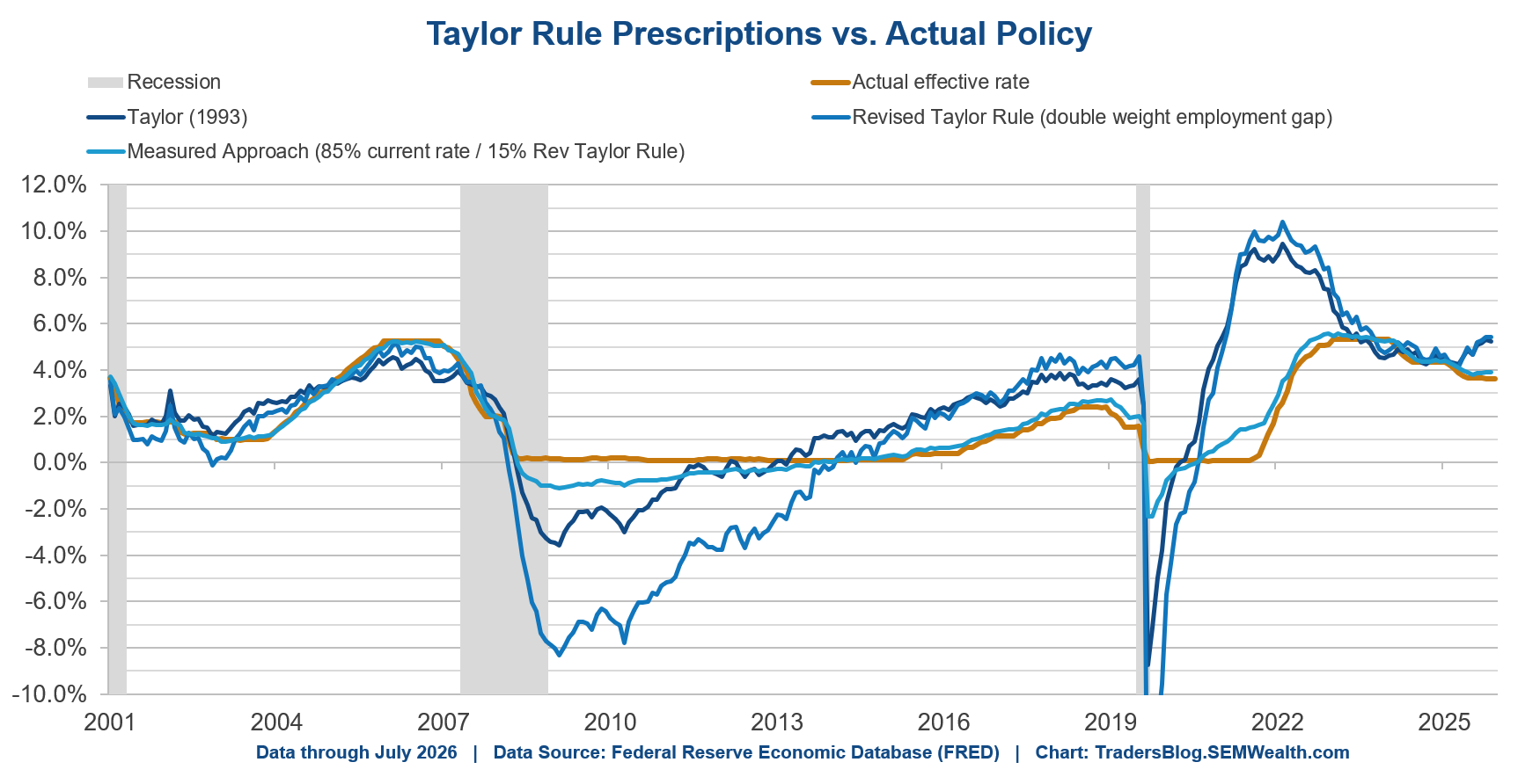
Will they do it? I guess time will tell whether the Warsh Fed is more data driven or will continue to follow the "old way" of being way behind in acting to keep inflation close to their target. Letting inflation run too hot is most certainly a risk the market is not prepared for.
Nvidia Chip Acceptance Corporation?
This brings us to the biggest news of the week, but also something that ultimately could be the thing that strikes to cause us to forget about the beauty of the rally.
As most of you know, some of the things I enjoy doing when away from my desk put me solidly in the "nerd" category. The podcasts I listen to most certainly fall in that camp. One of them I've been listening to lately is "Business History". One of the things they say often on the show is, "every business success story always ends in failure." They walk through the beginning, middle, and unfortunate end of various businesses. I recently listened to back-to-back episodes on Ford. The first was how Ford invented the "modern" world while becoming the dominant car manufacturer. The next was how GM beat Ford.
How did GM do this? They offered financing via the General Motors Acceptance Corporation (GMAC). For those of you who weren't adults yet in 2008, GMAC is now Ally after having failed spectacularly in 2008 and being part of the "too big to fail" firms who were bailed out by the taxpayers and Federal Reserve. Ford may have invented the assembly line, but GM turned vendor financing into an industry.
My goal was to keep this week's blog shorter, so I'm not going to walk through all the reasons GMAC failed (or give you a history lesson on vendor financing). There's only one piece we need today. In almost every form of vendor financing, somebody has to guess what the collateral will be worth when the loan ends – and somebody has to eat the difference if that guess is wrong. GMAC guessed what a three-year-old Suburban would be worth. Then gas went to $4 a gallon, nobody wanted a used Suburban and GMAC took a $716 million charge in a single quarter on the leases coming back to them. Lucent and Nortel made the same kind of guess about telecom gear in 2000. It's the oldest way there is to make revenue and earnings look better.
In July, Nvidia reportedly offered to guarantee up to $250 billion in loans for a planned OpenAI Data Center. Nvidia's credit default swaps jumped to a record on the news (making it more expensive for them to borrow money.) They went back to the drawing board and on Monday announced their new and improved version of vendor financing. (They also on Friday announced they were dropping their guarantee to $125 billion.)
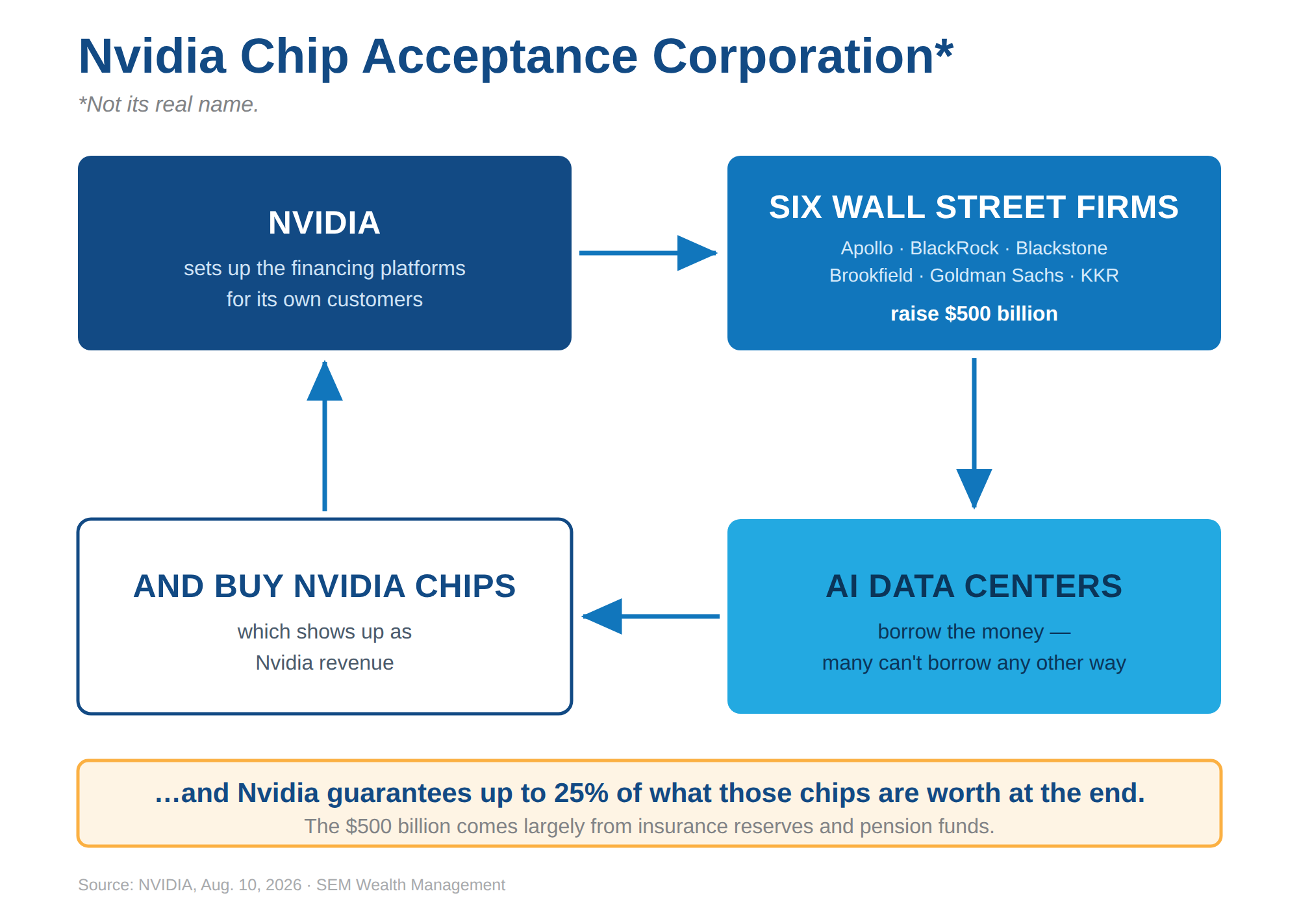
Nvidia is partnering with Apollo, BlackRock, Blackstone, Brookfield, Goldman Sachs and KKR to build a financing platform meant to raise over $500 billion – other people's money – to lend to companies so they can buy Nvidia chips. Nvidia CEO Jensen Huang went on TV and called his chips an "investable asset." The market's reaction? Nvidia lost roughly $130 billion in market value that afternoon. Think about this – a company announced half a trillion dollars of financing for its own product and the stock went DOWN.
Here's the part almost nobody seemed to focus on......Mr. Huang said Nvidia is guaranteeing up to 25% of what their chips are worth when the loans come due. If a graphics chip really holds its value for six to ten years the way Nvidia says it does, why would anybody need that guarantee? What happens if there is too much capacity and Nvidia has to step in and cover 25% of their sales that were part of this program?
I don't have the time or space to answer that this week – the CPI report already got my word count higher than I wanted, but it's the question I'll be working on over the next few weeks (months), because the money behind these vendor financing platforms isn't coming from Wall Street trading desks. It's coming from insurance reserves and pension funds. That's the same "safety-seeking" money I discussed back in February, and it has earned its own post (although I'm still working on the post from the July Nvidia - OpenAI - SoftBank Data Center deal.)
Private Credit Didn't Go Away
Finally, the last danger.....Go back and look at the list of firms in that Nvidia deal: Apollo, BlackRock, Blackstone, Brookfield, Goldman Sachs and KKR.
Four of those six capped withdrawals from their own private credit funds earlier this year. Three of them did it in June.
Private Credit was a frequent topic in the blog at the start of the year through March. I haven't talked much about it since then. That wasn't because it got fixed. The war in Iran had started, the market's attention moved on, and the blog followed what the market was focusing on. The issues with Private Credit remain.
Here's a brief update – these non-traded credit funds continue to cap the withdrawals from their funds. In the second quarter, Apollo's fund received requests for 16.8% of the funds assets – worse than the first quarter. Ares received 14.4% and BlackRock was 13.3%. Blackstone's BCRED (the biggest fund in this part of the market) capped in June for the first time ever after seeing requests for over 10% of its assets. Blue Owl isn't in the Nvidia group, but it's the extreme case: one of its funds received requests for 38% of its shares!
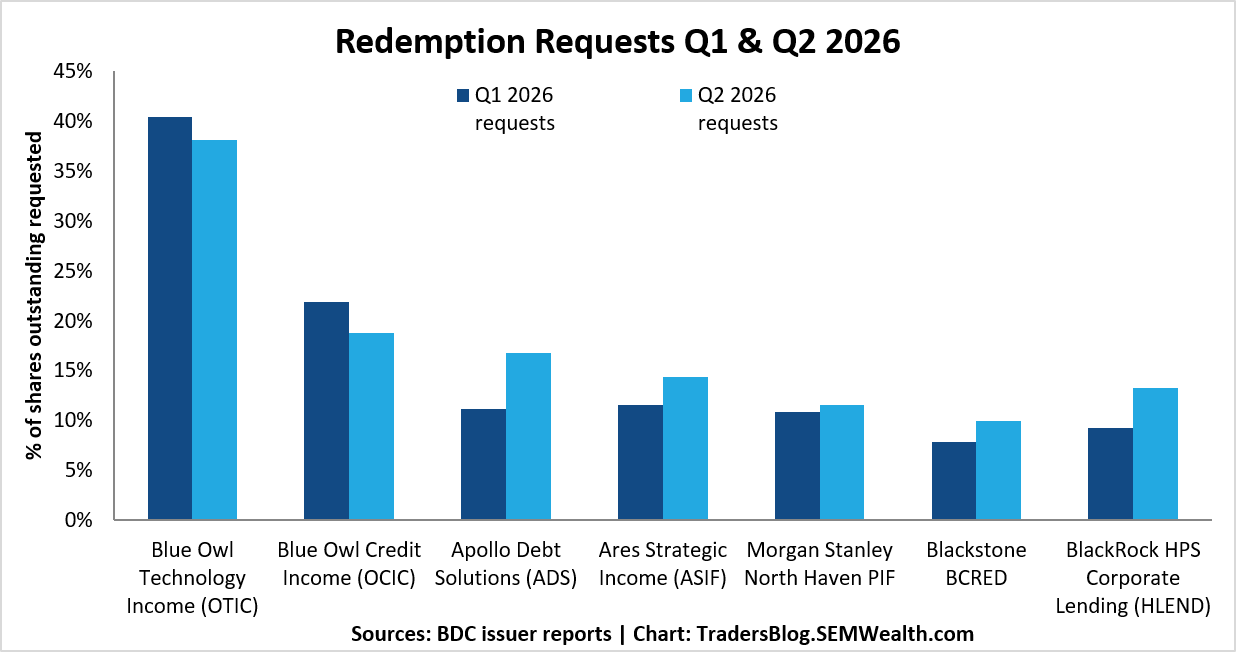
Back in the first quarter, investors asked for $15 billion across the twelve largest of these funds and got a little over half of it. It was also the first quarter in the history of these funds that money going out exceeded money coming in.
(Side note: nobody broke a rule here. The caps are written into the documents, and Blackstone's Jon Gray called them "a feature, not a bug" back in March. The alternative is a fire sale that hurts everybody who stayed. He's right. But "you agreed to this" and "you can't have your money" land the same way for client's (and their advisors) who treated these "low risk" assets like it was a "normal" investment.)
So now these same six firms are being asked to raise half a trillion dollars of new money with graphics chips as the collateral. Nothing is signed yet – what Nvidia announced were memorandums of understanding, not final agreements. As we know, a lot can change.
I'm not saying this isn't going to work. In fact, we may start seeing an AI infrastructure fund being pitched to our clients by Wall Street later this fall. If it is, it will be sold on the same promise that sold the last batch of private credit – low volatility, steady returns.
SEM has never used these vehicles or vehicles of this sort for many reasons. I don't see this changing any time soon, but this doesn't mean problems in that market cannot strike the rest of the market, so we will continue to follow and write about them as necessary.

The ETF Buffet Is Open: Options for Every Investment Style
I'm sure a few of you have seen or heard a similar headline to the one below and wondered whether it was an alarming sign for your investment portfolio.
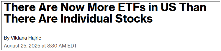
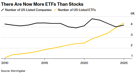
Granted, that Bloomberg article headline was from 2025 (nearly exactly a year ago - what timing!) and signaled to the public that it was the first time that the ETF count crossed the U.S. stock count - 4,300 exchange-traded funds compared to 4,200 U.S. listed companies, based on data compiled from Morningstar.
How did this revolution get started, and how did we get here?
A Brief History & Introduction on Exchange-Traded Funds
Contrary to the innovative or inspiring story you might associate with American history, exchange-traded funds (ETFs) were introduced in the United States as a new investment vehicle that combined the trading flexibility of individual stocks and the diversification benefits of mutual funds.
This development was heavily influenced by the Dow Jones Industrial Average falling 22.6% in a single session, the largest single-day percentage decline in its history, on October 19, 1987, which later was named Black Monday. Market participants and regulators desperately sought more efficient ways to gain market exposure.
After learning from our northern neighbor, when Canada introduced the Toronto Index Participation Units on the Toronto Stock Exchange in 1990, the U.S. followed three years later.
On January 22, 1993, State Street Global Advisors launched the first U.S. ETF, the SPDR S&P 500 ETF Trust (Ticker: SPY), on the American Stock Exchange, designed to provide a simple, liquid, and diversified tool for managing S&P 500 exposure.
Over the next decade, the total number of U.S. ETFs nearly reached 100, and they were largely viewed as a niche tool for hedge funds and sophisticated traders.
Now, let's fast forward to 2026...
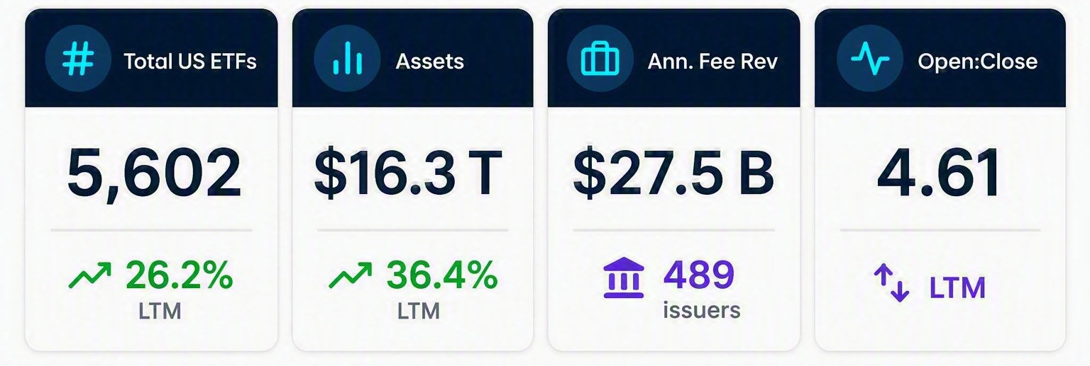
After 30+ years, U.S.-listed ETF AUM surpassed $16 trillion for the first time, bringing the total to 5,602 funds. In fact, the first half of 2026 had $1 trillion added to net flows, setting a fresh record for the strongest first half of ETF inflows ever - nearly doubling the previous record and an 86% increase from last year.
Pretty incredible, right? It seems like there's practically a "flavor" for any investor's appetite from the ETF menu.
On the other hand, you could argue that it's made it even harder to choose a single fund from 5,059 ETFs and to tell the difference between similar funds or strategies.
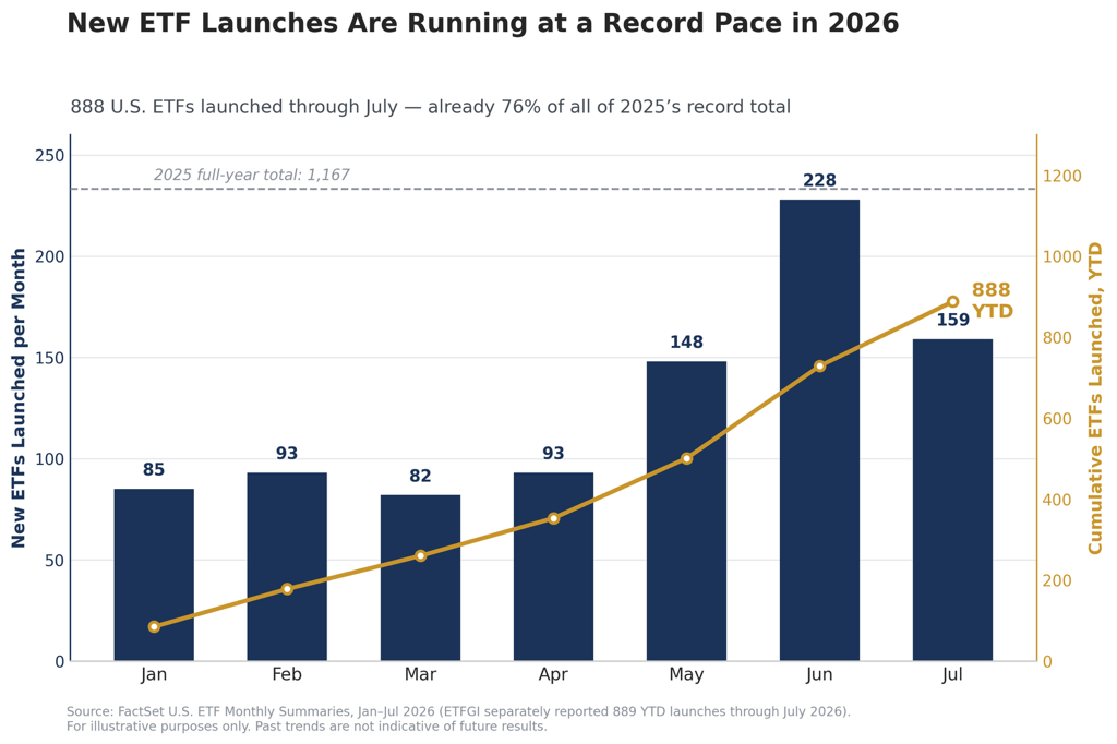
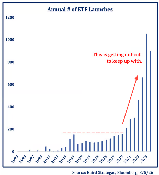
Now, let's step back and look at ETF launches on an annual basis.
To go a step further, let's organize the annual number of ETF launches by exposure.
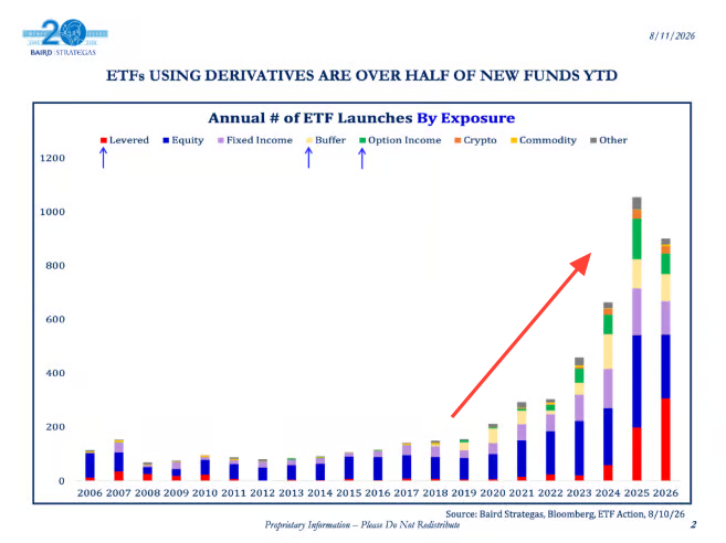
From 1993 to 2019, the ETF launch curve was relatively flat. Starting in 2022, the slope steepens exponentially after each calendar year.
Why are there so many options? What does this mean?
Let's explore four key reasons that can help explain this.
Rise of the Vanguard "Bogleheads" and Commission-Free Trading
Beginning in the 1970s and 1980s, Jack Bogle, founder of Vanguard, is widely credited with leading the low-cost investing phenomenon by promoting broad-based index funds with minimal expense ratios that emphasized diversification, simplicity, and a long-term horizon.
Following the 2008 financial crisis, Bogle's philosophy caught on quickly as investors lost confidence in actively managed mutual funds while paying annual fees to see underperformance.
Looking at the chart below, there has been a decades-long trend of assets shifting toward ETFs with lower fees, meaning investors wanted exposure they understood at a reasonable cost.
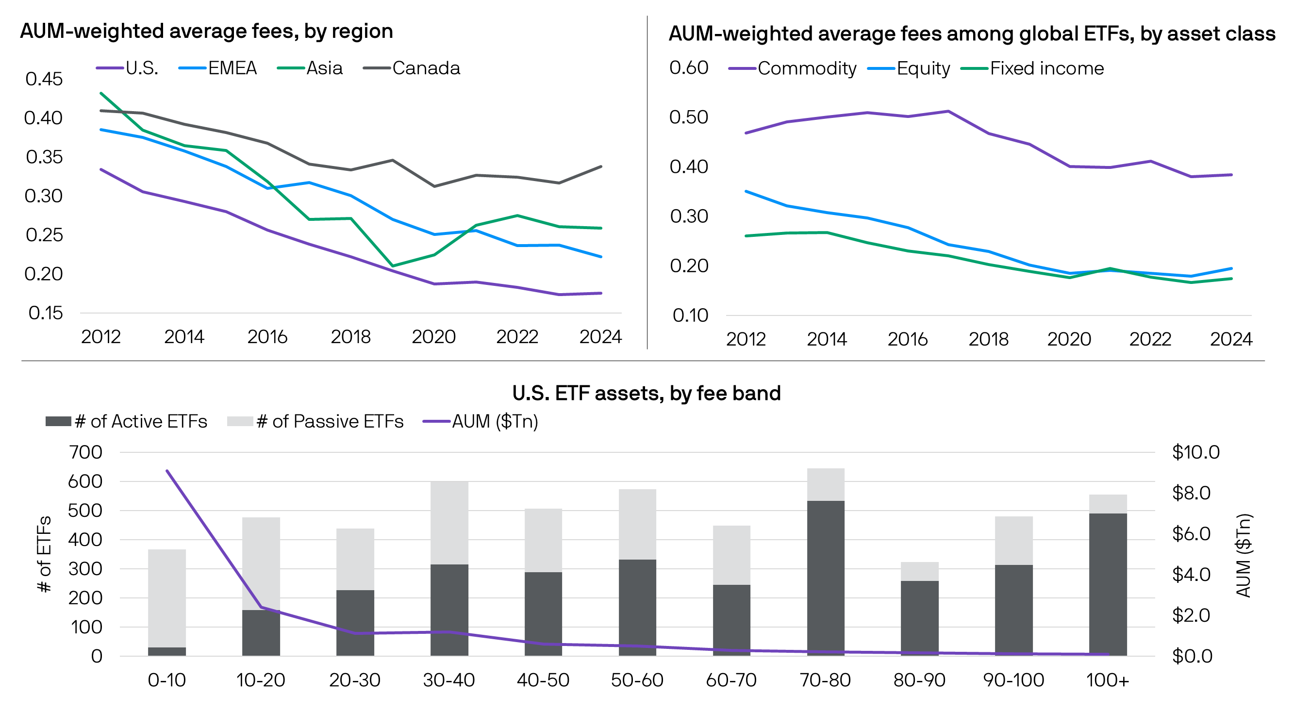
So, when custodians like E*Trade, Schwab and Robinhood eliminated trading commissions, the cost of owning an ETF fell to practically left only the expense ratio leaving the fee wars between Vanguard, BlackRock, and State Street to pushing closer to zero.
ETF Issuers Granted Their TSA Precheck: ETF Rule (6c-11)
When the SEC passed the ETF Rule in 2019, it permitted ETFs that satisfy certain conditions to operate without the expense or delay of obtaining an exemptive order.
The rule was designed to create a consistent, transparent, and efficient regulatory framework for ETFs that are organized as registered open-end management investment companies (“open-end funds”) and to facilitate greater competition and innovation among ETFs.
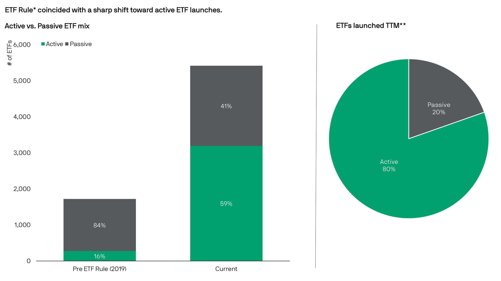
This enabled ETF issuers, large and small, to bring new strategies to market faster under the new regulation, at a much lower cost than before.
The Active & Thematic Reemergence
In the U.S., active ETFs now outnumber passive ETFs, with AUM growing 80% year over year to $1.8 trillion. Over the past six years, active products have accounted for more than 60% of new ETF launches.
In 2025 alone, 953 active ETFs accounted for 83% of all new ETF launches, according to JPMorgan Asset Management, more than triple the 308 active strategies introduced in 2021.
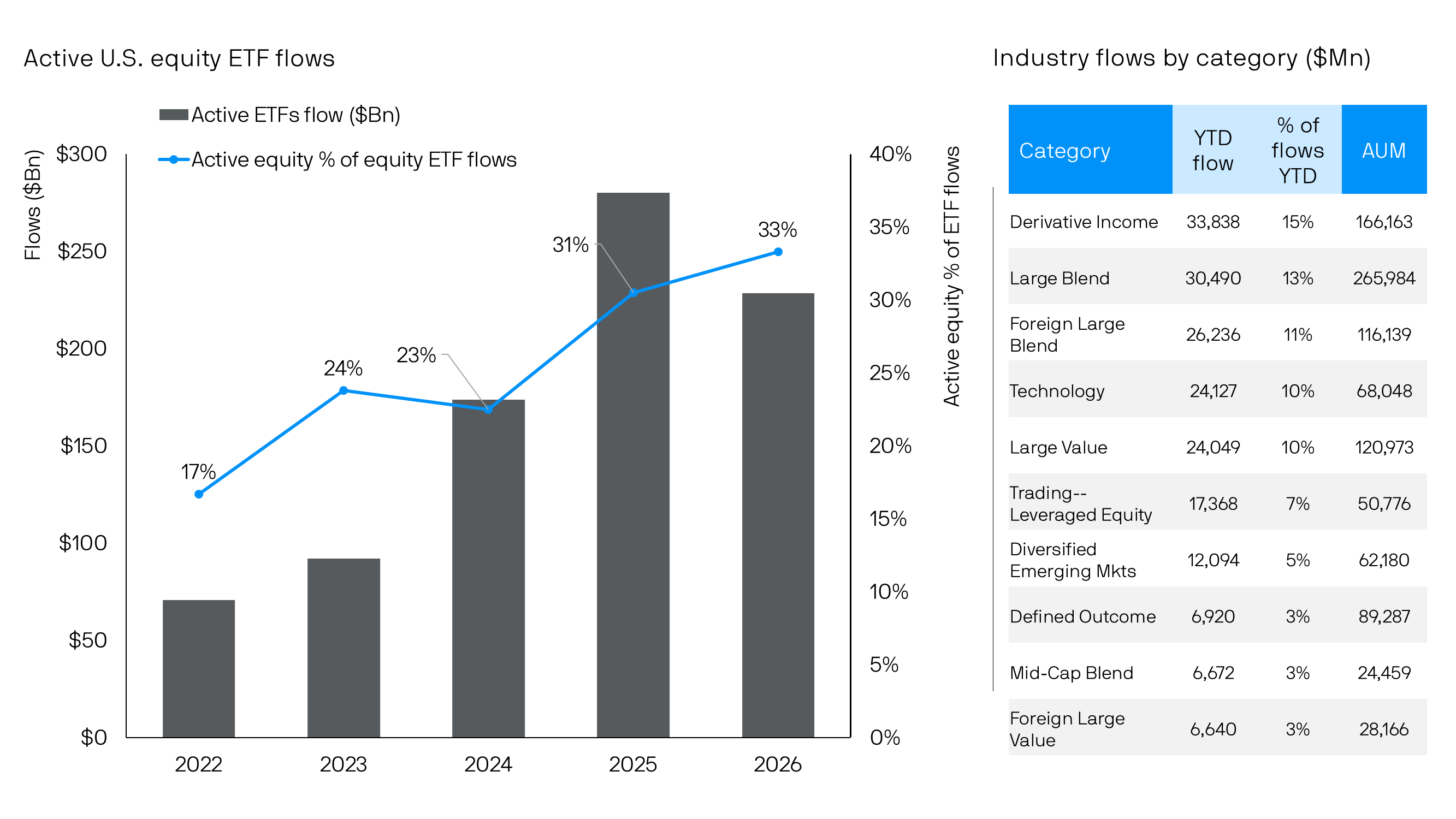
Looking ahead, 83% of ETF issuers plan to launch at least one active ETF in 2026, and 94% are either currently developing (87%) or plan to develop (7%) transparent active ETF solutions, according to Cerulli research.
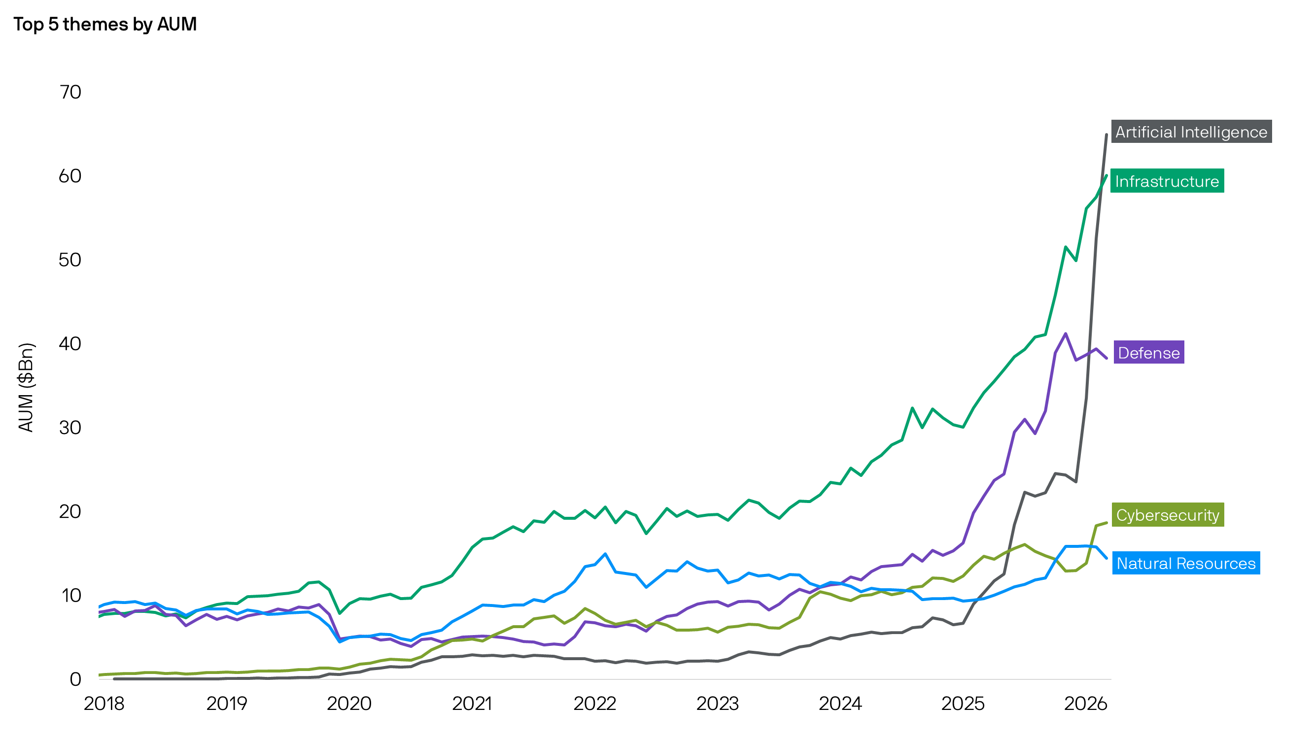
Thematic ETFs revived during the COVID pandemic as investors sought exposure to innovative or digitalization-linked names. Themes covering artificial intelligence, clean energy, robotics, genomics, and cybersecurity attracted investors, which ultimately resulted in a mixed bag of fund performance.
The Issuer's Dilemma: Healthy Innovation vs. Speculative Creation
Before 2019, closing a fund due to a lack of interest was viewed as an embarrassment for any ETF provider. Now, it's a spaghetti-cannon approach: funds launch dozens of ETFs and see which ones gain traction in terms of assets under management.
For example, on May 6, 2026, Corgi Invest raised $160M and launched 34 ETFs in a single day, with plans to launch hundreds more in the coming months.
Even on Friday, Volatility Shares Trust filed to launch 32 separate NHL team ETFs tracking on-ice performance through futures contracts. So, if approved, we will have a separate ETF for each of the 32 teams in the National Hockey League.
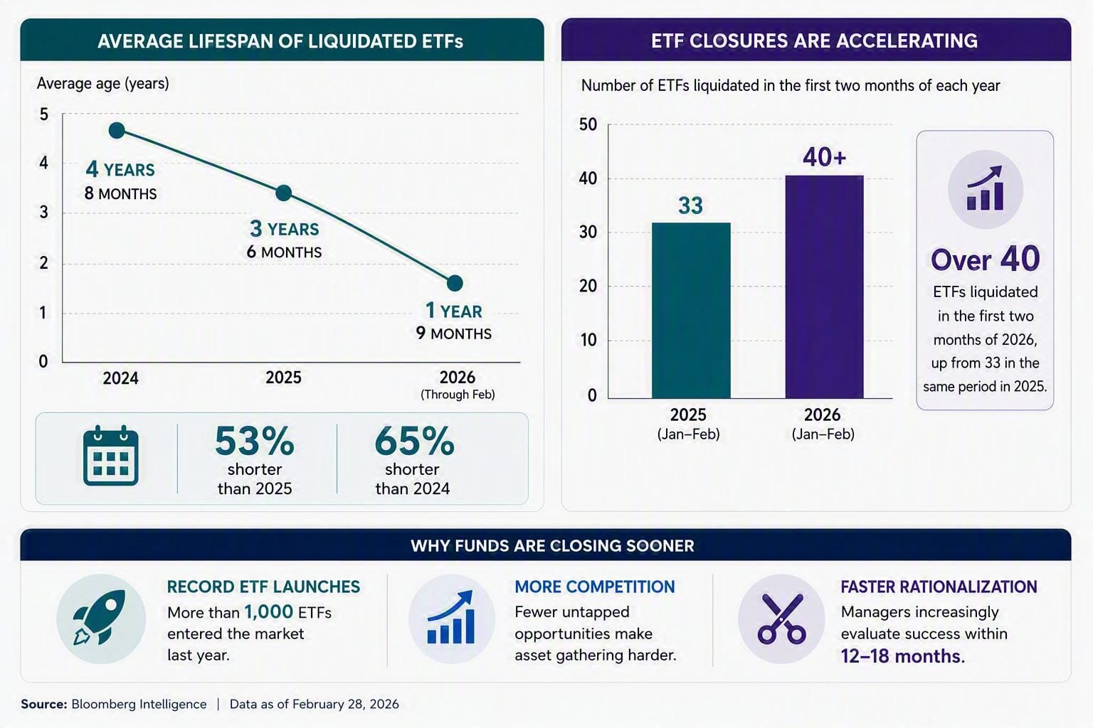
Despite the low cost and limited number of guardrails for launching an ETF today, not every ETF launch succeeds. Most ETF closures involve smaller products with less than $50 million in assets under management (AUM), suggesting they failed to attract interest from advisors and investors and lacked a clear core component for the issuer's future growth.
For example, in July 2026, the Themes ETF Trust announced the liquidation of 13 separate funds after citing an inability to attract sufficient assets. The casualty list included leveraged single-stock products and thematic plays on infrastructure, research and development, and natural monopolies.
At SEM, we believe your time is best spent focused on what matters most to you, not on keeping up with the complexities, evolving regulations, and latest trends shaping the ETF marketplace. As your trusted advisor, we take on that responsibility through a disciplined, research-driven investment process designed to identify opportunities, manage risks, and adapt to changing market conditions.
Thank you to all of the visitors who read last week's "Chart of the Week". I hope to continue sharing these talking points about markets, investing, etc., for you to share with family, friends, coworkers, or anyone along the way.
See you next time!
Market and Economic Data
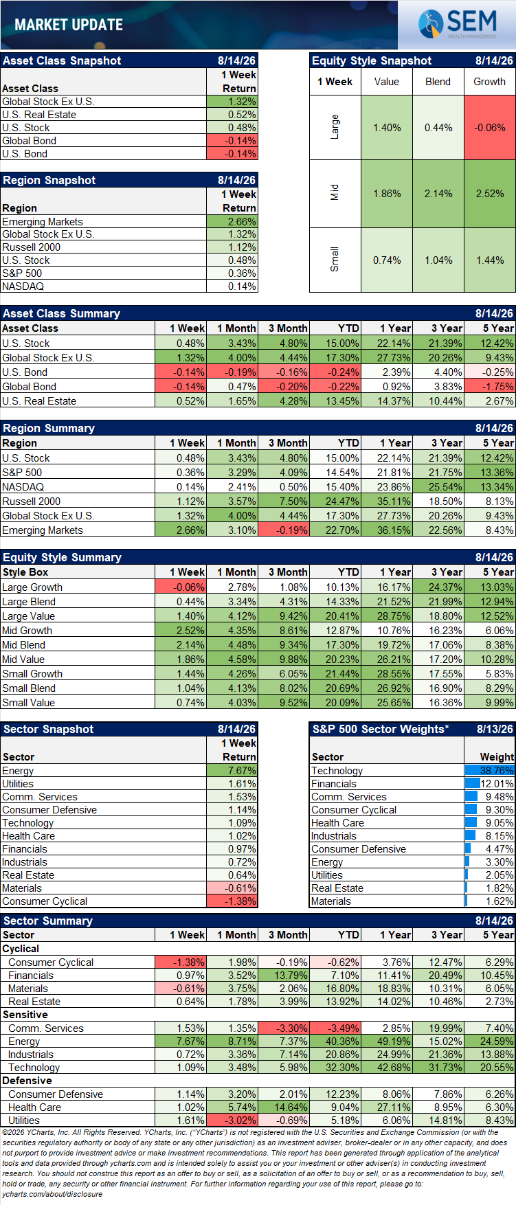
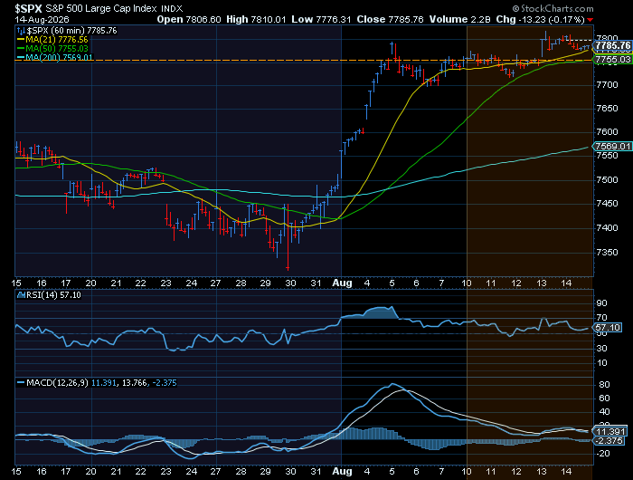
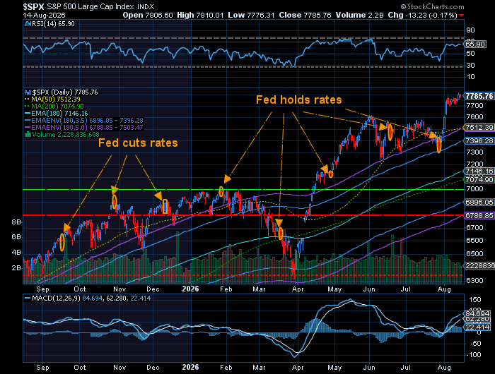
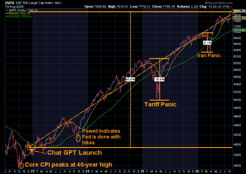
U.S. indexes were little changed overall after stocks took a breather following a rally that lifted the S&P 500 and the Dow to record highs the previous week.
The U.S. small-cap index set a record high and outperformed large-cap for the week. Following Friday's close, U.S. small-cap growth was up 1.44% for the week.
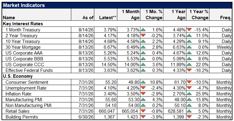
We had two reports which reflected elevated but modestly easing inflationary pressures at the consumer and wholesale levels. The Consumer Price Index held steady at a 3.4% annual rate in July, slightly below June’s 3.5% figure. A subsequent report on producer prices showed inflation was little changed in July relative to the previous month.
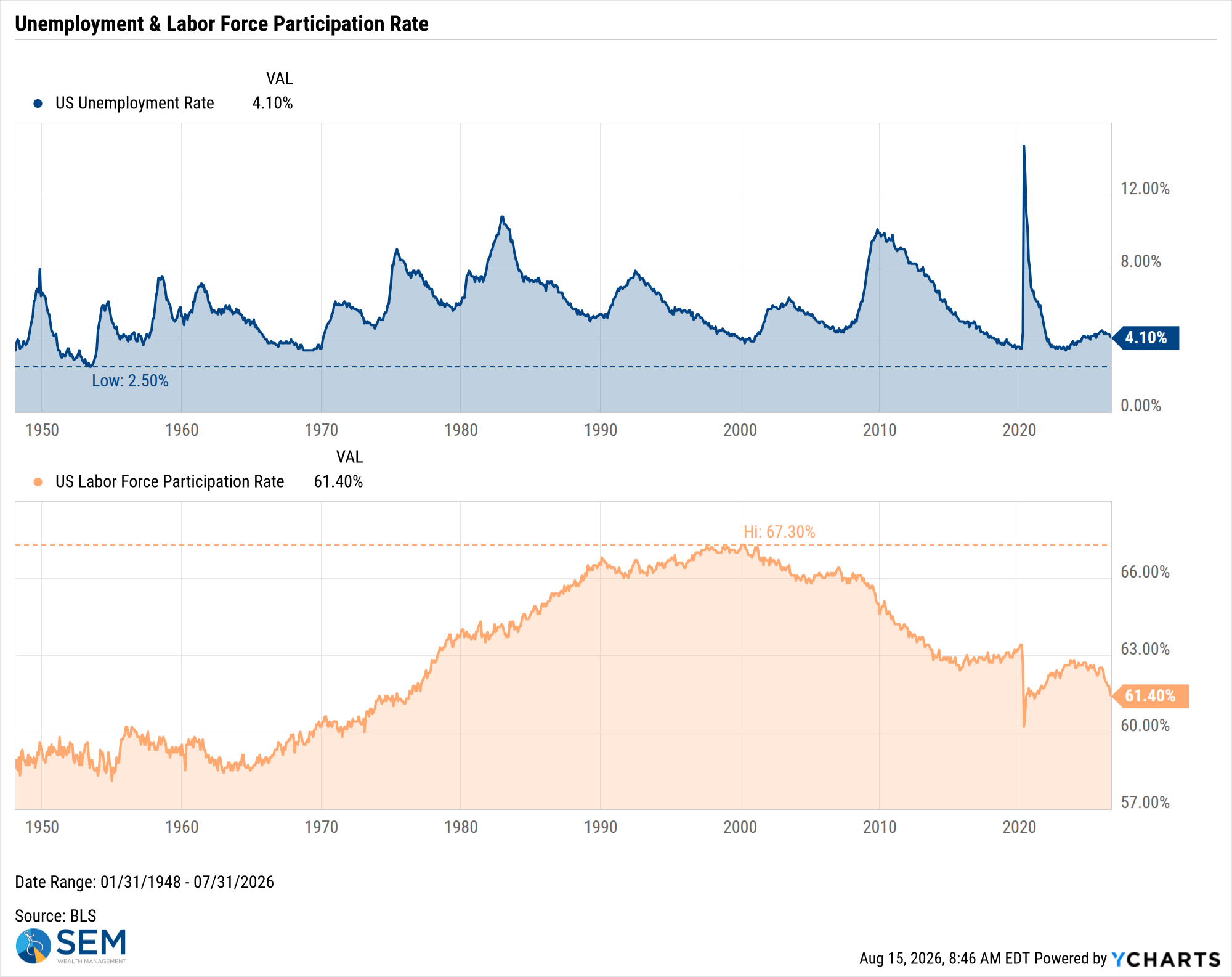
US Unemployment Rate data by YCharts
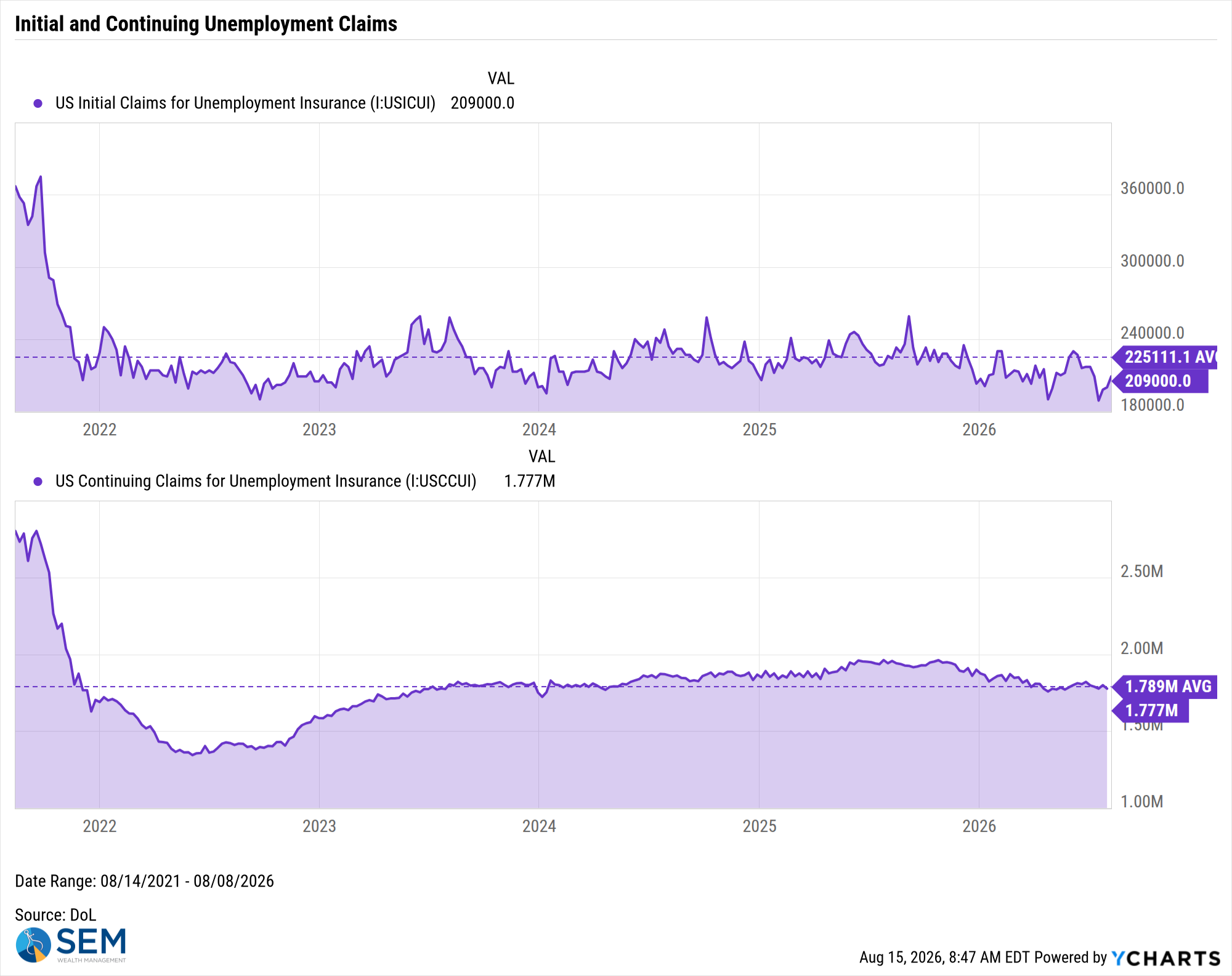
US Initial Claims for Unemployment Insurance data by YCharts
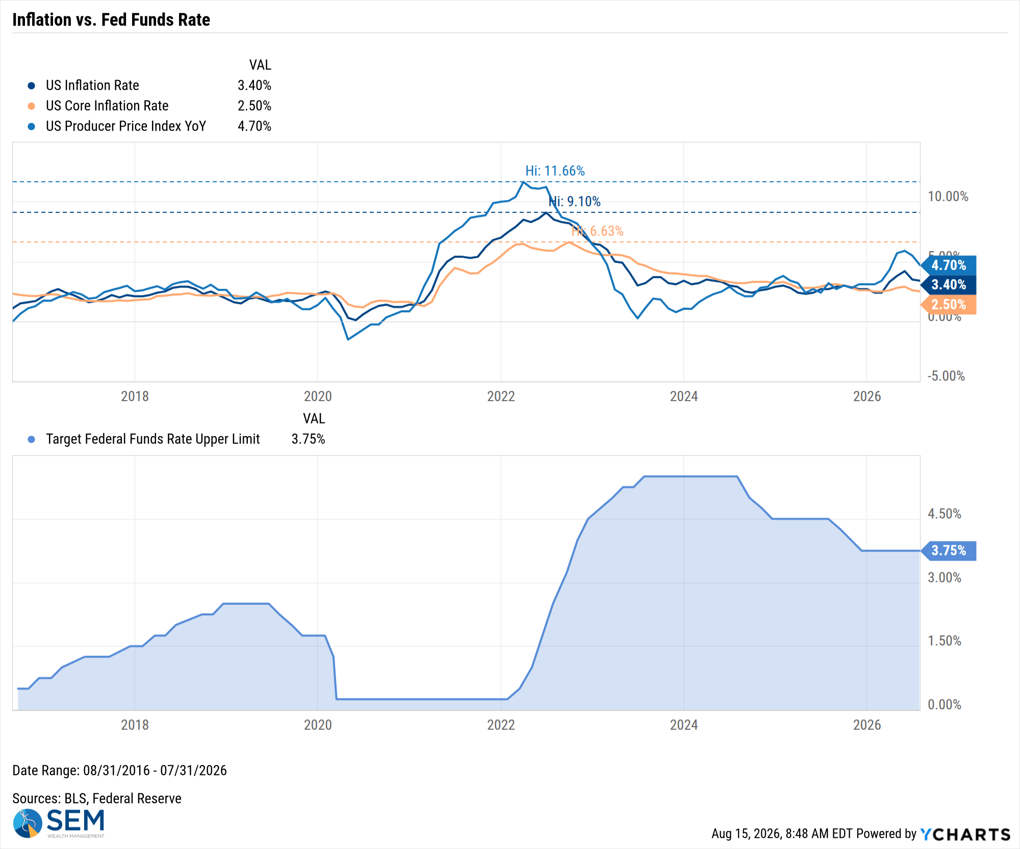
US Inflation Rate data by YCharts
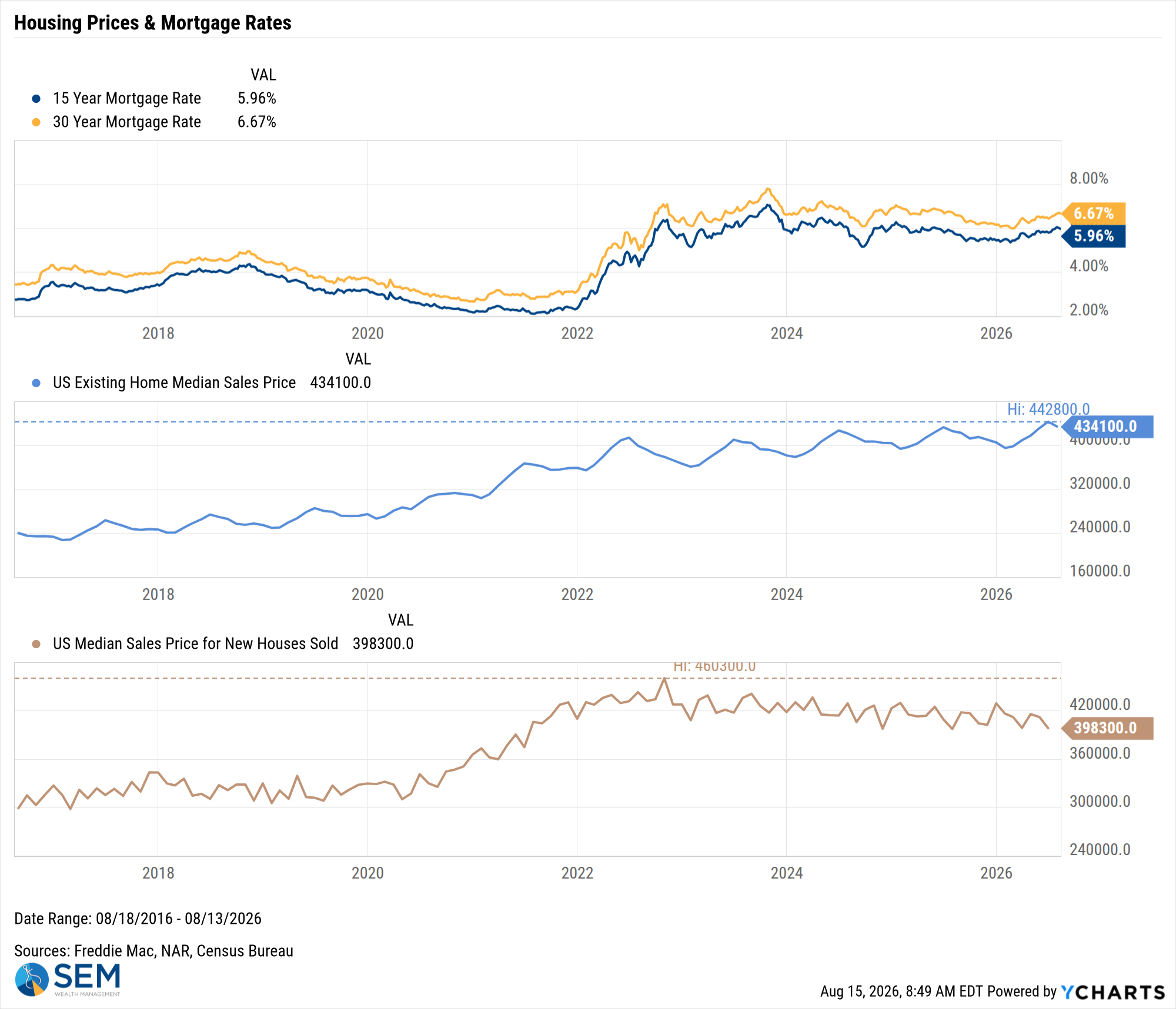
US Existing Home Median Sales Price data by YCharts
SEM Market Positioning
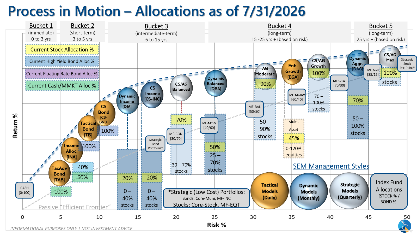
SEM deploys 3 distinct approaches – Tactical, Dynamic, and Strategic. These systems have been described as 'daily, monthly, quarterly' given how often they may make adjustments. Here is where they each stand.
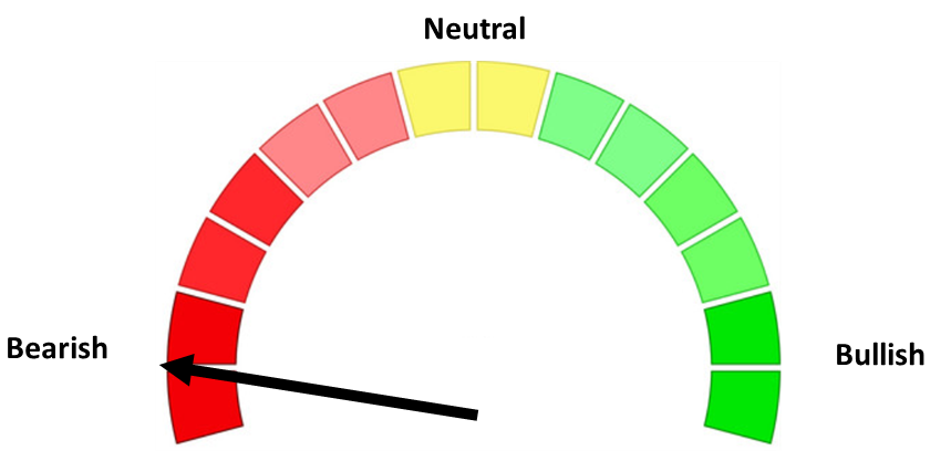
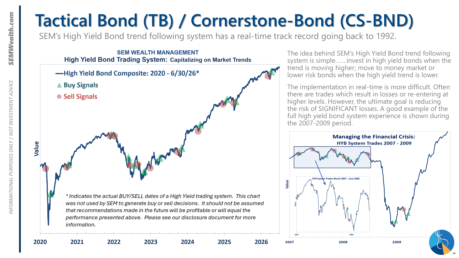
- Tactical = BULLISH | 100% High Yield Bond (4/8/2026) | High-yield spreads remain narrow but trend is slightly higher
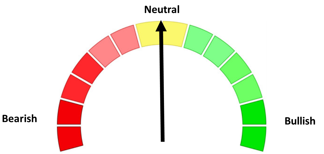
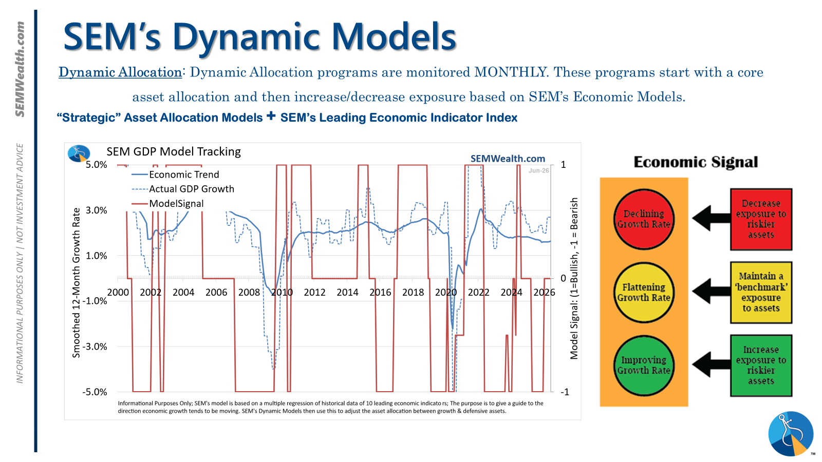
- Dynamic = NEUTRAL (2/15/2026) | "Benchmark" Allocation | Economic model inconclusive
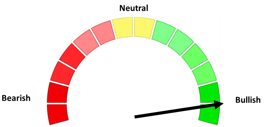
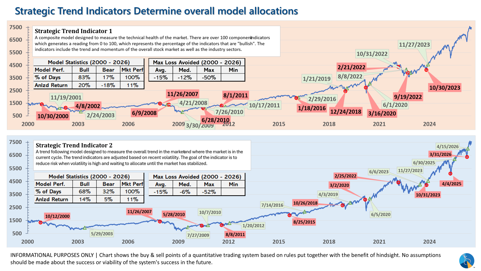
- Strategic = BULLISH (4/15/2026) | V-Bottom projecting "end" of Iran War
Tactical (daily):
- Monitored DAILY
- Models: Tactical Bond, Cornerstone Bond, Income Allocator, Tax Advantaged Bond
- Designed to follow the trends for use in our lower risk models
- BUY Signal issued April 8, 2026 (exiting the sell from March 13)
Dynamic (monthly):
- Monitored MONTHLY
- Models: All "Dynamic" Models (Income, Balanced, Growth, and Asset Allocator)
- Uses SEM's Quantitative Economic Model
- Designed to overweight riskier assets if economic trend is higher & underweight those assets if economic trend is lower.
- NEUTRAL signal issued February 15, 2026 (following BEARISH signal from July 2025)
Strategic (quarterly)*:
- Monitored QUARTERLY
- Models: AmeriGuard (Balanced, Moderate, & Growth) and Cornerstone (Balanced & Growth)
- Core Component: Quantitative Filter using 4 different time horizons across universe of asset classes
- Trend Indicator: Two different Quantitative Systems monitoring the intermediate-term trend, health of the market, and volatility
- CORE has been overweight small cap and international since October 2025 – overweight increased slightly in January
- Both TREND INDICATORS are BULLISH following 10% drop and "V-Bottom" reversal in early April
- AmeriGuard & Cornerstone Max DO NOT use the Trend indicator and are always 100% invested in stocks using our CORE rotation model.
The core rotation is adjusted quarterly. This quarter we saw half of our international positions reduced (we sold developed markets and kept our emerging markets exposure). We also saw the remaining share of mid-cap reduced in favor of more small cap exposure. We remain with a "barbell" core portfolio – about half in large cap and half in small cap as the models expect the market to "broaden".
The * in quarterly is for the trend models. These models are watched daily but they trade infrequently based on readings of where each believe we are in the cycle. The trend systems can be susceptible to "whipsaws" as we saw with the recent sell and buy signals at the end of October and November. The goal of the systems is to miss major downturns in the market. Risks are high when the market has been stampeding higher as it has for most of 2023. This means sometimes selling too soon. As we saw with the recent trade, the systems can quickly reverse if they are wrong.
Overall, this is how our various models stack up based on the last allocation change:
Curious if your current investment allocation aligns with your overall objectives and risk tolerance?