As we start the 20th week of the Coronavirus panic in the U.S. in many ways it feels like we haven't made much progress. Cases are spiking in two heavily populated states, schools are trying to determine what they should do with their students, Congress is arguing over what type of stimulus is needed, and there is wide spread confusion over what should be done, with a huge divide between the two major political parties.
All of this makes decision making especially difficult, especially when it comes to investing. After doing this for over 25 years, during times of uncertainty, lists and data are the only way to keep some sense of structure to decision making. For the last 20 weeks I've been providing my list each Monday. Here's what's on my list for you to focus on this week:
#1.) The "market" is not the economy
The most often asked question on the video calls I've been conducting with advisors and clients is "why is the stock market going up when the economic data is so bad?" Most clients and advisors focus on the S&P 500. In our Summer Newsletter we mentioned how just 6 stocks (FAANGM - Facebook, Apple, Amazon, Netflix, Google, and Microsoft) represented 25% of the S&P 500. Those stocks certainly are not representative of the economy.
 Jeff Hybiak, CFA
I prefer looking at the Russell indexes. They have more structured rules than the S&P 500. The Russell 3000 represents the top 3000 companies in the stock market in terms of capitalization. The bottom 2000 are the smallest companies and the top 1000 are the largest. There are many other divisions, including the "Top 200." These two charts illustrate how the top 200 stocks have pulled the entire stock market (the Russell 3000) higher. Smaller companies have struggled and are barely positive over the past 3 years.
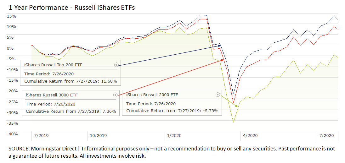
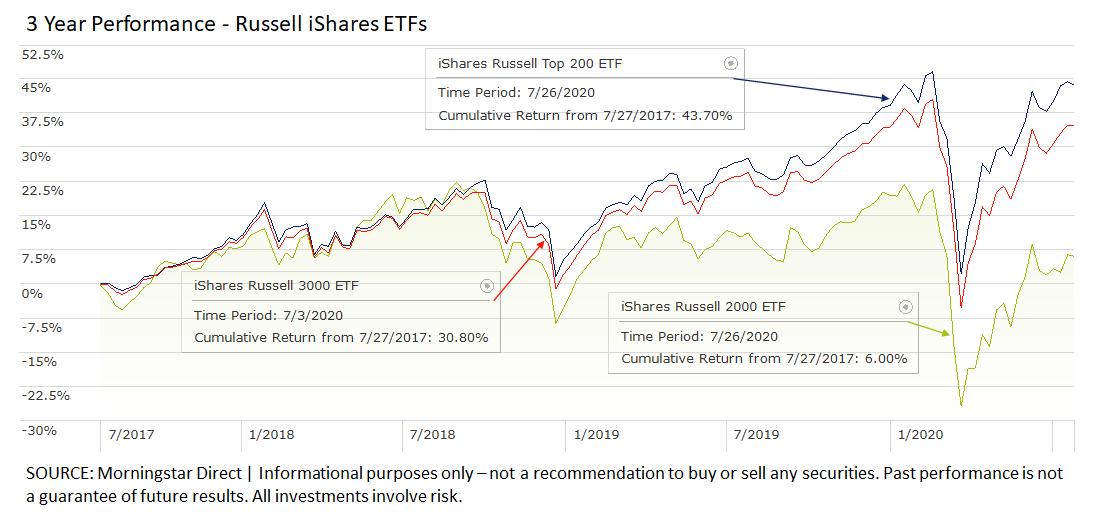
We've certainly had other periods where the "market" as represented by the S&P 500 was nowhere close to representing the overall economy. In all cases, the "market" eventually reverted back to being more representative of the overall economy. Periods like this can go on for longer than we believe is logical, but they are also especially dangerous because it begins to cement in our minds that these top 200 companies are vastly superior to all other companies and will remain so.
With SEM you can participate in these manias – we are heavily invested in the top 200, but we also have mechanisms in place to rotate out of them when the trends finally reverse.
#2.) Still all about jobs
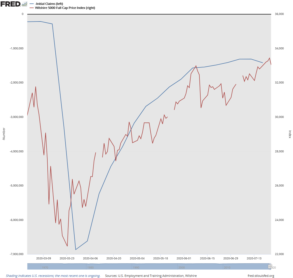
While the "market" is not the economy in terms of the S&P 500, it will still react to economic data. Back in mid-June, I showed the strong correlation between the stock market (this time represented by the Wilshire 5000, which has the most data in the FRED database.)
Jeff Hybiak, CFA
A couple of weeks back I identified the pattern the market has been following. I called the current stage the "pause." I heard Blackrock call it the "slog" last week.
Jeff Hybiak, CFA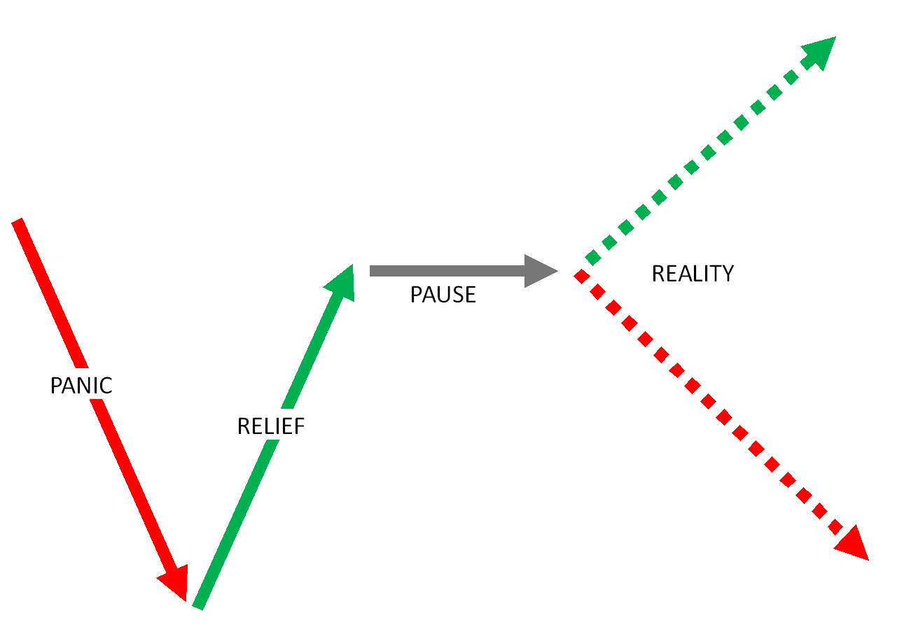
What is interesting is we can see the pause correspond with the loss of momentum in weekly jobless claims. The chart below has inverted jobless claims so we can visualize the data better. Claims moving higher on the chart is good, moving lower is bad. We've seen more people filing for initial jobless claims the last few weeks, which is bad news for the market.
We didn't receive any new economic data that is part of our economic model last week. We will see some key releases this week, including a GDP number that is likely to be shocking given the way the government reports it (they annualize the 3 month change, making it a very volatile number.) I'll have updates early next week on where our economic model stands.
#3.) More stimulus is coming
Even if you've only read a few of my blogs over the years, you probably know I am deeply concerned about the level of debt in our country. For 20 years I've been criticizing leaders on both sides of the political spectrum for their "we'll pay for it later" attitude. I won't go into that today. Just know any stimulus is borrowing from future growth. Funds that are spent to increase consumption create a long-term drag on future growth rates. Debt can be ok if it is an "investment" in things which will create future growth.
This week we'll be hearing a lot about stimulus. The payments could technically be considered an "investment" in that some of it has indeed helped save businesses and jobs. Unfortunately, a lot of the stimulus money seemed to go to people who didn't need it, with those who did, not receiving enough.
Data from Moody's shows the lowest income people spending near their same levels while those at the highest income levels have not resumed their spending at the same rate.
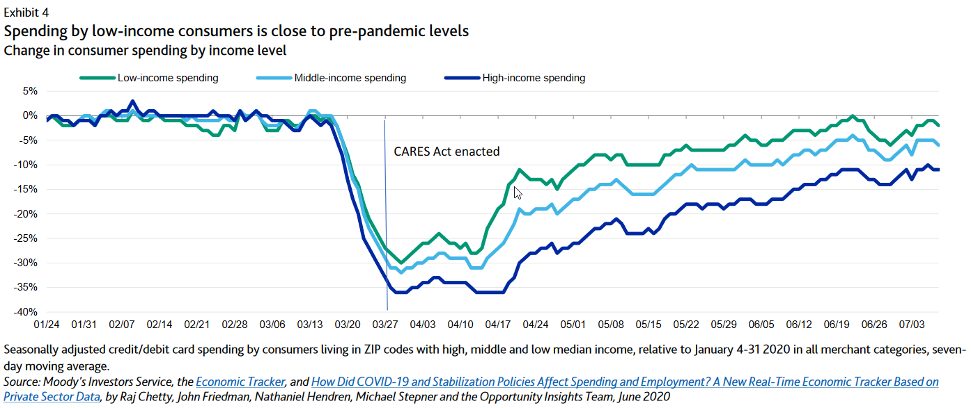
A textbook could be written focusing on the underlying factors in the above chart, so I will reserve commenting on the specifics of the stimulus measures.
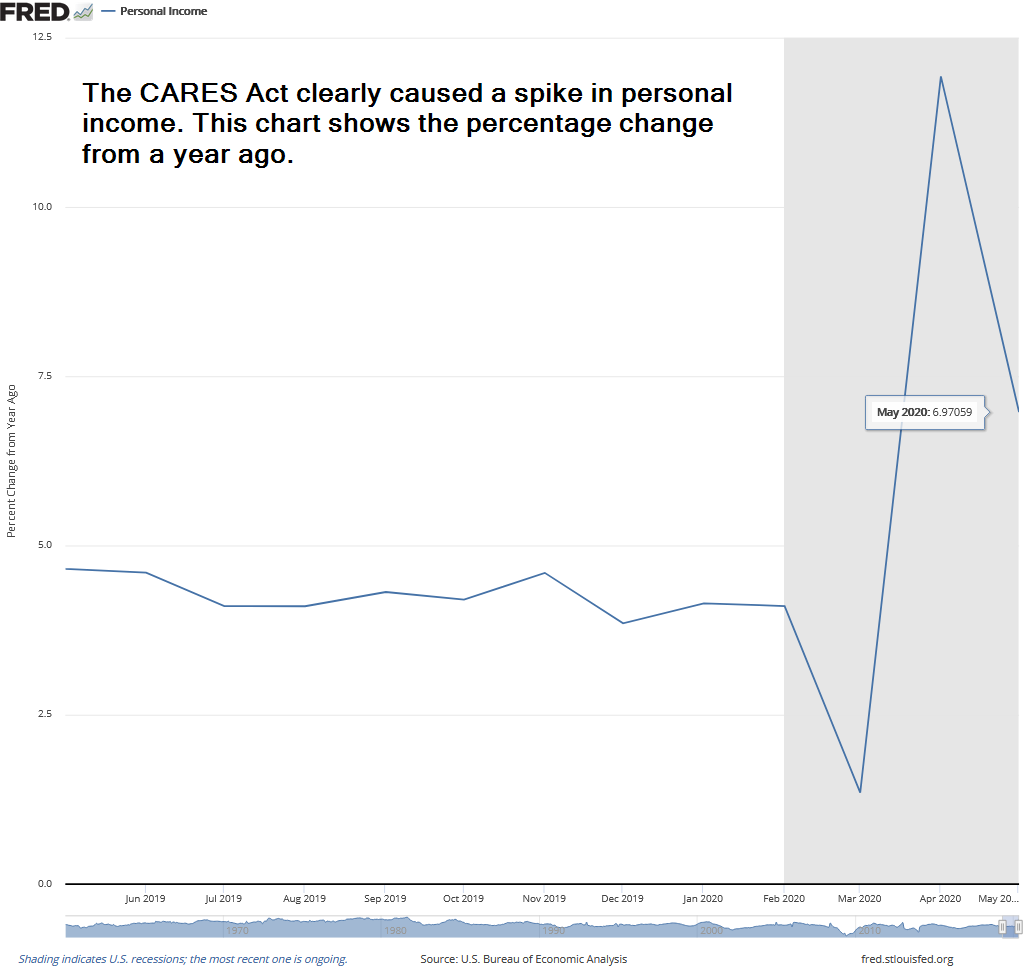
Looking at the overall data, we can see the impact the stimulus has had on income. Overall income is up 7% from a year ago. Do Americans really feel that much richer? I guess time will tell.
The structure of the stimulus and how it is distributed will play a key role in the upcoming direction of the market and economy. No sense speculating now until we see the details.
#4.) No matter what, bond defaults are coming
Based on our track record, which goes back to 1992, SEM is one of the premiere fixed income managers in our country. Our high yield bond trend following models give us a very favorable return/risk profile. The beauty of high yield bonds is they are a direct representation of the health of the economy. When you invest in a stock you hope to sell it at a higher price. When investing in a bond you are looking to capture the coupon with a close eye on making sure you can get your money back.
The Fed did a good job to stabilize the bond market overall this spring, and has helped high yield (junk) bonds rally since mid-April. However, they have said repeatedly they will not be able to buy insolvent companies. Recessions stress the most indebted companies. No amount of stimulus will be able to save them all.
While we don't know when or how many bonds will ultimately default, Moody's has predicted we could see a run of defaults into the late fall with a peak just before year end.
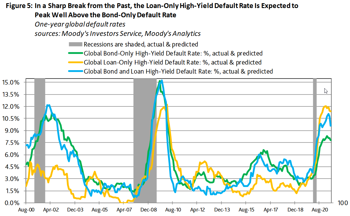
This will cause stress on banks and others relying on these loans. In March, we saw spreads spike to 1100 basis points over Treasury Bonds. They have since fallen to a paltry 525 basis points. Moody's predicts those spreads could get as high as 1500 basis points once again as the defaults pick-up. You're only being paid 5.6% in high yields to take on this risk. As we said in April, opportunities are coming. We have been able to turn the current rally into a nice jump in our returns, but fully expect a sell signal to come soon.
Jeff Hybiak, CFA
Tactical Bond is the best pure way to access our high yield bond models, although you get access to those as well as a more diversified mixture of income models in Income Allocator. Dynamic Income Allocation gives you access to the handful of other top high yield bond trend following managers in our country. All have managed money for a couple of decades and have a similar return/risk profile, but a different approach to SEM.
Jeff Hybiak, CFA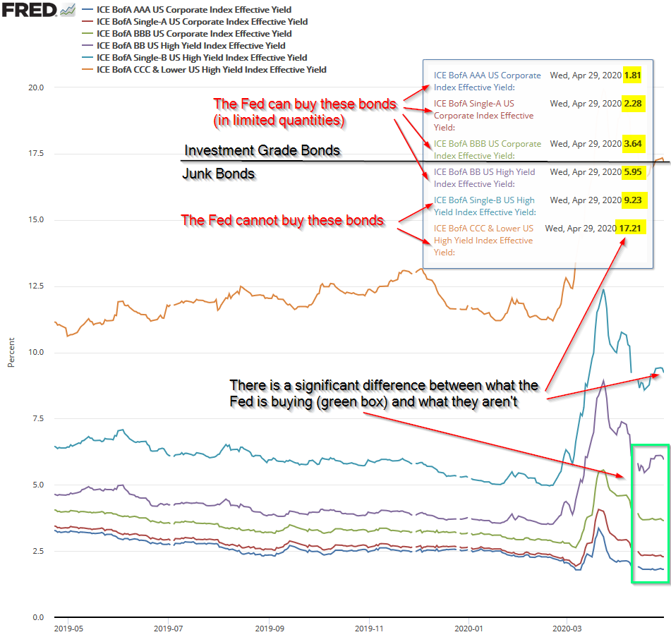
Opportunities are coming, we just don't know when. Patience will be key.
#5.) Redefining Normal
This weekend our 13-year old twins had their first outdoor soccer games of 2020. It was different, but still normal enough to make us feel like there could be light at the end of the tunnel. Nothing changed in the actual game play. No shaking hands with the other team, a more "distanced" bench, no shared drink stations or snacks, and the spectator section was further from the field with more space to spread out. Brandi commented on a key behavioral idea – rather than complaining about how things used to be, we should just go into this thinking things will change. We'll have to wear masks more often than we want to, we'll have some businesses forever changed (or no longer necessary,) we'll have to change the way we travel and interact with others. If we go into it thinking this is "normal" and things actually get better quicker, it will be a nice surprise. If we continue lamenting about all the things we used to do or protesting all the changes, it will just make us more miserable.
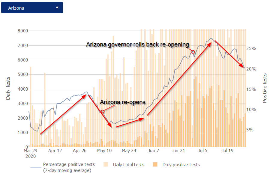
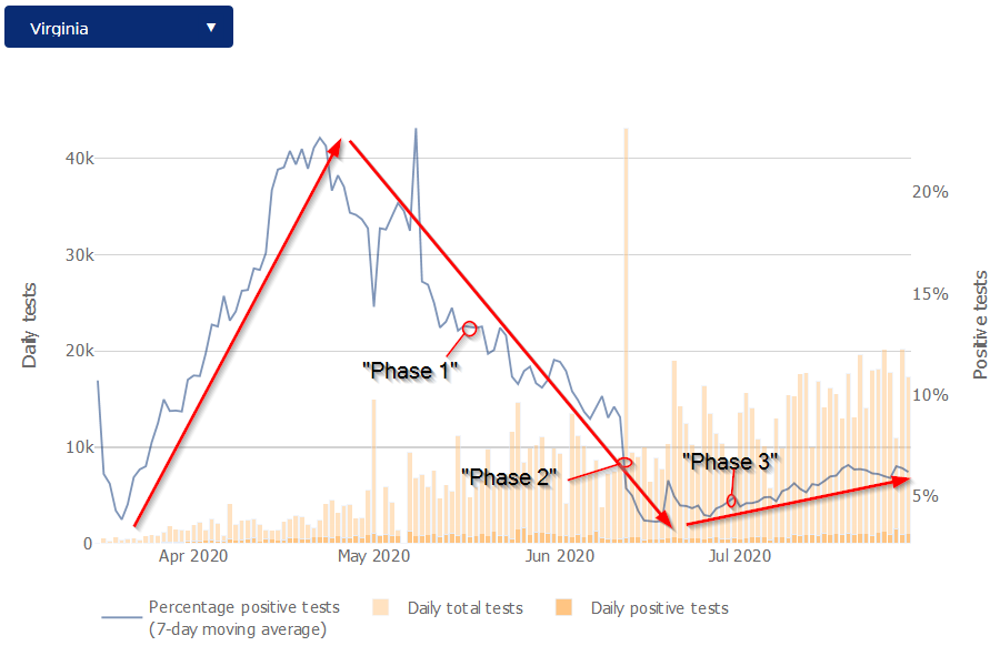
I of course realize we all live in different locations. Even at the tournament, it was obvious most of the families there had very little economic damage done to them from the Coronavirus shutdowns. Club sports are not cheap, even at the regional travel team level. A few families had to receive scholarships for their kids to continue to play. Virginia is also different in its handling of the virus than other states. With a pediatric neurosurgeon governor, our state pretty much followed all of the guidelines by the CDC, Mayo Clinic, John Hopkins, and other experts. With offices and friends, and family (including some children) in Arizona and Virginia, we've watched the data and policies closely. Arizona instead followed the "economic" models that said we had to get businesses reopened ASAP and did a nearly full-scale re-opening on May 15.
Here's the latest update (through Wednesday, July 29).
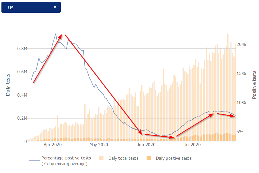
First the Percent of Positive Tests from John Hopkins:
Arizona re-imposed some restrictions three weeks ago. So far this seems to have helped a bit in terms of positivity rates. Even still, with 20% of all tests coming back positive, they are still in a danger zone.
Virginia did see a steady climb in positivity rates after our "Phase 2" reopening in mid-June. The governor came out with a warning two weeks ago as the "Phase 3" opening saw a more significant rise in positivity. Since then rates have again declined. Even with the increase, Virginia remains in a fairly safe 7% positivity rate. Most of the spike is due to the Virginia Beach area, which is seeing a close to 20% positivity rate.
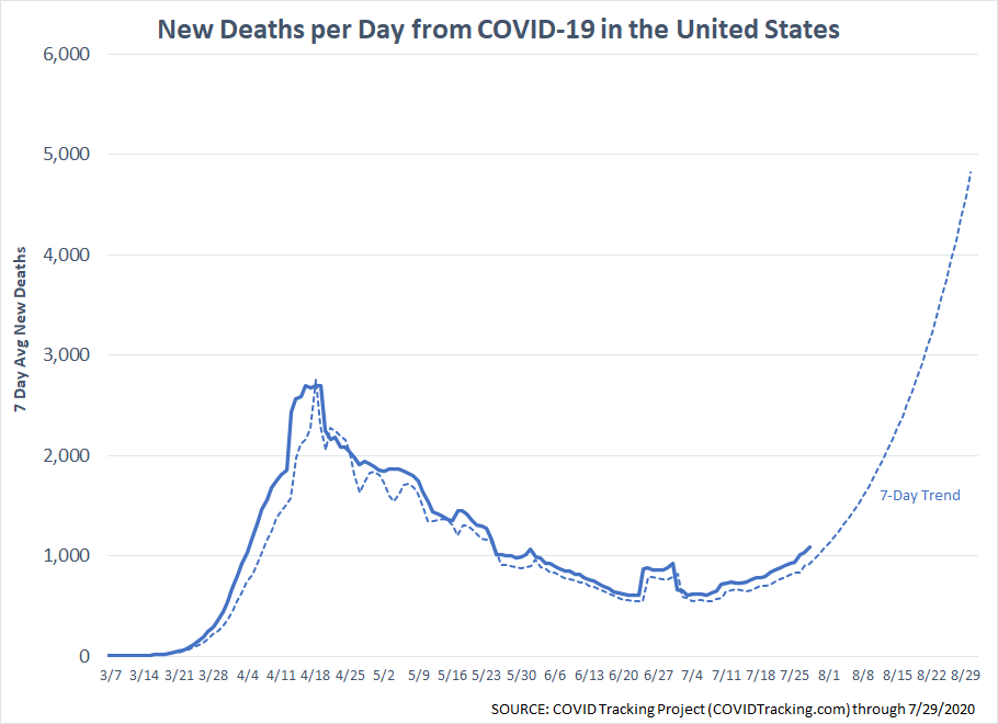
President Trump has once again taken a more somber tone, nearly echoing his March 31 warning that the numbers would get "worse before they get better." Back then, he discussed the possibility of 100,000 to 240,000 deaths. We've already exceeded the 100,000 mark, but thankfully we do not look to be on track to hit that 240,000 level (until fall).
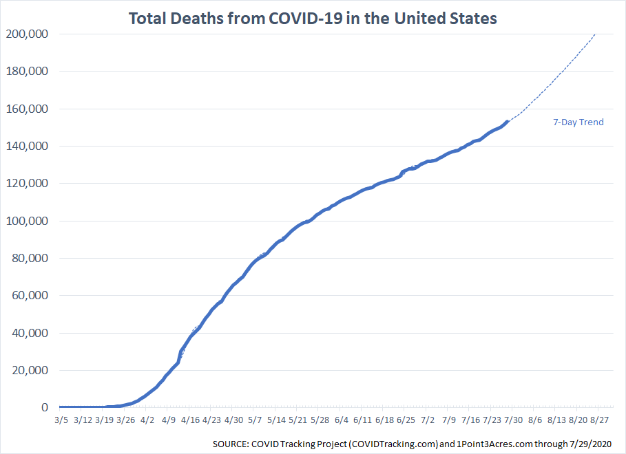
While we are again approaching the 1000 deaths per day level, it is not nearly as bad as what we saw in March and April, but easily could get there if the trends do not change soon.
Focusing in on Arizona and Virginia, you can clearly see what the experts meant when they said "flattening the curve". There are still deaths happening in Virginia from COVID-19, but nowhere near the rate we see in Arizona.
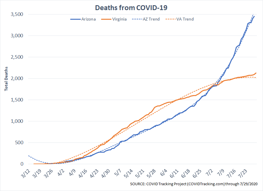
When you consider there are nearly 2 million more people in Virginia than Arizona, the numbers really jump out at you.
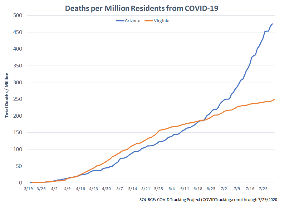
Keep in mind, Arizona is a far more "fit" state. Virginia rates near the bottom for overall health, which means the residents in Arizona should be much more able to fight COVID-19. The fact so many more are dying cannot be explained without acknowledging the measured approach in Virginia to fight the disease has been much more impactful than the free-for-all we saw in Arizona.
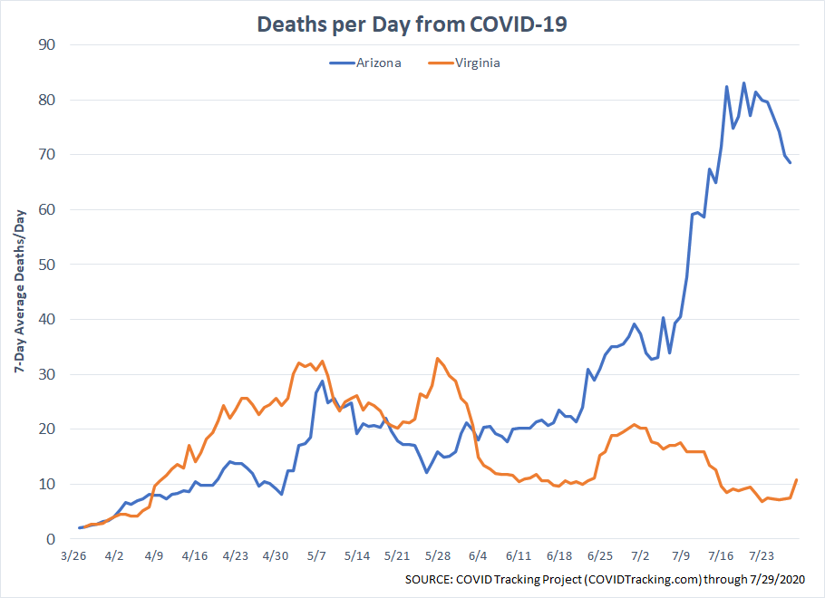
The deaths per day appears to be rolling over in Arizona, which is a positive development.
The good news is, we know a lot more than we did back in March or even in May. The number of people dying overall is not as high. We should have some sort of vaccine next year as well as more treatment options. We are all more aware of what it takes to be healthy. Longer-term this could be a very positive thing.
However, we need to get through the rest of the year in a sensible manner to give our doctors and scientists time. Without proper steps, we risk upsetting a very fragile economic recovery that will make the chance of returning to a similar "normal" much more unlikely.
For now, I feel like this has been most of us. Just when we think we are finally back to "normal," something comes out of nowhere to knock us back.