For those of you who weren’t aware, our intern Toby, who had his own “Toby’s Take” section of the blog while he was seeing if he wanted to pursue a career in finance, started an apprenticeship earlier this summer with a commercial HVAC company. Last week we were talking about diagnosing the problems which inevitably come when we are again hitting record temperatures at a time when humidity was high. I shared how many houses in Arizona, which is normally a “dry heat” (like your oven), struggled during “monsoon” season when humidity levels would rise. The air conditioners were working harder to pull the slightly more humid air out, and if they ran for too long (and were older units) they would freeze up. People would think they were broken and call for repairs. The “fix” was often patience – turn the unit off, run the fan for a few hours, and let it thaw a bit. If you were desperate (as you would be when it’s over 100 outside), you could use a hair dryer to accelerate the process.
On Friday we heard a lot of pundits in the financial media talking about a “broken” economy and discussing ways the Fed could fix it. As I will discuss below, it’s not so much that the economy, and specifically the labor market is broken, but rather frozen. To me, this means the “solution” is not to seek a repair, but to look at why it is frozen and then have a little patience.
But first, let’s take a quick look at last week’s market action.
Another Record High
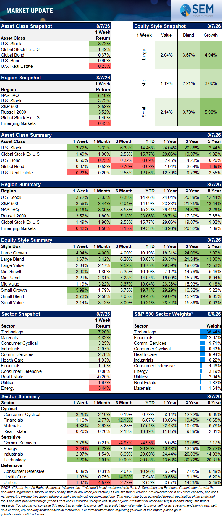
Stocks finished last week at a record high with the S&P 500. Most of the work was done early in the week – the S&P 500 jumped nearly 2% on Tuesday before meandering around the rest of the week.
Earnings were once again the key driver. At the start of the year I asked if it was reasonable to expect S&P 500 earnings to grow in the mid-teens for the third consecutive year. I’ve been happily wrong as the “broadening” in the rally beyond the hyperscalers and “Mag 7” mega cap stocks has provide our models a nice boost. The S&P 500 companies are tracking close to a whopping 50% earnings-per-share growth for the second quarter, the largest jump since 2021. After starting the year expecting 17% growth, analysts now expect 23-30% earnings growth. From Palantir to Broadcom to Micron and even Caterpillar we saw companies not only beating expectations, but then revising their expectations higher.
The bond market is the more interesting story. The 30-year Treasury touched nearly 5.3% the prior Friday, the highest since 2007, and the 10-year hit 4.75%. Both eased through last week as the wild swings in oil prices continued with oil falling on the week with hopes (again) that a deal can be struck to get the Strait of Hormuz fully and safely open. The surprisingly weak jobs report on Friday was just what the market ordered – lower economic growth likely takes away any urgency to raise rates.
Apologies in advance
This is probably one of my longest running blogs in a long time. One of the benefits of adding George to our investment team is it has freed up a large block of my time for "big picture" things. He also challenges me to look at things for other perspectives since his career started in the post-financial crisis era. One of my favorite things to do which I haven't had as much time as I like is to dig deep into economic data to see what I might be missing (or what economists are missing.) The "Super Bowl" of economic data releases has always been the Payrolls report. I took most of last week preparing for this by creating new economic data tracking spreadsheets to include hundreds of more data points, dozens of new charts, and a fresh new way to display them. At the same time, I wanted to make these charts easy to update each month for others on our team to use.
Brandi told me I need to stop writing and publish this thing because "who is actually going to read it." She's probably right. If you have the time to read it today or later on in the week or weekend, I think it will be worth your while. I also understand how busy everyone is, so at the end of my post, just ahead of George's is a "Cliff Notes" version (for those of you old enough to remember those handy black and yellow books). Our older kids (4 Millennials) used "Spark Notes", the online version. Our twins (Gen Z) just used Google, which I guess for some is now transitioning to Gemini or ChatGPT. Whatever you call it, if you don't have the time, scroll down and hit the key highlights which are more in the form of the traditional Monday Morning Musings.
For those of you who want to do some digging and hopefully look at the data in a new light, buckle up...........
Jobs and hours
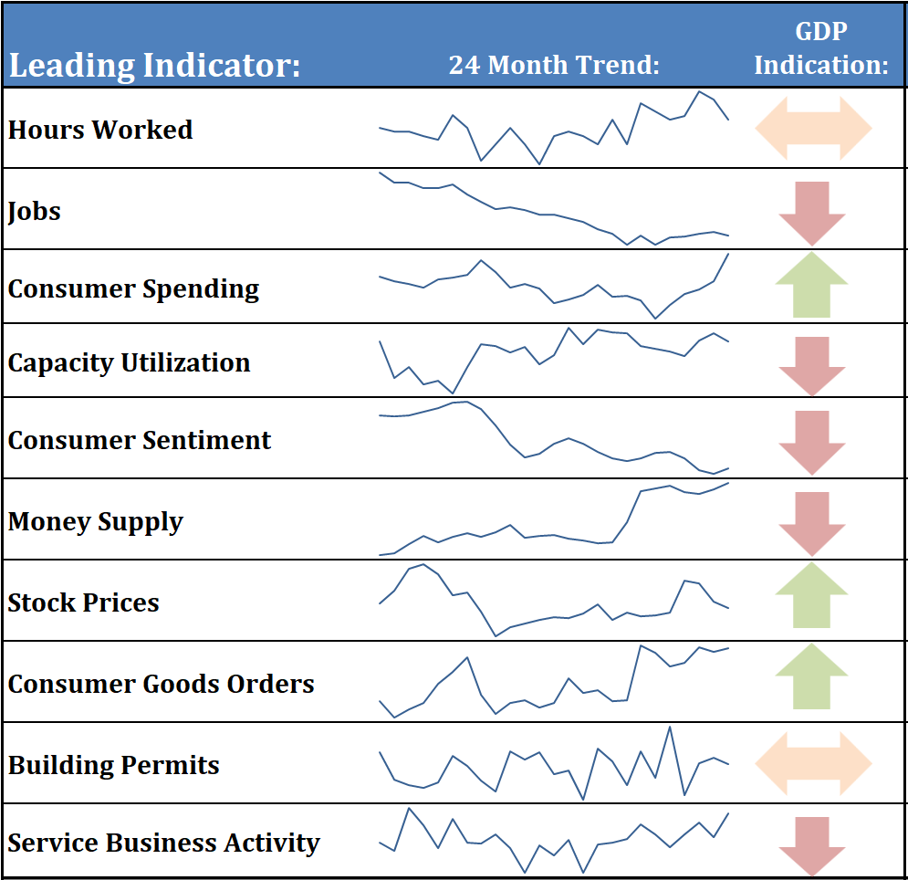
Of everything in SEM’s Leading Indicator dashboard, hours worked and payrolls have the tightest relationship to where GDP goes over the next few months. This is why we focus on them so heavily.
Payrolls fell by 23,000 in July. More important than the headline, May and June were both revised lower – by 66,000 and 103,000. The three-month average is now about 20,000 jobs a month.
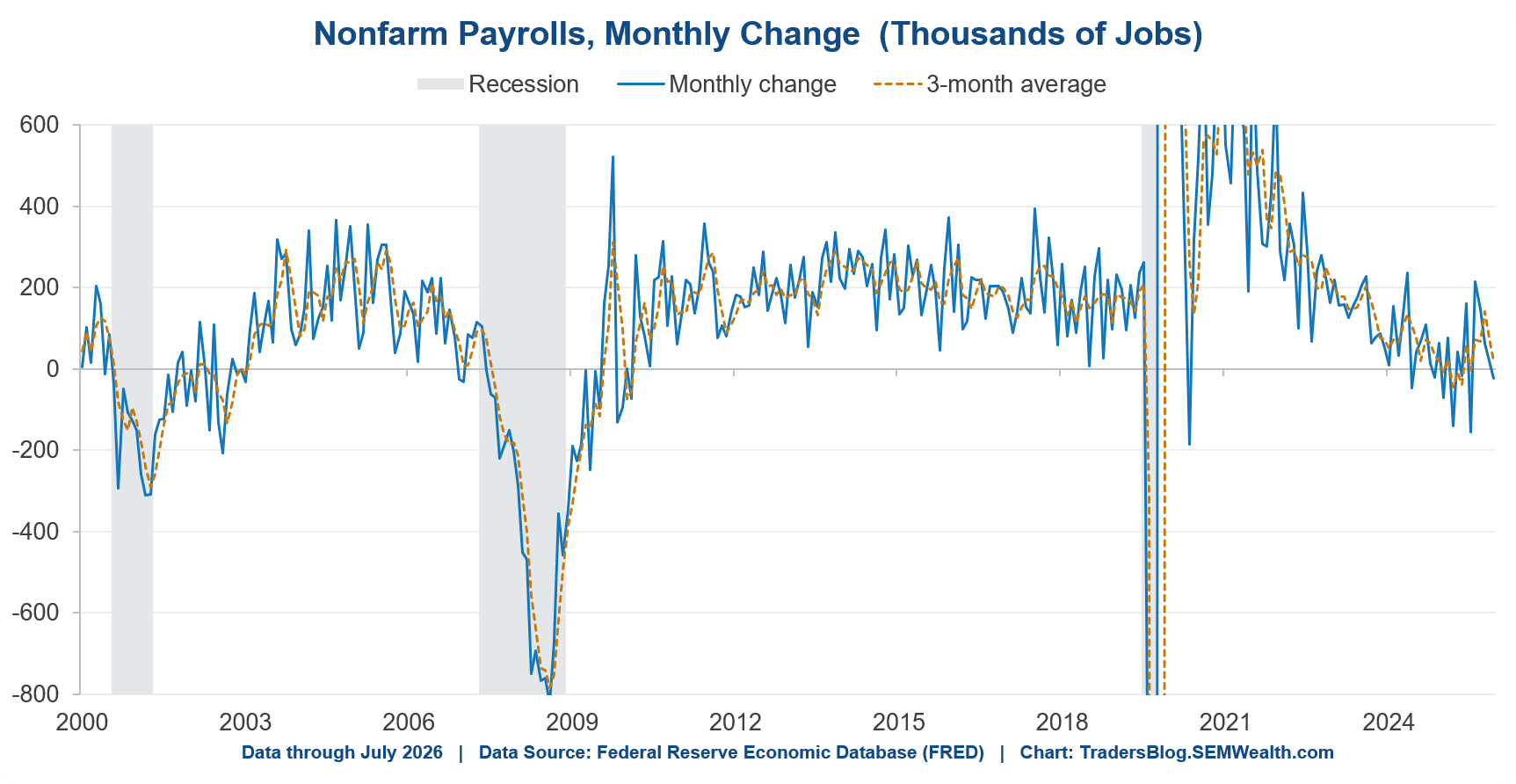
Is 20,000 good or bad? That question doesn't have a fixed answer anymore, and it's the most useful thing to understand about the current data. The number of jobs we need each month just to hold unemployment steady (what economists call the “breakeven” rate) has collapsed. It ran roughly 230-250,000 a month in 2023. Estimates now from the Fed put it somewhere between 15,000 to 87,000 because the labor force isn't growing the way it was. (The Wall Street Journal on Friday covered the latest research.)
A 100,000 print signaled a deteriorating labor market in 2023 and would signal an improving one today. Too many economists and pundits are still anchored to "we need 150,000 jobs a month,". I think this may include some of the “old guard” at the Fed.
Here's another new chart we created this week to look at this (we actually had already created it prior to the WSJ article). As you can see, a static "breakeven" rate used by many old guard economists is dangerous and misguided:
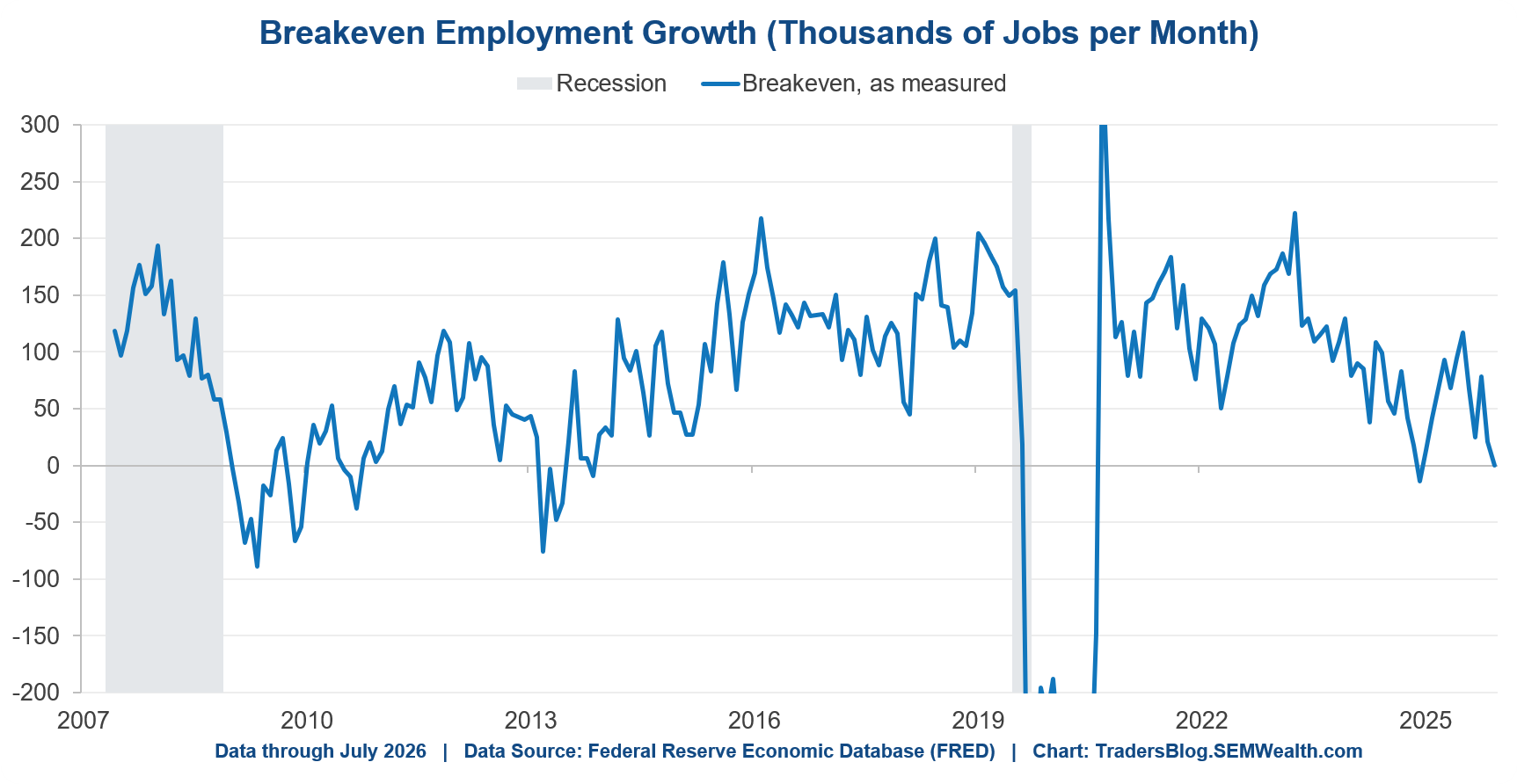
Overall the labor marked averaged 44,000 new jobs a month for the last 6 months. If the breakeven rate is 15,000 a month the economy was running nearly triple the breakeven rate, which is by definition a labor market that is running "hot".
(Side note: I’ve said this many times before – the STAFF at the Federal Reserve are some of the best economic minds and researchers in the world. They feed amazing research up the chain to the people that vote on rates. The problem is those people are political appointees, who have been made to believe they are “wizards” who can control the economy. This leads too often to the VOTING members of the Fed ignoring what the DATA inside their own research is saying, which will make Kevin Warsh’s job much harder.)
Back to the data…….the 12-month view is cleaner.
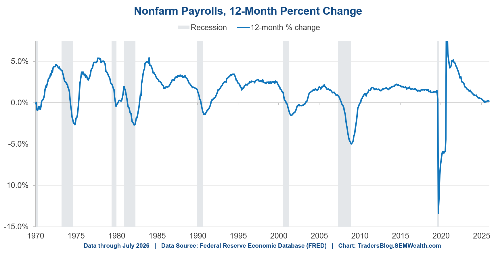
Payroll growth over the past year is +0.2%. Barely positive. Outside of 2020 you have to go back to the years after the financial crisis to find it this low.
Hours worked say the same thing, which matters because companies cut hours before they cut people. Aggregate hours are up 0.8% from a year ago and the last three months annualize to -0.3%.
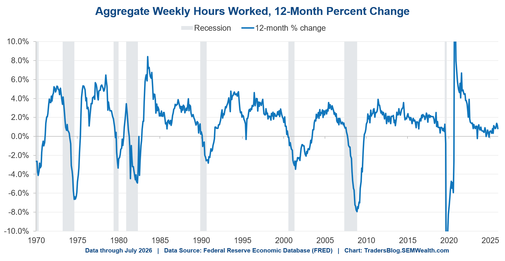
So we have two separate measures of labor input, both at roughly zero growth.
So why did the unemployment rate go down?
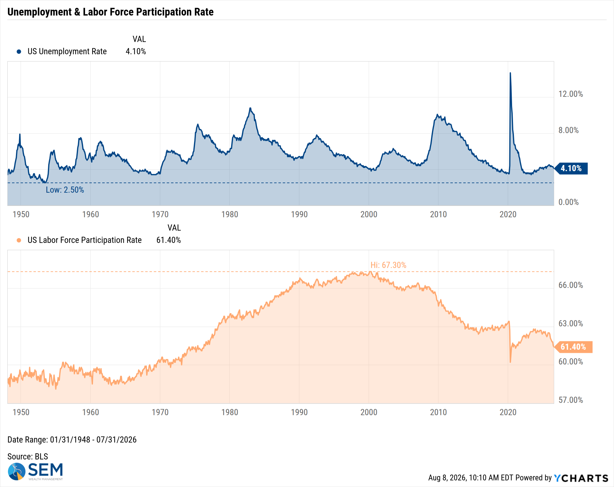
How can the unemployment rate fall from 4.2% to 4.1% in a month when payrolls dropped. That looks like a contradiction and it's worth explaining.
The unemployment rate is a fraction – people looking for work, divided by everybody working or looking for a job. It can fall because the top gets smaller (good) or because the bottom does (not good). We built a new chart on Friday that splits each month's move into those two pieces to better explain this.
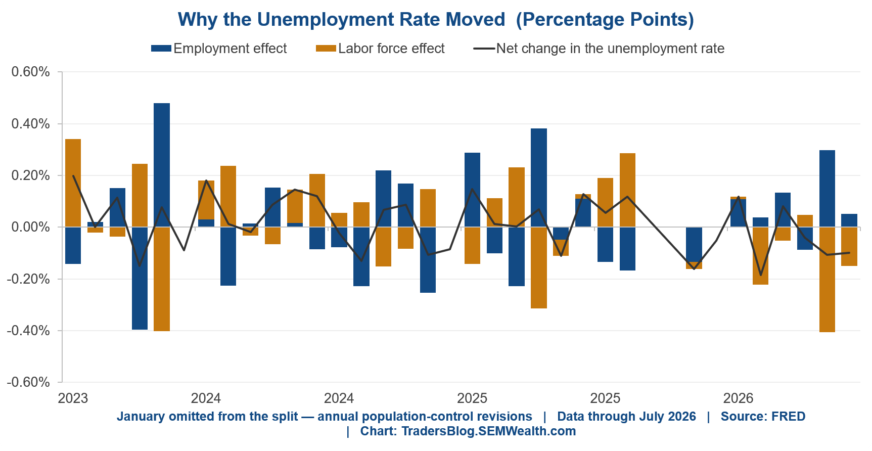
In July, falling employment pushed the rate UP by 0.05%. A shrinking labor force pulled it DOWN by 0.15%. So this nets to a decline of 0.10%.
Put more simply – the rate improved because 264,000 people left the labor force while the number actually working fell by 87,000. Fewer people looking isn't the same thing as more people working.
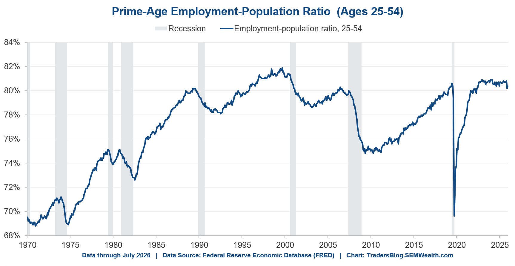
This isn't a one-month quirk. And before anybody tells you the weakness is just Boomers retiring – look at the 25 to 54 year olds, which strips out retirements and students. The share of them with a job is 80.4%, the same as it was a year ago. Flat. If anything that understates it, because the January reset works against that number too. That measure strips out retirements and students entirely.
There is something else at work here as well.....immigration policy. This is not a political statement, but simply showing you the data to help all of us understand what is happening with the economy. The drop in immigration has directly impacted our labor force. As you can see, over the last 12 months, the native born labor force has increased by the same amount the foreign born labor force has shrunk.
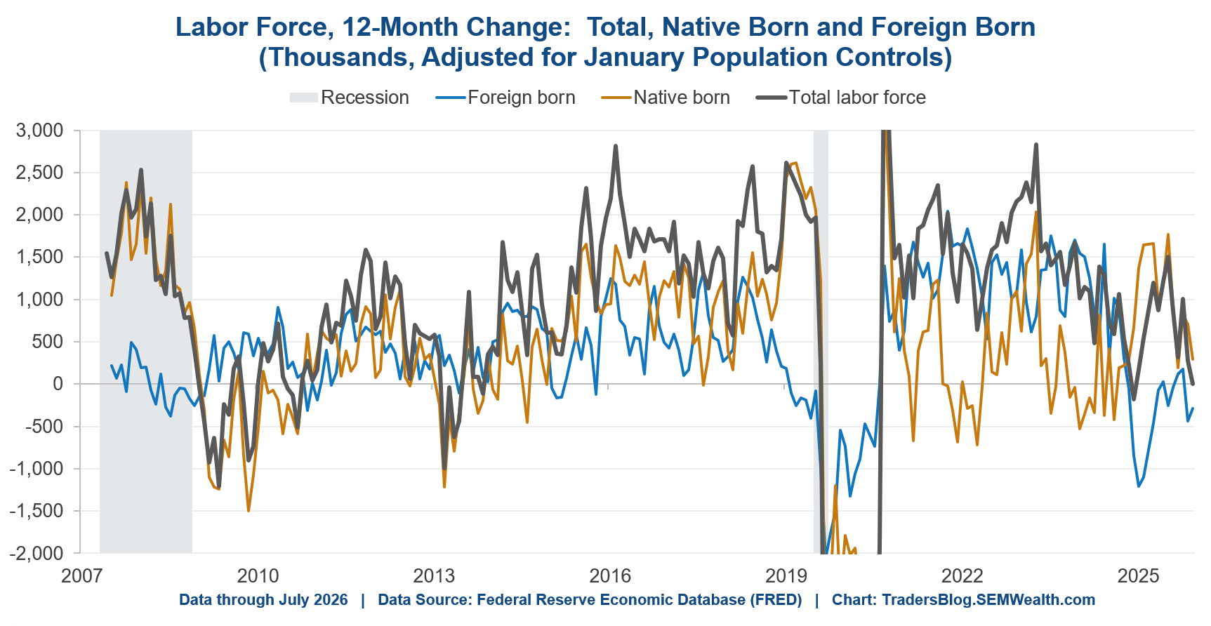
If you've heard me speak about the long-term potential of our economy at any point in the last 15 years you understand why this is important – the potential growth of our economy is a function of the number of people working and how much they are producing. If we have fewer workers, all things equal, our economic growth will go down. Of course I'm talking about LEGAL immigration and finding ways to put them to work, pay taxes, and help increase our overall economic growth.
That said, the current policies are the policies, and economists need to adjust – immigration policies are having a direct impact on the breakeven level of employment. If they don't adjust they will run the economy too hot and risk creating structural inflation (oh wait, they've been doing that for a few years now.)
Here's the other problem, and unfortunately it is also political. The Fed has two mandates – maximizing employment and maintaining price stability. The DATA shows "maximum" employment in this economy is essentially a "flat" labor market. Of course, politically its hard to convince Americans (and politicians who may want to control the Fed) that we are basically at "maximum" employment even when we lose 20,000 jobs in a month. So they are pressured to keep "stimulating" while at the same time the Fed has been nowhere near their "price stability" mandate.
Who is actually unemployed?
Here’s another new chart for us and I think it's the most useful one we've added in recent years. It breaks the unemployed into WHY they're unemployed, which the headline number throws away.
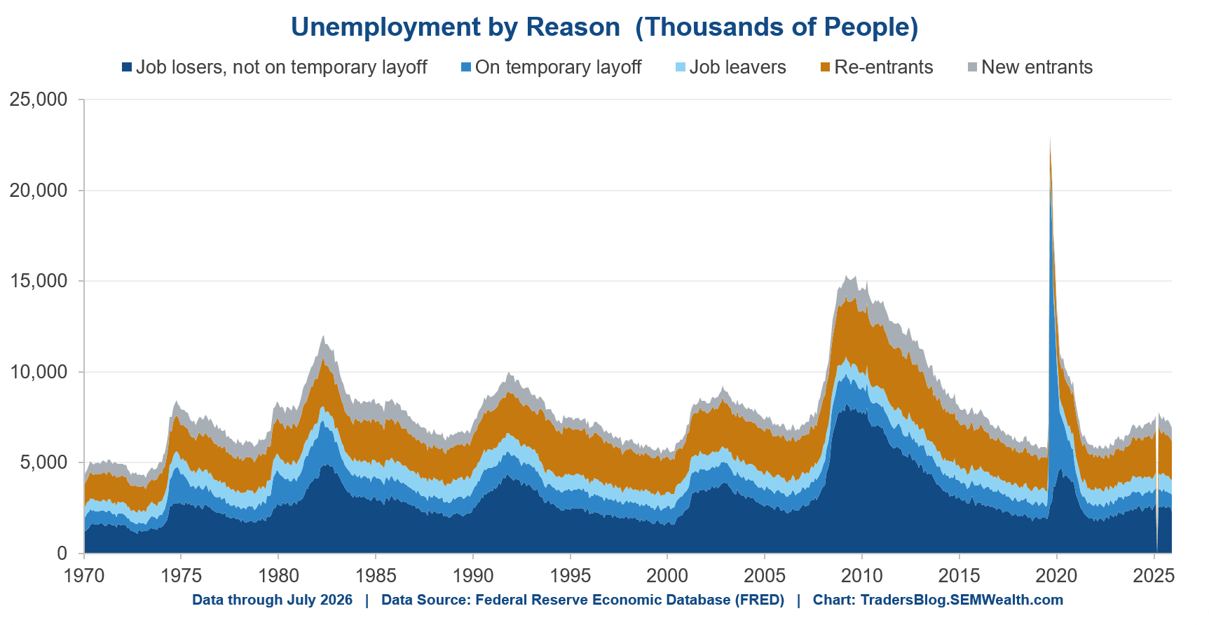
Re-entrants – people coming back to look for work after time away – are now the largest single category at 2.1 million. That's rarely been true outside the late stages of a recovery. Of the unemployed, only 47% had lost a job. 42% of the “unemployed” are without a job because they just started looking.
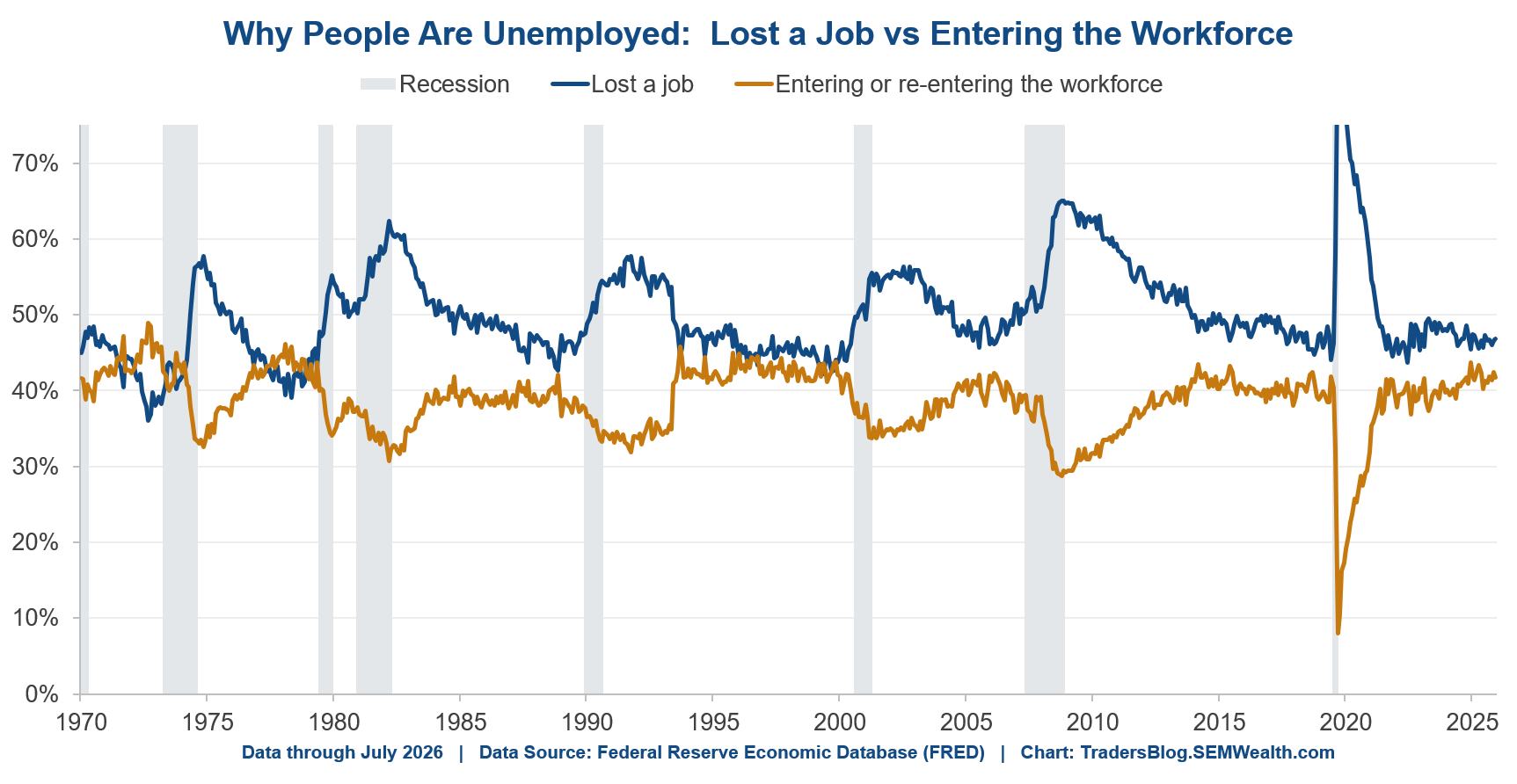
This is also why the popular "Sahm Rule" flagged a recession in 2024 that never showed up (one of the reasons Powell’s Fed was CUTTING rates, which ignited the inflation pressure). For those who haven’t heard of the Sahm rule, Fed economist Claudia Sahm found that when the unemployment rate's 3-month average rises half a point above its low of the past year, a recession has usually already started. It had a good track record for decades. The problem is it reads the unemployment rate and nothing else, so it can't tell the difference between people losing jobs and people showing up to look for them.
The more important number is the count of people unemployed because they lost a job. At 3.2 million it is down 2.0% from a year ago.
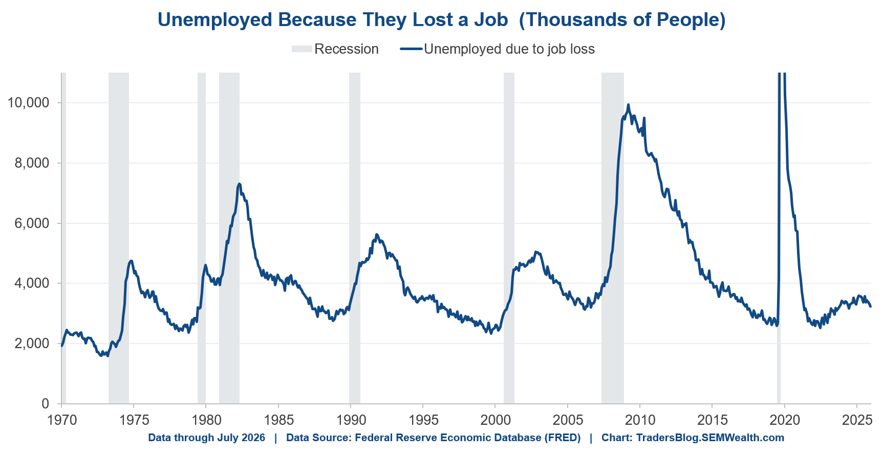
Put another way, fewer people are out of work due to job loss than last year. That's a genuinely reassuring number and it deserves equal billing with the weak payroll print.
The freeze
Here's the cleanest way to describe this labor market.
The share of employed people who lose work is 0.78% – the LOWEST reading in the history of this data going back to 1990 (and just below the pre-COVID lows.)
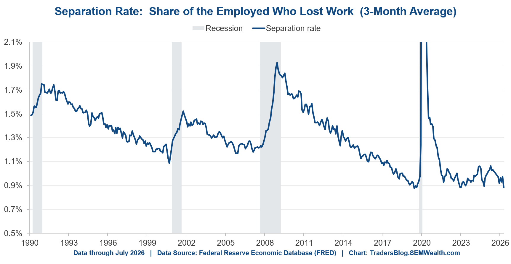
Read that again. Separations aren't just failing to rise. They're at a record low.
Companies have stopped hiring, but they haven't started firing. If you already have a job you're about as safe as you've ever been. If you're looking for one it's the hardest market in years. Both are true at once, which is why we hear wildly different descriptions of "the job market" depending on who they talk to.
What isn't flashing red
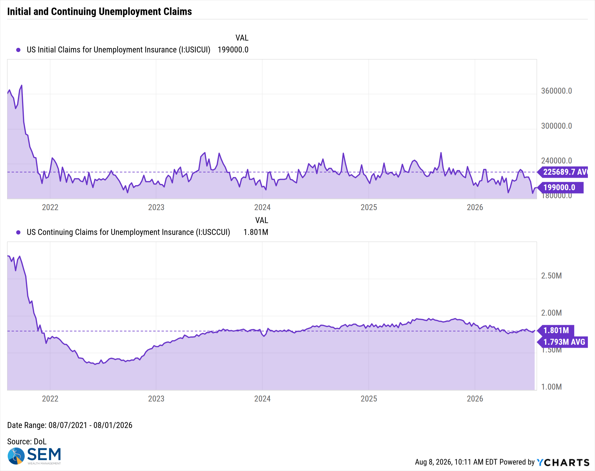
Regular readers know the weekly jobless claims are one of my favorite indicators, and it's worth looking at them here. Unemployment claims are reported each Thursday from the prior week. More important, they're a consolidated count of what every state actually processed – not a survey of 60,000 households. Nobody is estimating, nobody is extrapolating from a sample, and the numbers don't get revised by hundreds of thousands months later the way payrolls do. When I want to know whether people are actually losing jobs, this is where I look first (or as we learned during the government shutdown a much more reliable source of data).
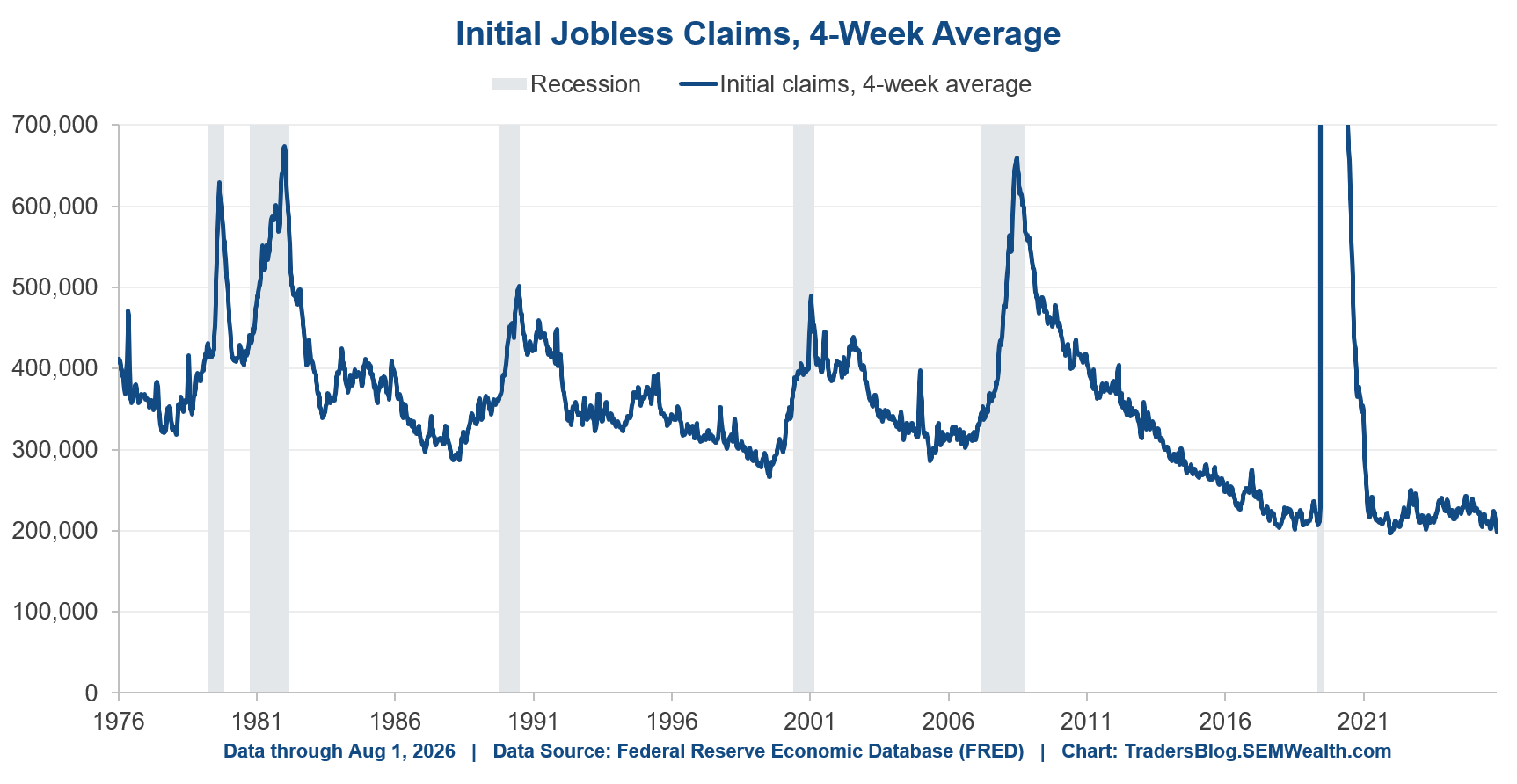
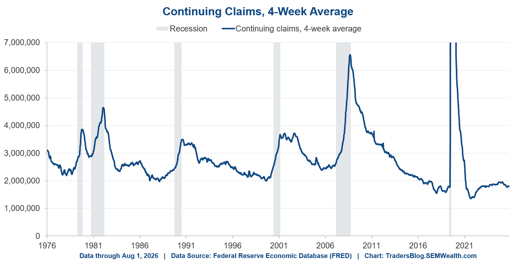
Initial claims are running under 200,000 on a four-week average, down about 10% from a year ago. Continuing claims are near 1.8 million. Neither is close to concerning levels.
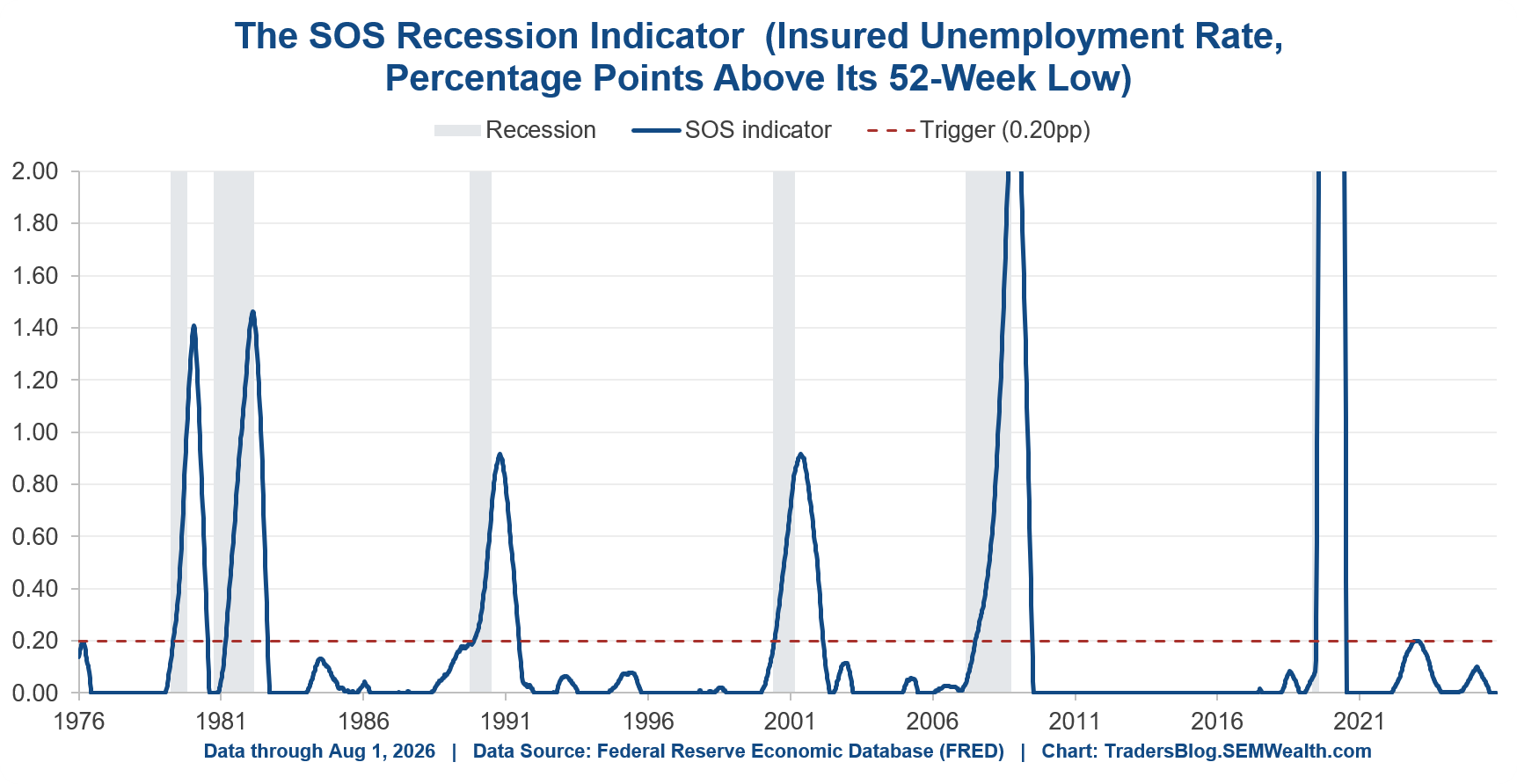
We’ve added yet another new chart to watch here too. In early 2025 two economists at the Richmond Fed, John O'Trakoun and Adam Scavette, published what they call the SOS indicator. Same idea as the Sahm Rule discussed above but built on claims data instead – it tracks the insured unemployment rate, meaning the share of covered workers actually collecting benefits, and signals when the 26-week average rises more than 0.20% above its low of the previous year.
Two things make this interesting. On their sample which covered 1971-2024 it recognized recessions faster than the Sahm Rule (2.3 months versus 3.4) without any false signals. And it can't be fooled by the problem discussed above because people entering or re-entering the workforce aren't eligible for benefits, so they never show up in it. It only moves when people who HAD jobs lose them.
The recession trigger is a reading above 0.20. Today it reads 0.00.
Elsewhere in our model
Last week we highlighted how nearly half of 2nd quarter GDP growth was related to the data center buildout. That momentum seemed to continue in July, at least based on the ISM Manufacturing Index. The overall index hit its highest level since April 2022 (when it was on its way down) indicating a strong expansion taking place.
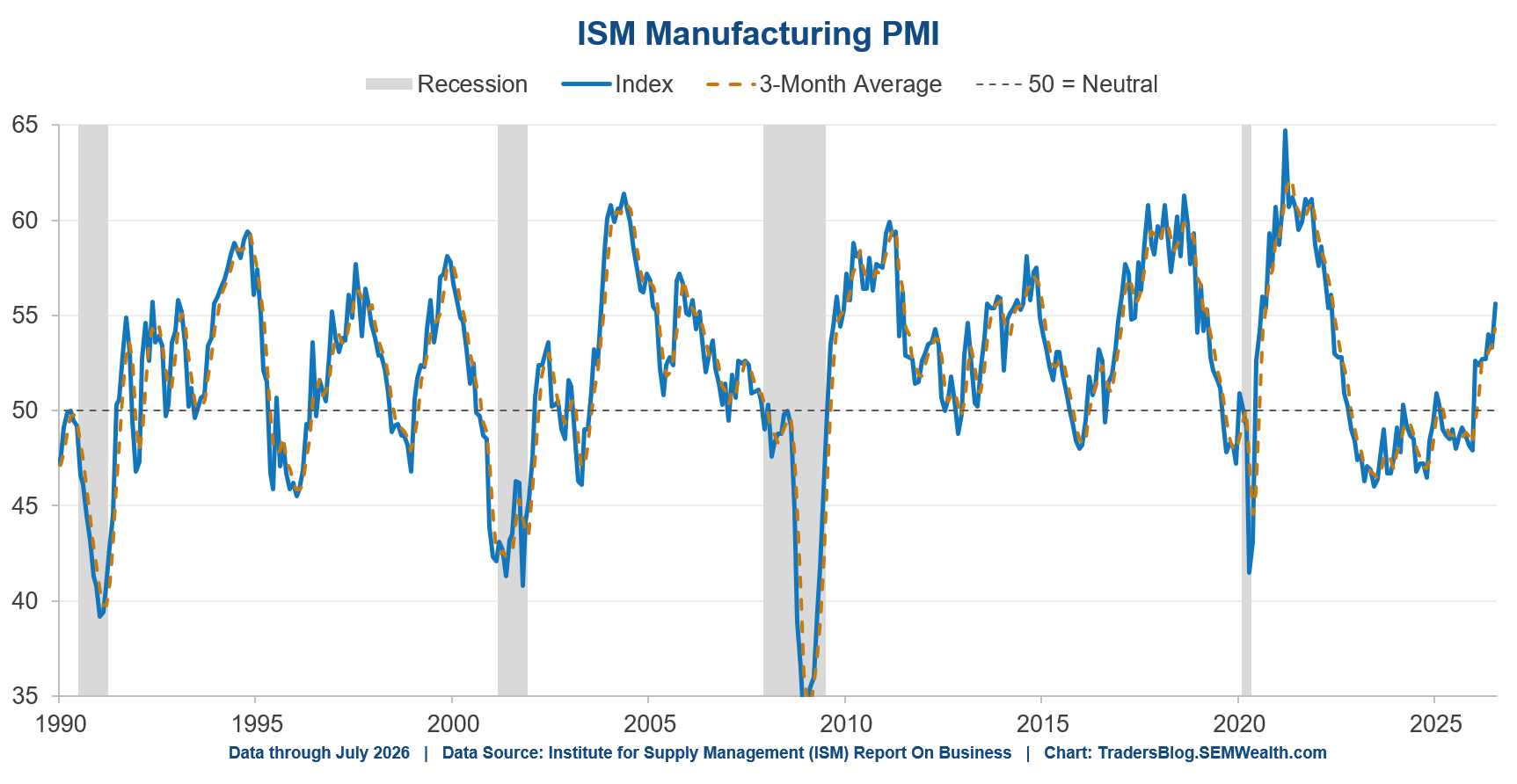
The internal components we track (New Orders, Supplier Deliveries, and Backlog) all showed strong increases and are solidly in expansion territory.
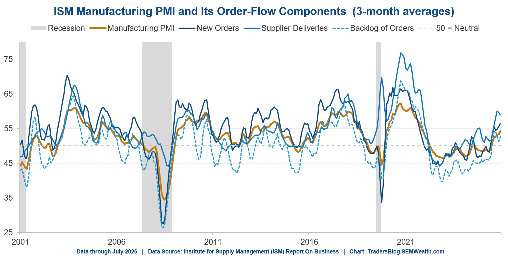
The key question we'll have to tackle in future weeks will circle back to the theme of this year – the cost and financing of the buildout at a time where inflation is becoming structural.
Where this leaves us
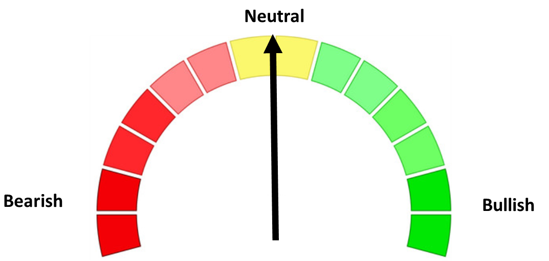
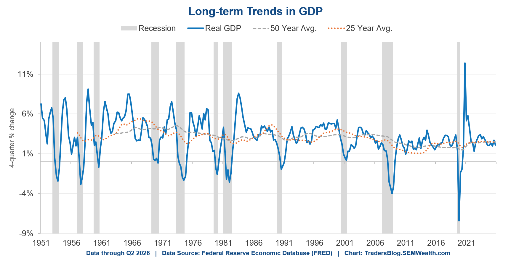
Our model stays "neutral", which is our way of saying we expect average growth. It’s worth remembering that average GDP growth this century has run about 2.3-2.5%, not the 3.1% long-term number most people think is “normal”.
The employment data doesn't change that, but it sharpens what we're watching. The labor market is frozen, not breaking. Hiring has stalled, but firing hasn't started. The unemployment rate is falling for an unhelpful reason. And the fastest, cleanest measures of actual job loss are quiet.
Frozen things thaw with patience. They also can crack if not handled correctly. The difference in the economy will show up first in job separations, not in hiring – and separations are at a record low. So that's what we're watching, along with the SOS indicator lifting off zero. Neither has budged.
What we're NOT going to do is read too much into one soft payroll number. With breakeven near zero, a small negative print carries far less information than it used to. The Fed's own work suggests employment could fall by 100,000 in a month with the economy still growing at potential. The question is whether the “old guard” will panic or put pressure on a Fed where inflation is still a problem.
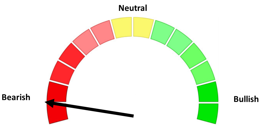
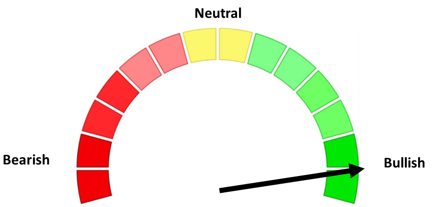
In terms of our models, the Dynamic models remain in their “benchmark” allocations, but both our Tactical and Strategic models remain fully bullish. All of them are on higher than normal alert given the pace of the market move and the increased volatility we’ve seen over the past several months (and weeks.)
As always – we will be ready for whatever happens and let you know here.
The Cliff Notes Version
As I said at the outset, this post ran long, and it was on purpose. I wanted to build out our new employment charts in one place so we can point back to them the rest of the year (and beyond) rather than rebuilding the case every month. For those of you who scrolled straight down here (I forgive you and I understand) – the labor market isn't broken, it's frozen. Hiring has stalled and firing hasn't started, the unemployment rate fell for a reason nobody should celebrate, and the cleanest measures of actual job losses are "flat". SEM's economic model stays "neutral" and we're watching job separations, not payrolls.
- Payrolls fell 23,000 in July, and May and June were revised down by 66,000 and 103,000. The three-month average is roughly 20,000 additions a month.
- "Breakeven" has collapsed. We needed 230,000-250,000 jobs a month in 2023 to hold unemployment steady. The Fed estimates now put it between ZERO and 90,000. Anyone still quoting "we need 150,000 a month" is using a 2023 measurement on a 2026 economy.
- Not using the proper "breakeven" rate means running the economy "too hot" trying to push employment to a level that is not obtainable without creating inflation. This makes Warsh's job much more difficult given the amount of "old guard" members voting on Fed policy.
- The unemployment rate fell to 4.1% for the wrong reason. 264,000 people left the labor force while employment fell 87,000. Fewer people looking isn't the same thing as more people working.
- It's not just Boomers retiring. The share of 25-54 year olds with a job has slipped from 80.8% in January to 80.4%.
- Only 47% of the unemployed actually lost a job. Re-entrants are the largest single category at 2.1 million, and the count of people out of work due to job loss is DOWN 2.0% from a year ago.
- Separations are at a record low – 0.78%, the lowest in the history of this data going back to 1990. If you have a job you're about as safe as you've ever been. If you're looking for one it's the hardest market in years.
- Jobless claims aren't confirming any of the gloom. Initial claims are under 200,000 and down about 10% from a year ago. The Richmond Fed's new SOS indicator triggers at 0.20 – it currently reads 0.00 (this new research will likely help improve our own economic model).
- The manufacturing side is strong. ISM hit its highest level since April 2022, with New Orders, Supplier Deliveries and Backlog all solidly expanding – the data center buildout is still doing the bulk of the work here.
- Positioning: Dynamic models in their "benchmark" allocations, Tactical and Strategic fully bullish, all on higher than normal alert.
One final comment.......call this irony. I posted this before heading to the Tucson office. When we got there it was 87 degrees in the back where all our offices were. Unfortunately it isn't "frozen", but there is some sort of electrical problem (based on experience in Arizona a $25 capacitor probably blew, but the AC is on the roof and we don't have a ladder to get up there, so repair it is.) Thankfully we have a portable unit and fan to survive the day (we arrive at 5:30 AZ time (8:30 ET) so the repairman isn't going to be on the clock for several hours.)

Situational (Lack Thereof) Awareness
It was too easy not to make the title for this week's Chart of the Week an ode to the recent news of the meltdown of the $45B hedge fund, Situational Awareness, led by 24-year-old Leopold Aschenbrenner.
For those who are unaware, Aschenbrenner quickly became a household name in Silicon Valley after graduating from Columbia University at just 19. He later joined, for a brief period, the FTX Future Fund before Bankman-Fried's fund went belly-up and abruptly left OpenAI's research team.
Two years following his introduction into the AI space and with no trading experience, Aschenbrenner's profile skyrocketed after publishing a 165-page essay in 2024, titled "Situational Awareness," arguing that artificial intelligence would quickly transform modern society, which caught the attention of prominent technology backers in the Silicon Valley area, ultimately raising over $200m by June 2024.
Situational Awareness LP mainly took concentrated bets on companies critical to artificial intelligence infrastructure. The fund went from $9B in March to $45B by early July and then back to $10B in a few weeks.
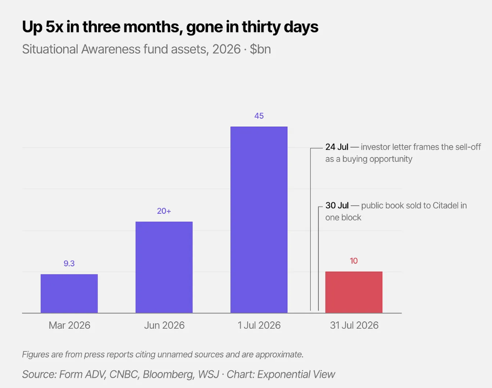
Marc Rubenstein shared more about the downfall of Situational Awareness LP:
In the space of a month, the 29 US-listed long positions in Aschenbrenner’s portfolio fell by an average of 21%, while short positions such as Adobe rose by 26%. Combined with leverage of three to four times, that spelt disaster. The fund was down 67% for the month; strip out private company holdings such as Anthropic, which made up around $10 billion of the $45 billion peak assets, and the public portfolio was down around 85%.
Why you ask? Here's an excerpt from a recent WSJ article:
"For every $1 of capital, Situational would upsize its positions by borrowing an additional $3 to $4, or sometimes more, people familiar with the matter said, well above the leverage used by funds trading such volatile kinds of shares. It also used options to amplify its returns. That meant that even small declines in individual names could have big impacts on Situational’s portfolio."
Even with the volatility in the market, leverage can be great on the way up, but it can wipe investors out when things turn south. Leverage can magnify returns and make a successful strategy look untouchable when Mr. Market is on your team. However, if things go wrong, it can reduce an investor's ability to absorb a setback or take advantage of one.
At SEM, we understand the value of long-term investing, staying the course, and holding diversified investment portfolios while remaining flexible enough to adapt to changes in the market environment.
Thank you to all of the visitors who read last week's "Chart of the Week". I hope to continue sharing these talking points about markets, investing, etc., for you to share with family, friends, coworkers, or anyone along the way.
See you next time!
Market and Economic Data
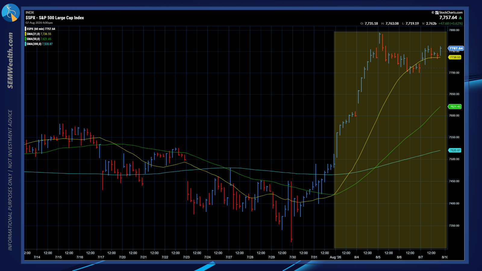
The hourly chart from last week tells the story. Big gains on Monday and Tuesday, a pull back, consolidation on Wednesday and Thursday, and a tepid rally on "bad" economic news.
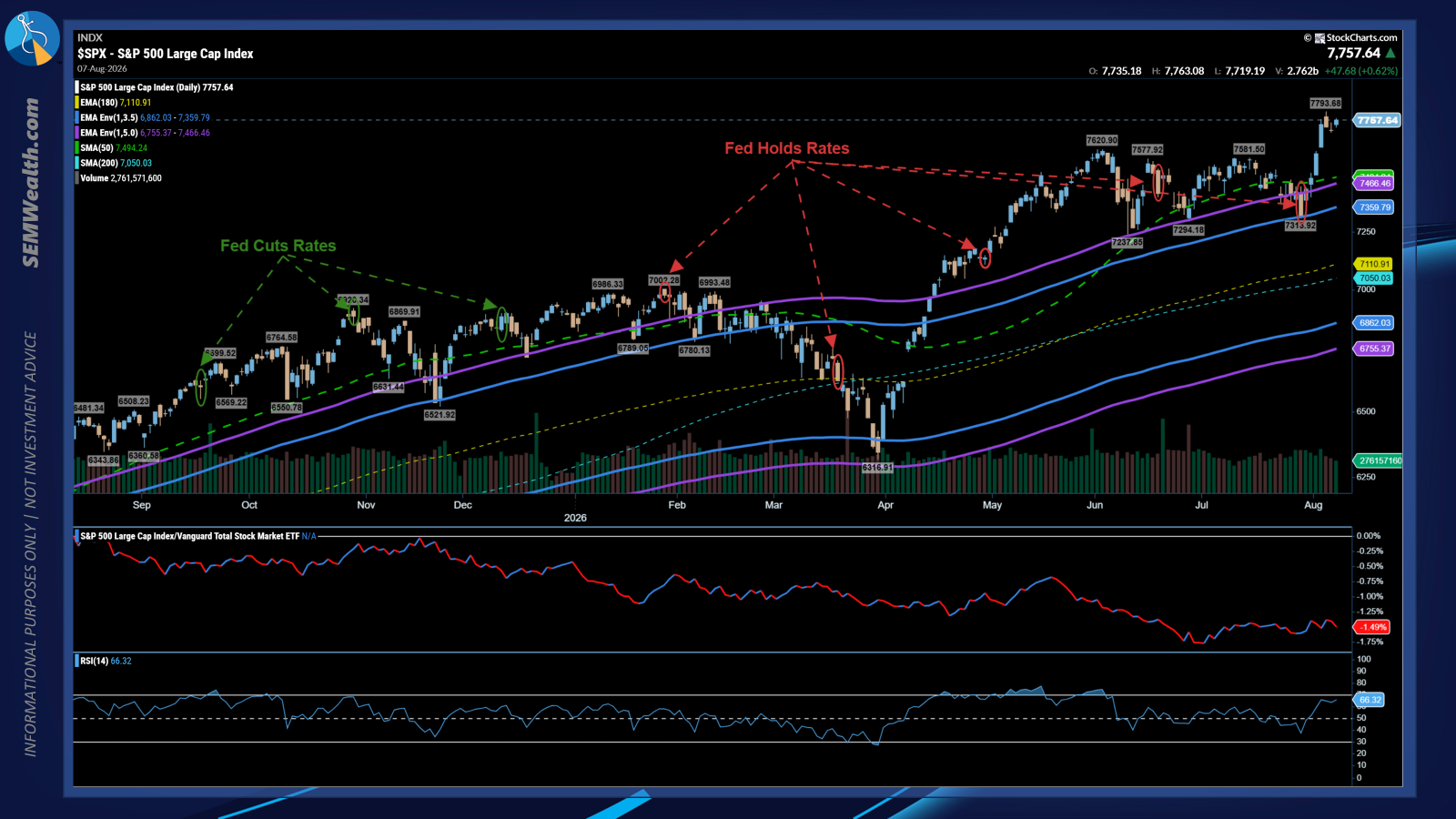
Nothing seems capable of stopping the market as the S&P closed at a new record closing high.
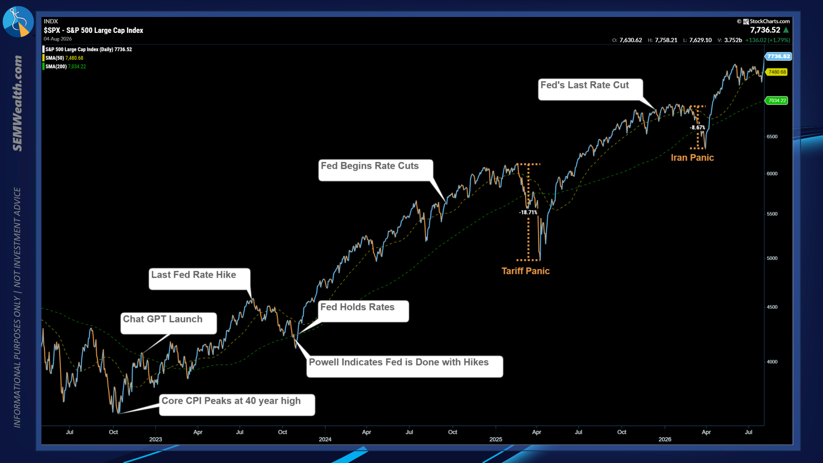
Looking at the bull run off the bottom in 2022, for now it appears the weakness this summer was simply a consolidation phase. Higher highs tend to lead to higher highs until something comes along the way to smash them back down.
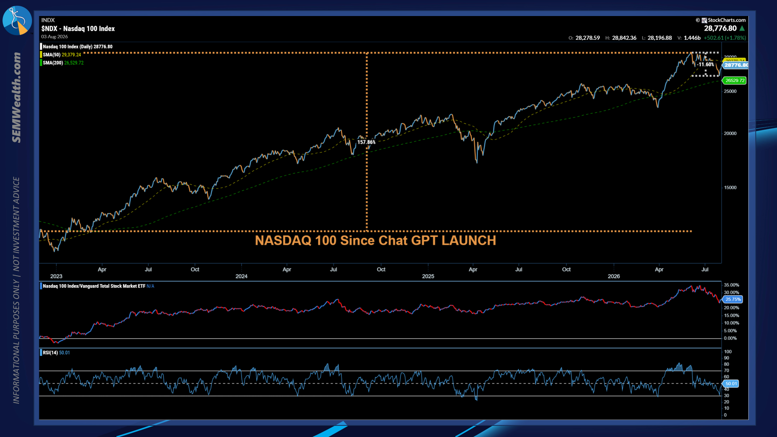
The NASDAQ 100 has rebounded off oversold levels. I like this chart because the middle panel shows the relative performance of the tech-heavy NASDAQ 100 (NDX) versus the total stock market. It is a quick way to see whether or not tech is driving the market. As of now, the broadening appears to be intact.
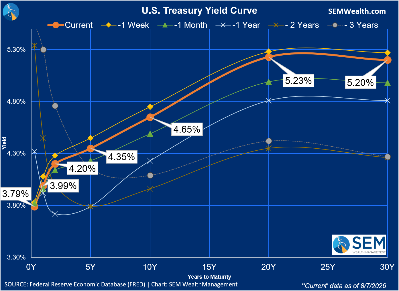
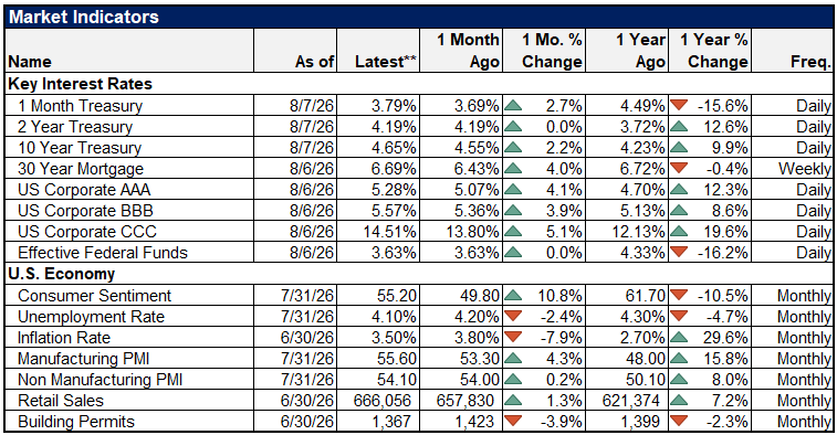
Yields backed down across the board last week, helped a bit by the "weak" jobs report.
US Unemployment Rate data by YCharts
US Initial Claims for Unemployment Insurance data by YCharts
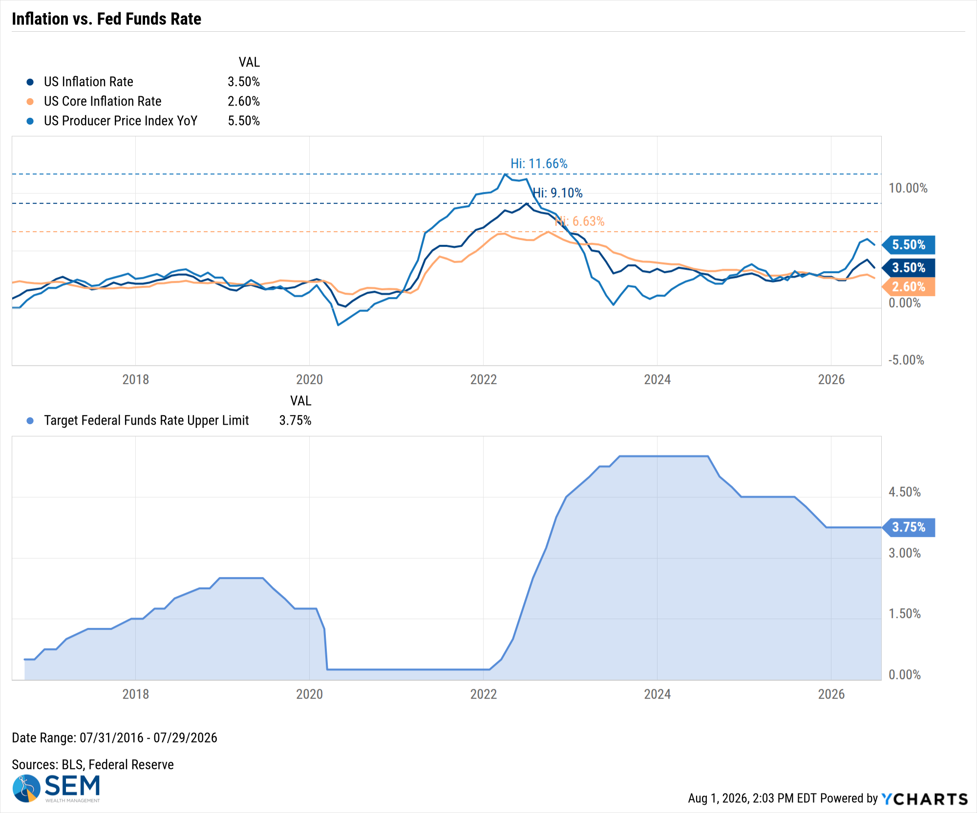
US Inflation Rate data by YCharts
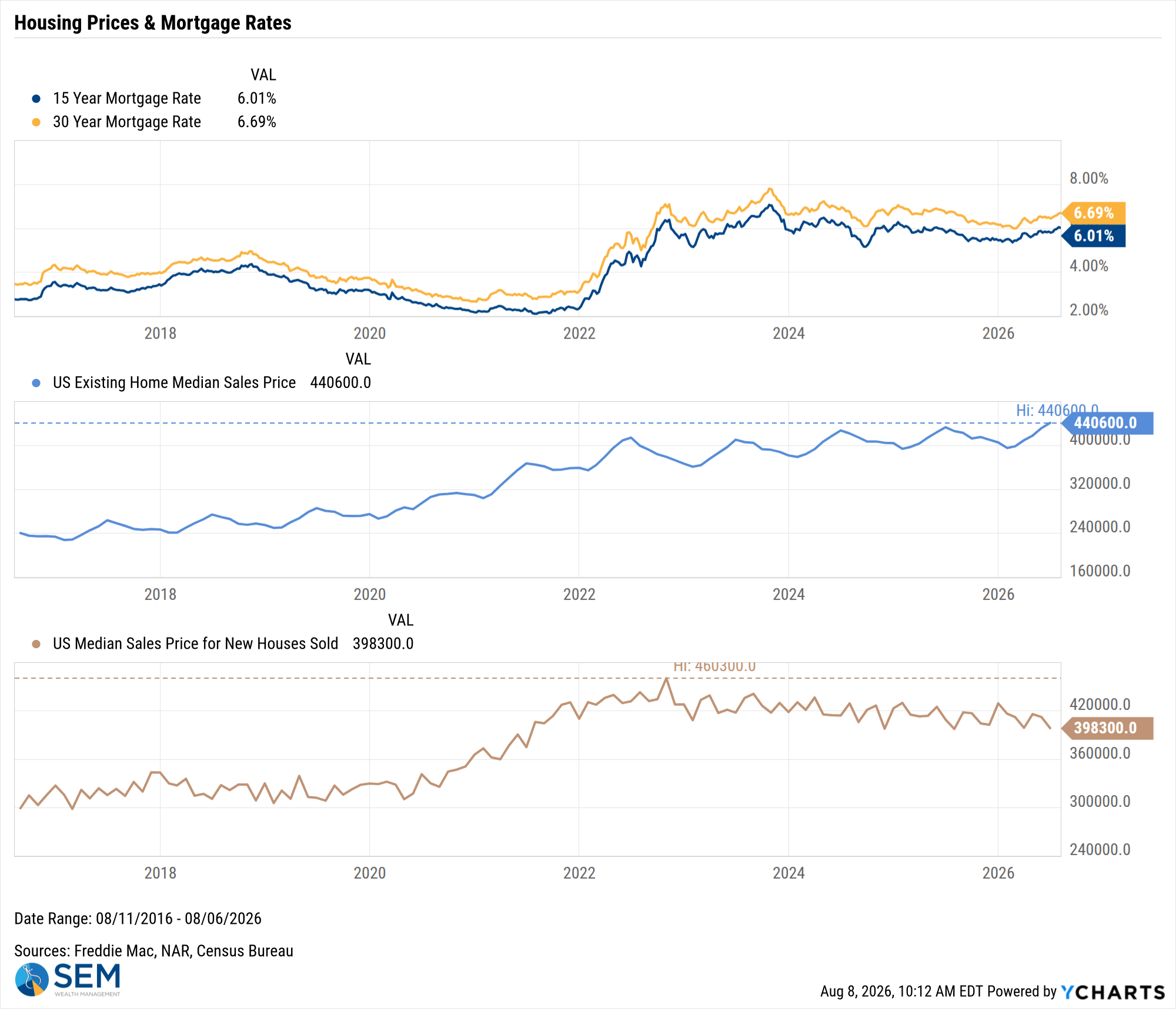
US Existing Home Median Sales Price data by YCharts
SEM Market Positioning
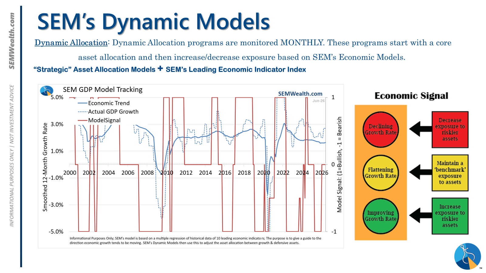
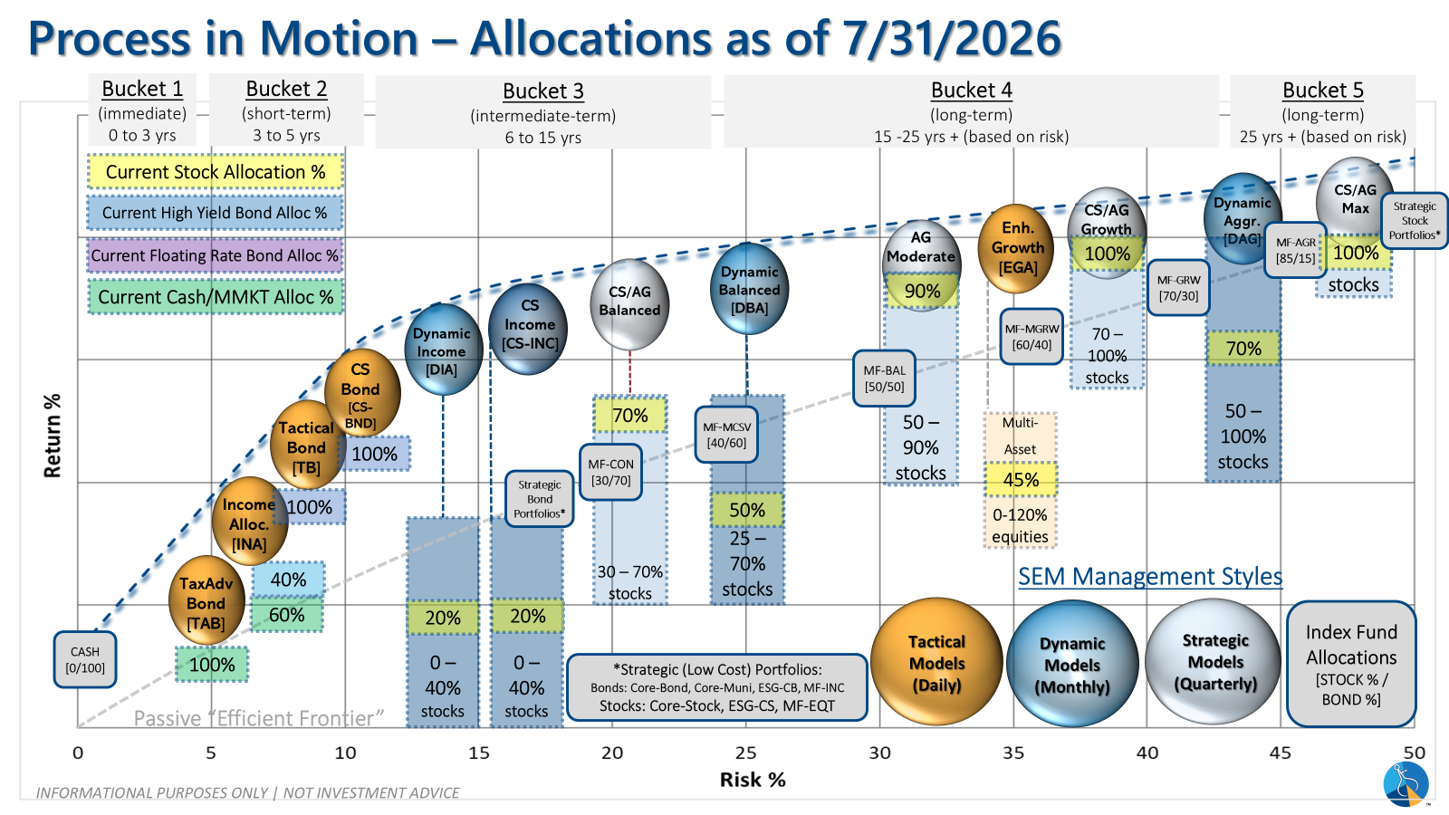
SEM deploys 3 distinct approaches – Tactical, Dynamic, and Strategic. These systems have been described as 'daily, monthly, quarterly' given how often they may make adjustments. Here is where they each stand.
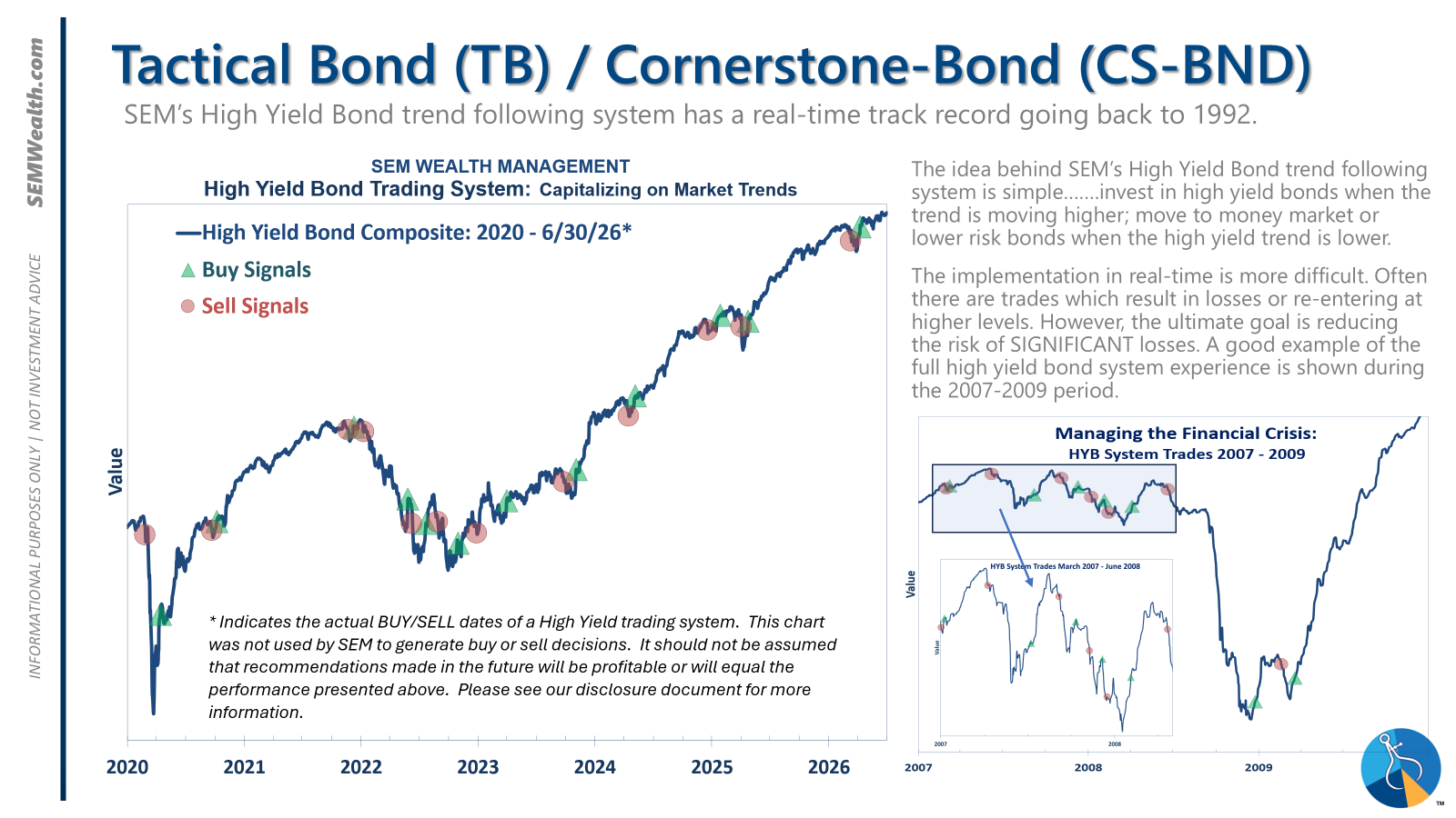
- Tactical = BULLISH | 100% High Yield Bond (4/8/2026) | High-yield spreads remain narrow but trend is slightly higher
- Dynamic = NEUTRAL (2/15/2026) | "Benchmark" Allocation | Economic model inconclusive
- Strategic = BULLISH (4/15/2026) | V-Bottom projecting "end" of Iran War
Tactical (daily):
- Monitored DAILY
- Models: Tactical Bond, Cornerstone Bond, Income Allocator, Tax Advantaged Bond
- Designed to follow the trends for use in our lower risk models
- BUY Signal issued April 8, 2026 (exiting the sell from March 13)
Dynamic (monthly):
- Monitored MONTHLY
- Models: All "Dynamic" Models (Income, Balanced, Growth, and Asset Allocator)
- Uses SEM's Quantitative Economic Model
- Designed to overweight riskier assets if economic trend is higher & underweight those assets if economic trend is lower.
- NEUTRAL signal issued February 15, 2026 (following BEARISH signal from July 2025)
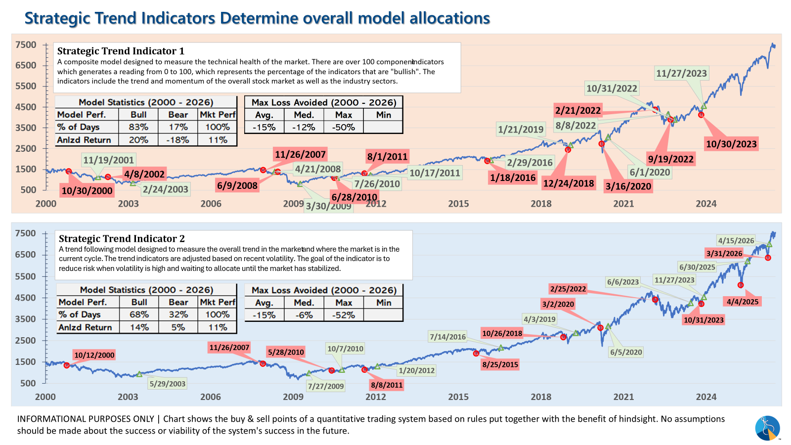
Strategic (quarterly)*:
- Monitored QUARTERLY
- Models: AmeriGuard (Balanced, Moderate, & Growth) and Cornerstone (Balanced & Growth)
- Core Component: Quantitative Filter using 4 different time horizons across universe of asset classes
- Trend Indicator: Two different Quantitative Systems monitoring the intermediate-term trend, health of the market, and volatility
- CORE has been overweight small cap and international since October 2025 – overweight increased slightly in January
- Both TREND INDICATORS are BULLISH following 10% drop and "V-Bottom" reversal in early April
- AmeriGuard & Cornerstone Max DO NOT use the Trend indicator and are always 100% invested in stocks using our CORE rotation model.
The core rotation is adjusted quarterly. This quarter we saw half of our international positions reduced (we sold developed markets and kept our emerging markets exposure). We also saw the remaining share of mid-cap reduced in favor of more small cap exposure. We remain with a "barbell" core portfolio – about half in large cap and half in small cap as the models expect the market to "broaden".
The * in quarterly is for the trend models. These models are watched daily but they trade infrequently based on readings of where each believe we are in the cycle. The trend systems can be susceptible to "whipsaws" as we saw with the recent sell and buy signals at the end of October and November. The goal of the systems is to miss major downturns in the market. Risks are high when the market has been stampeding higher as it has for most of 2023. This means sometimes selling too soon. As we saw with the recent trade, the systems can quickly reverse if they are wrong.
Overall, this is how our various models stack up based on the last allocation change:
Curious if your current investment allocation aligns with your overall objectives and risk tolerance?